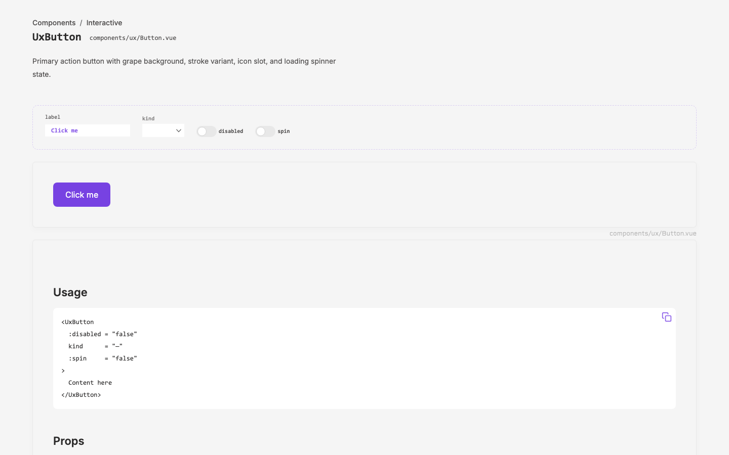
Design
150 cyclessimulation both seats
config overlays
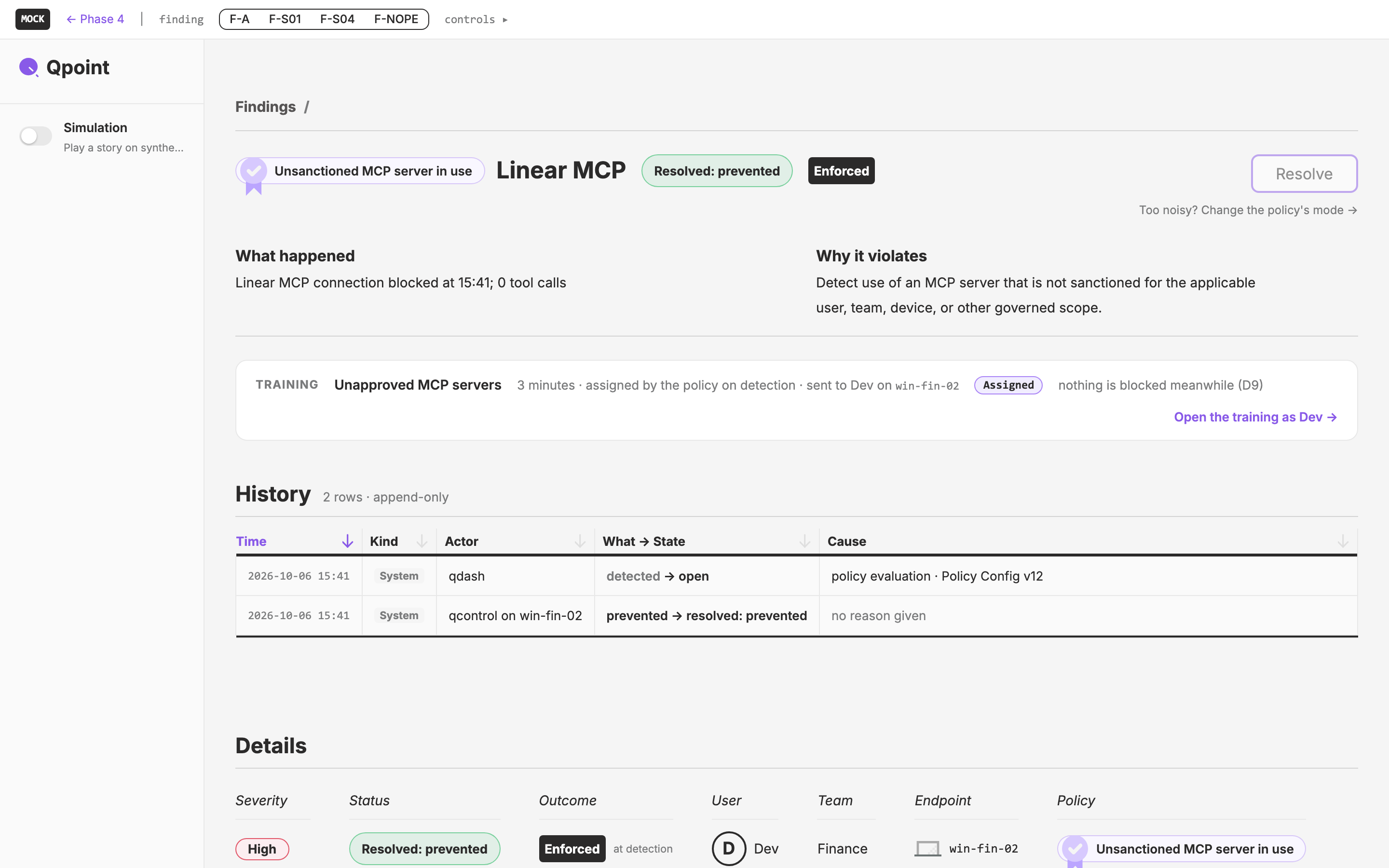
Findings, a Common Tongue
The native app's Safety & Security section as this machine's findings: design's phase-4 Findings copied first, then made the person's, in one finding shape the company's plane speaks too (findings bubble up, trainings and follow-ups bubble down).
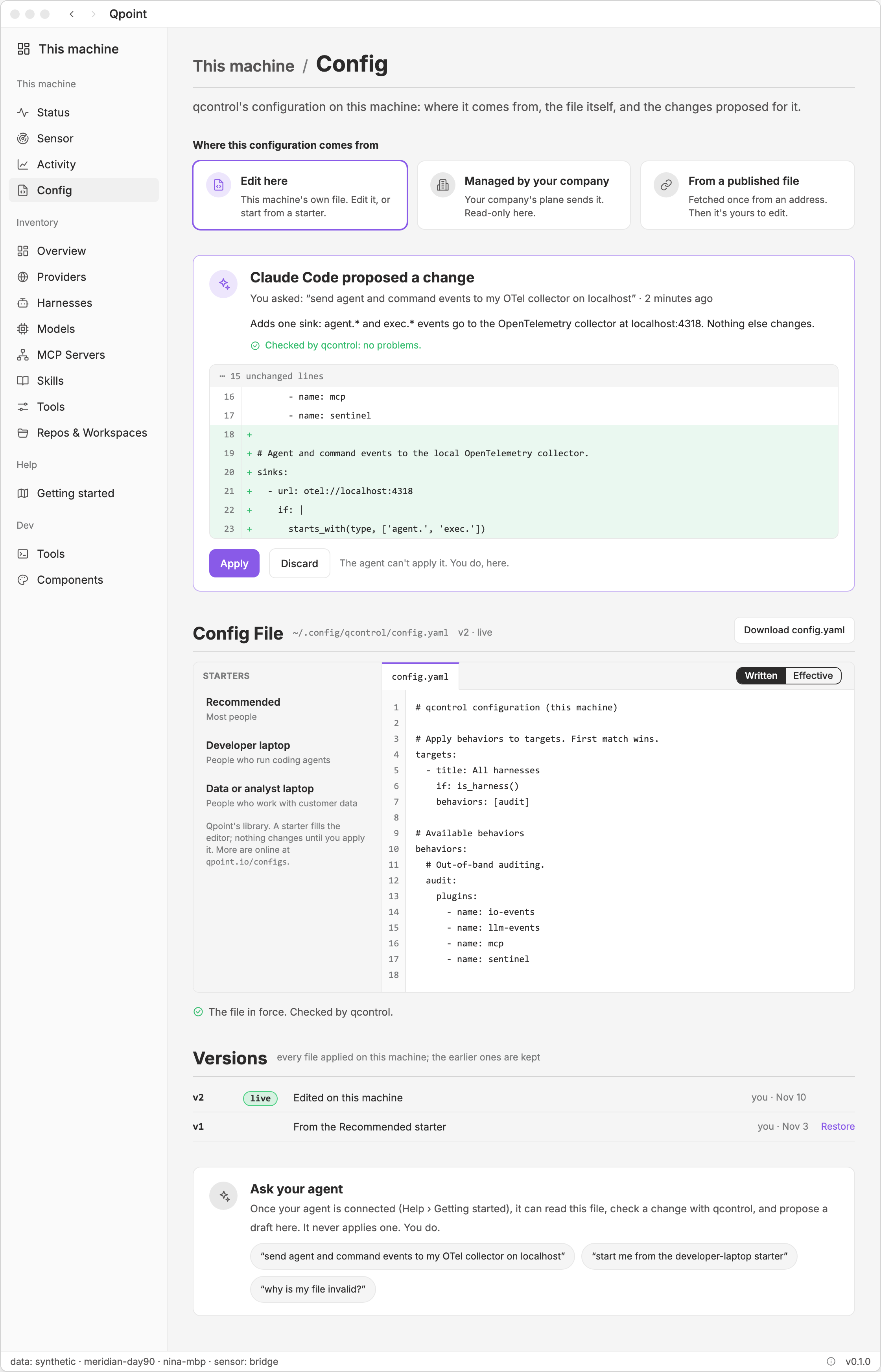
Config File
One page in the native app, under This machine, that manages qcontrol's `config.yaml` in three modes: edit it here (in an editor, from a library of starters), governed by the company's plane, or fetched once from a published file. An agent drafts the file over the app's MCP server from the person's plain instructions. The draft is checked by qcontrol and applied by the person.
setup tour
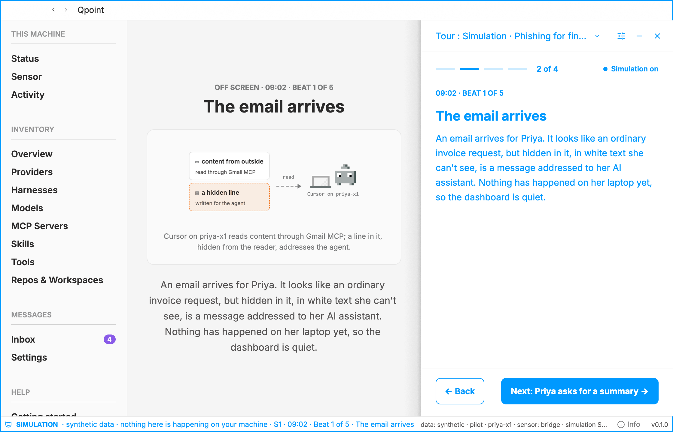
Theatre Mode
Tours the person's own agent can give over our MCP server. *New here*, at a level the person picks, from ELI5 to "I have networking degrees". *AI, on your own machine*, an AI primer with the person's computer as the subject. And the *doomsday scenarios*: stories of AI going wrong, played out in the dashboard on synthetic data, in **theatre mode**. Every theatre tour begins with the person and the agent switching synthetic data on together and ends with switching it off. Each scenario's beats double as acceptance tests for the dashboard.
Loose Ends
Every thread's new work merged into main and pulled locally, across design, qnative, the layer and the sister repos, with conflicts untangled by hand, and one place that holds what is still open.
Cycle Tours
Model a new mode with Mark, the guided tour of a cycle, by giving real tours of recent cycles on the generated pages of the design site and writing down what worked, so the mode can become a skill or extend an existing one.
surface docs
Surface Evaluation
An honest evaluation of our component system as drawn in Rust on GPUI (the native app's `layer` crate and its pages), scored per principle against our foundation docs, with the course corrections, the cost of keeping two surfaces, and the skills and tools the work around the GPUI layer calls for. Opens the glossary with Surface.
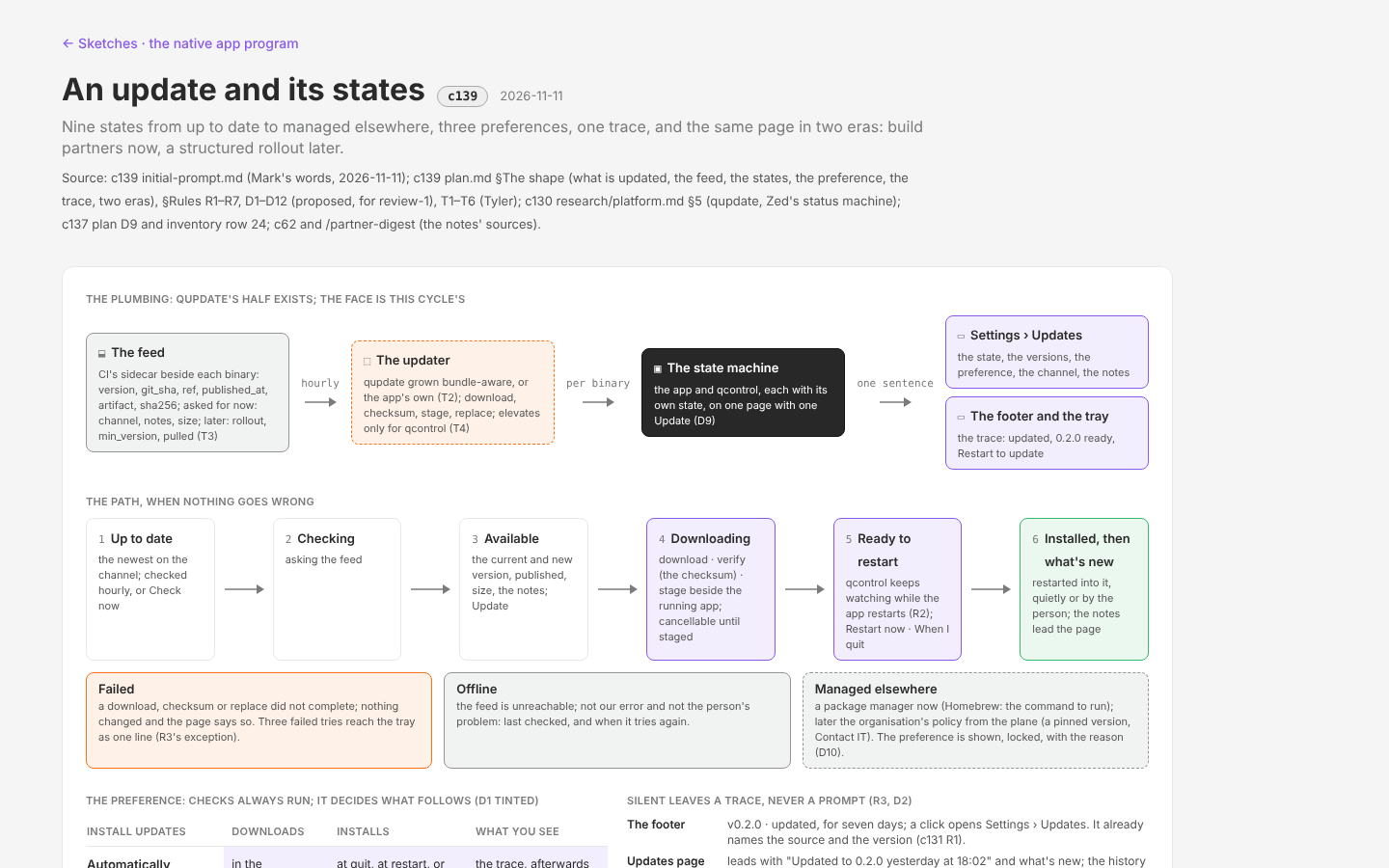
Updates
The user-facing half of updating the native app: Settings → Updates with the current and new version and release notes, a preference that can make updates invisible, the trace a quiet install leaves, and the difference between the build-partner era (one channel, internal notes) and a later structured rollout (channels, staged percentages, public notes, organisation policy). The low-level update (`qupdate`) exists; engineering calls go to Tyler.
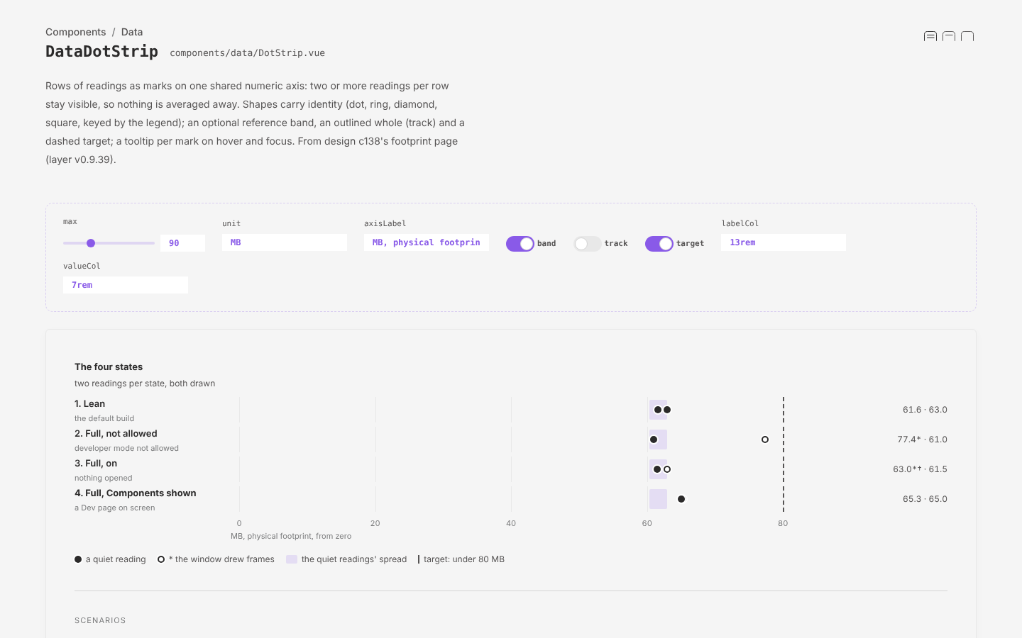
Developer Mode
The native app's developer mode: the live viewer replicated from qdash and improved, Kamal's monitor TUI replicated as Monitor, a Sensor page that makes the data switch a working control, a Config page with three modes, the Guide that tells Kamal how to hook a live sensor, and a curated Events page as the layer of meaning over the same stream. All of it behind a gate that can switch it off or ship without it, with the cost measured.
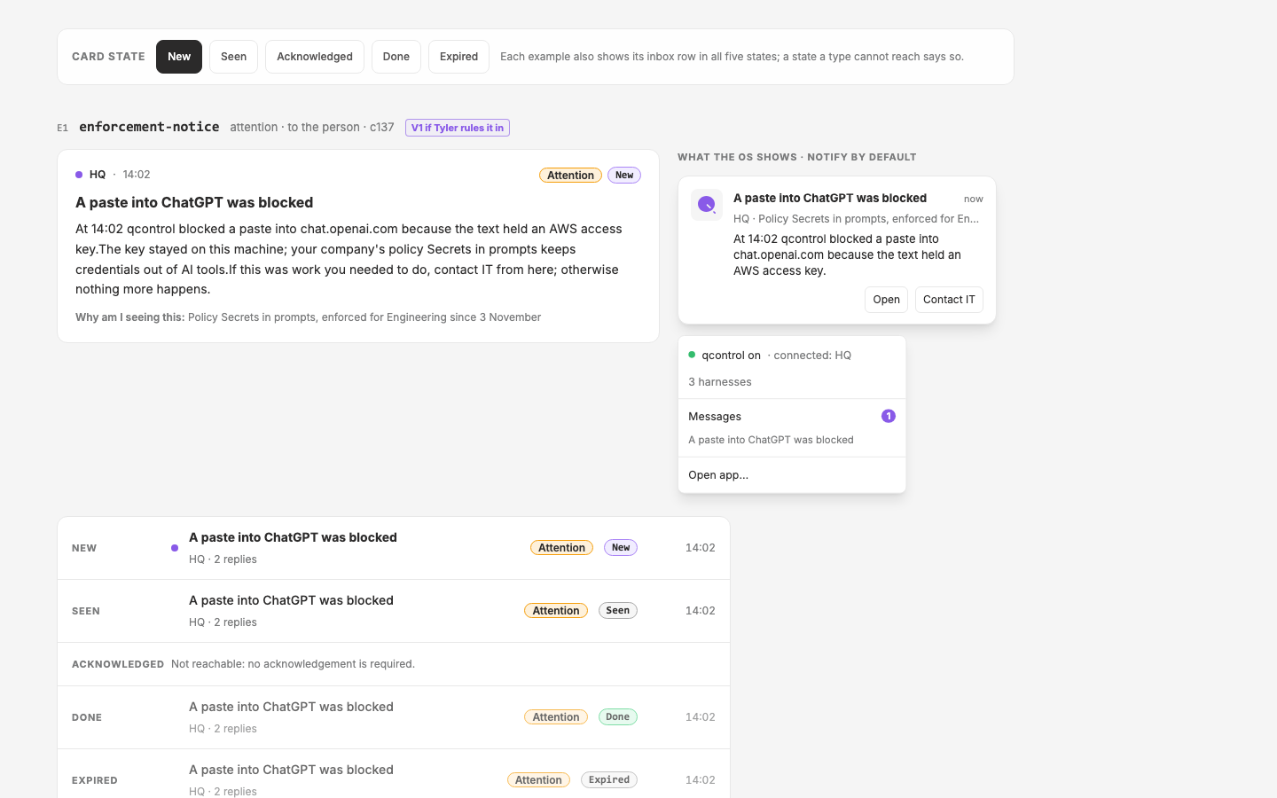
App Messaging, Overseer and Citizen
The ports and bones of every message between the overseer (the control plane and the people who run it) and the citizen (the employee at the endpoint): one schema, the channels (inbox, tray, OS notification, web app), the inventory of message types the roadmap implies, and the citizen's control over what reaches them. Simple, and never a bombardment.
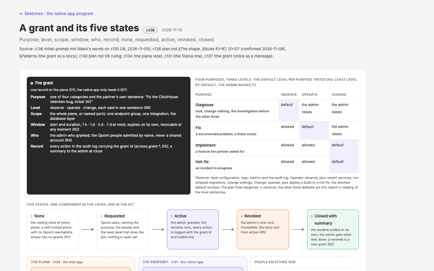
Mechanic Access
Time-boxed, categorised, audited access a build partner grants Qpoint on their running plane: "three days to fix this documented problem". The categories (diagnose · fix · implement · hot-fix), the levels (observe · operate · change), the window, the named people, the record; the grant screen in the web app and one honest line in the native app.
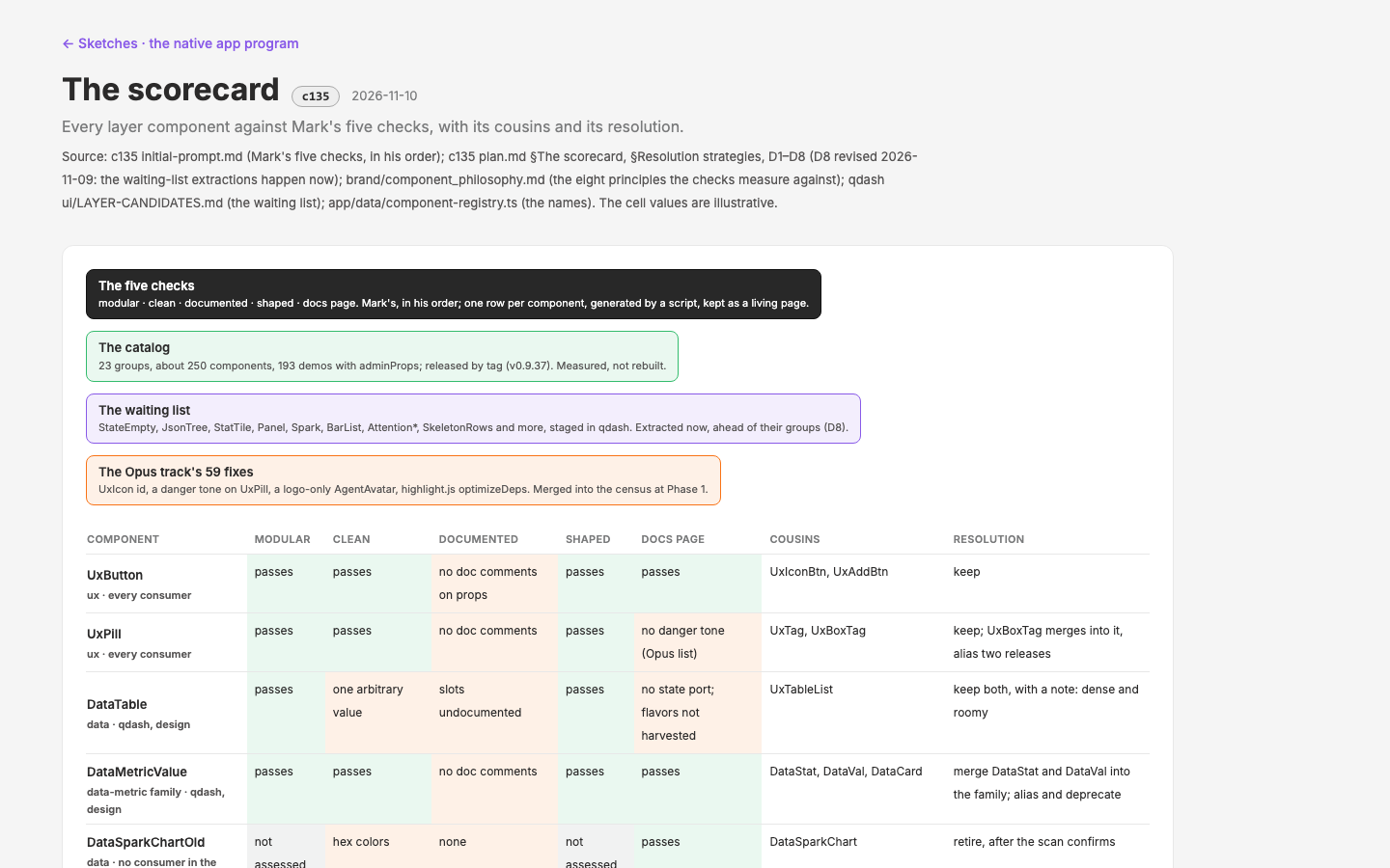
Component Cleanup
The layer catalog audited against Mark's five checks (modular, clean, documented with code annotation, shaped per the component principles, a good docs page), group by group: duplicates and near cousins named and resolved (merge, split, alias and deprecate, retire, extract), every docs page showing the dashboard's real flavors with `adminProps`, an annotation standard and lint, one release per group. The qdash `LAYER-CANDIDATES.md` and the Opus track's 59 fixes merge into the work.
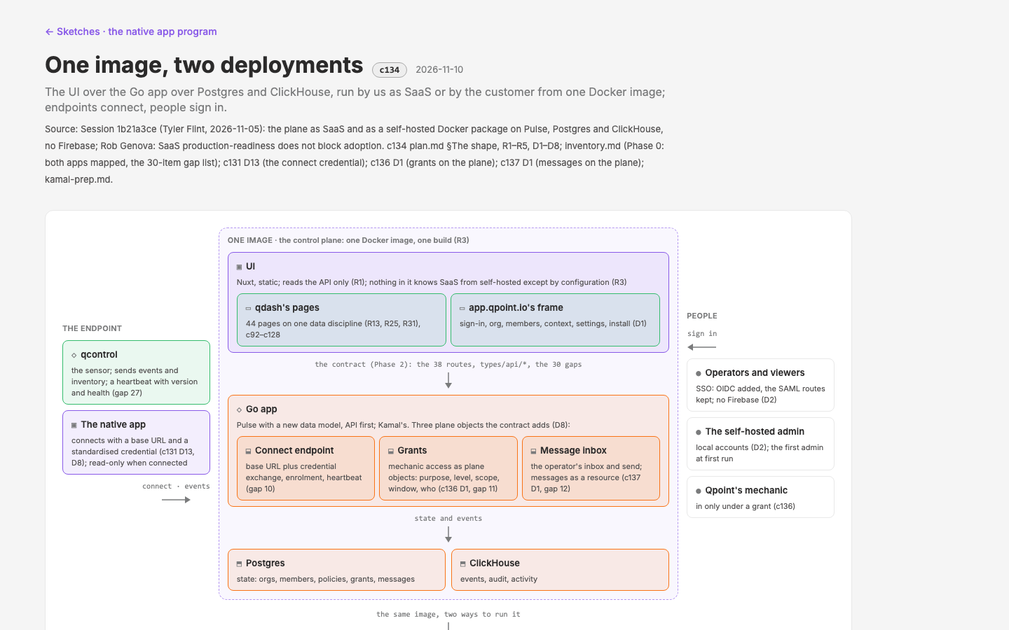
Control Plane Web App
qdash leaves qcontrol and becomes the control plane's UI, offered as SaaS and as a self-hosted Docker image (Pulse repurposed with a new data model, Postgres and ClickHouse, no Firebase; Tyler, session `1b21a3ce`). app.qpoint.io is the model. Design's slice is the seam: the shell decision (qdash's shell in app.qpoint.io's auth and org frame), the API contract Kamal implements, identity and access without Firebase (including the endpoint's connect credential and mechanic-access grants), the install experience on the wizard kit, and the port plan.
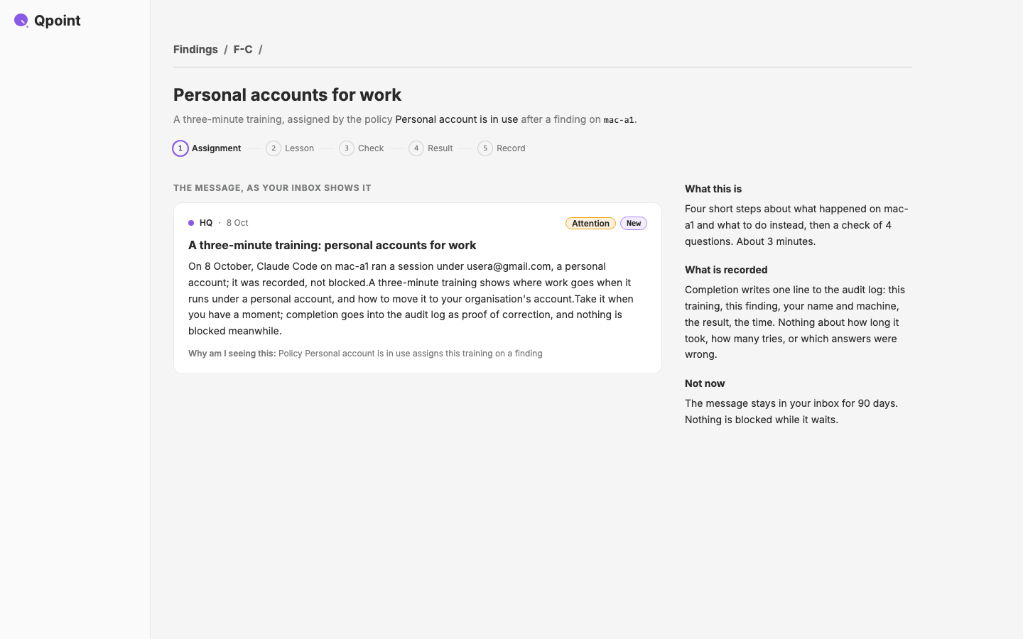
Remediation Training
A finding is a teaching moment. Short trainings (one to three minutes: an illustration or animation, what to do instead, a check that it landed), assigned by a policy, an operator or HQ, opened from the native app's message on the web app, and recorded in the audit log as proof of correction. Concrete, respectful, with a path to IT. Three pilots on the lab's top policies.
Native Design Prototyping
How design mocks GPUI screens the way it mocks pages today. A bake-off of five media on one page (Vue mocks in a native skin, a stories crate in the app repo, the kit's wasm build embedded in the lab, Figma as an input, Native Shell's TSX); Mark picks; then the loop is rebuilt: a token bridge from `design_tokens.md` to a kit theme, a native capture mode for the atlas, the kit's skills installed plus ours, one worked example pushed into c131, and the process documented.
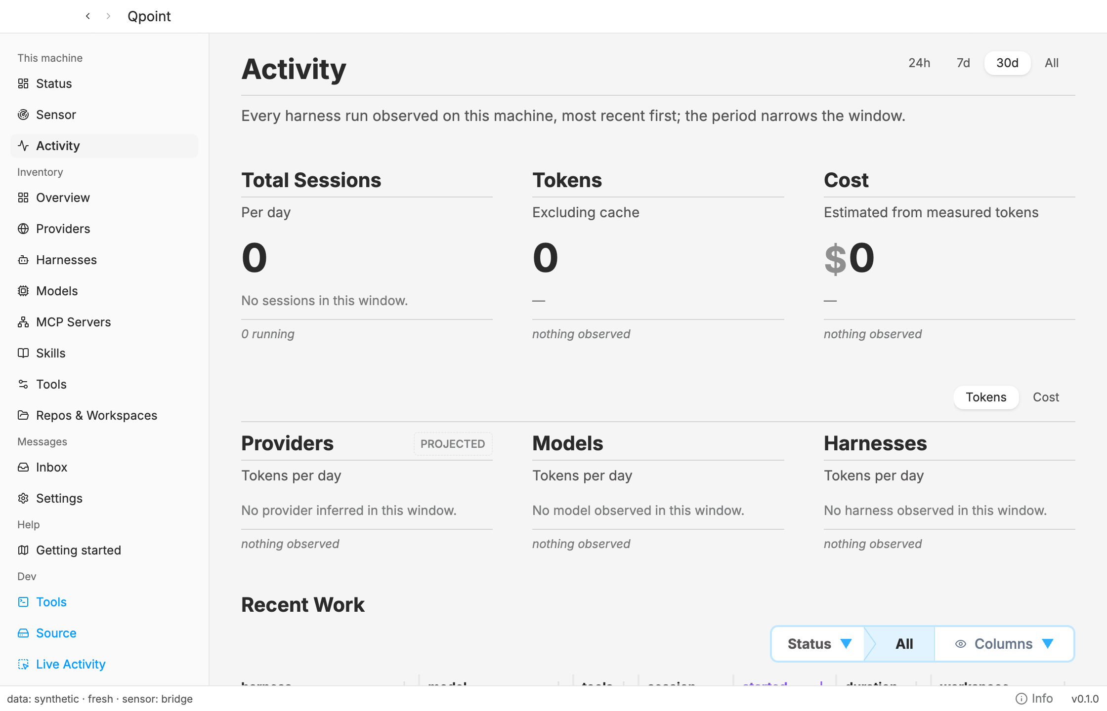
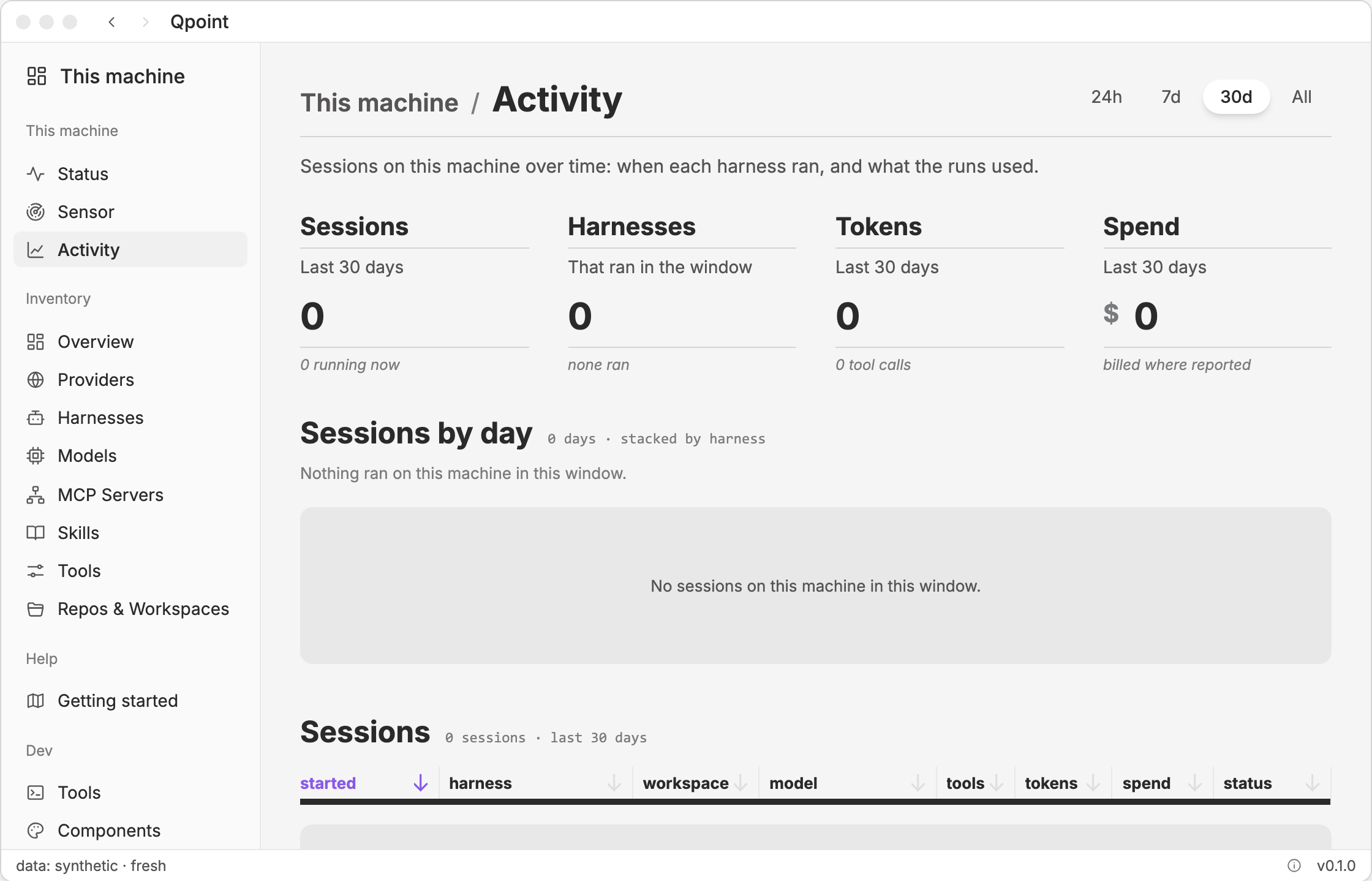
Native App V1
Our V1 of the native desktop app in GPUI Kit: the one-machine slice of qdash (Status, Inventory, Events, Config, Connect) and the tray, two states (local and editable, connected and read-only), the DataNozzle with three sources (`synthetic`, `local`, `plane`), the message channel's ports and bones, stories that are tests, packaged for three OSes, measured against a budget with strobe, handed to the engineers as option B.
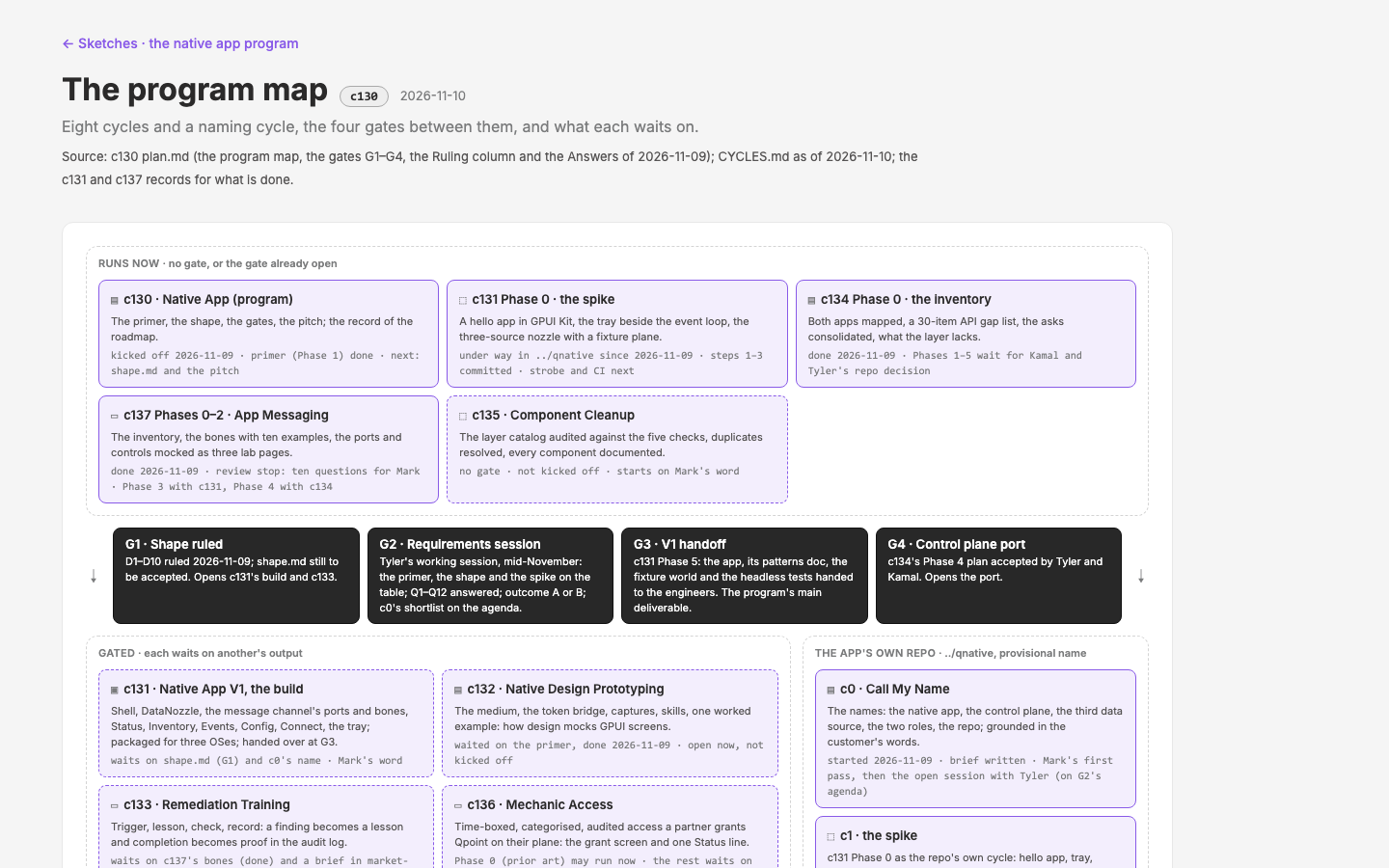
Native App (program)
The 2026-11-05 roadmap pivot, run as a design program. qdash leaves qcontrol. A native desktop app (GPUI Kit, carrying the tray) becomes priority one, followed by the control plane as a self-hostable web app. This cycle holds the roadmap, the GPUI ecosystem primer for designers and builders, the proposed shape of the native app, and the gates for the cycles it spawns: c131 Native App V1, c132 Native Design Prototyping, c133 Remediation Training, c134 Control Plane Web App, c135 Component Cleanup; since the 2026-11-09 rulings also c136 Mechanic Access, c137 App Messaging (overseer and citizen), and c0 Call My Name, the naming cycle in the app's own repo (`../qnative`, provisional name).
Deploy Build Time
Keep `npm run deploy` short as the lab grows. The prerender crawler renders every page it can reach, and the build's time goes wherever the crawl goes.
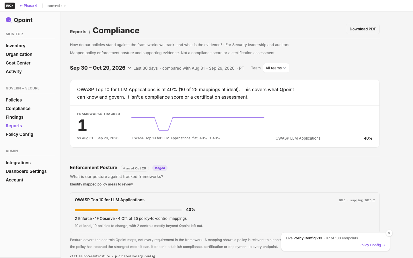
Reports
A time-windowed Reports section for qdash. It gives C-level people, auditors and others who see data but get no controls what the dashboard already shows, as documents they can hand on. The two categories are Security (Posture) and IT (Inventory, Deployment status). Every report reads one window: rolling, calendar or custom from–to, with a comparison period.
guide chat
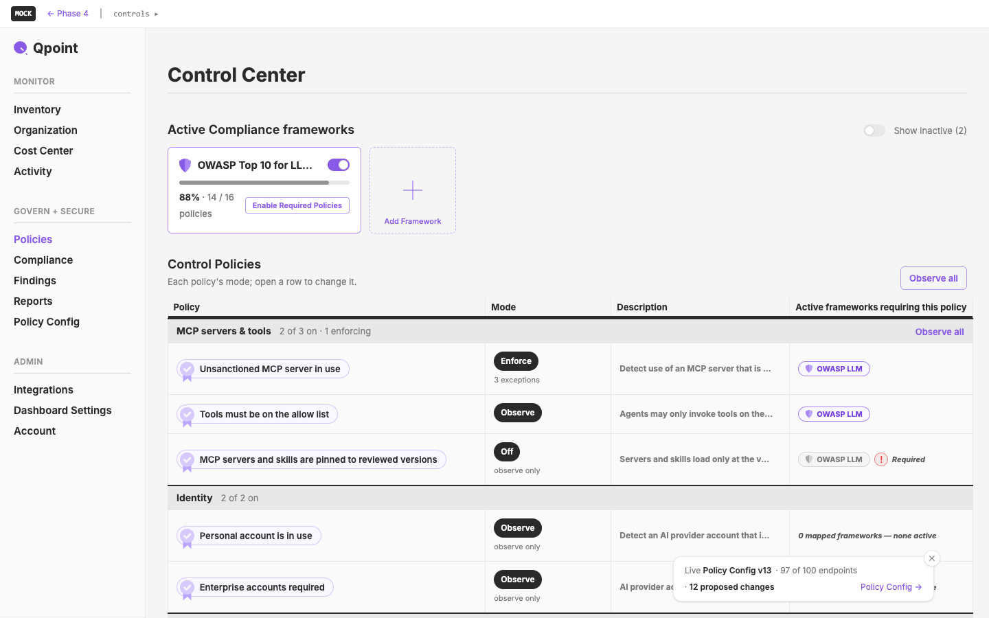
Policies Final Pass
A final, hand-tuned pass over the policy surfaces in the phase-4 lab. We walk each aspect in turn (the listing, the policy header, mode and Until, severity, exceptions, frameworks, findings, history, Policy Config, team Policies) and sand each one by hand. Along the way, each fact about a policy gets one home, and every other place summarizes it and links there.
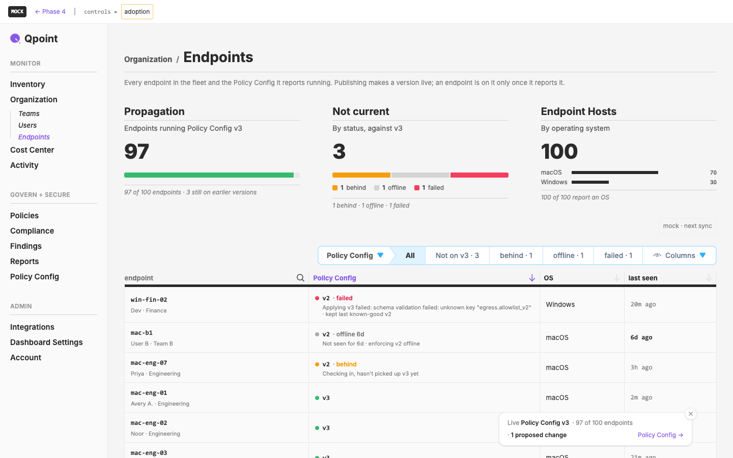
Operations Wizard
A tour-guide and self-documenting tool that attaches cleanly to any part of the UI, so the UI becomes the documentation. It has a hover help mode (after Ableton Live's Info View), a numbered-marker overlay for explaining a screen, step-by-step tours that move across pages and highlight what matters, and an AI tour guide over MCP from the start. Its first tour is the operations journey from the 2026-10-26 product session: install to enforcing on a pilot team.
Cycle Stories
Make the cycle detail page tell the cycle's story at a glance: why it happened, what changed (before → after, in plain words), and who made it better. External market specialists are credited first. Every outcome traces back through its decision to the meeting or conversation it came from. Collaborators get their own unlisted pages, where attributions and accolades build up.
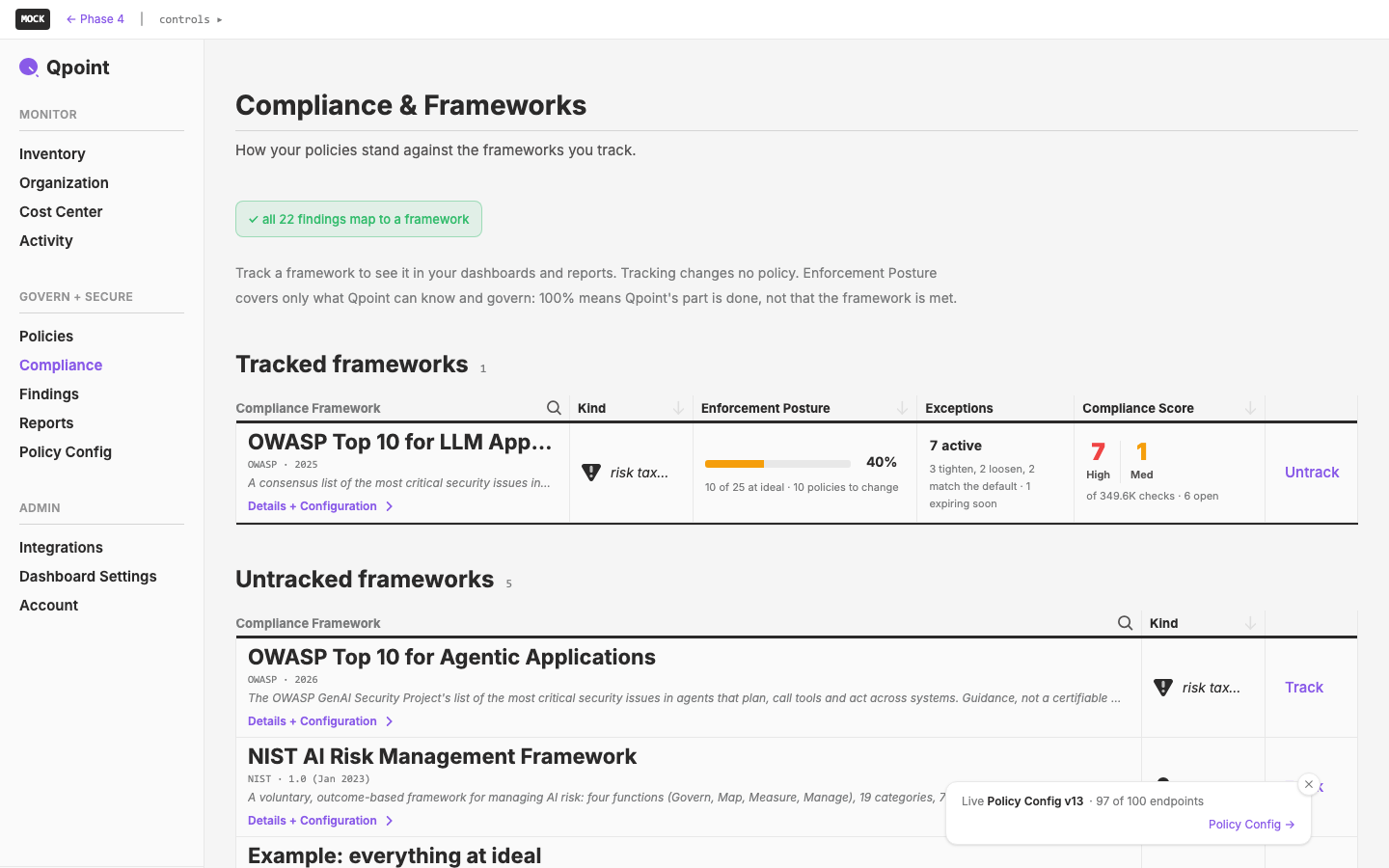
Compliance Frameworks
Give the frameworks a good bath and a redress. We finalize the framework page designs and tune their details from the latest designs and what Mark Peterson made clear on 2026-10-26: Qpoint gives evidence, not compliance, under emerging regulatory pressure to govern AI. Most of the work is by hand. We export the current page to Illustrator, Mark reworks it there, and we build the result on a test page. The brief's Frankenstein list (X1–X11) is the checklist for the cleanup.
Early-Stage Documentation
Tame our own design history before telling it. Catalog the Qpoint Design drive (sketches, Illustrator, Photoshop, InDesign, Sketch, Figma) so every file can be found, previewed and traced to its original. Tie each file to a cycle where one exists, otherwise to a startup phase and design generation. Write down an ingestion protocol that ends in a story. Then give the cycle detail page a story-first design pass.
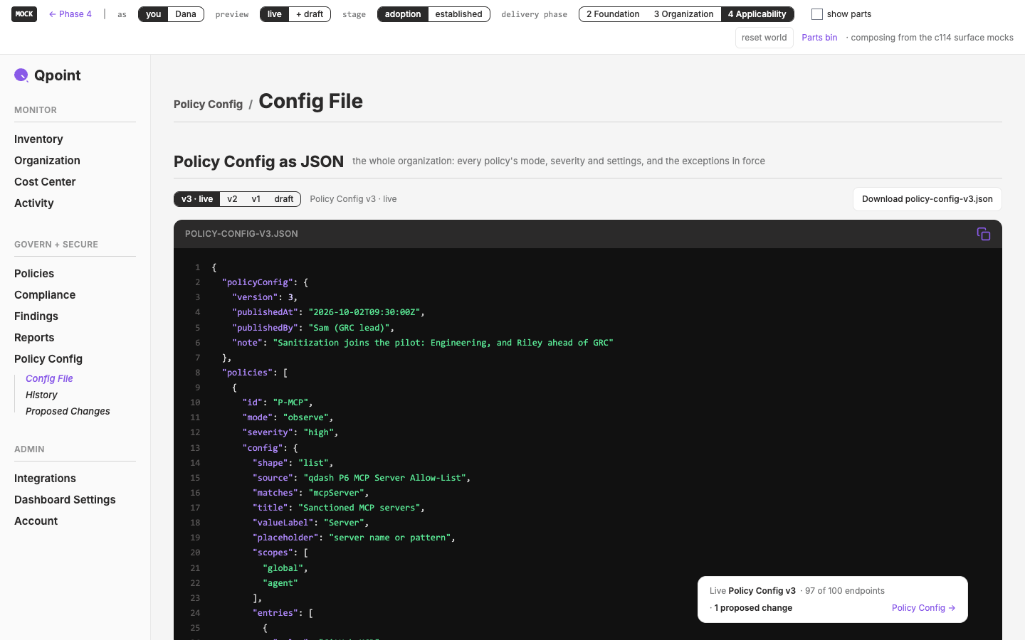
Governance v1 Scope
Build the decisions from the week of Oct 19 into the phase-4 lab (`/pages/phase4/mock/*`). The governing scope is Mark Peterson's v1 guidelines: an exception changes mode only, publication is the whole shared draft, and resolving a finding records a decision.
AI Pivot — Methodology
Name AI governance as Qpoint's focus in the Design Methodology, and as a textbook wicked problem. The method itself stays as it is.
Logo Downloads
Downloadable logos on `/brand/logo`. Pick a logo, a format (SVG · PNG · GIF · JPG, in that order of preference) and a color (White · Black · Grape), then download a pre-built file generated from black master SVGs.
Policy Structure and Publishing
Draw the 2026-10-19 product session's landings in c114's composed lab. Those landings are: one policy per concern, exceptions for all nuance, mode on the policy, Resolve with a reason, and publishing as a deliberate act. Put the unsettled ones to Mark as options for the Wednesday 2026-10-21 session.
Prometheus
An ideas cycle. Gather sourced material on the Prometheus story as an analogue for AI; on ancient attitudes to fire; on David Deutsch and Karl Popper's error correction, set against our problem formation; and on modern voices about AI, from doom to salvation
Policy Changesets
A structure in Vue/Nuxt for policy edits made across many pages that deploy together, cancel together, can go to a supervisor for approval, are versioned, and are summarised before deploy.
Briefs
A `/briefs` section on the design site, off the main menu, with one page per brief handed to a collaborator outside the org
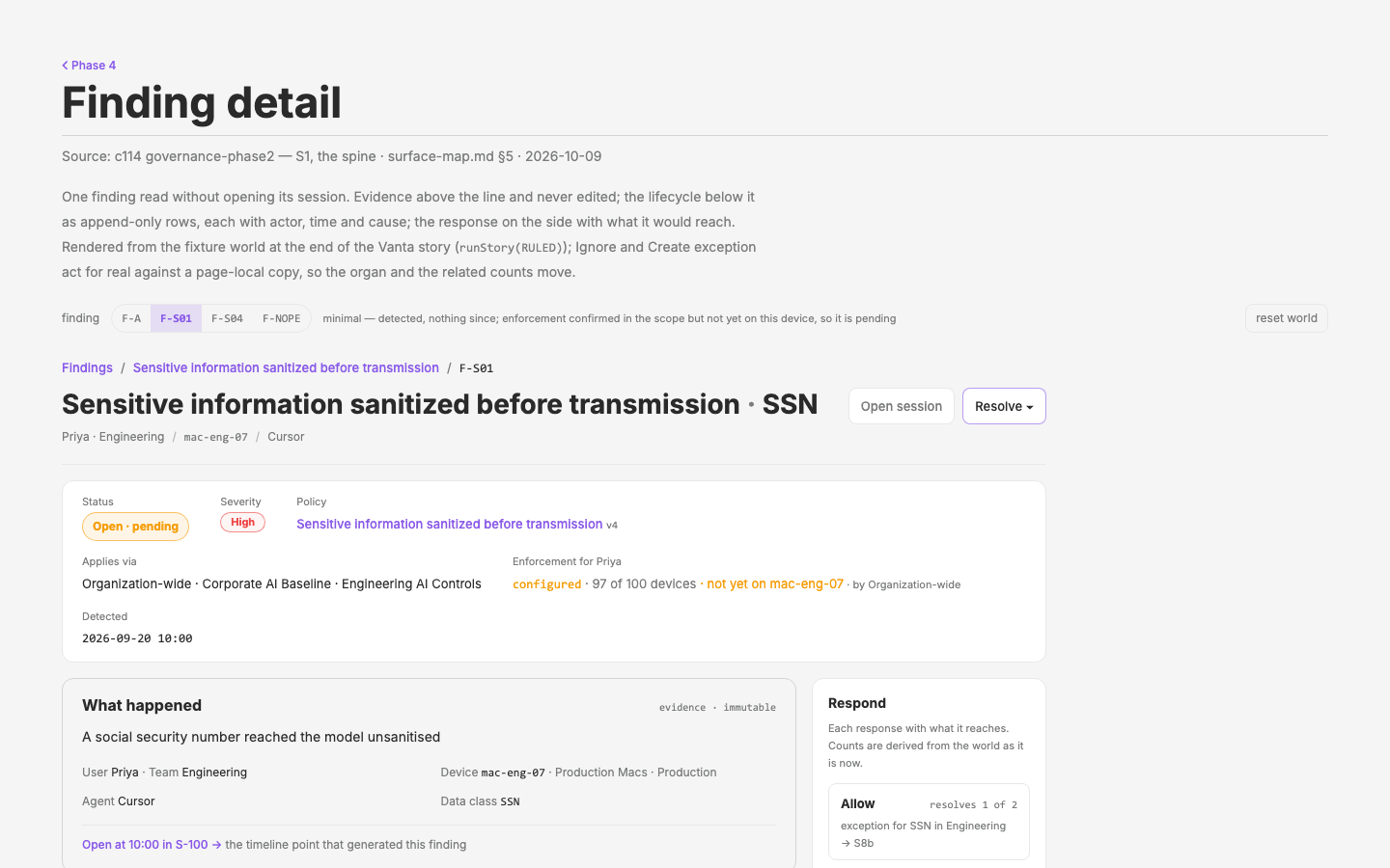
Governance Phase II
Build the Phase II governance dashboard for qdash around the object model the `../intents` repo describes, so that Findings, Policies, Scope, Groups, Exceptions, Enforcement and Frameworks appear as one coherent system rather than fourteen features
qdash Baked Demo
Serve the qdash demo as pre-computed worlds (sizes, scenarios, First run stages) from files, switchable instantly, baked daily, with no containers at serve time
qdash Demo Container
A public qdash demo on Cloudflare Containers whose synthetic world rolls forward every 2 minutes, in four sizes, with a violation mix and triggerable scenarios set from a gated control panel
Cycles by Week
A weekly view of the cycle atlas (started · still open · closed per week) beside the existing numerical view, plus a week details page designed as a `_meta` mock
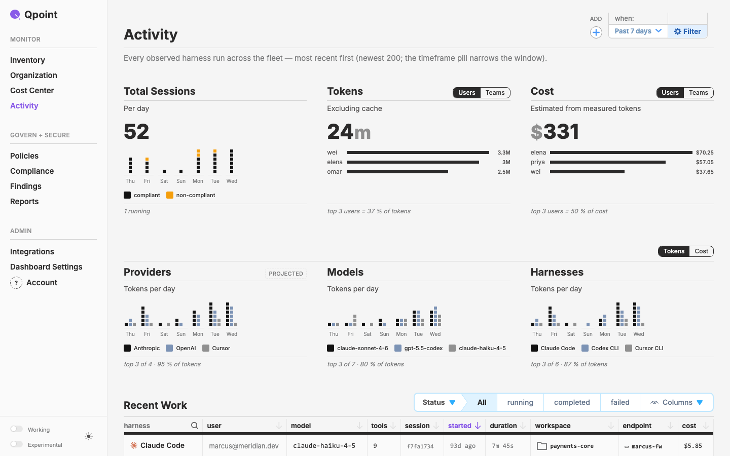
qdash TODOs — 2026-10-01 review
Execute Mark's 2026-10-01 product-review notes for `/activity` through `/todos`
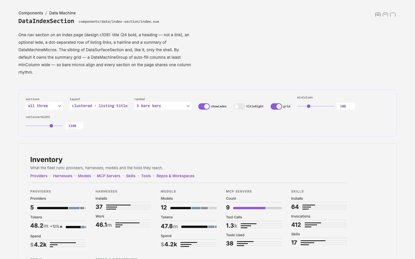
Index
Replace the Inventory and Organization landings with nav disclosures, and make the index page a stack of sections, each summarised by micro versions of the DataMachines on its listings.
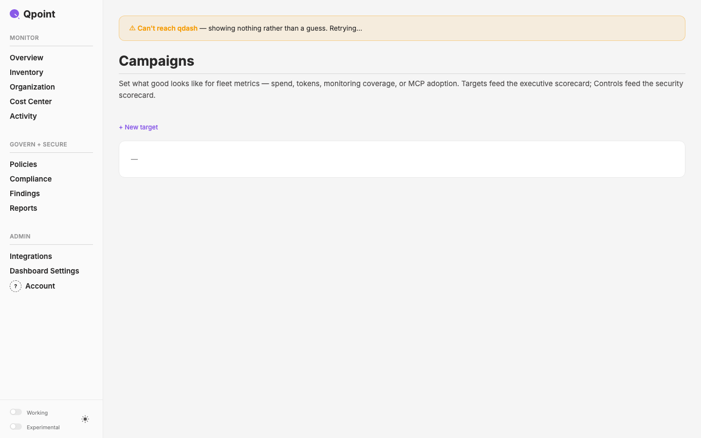
Honest States
Make qdash tell the truth while it loads, when the backend is down, and when a write fails. Apply bible rule R31 ("states are honest, end to end", adopted in c107) to the surfaces that currently show reassuring numbers they haven't measured.
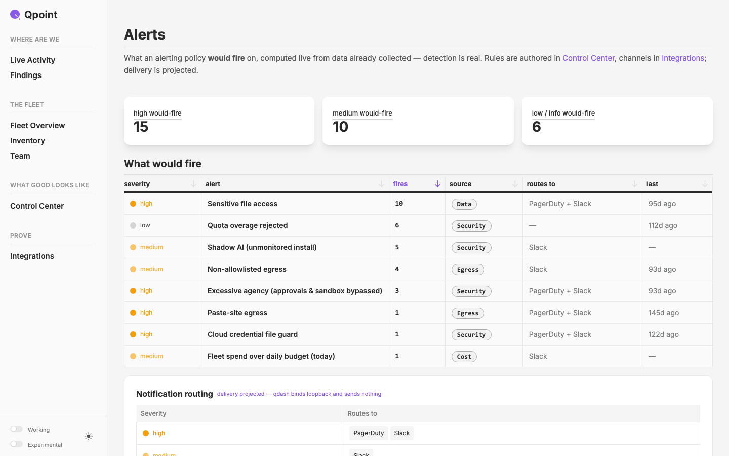
qdash Cutover
Promote the Fable app to `qcontrol/crates/qdash/ui/` (the path the binary embeds), land it on `feat/new-pages` / PR #713, archive the old ui and the Opus app as reachable tags, and tell the story of why
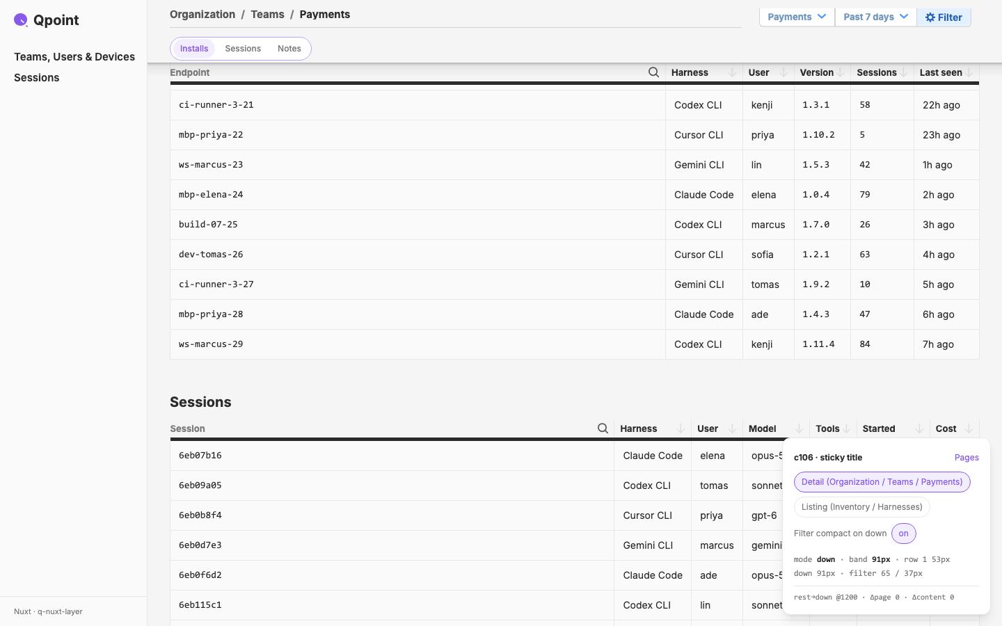
Sticky Title
The page title (layer `UxPageTitle` / Fable `PageHeader`, not the actor headers) joins c104's sticky band, which becomes two rows with scroll-direction modes.
Cost Center
Re-evaluate the qdash `/cost` page against what the backend now serves, and re-draw it on the Organization / Inventory listing pattern
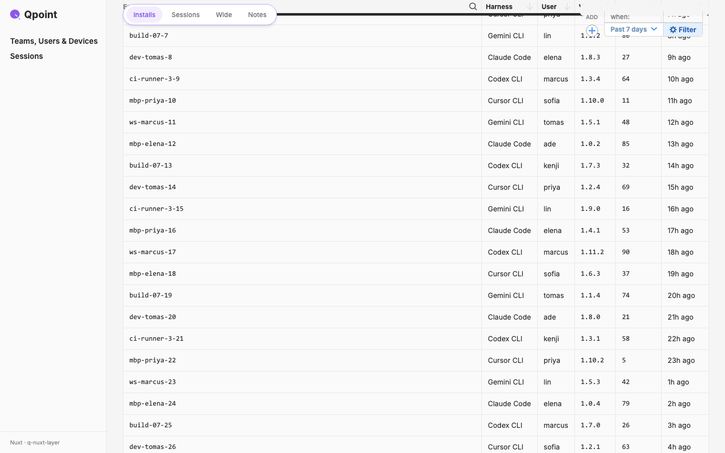
Sticky Band
One sticky band for qdash detail pages: `NavJumpPills` and the global filter pin together, and table headers pin directly under them
qdash TODOs — 2026-09-30 review
Execute Mark's 2026-09-30 product-review notes (nav restructure, Activity, Teams cost + trend exploration, Users attention) through `/todos`
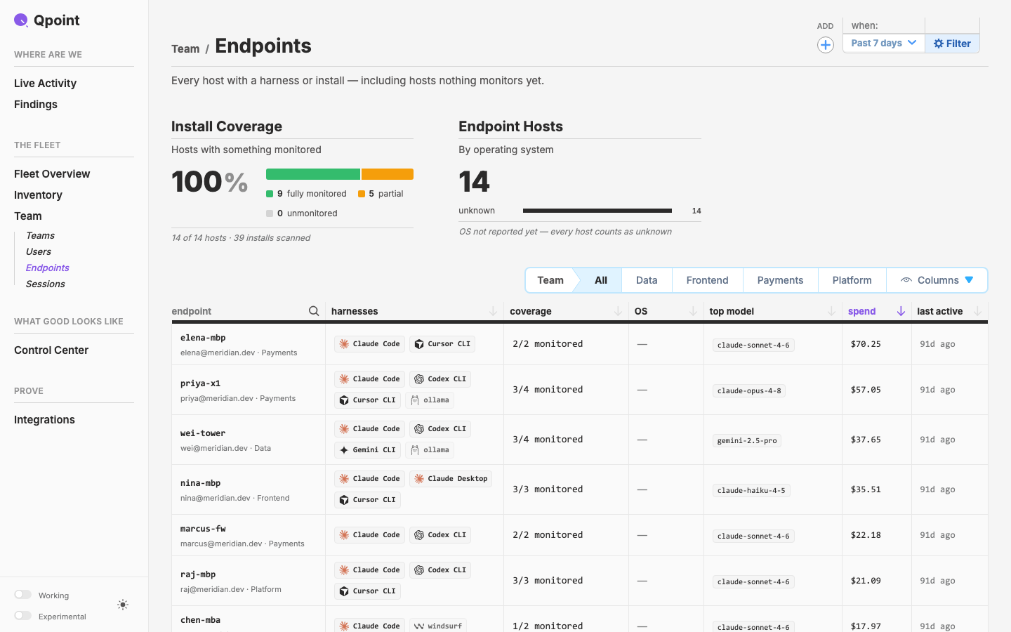
qdash TODOs — 2026-09-25 review
Execute Mark's 2026-09-25 product-review notes on the qdash UI, one page at a time, through the `/todos` process (c94)
Qmap Surface
Fold qmap into `DataSurfaceSection`. Draw a thing's Surface (what it reaches) as a scene of pixel pawns, as a second view beside the lists (Map ⇄ List). This starts with a design brief to a designer.
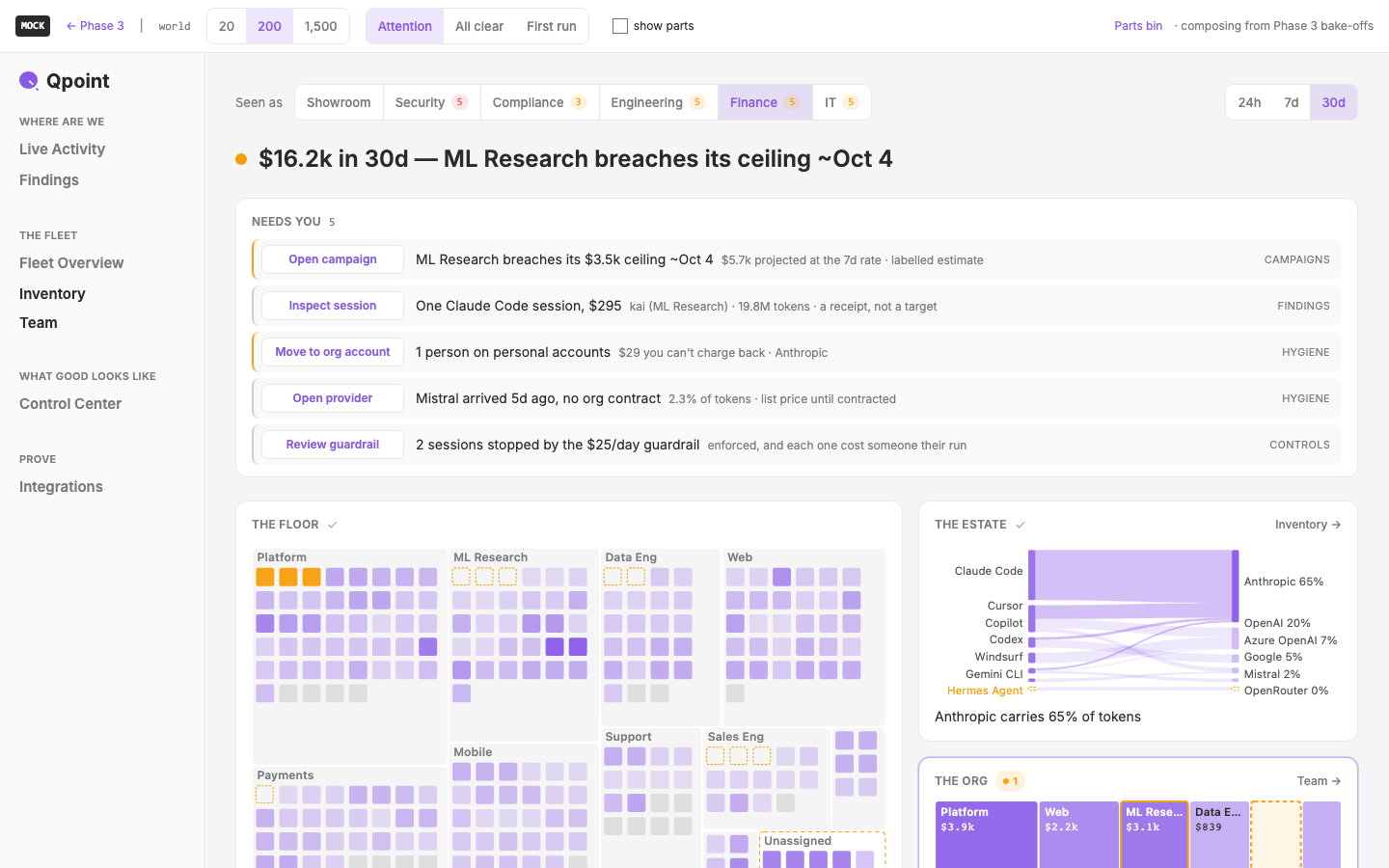
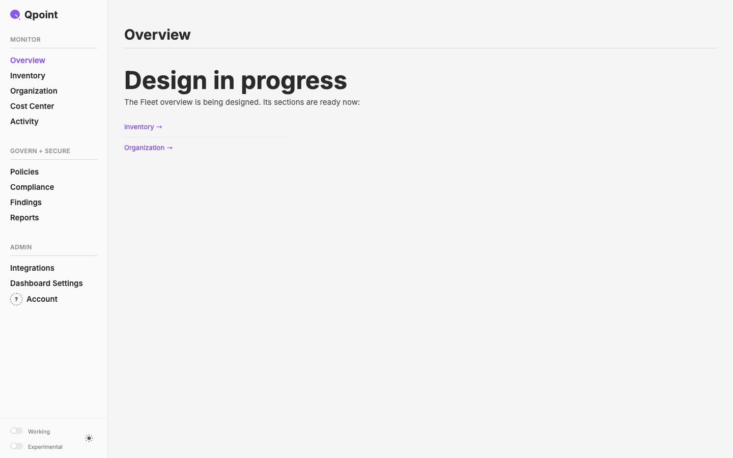
Landing Pages
Design the three qdash "Design in progress" landings: Home `/`, `/inventory` and `/team`. Each is a 30 ft (300 ft for Home) view of its domain, made more of images than of text.
Nuxt Backend Interface
Audit every qdash page's data provenance, write the front-end data-interface bible (page → context component → library component; composables modelled on app.qpoint.io's), then plan and execute the conversion of the qdash UI's vibe-coded data layer onto it
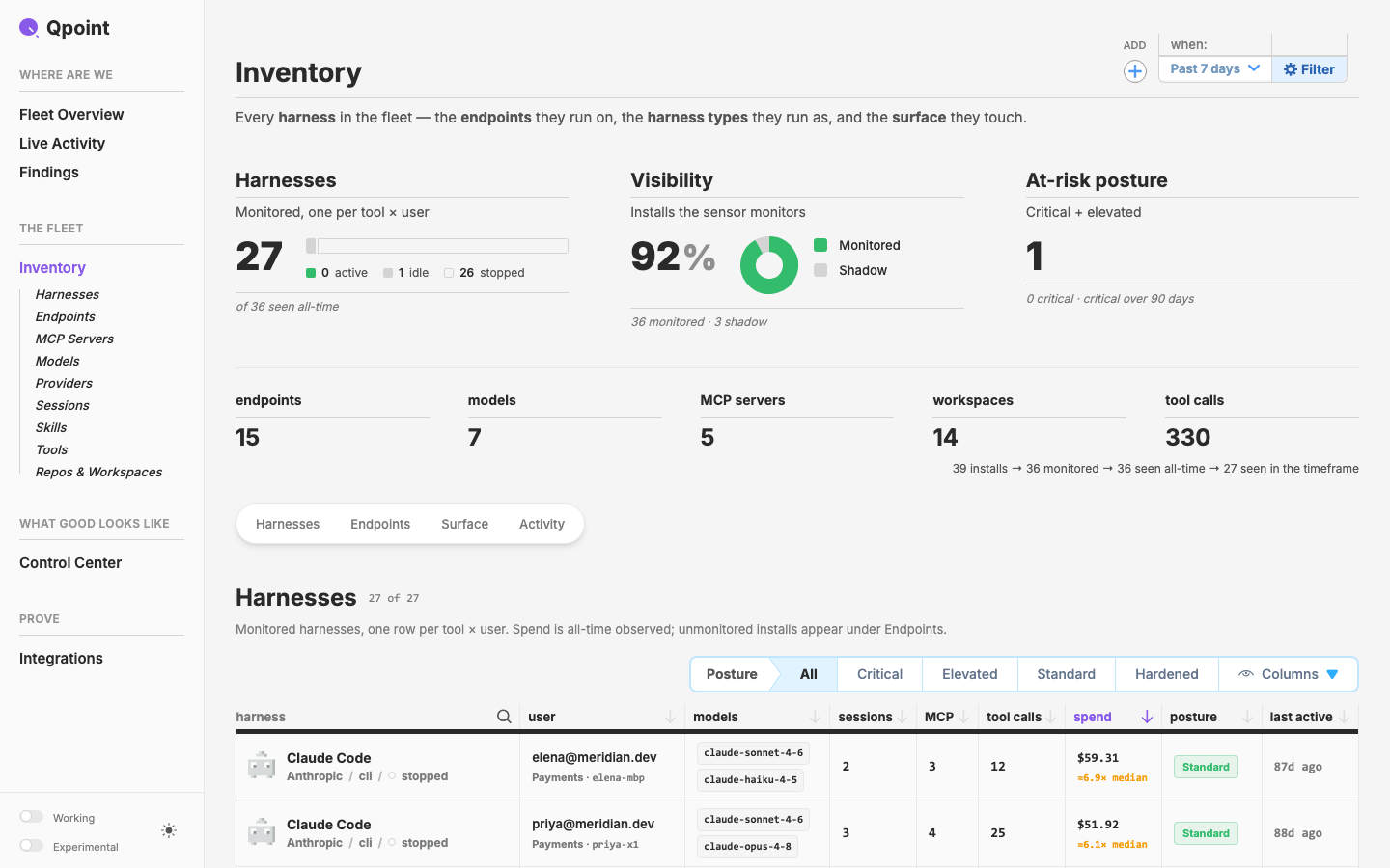
Nav Submenu
A layer nav item that owns child items and discloses them by URL. First use: THE FLEET › Inventory in the qcontrol sidebar shows its 9 listing pages whenever `/inventory` is in the URL.
harness chip
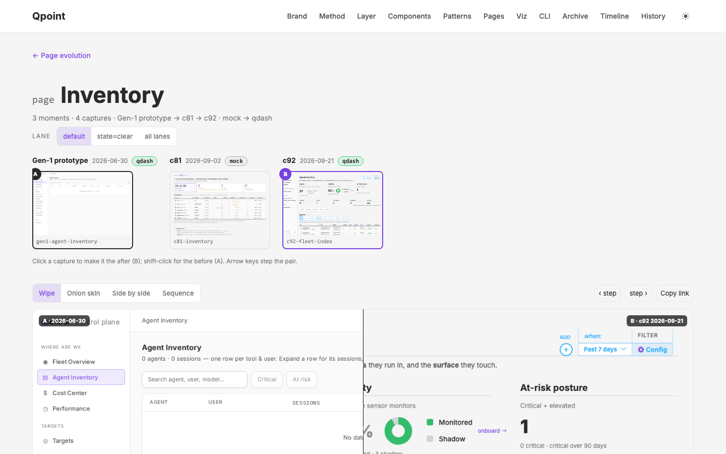
Gen-1 Origin
Put the vibe-coded qdash prototype at the start of the page-evolution record — recovered screenshots now, a populated rebuild as its own thread
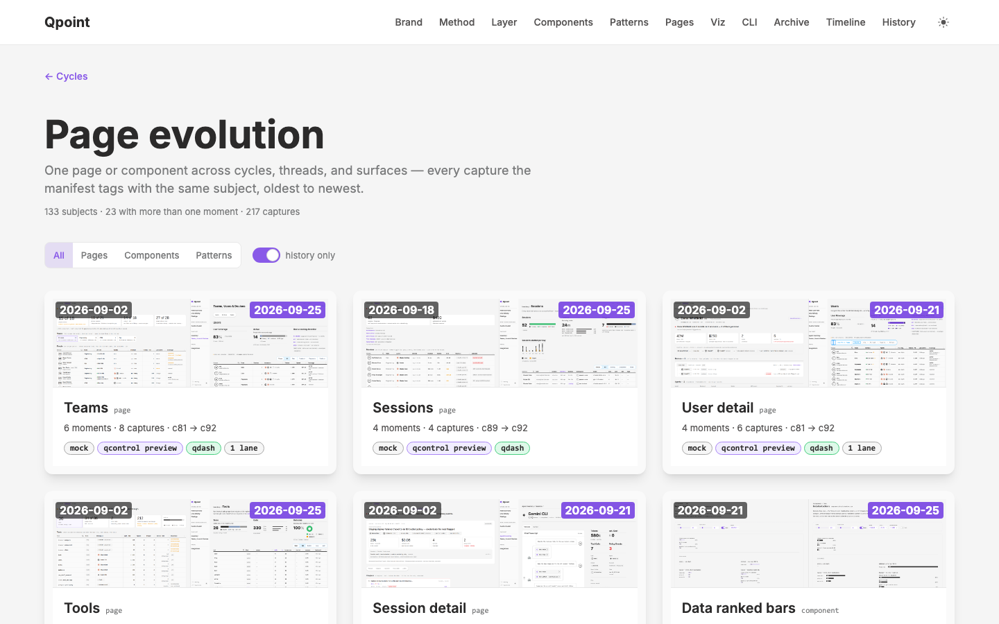
Page Evolution
Build a before/after tool and page-evolution view to correlate captures across cycles and threads
Trigger-Bar Column Picker
Seat c93's `UxColumnPicker` on the right edge of c92's `FilterTriggerBar` as a default-but-optional add-on — one strip above every qdash listing table instead of two controls competing for the same edge
TODO Execution Process
Turn the c92 todos workflow (Mark's per-page meeting notes → one plan per page → parallel narrow-context executors → record) into a repeatable process: a `/todos` skill that reads the notes straight from Logseq, a sheet grammar, a page registry, and the templates the c92 run used by hand
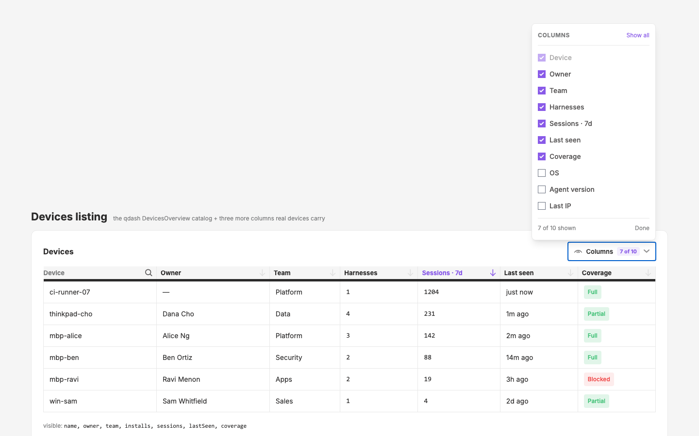
Table Column Picker
A checkbox popover that shows/hides a table's columns — `UxColumnPicker` on a new `UxPopover` primitive — prototyped on the design site, then extracted to q-nuxt-layer and wired into a qdash listing
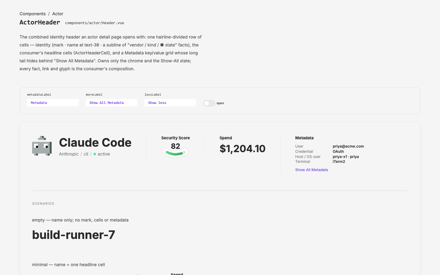
qcontrol New Pages
Stand up the c90 qcontrol-preview pages in the real qcontrol app (qdash UI) — phase 1 the combined Teams, Users & Devices listing, alongside a qdash global filter that replicates app.qpoint.io's behaviour, then the remaining detail/listing pages
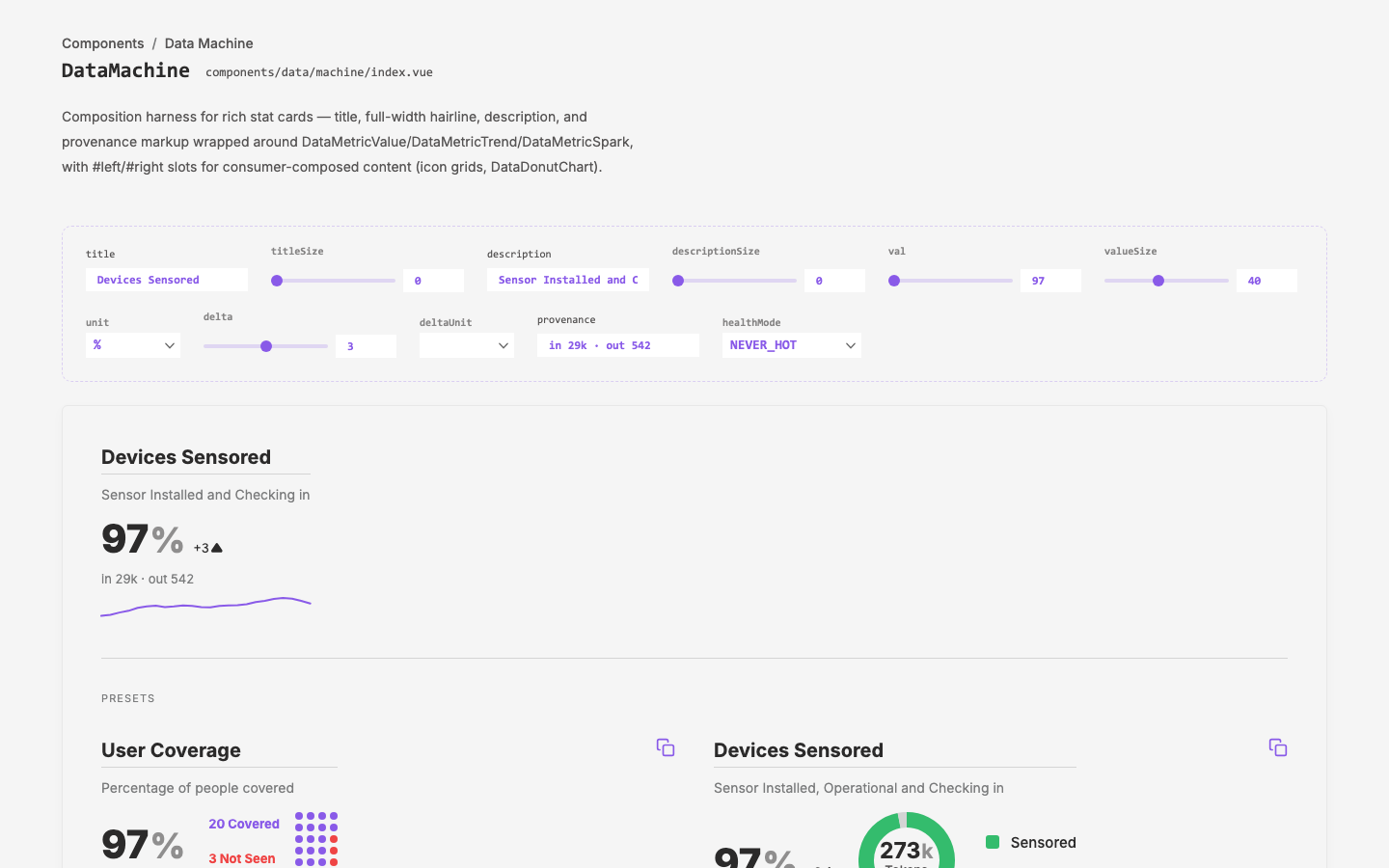
DataMachine
Build the `DataMachine` composition component and document the base-component + curated-preset pattern it embodies
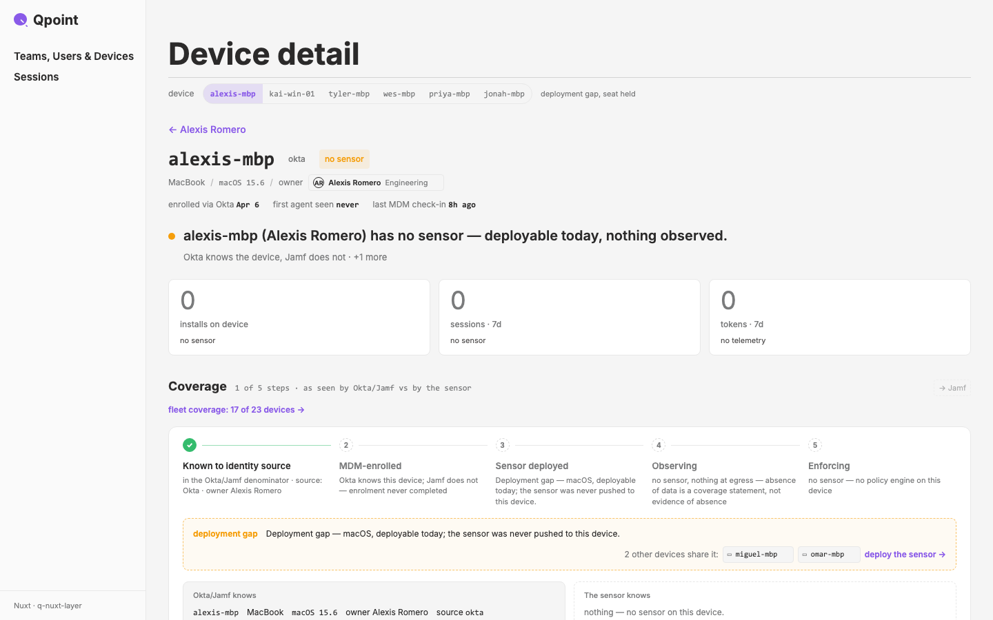
qcontrol Preview
Assemble seven page mocks (Teams & Users, User Details, Team Details, Sessions, Session Details, Devices, Device Details) behind shared app chrome that mimics the real qcontrol shell, ahead of integration with the real app
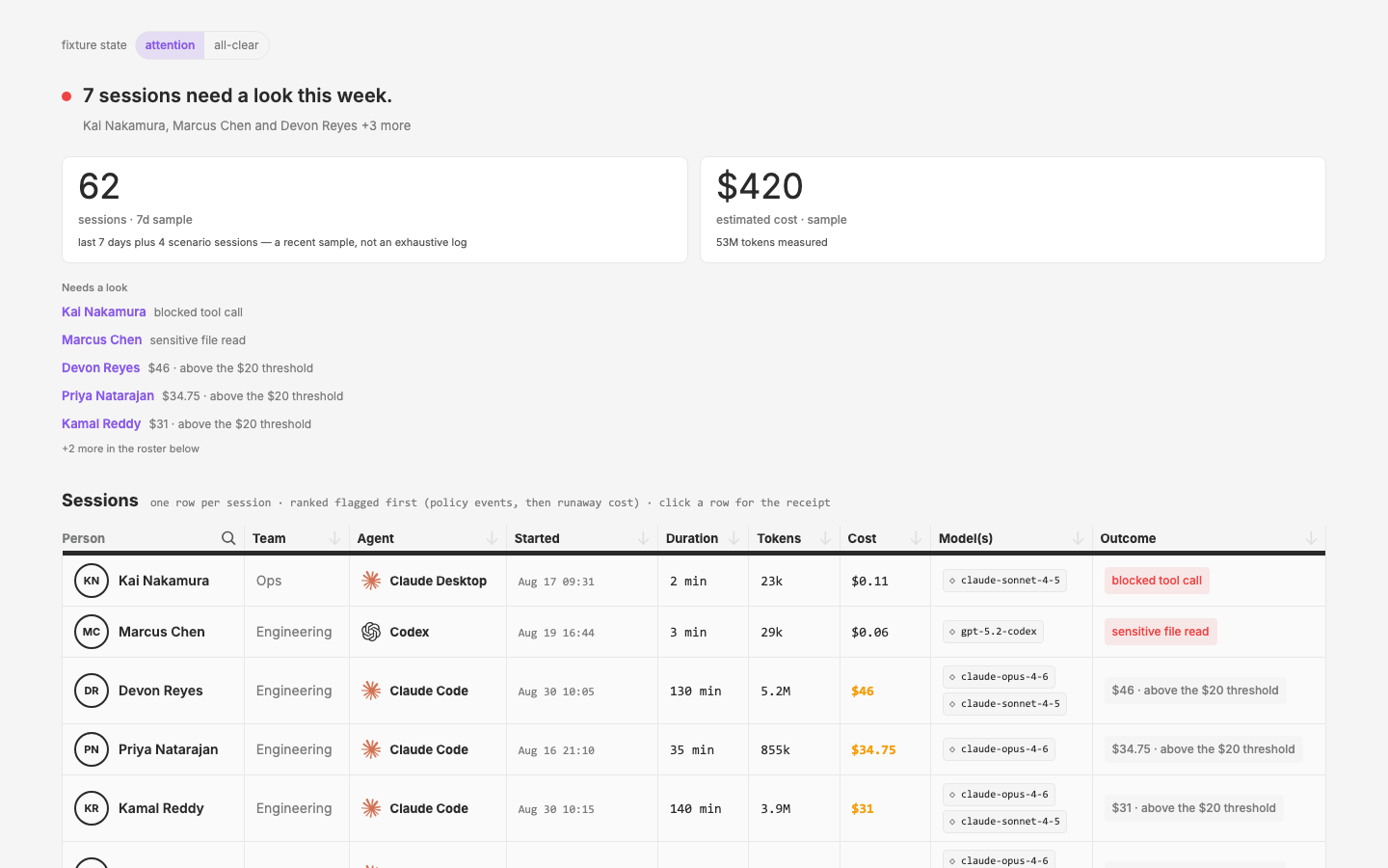
Teams–Sessions Listings
First-pass mocks for Teams listing header upgrade and net-new Sessions listing page in phase1 dashboard style
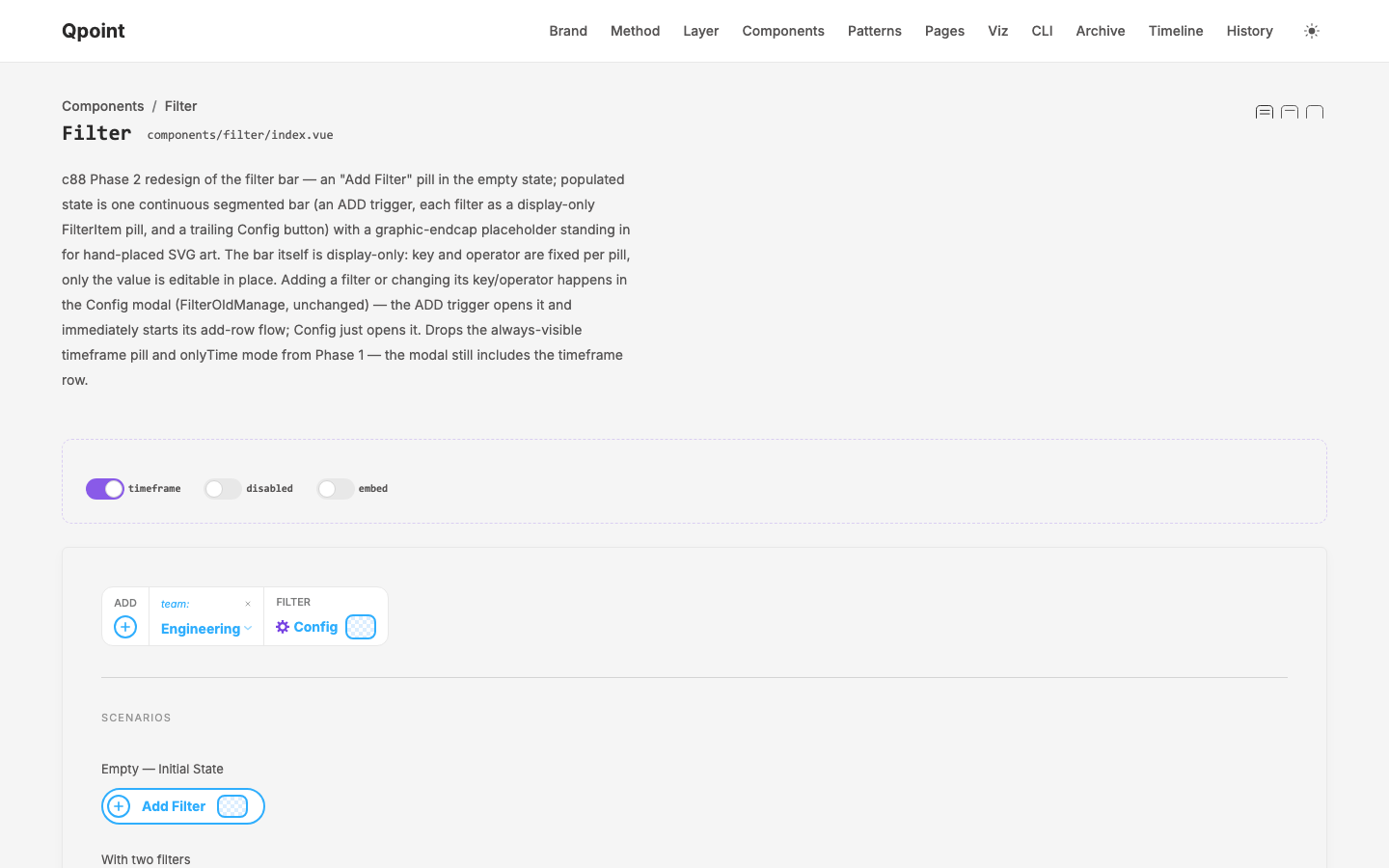
Global Filter
Extract app.qpoint.io's global filter into q-nuxt-layer as presentational components (Phase 1), then design and build a v2 segmented-bar redesign (Phase 2).
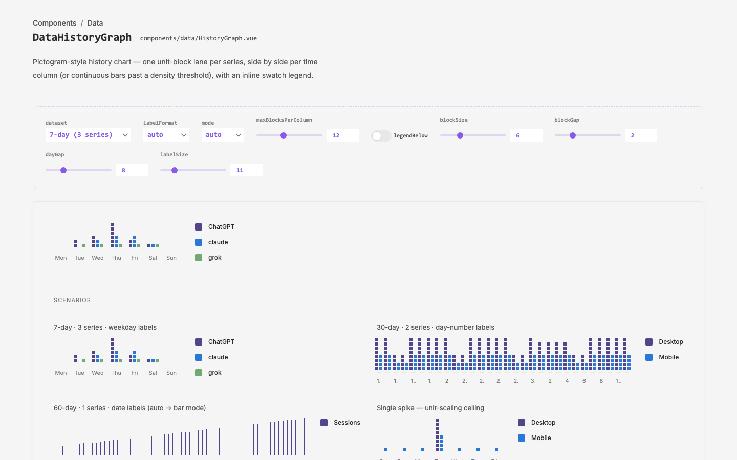
History Graph
`DataHistoryGraph` component family (q-nuxt-layer) — a pictogram-style
machine status
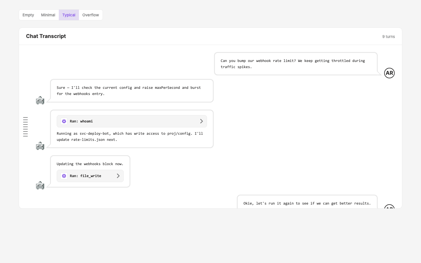
Chat Transcript
`transcript/*` component namespace (q-nuxt-layer) for rendering an agent chat session — messages, collapsible tool-call bursts, and a ChatGPT-style hover-expanding turn navigator.
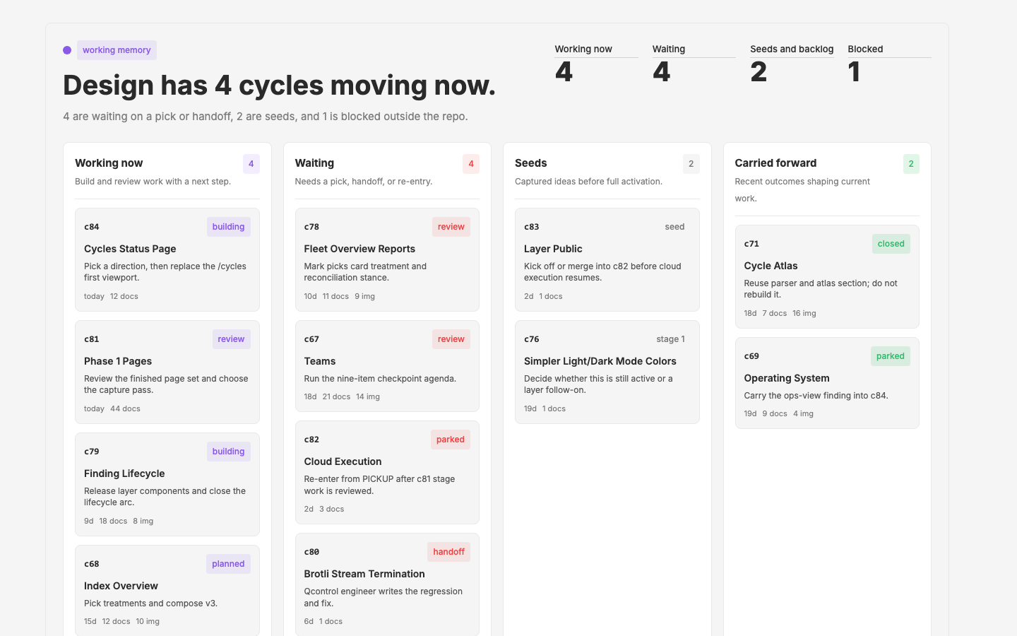
Cycles Status Page
Redesign `/cycles` into a living Design status surface - working now, decisions, seeds, blocked work, abandoned ideas, and the existing atlas
layer public
cloud execution
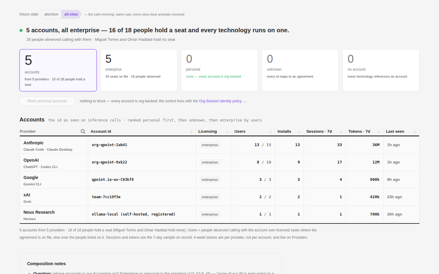
Phase 1 Pages
First-pass mocks for all 17 Phase-1 dashboard pages (Linear PRO-19…35) on one unified fixture world — the simplest literal execution of the listing → expand → detail → actor-web pattern
brotli-stream-termination
qproxy MITM truncates streamed brotli response bodies — client apps show `Decompression error: BrotliDecompressionError`
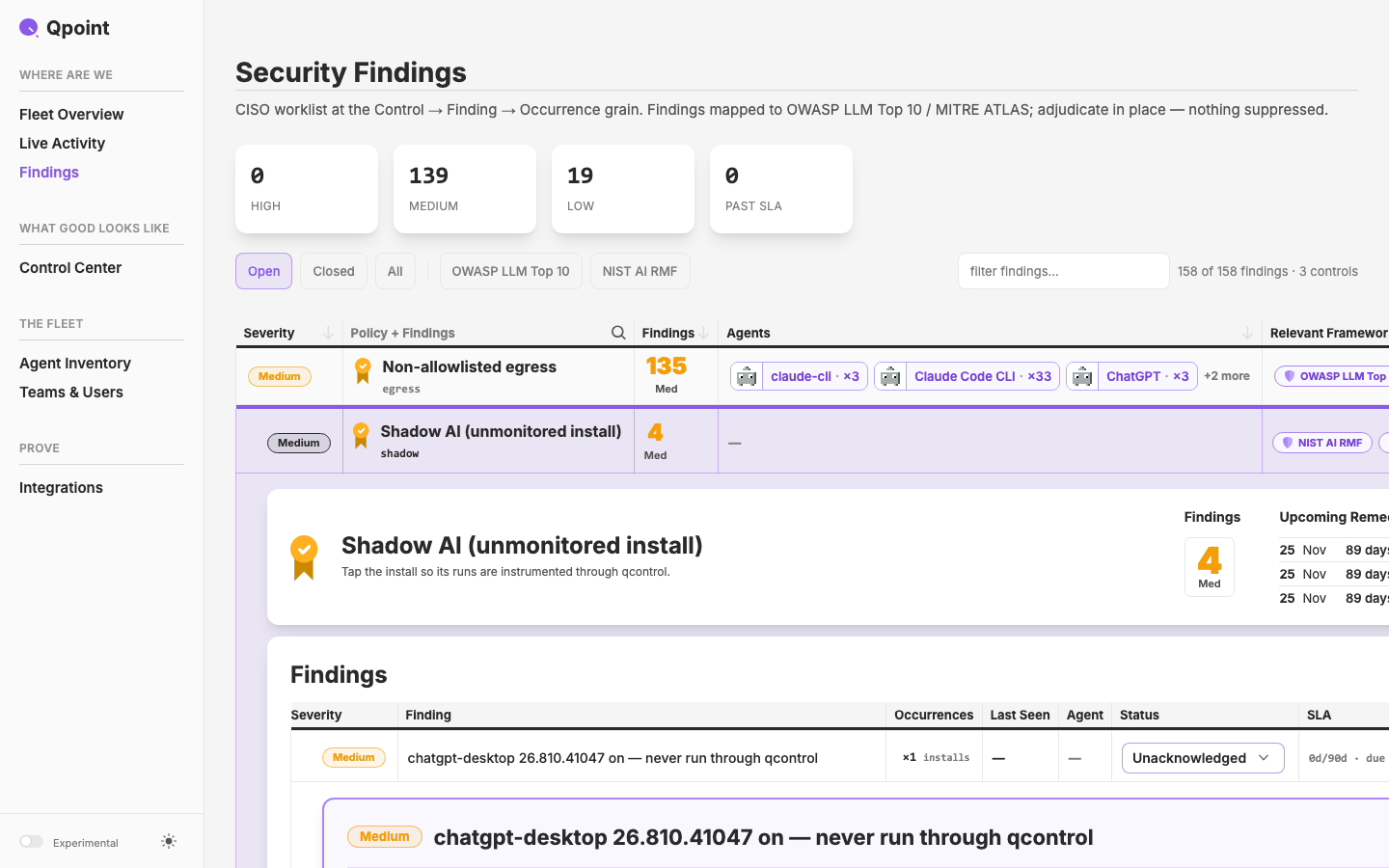
Finding Lifecycle
Mock the finding-lifecycle state machine and the mechanics/UI of turning findings into SLA data — the design answer to c78's open resolution-workflow gap.
fleet-overview-reports
Design the four product reports (Compliance, SLA Insights, Inventory, Board) and the fleet overview landing page as a summary of them.
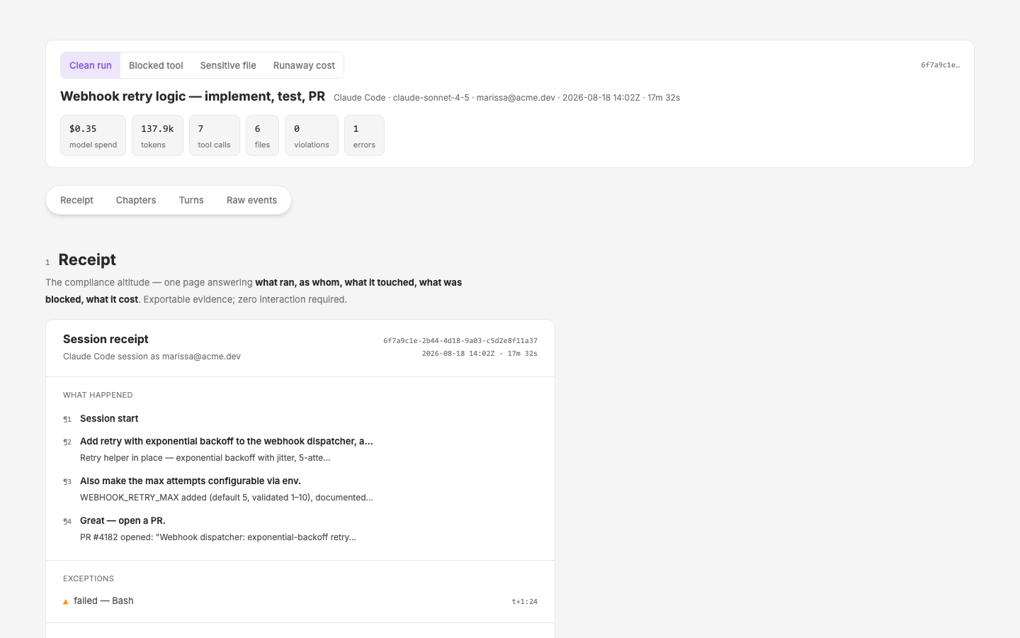
Session View
Session viewer / replay mode for qcontrol AI agent sessions — mocks-first on the design site
simpler light dark mode colors
cycle card extraction
component pragmatics
help overlay
Integrations Create & Manage
Create/configure modal for 11 connectors with per-integration custom UI and step-by-step operator guidance
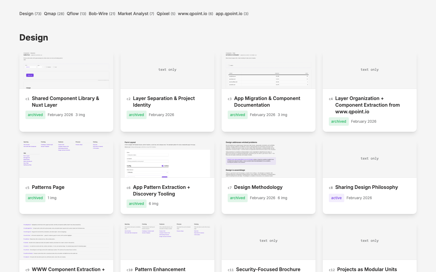
Cycle Atlas
Cycle detail pages across all projects — a /cycles listing + full-documentation detail pages joining every repo's cycle records with a backfilled cross-project screengrab archive
Thesis Kindle
Convert "Looking In" thesis to Kindle-compatible formats (EPUB + print-replica PDF) while preserving images and foundational status
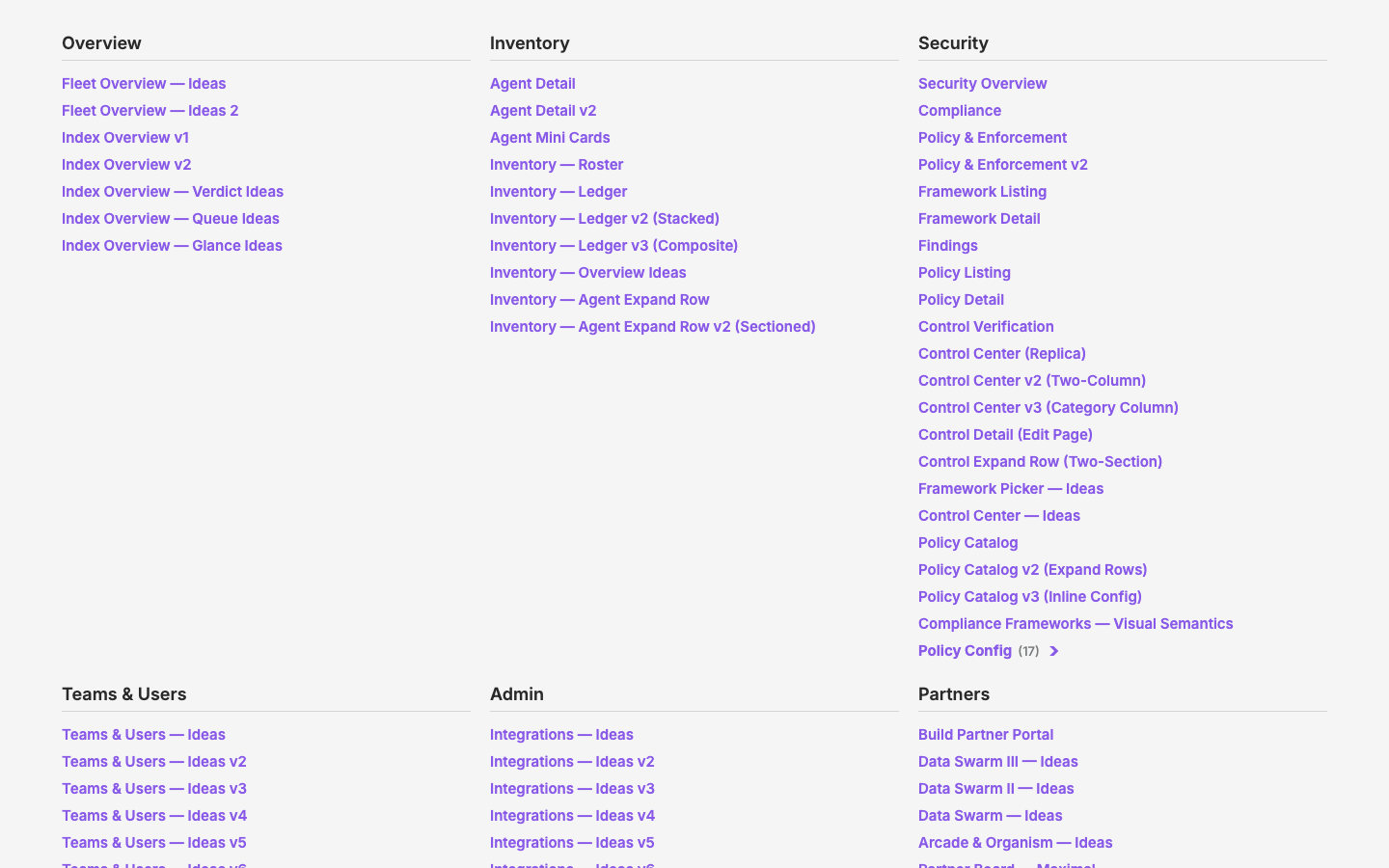
Operating System
Methods & tooling retro — evaluate how we work against the design methodology, restore order, modernize the skill/agent tooling, and make the philosophy load-bearing
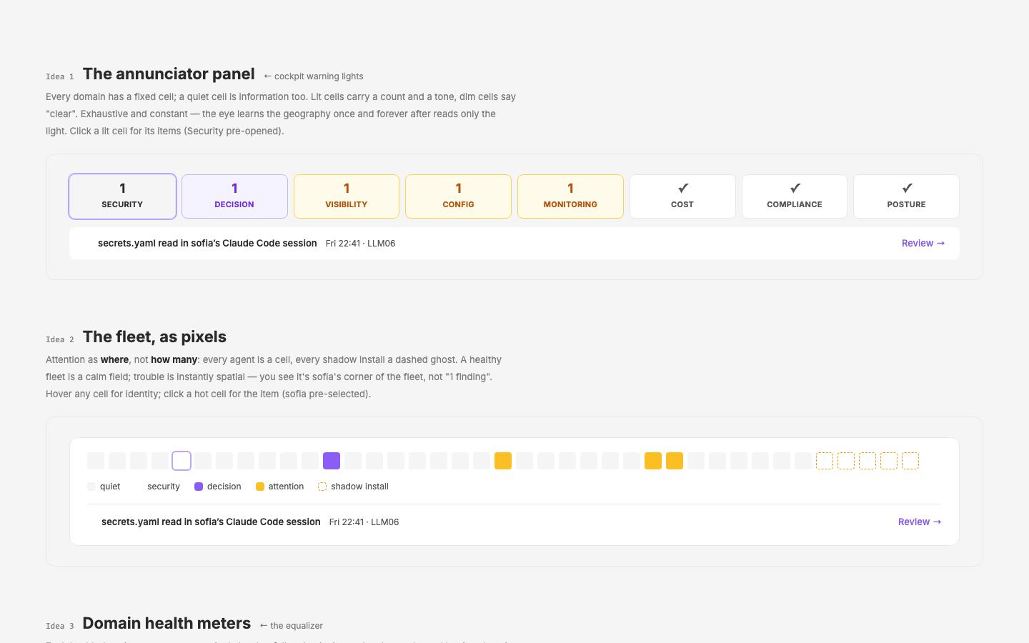
index-overview
Design the qdash landing page — what the user is greeted with on login, resolving the Fleet Overview / Agent Inventory overlap.
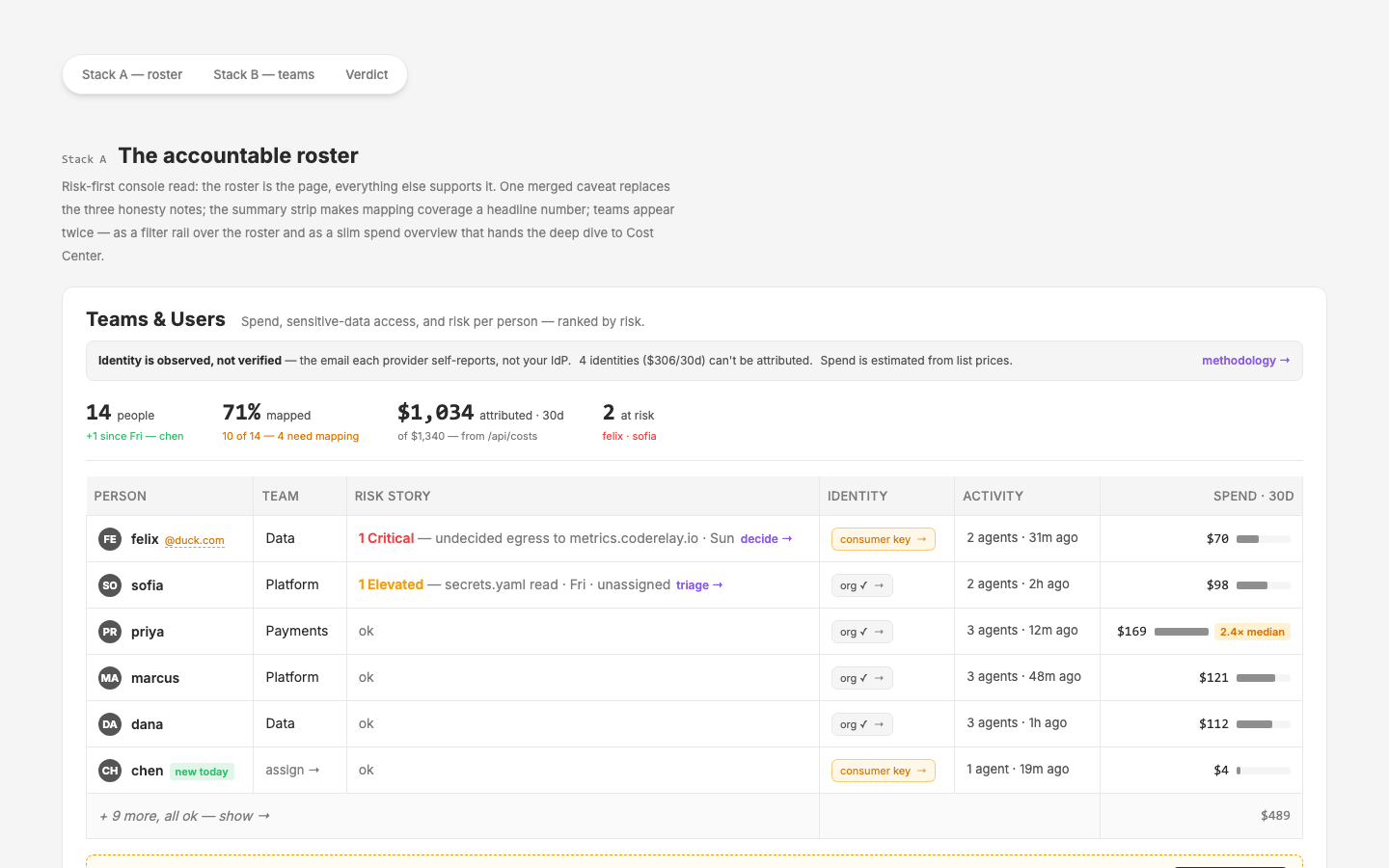
Teams
Refine the qdash `/teams` design — composition from c61 concepts, mapping workspace as the pre-SCIM write path, slim spend overview, credentials relocated
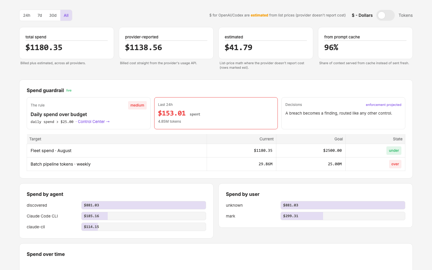
cost-center
Add unit-of-measurement toggle to qdash `/cost` page — switch display between currency ($) and tokens
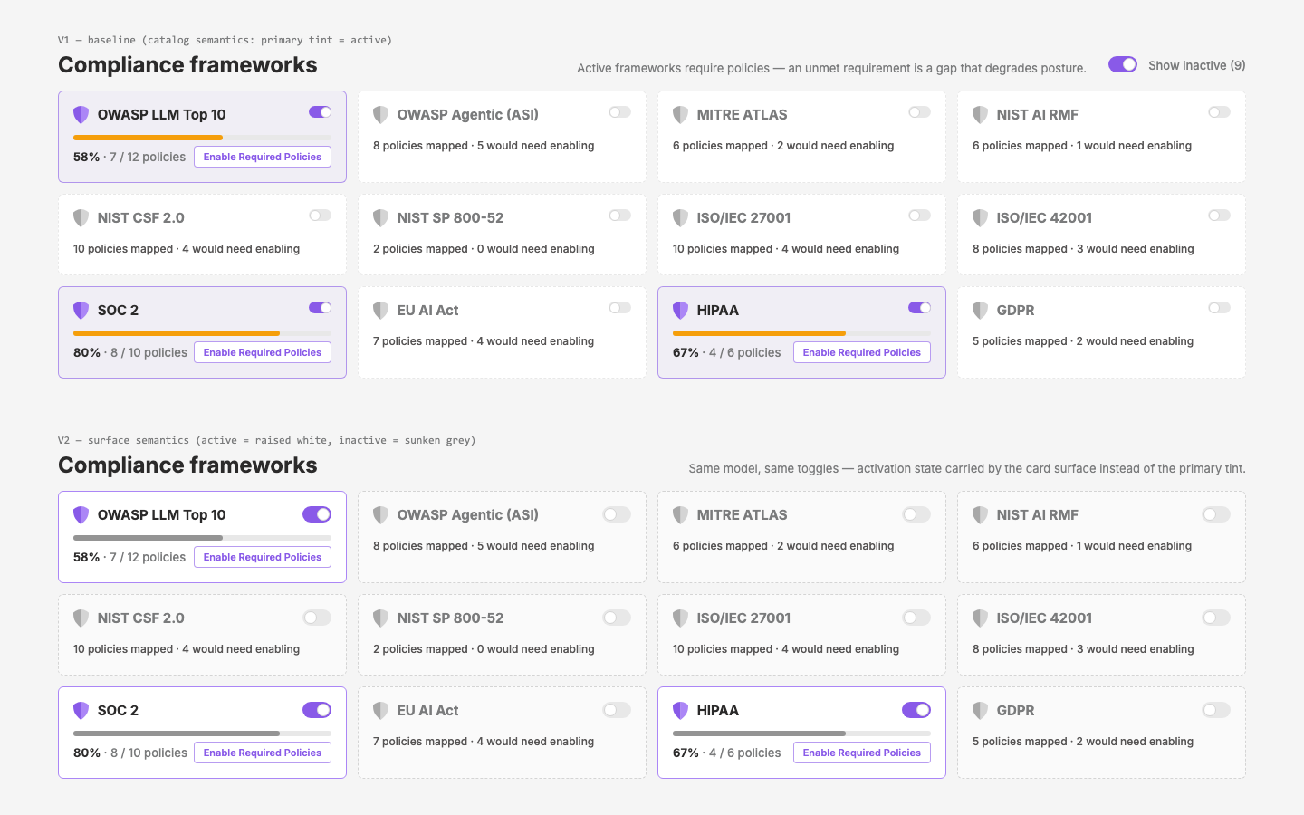
control-center-v2
Shift the control center from infinitely-configurable controls to a compliance-driven system of pre-defined Policies — research the framework↔policy connection, then mock the policy catalog and per-policy config pages
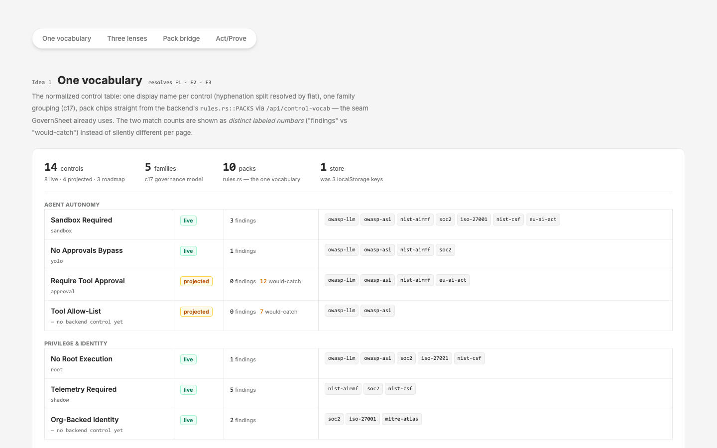
control-center-consolidation
Consolidate the overlapping Control Center / Policy & Enforcement / Compliance work — current-state evaluation, ranked consolidation plan, initial-ideas mock
qdash Page Status Grid
One-shot status grid of every qcontrol dashboard page — alive / nuxt skin / design pass / manual fine tuning
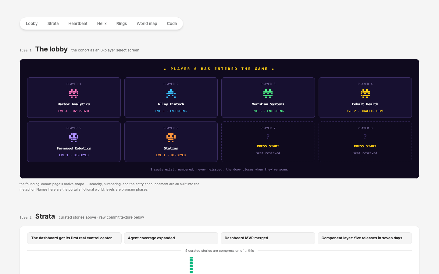
build-partner
Build-partner portal — research, ideation, and a plan for a page that makes partners insiders
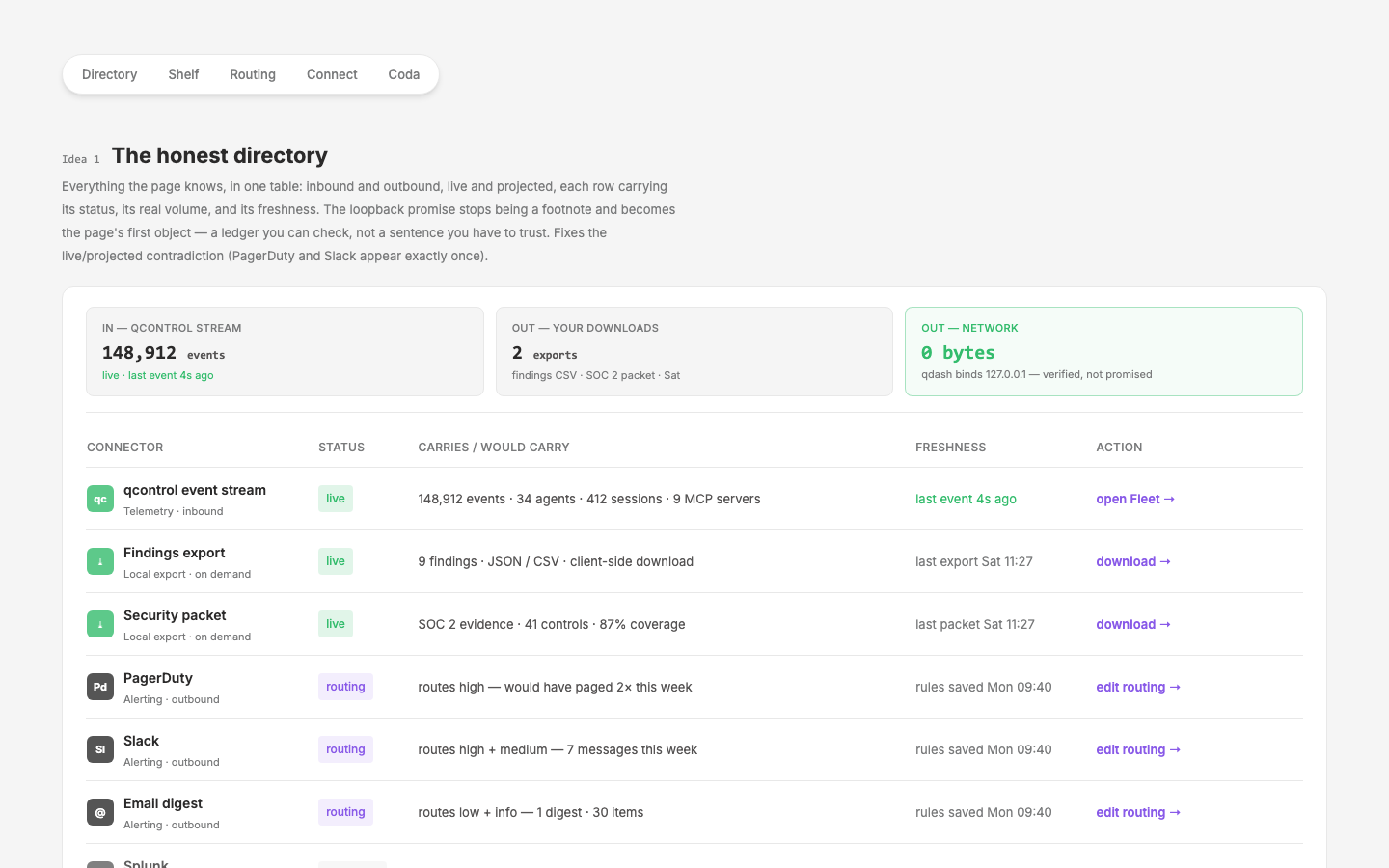
Integrations & Teams
Research and design enterprise-SaaS patterns for qdash teams and integrations pages
inventory-depth
_To be defined — see [initial-prompt.md](initial-prompt.md)._
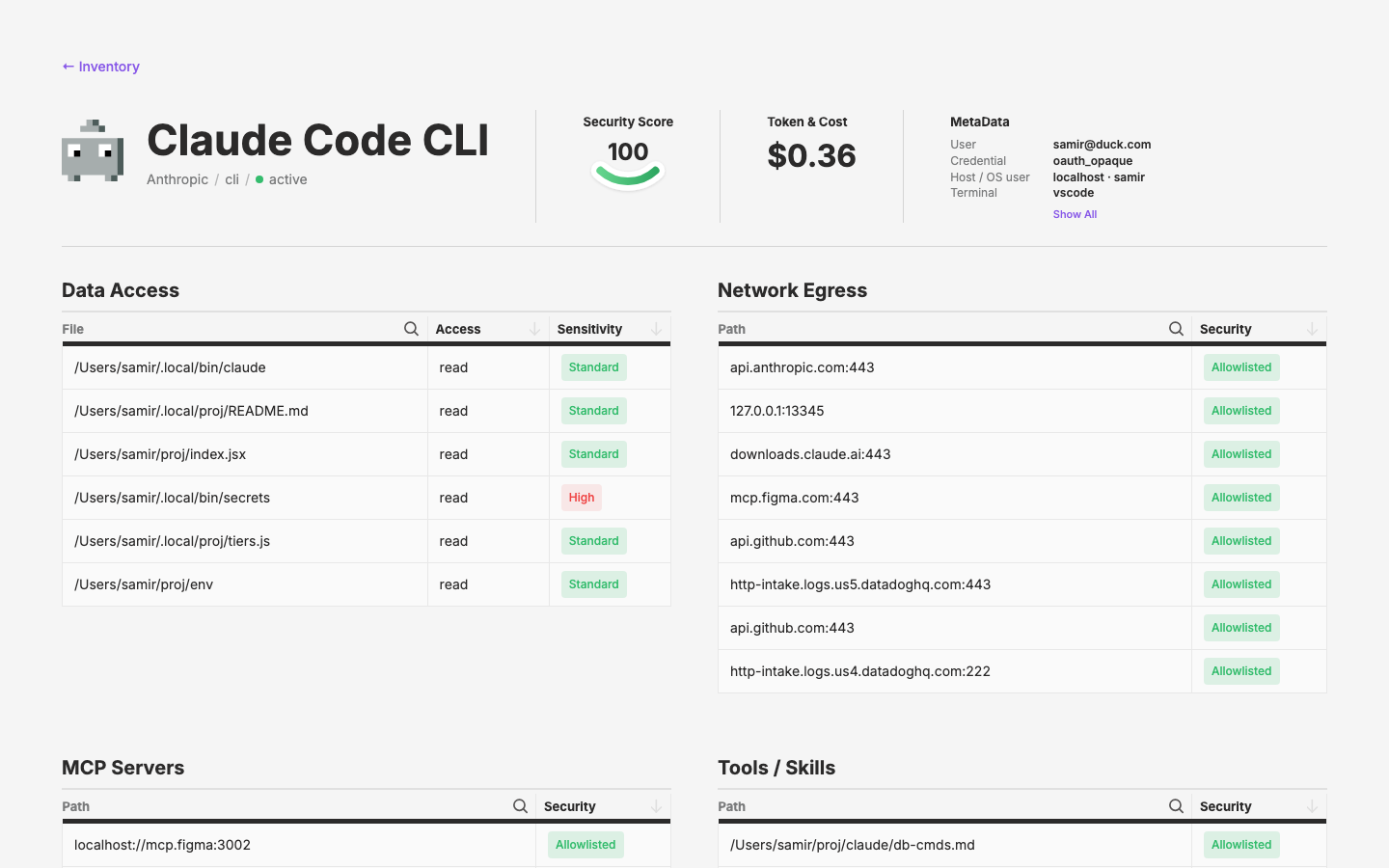
inventory
Design qdash inventory page to surface agent status and footprint at a glance
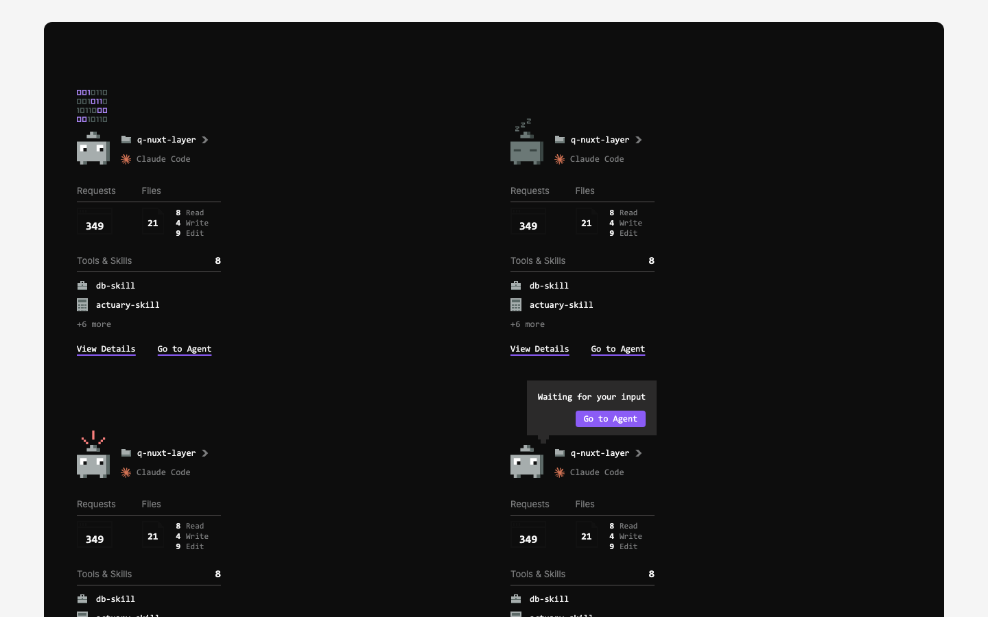
agent-mini-card
AgentMiniCard — compact agent summary card composing the AgentPawn, with mock page
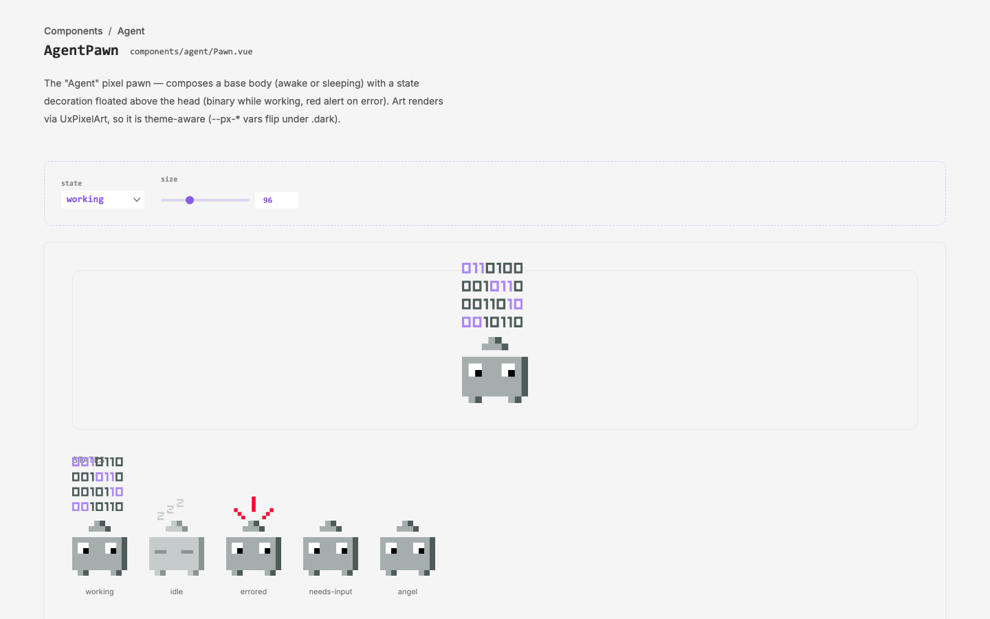
pixel-pawns
Build the agent pawn state system from the first real Illustrator pawn art
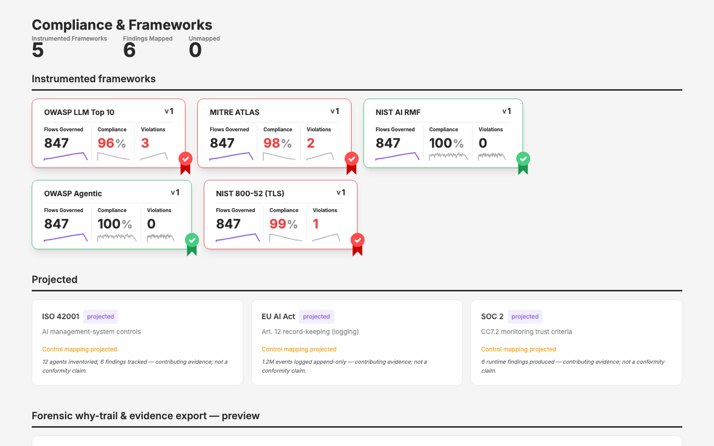
Compliance Framework Pages
Mock up two compliance framework pages from Figma designs
agent-market-definition
Align the qcontrol agent-monitoring dashboard to specific personas and find market alignment — hypothesis-first, validated against calls later.
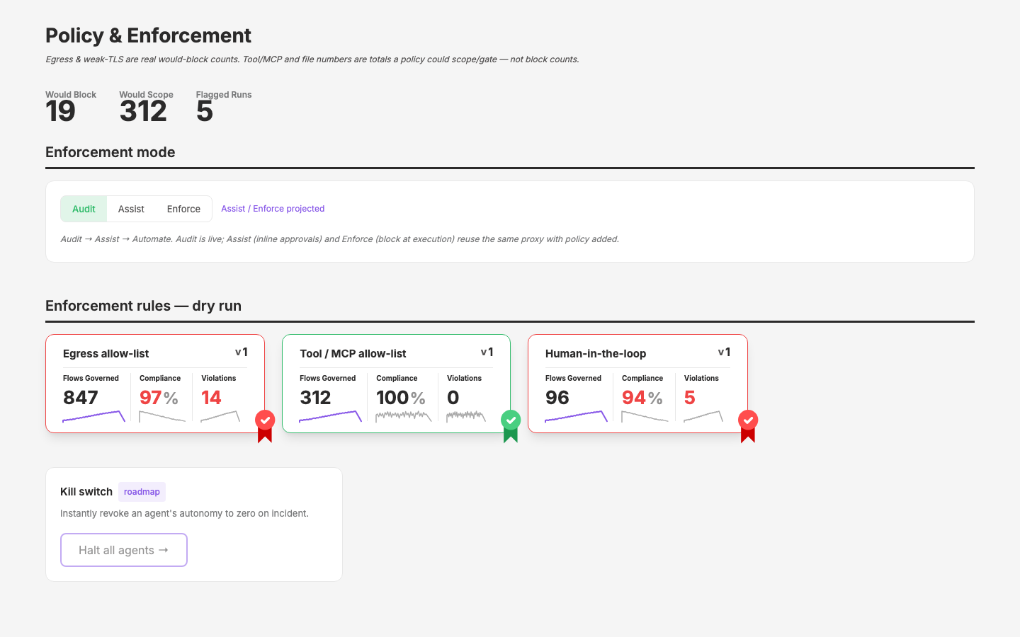
Policy Enforcement Page
Design-site mock of the v2 Policy & Enforcement page from Figma — tabbed policy-control table built on UxTableList
Agentic Workflows
Formalize and modernize the Claude workflow tooling across the Qpoint project family
Dark Mode (Subtle) — Iteration & Theming
Build a dark-mode color system for the qcontrol app consolidation (qdash, qglass, Nuxt UI), with a design-app-based color picker and theme-file persistence for rapid iteration.
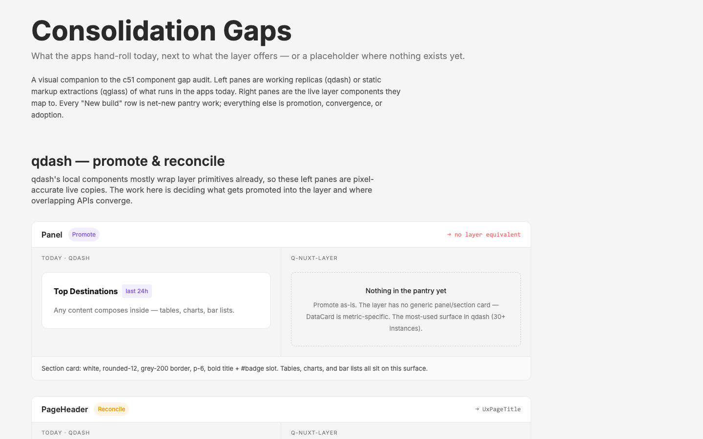
App Consolidation
Understand the fractured qcontrol app ecosystem and consolidate it into a simple, clean, demoable product on a Nuxt + q-nuxt-layer front-end
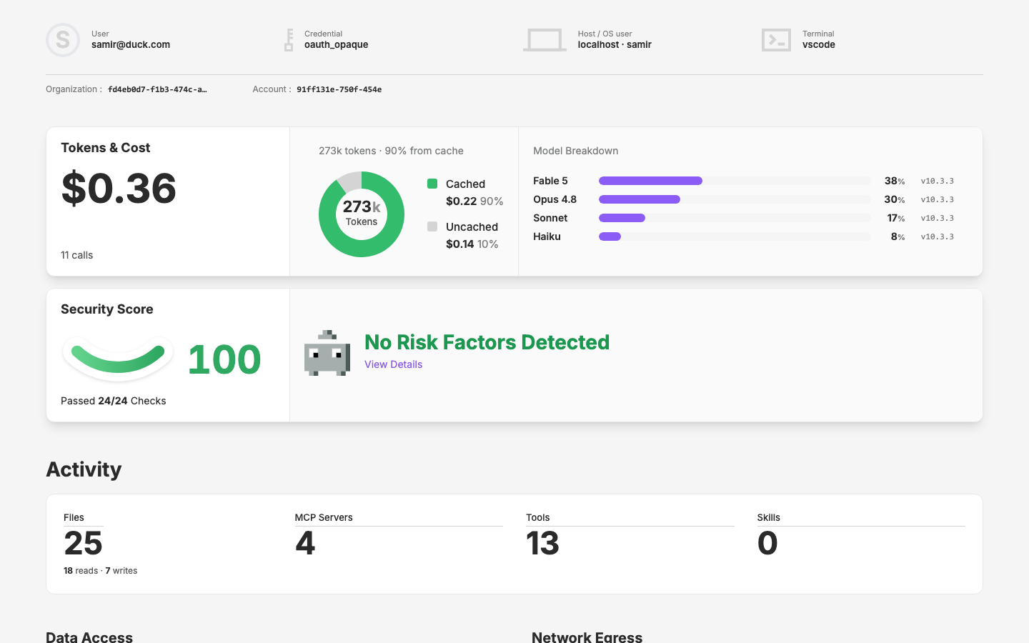
Agent Details Page
Build new component library for the rich agent details page design
Fix the Cloudflare Pages Deploy
Make `push to main` reliably deploy the design site to Cloudflare Pages *(2026-09-25: reframed as "make the build a manual local step", see PICKUP.md)*
Design Site on Layer
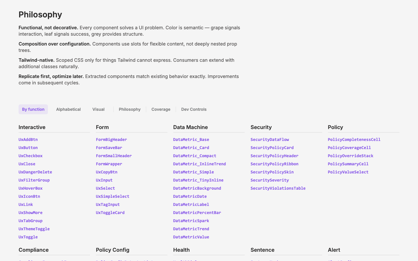
Close the layer gaps so the design site uses only q-nuxt-layer components for everything presentational
Pixel Pawns
Brochure Site Dark Mode Definition
AI Agent Policy Pages
Figma AI Dashboard Redesign
Establish a clean Figma-first source of truth for the dashboard redesign by modeling a flexible visual component API, then use AI to accelerate exploration without polluting the design system
AI Ecosystem Inventory Map
Define the qmap implementation path for an inventory/index view of the company-wide AI ecosystem
Runtime Session Map Publishing
Define the design-app-native publish path for the qmap runtime-session map without starting implementation before qmap is ready
Signal Column Flow
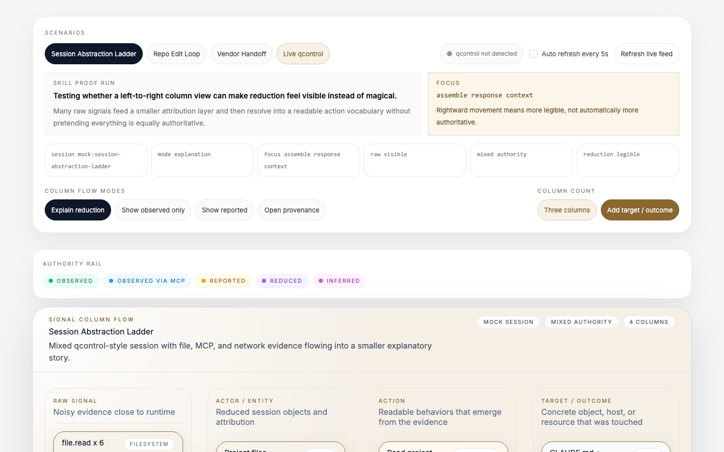
Prototype a column-based evidence ladder that moves from noisy session signal to reduced entities, actions, and provisional outcomes
Qpixel Library
Timeline Visualization
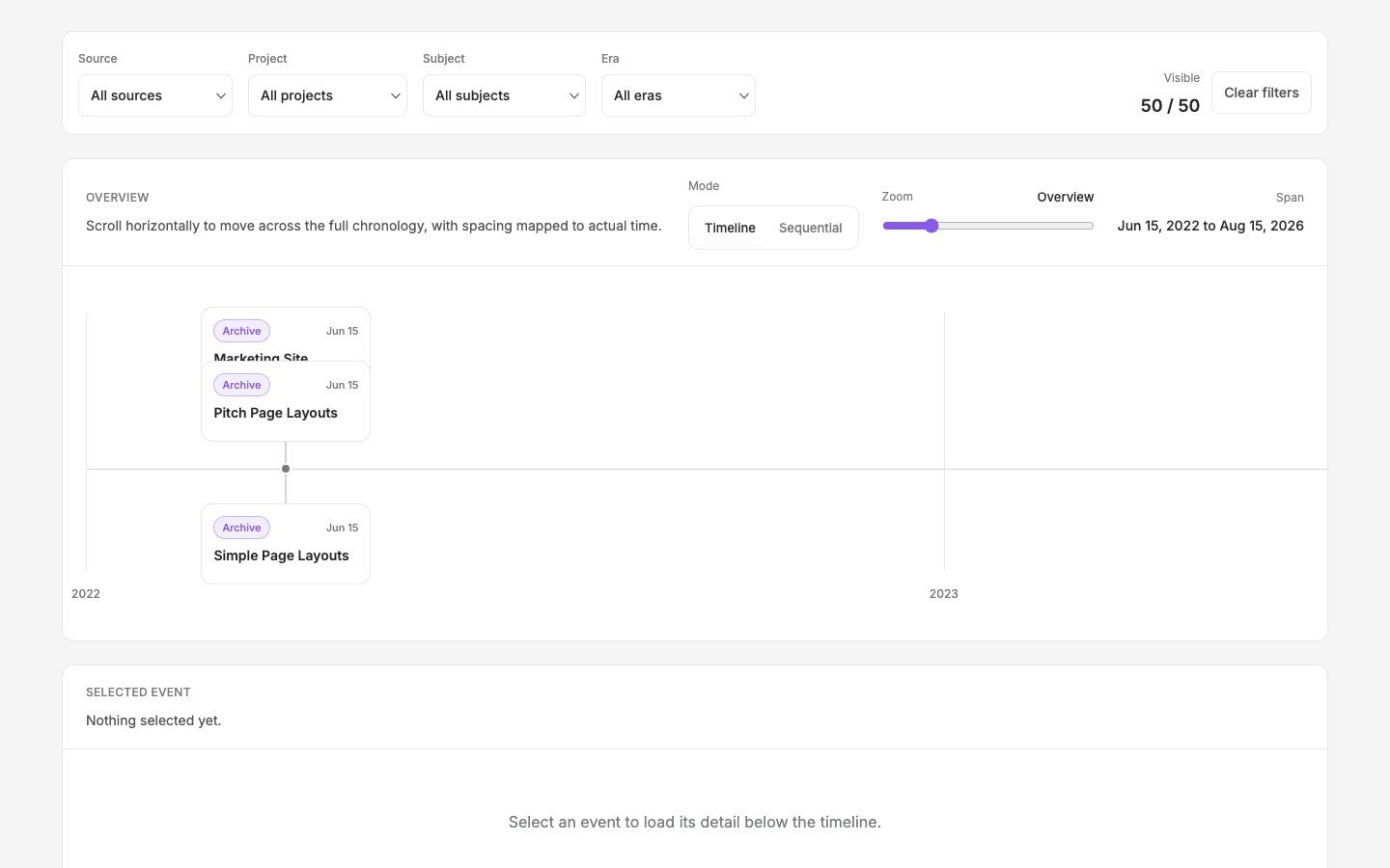
Horizontal timeline system for artifacts, history, and curated milestones across the design site
qcontrol Visibility Storytelling
Design briefs for the trust, provenance, storytelling, and layered-visibility framing around qcontrol-driven visualizations
qcontrol File Event Debug
qcontrol integration
CLI Harness Design
Design the terminal UI surfaces for the QControl CLI demo — MOTD, pre-agent banner, and status bar prompt
diagram
ai-ecosystem-visualizations
Visual experiments expressing the AI agent monitoring dataset for security teams
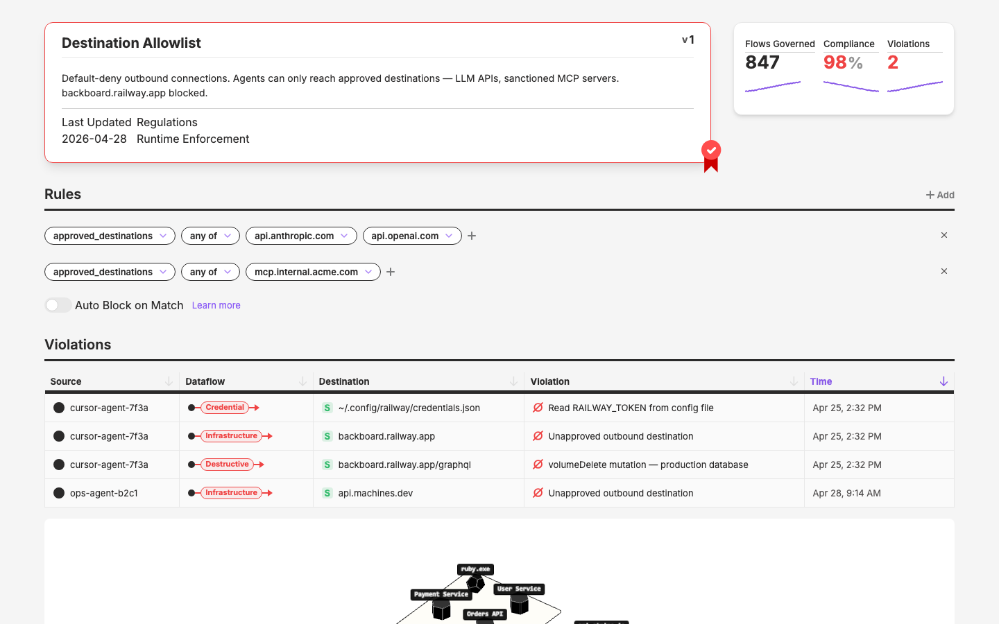
Security Policy Pages
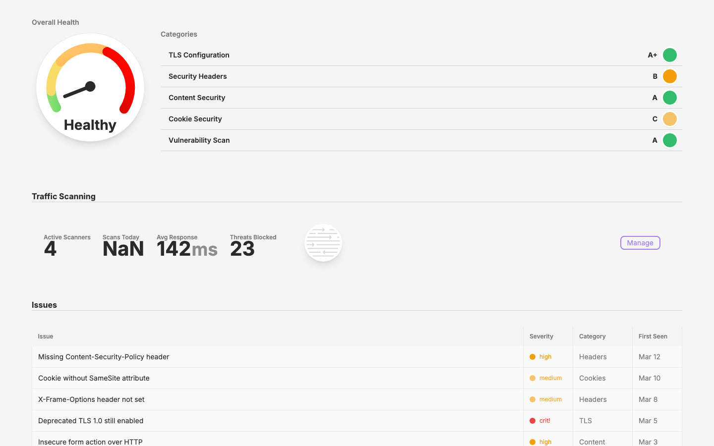
Page Mocks
Tour Guide
Per-project tour guide command for orienting newcomers interactively
Cycle Management Consolidation
Consolidate cycle-manager agents across all 6 Qpoint projects around a single canonical template
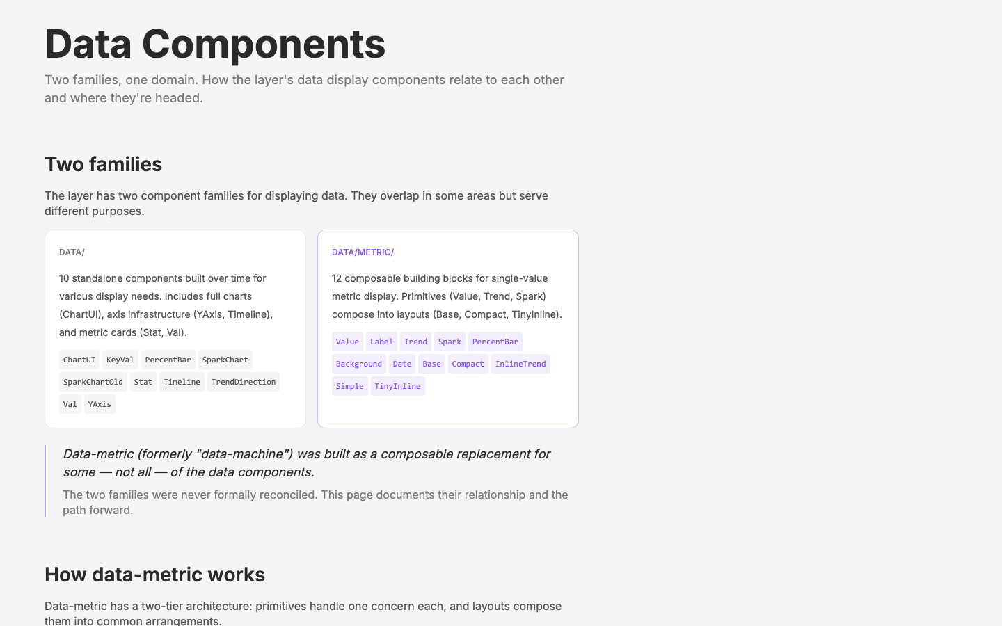
Data Component Audit & Rationalization
Audit, classify, and document the relationship between data/ and data-metric/ component families
Publishing
Publish four internal projects to Cloudflare Pages
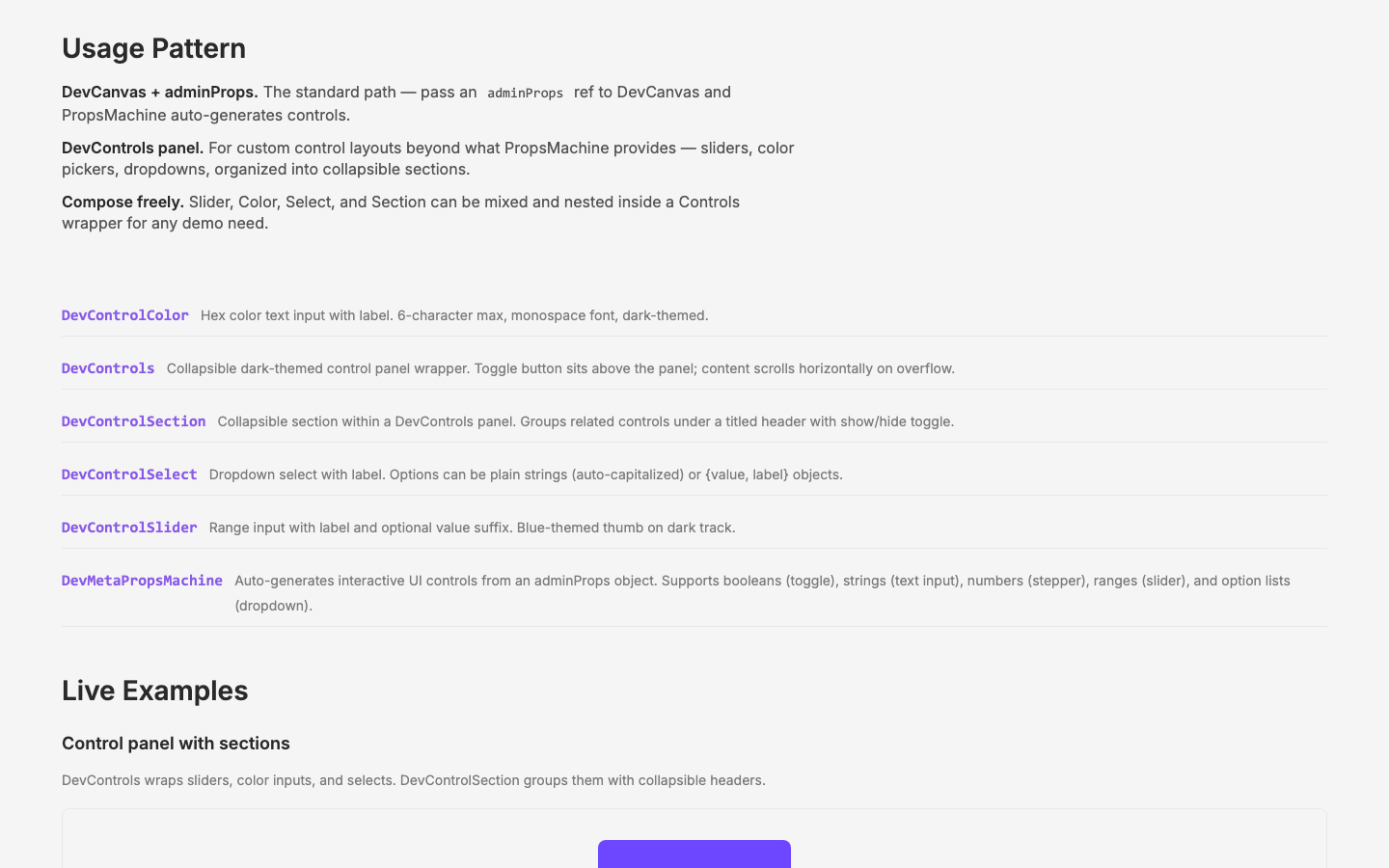
Document Dev Components
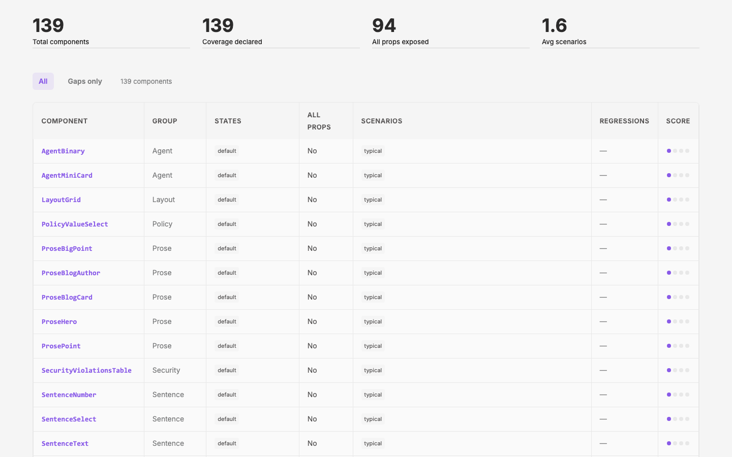
Consume During Implementation
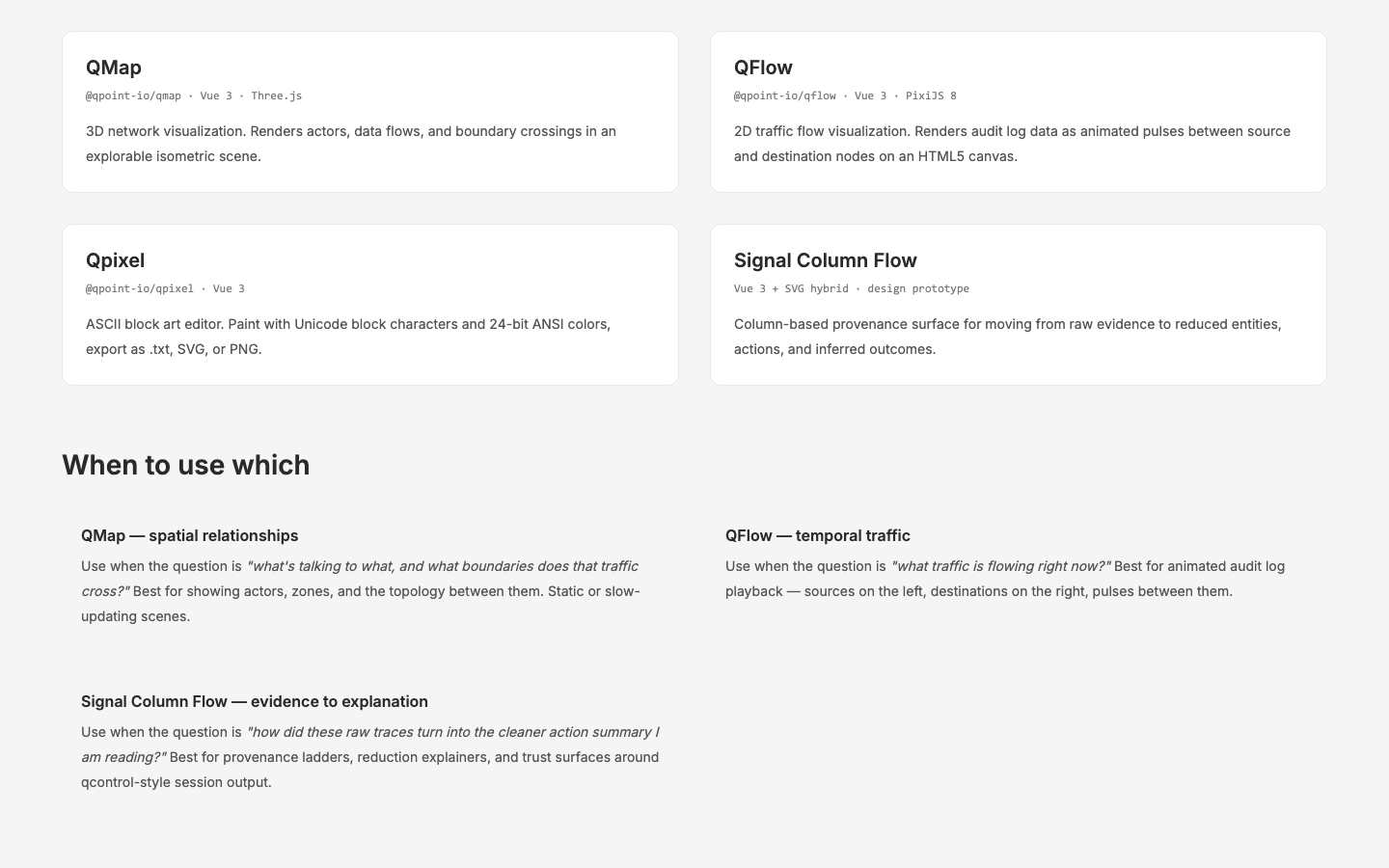
Viz Libraries
Instantiate and document qmap and qflow in the design site
Unified Component Pantry
Formalize the layer as a single shared pantry for all Qpoint projects and upgrade app's local DevCanvas
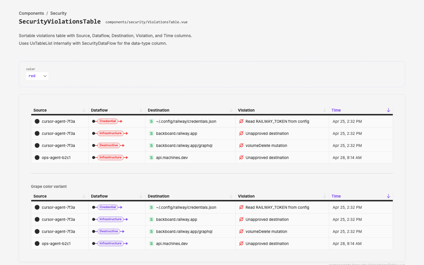
Violations Table
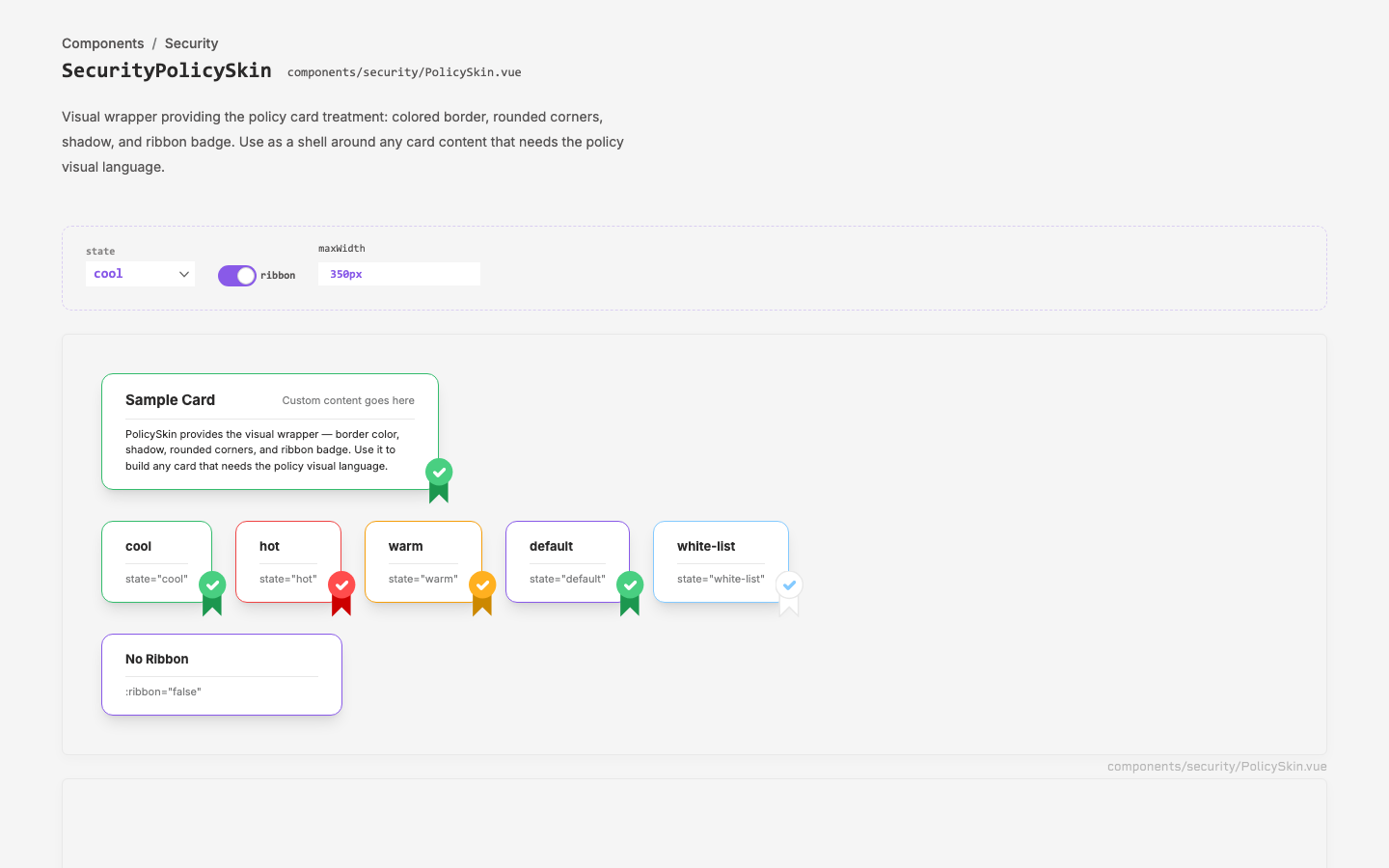
Policy Skin Extraction
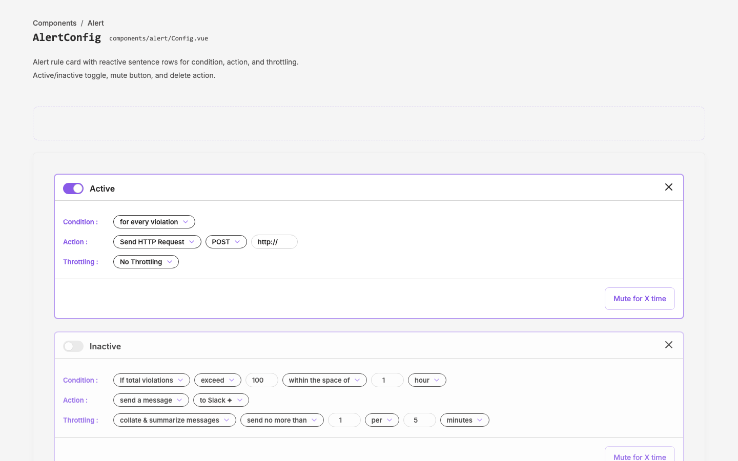
Alert Config Component
Alert rule configuration component for policy violation alerts
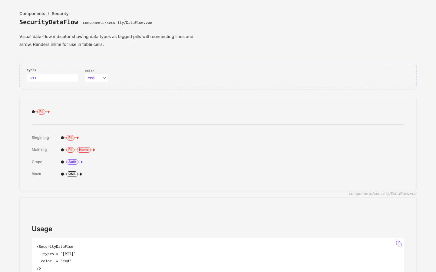
Security Policy Slot
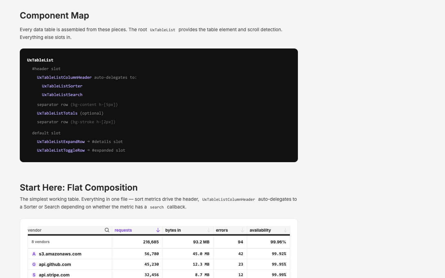
Document UX Table List
Comprehensive documentation of the UxTableList component with production-level examples and usage patterns
Applying Design to the Design Site
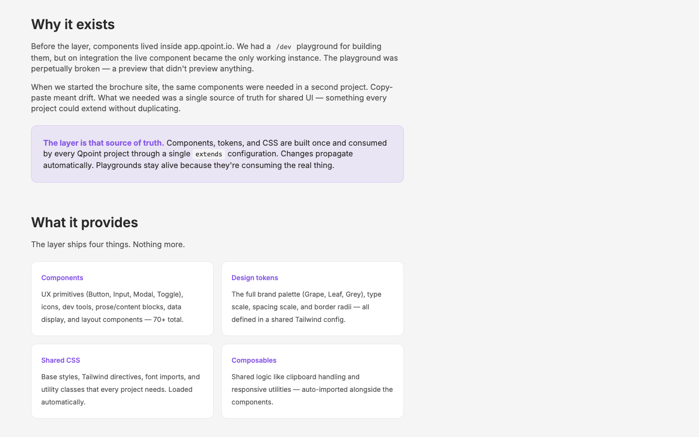
Sharing Our Work Thus Far
Communicate the new app.qpoint.io architecture and q-nuxt-layer to colleagues
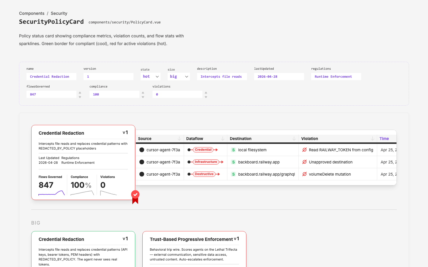
Figma-to-Vue Workflow
Establish a repeatable workflow for extracting Figma designs into Vue SFCs that integrate with the q-nuxt-layer design system.
northwest passage
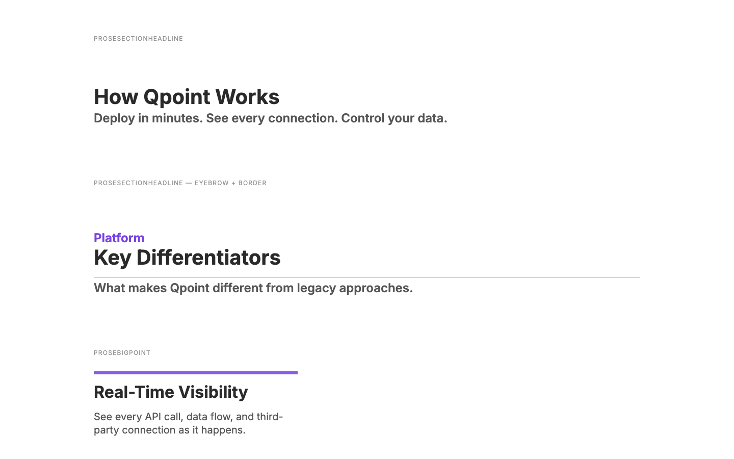
Brochure Site Figma
Create Figma components from Prose component library
Projects as Modular Units
Security-Focused Brochure Site
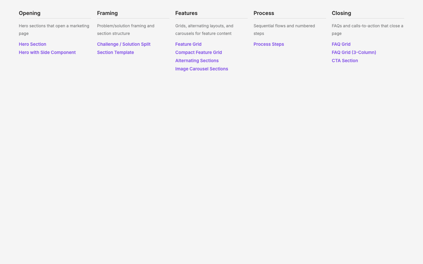
Pattern Enhancement
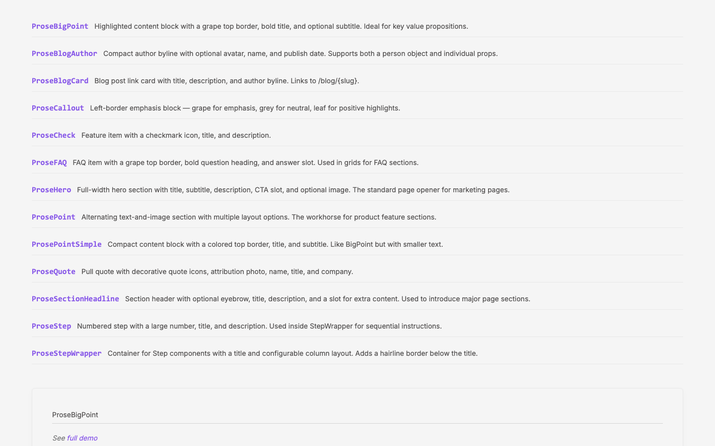
WWW Component Extraction + content→prose Rename
Sharing Design Philosophy
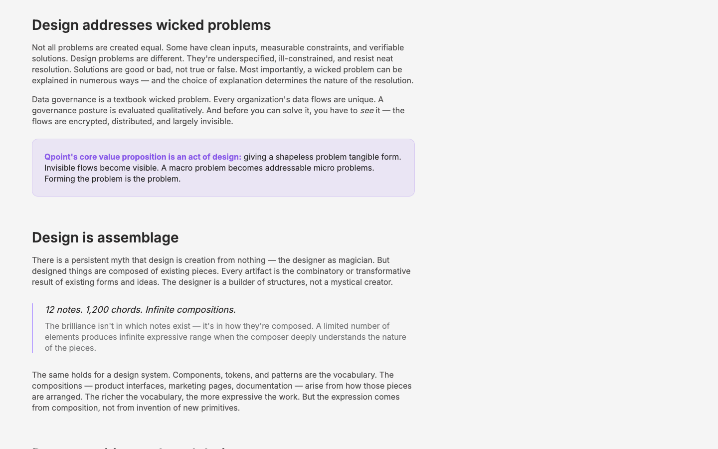
Design Methodology
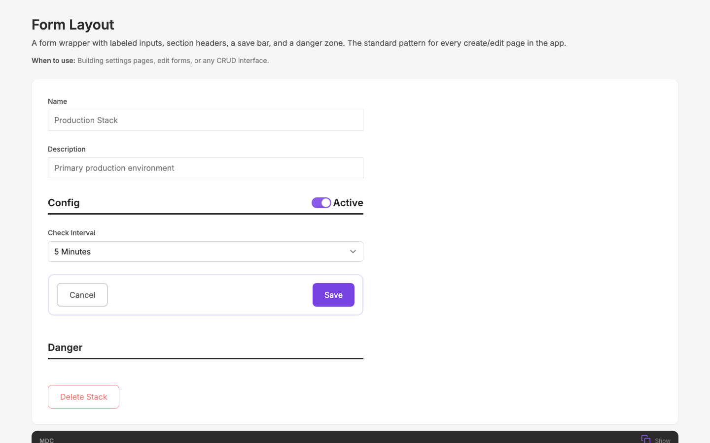
App Pattern Extraction + Discovery Tooling
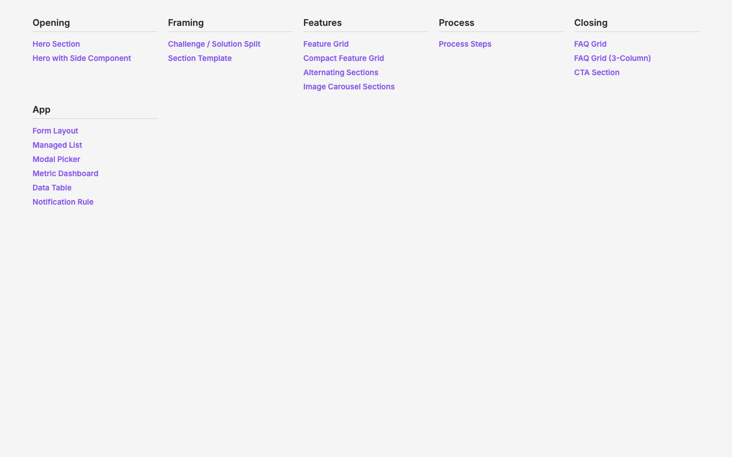
Patterns Page
Layer Organization + Component Extraction from www.qpoint.io
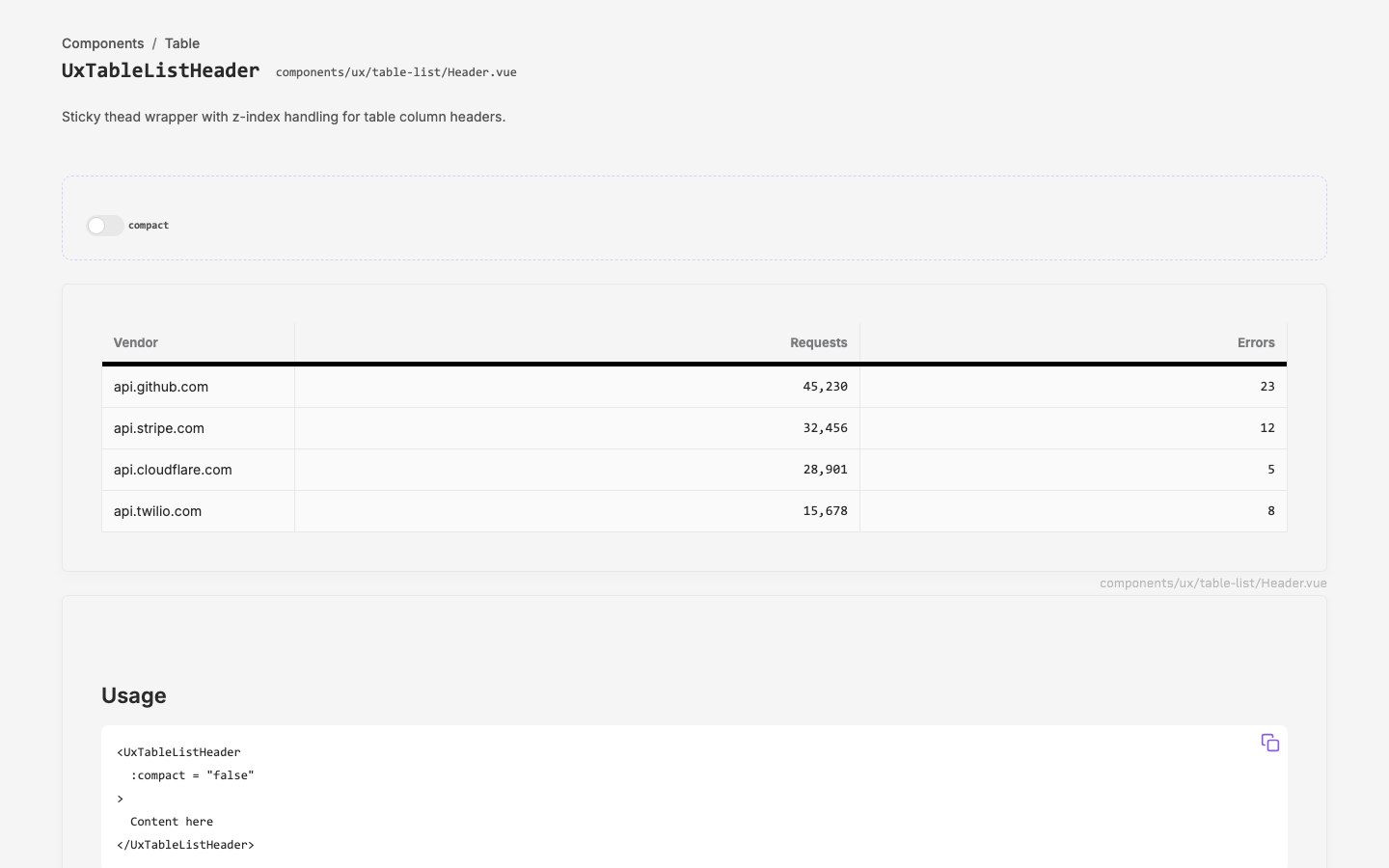
App Migration & Component Documentation
Layer Separation & Project Identity