Document UX Table List
Comprehensive documentation of the UxTableList component with production-level examples and usage patterns
Why
UxTableList is the most complex component in the layer — it handles sorting, searching, expandable rows, toggle rows, column headers, totals, and empty states. Despite being used extensively across app.qpoint.io, it lacks comprehensive documentation in the design site. The existing demo is minimal and doesn't reflect real-world usage patterns.
Objective
Create thorough documentation for UxTableList by examining all production instantiations in app.qpoint.io, building realistic demo examples with test datasets that replicate production conditions, and placing the documentation where it belongs in the component hierarchy.
Scope
- Audit all UxTableList usages across app.qpoint.io to understand the full API surface
- Document how each sub-component (ColumnHeader, Search, Sorter, ToggleRow, ExpandRow, Totals) is used in practice
- Create test datasets that mirror production data shapes
- Build demo examples that are closer to working app.qpoint.io patterns
- Determine proper placement (table group index page vs. dedicated page)
Key Changes
Production audit:
- Inventoried 36 files across app.qpoint.io using UxTableList components
- Identified 10 cross-cutting patterns: sorting/filtering, search, infinite scroll, row expansion, totals row, TD type components, compact mode, DataMetric integration, empty states, sorting without searching
- Documented the sort metric object shape (
{name, width, total, trend, unit, search, healthPolicy, spark})
Test dataset:
- New file:
app/data/table-list-demo.ts— 8 vendor records with production-realistic fields (connections, requests, bytesIn/Out, errors, availability, avgDuration, p99Duration), plusformatBytesandformatNumberhelpers
Demo rewrites (8 files):
UxTableList— Full production pattern: ColumnHeader-driven sorting, search filtering, computed totals row, expandable detail panels, black header separator bar, grey totals separatorUxTableListHeader— Working table with sticky header, compact toggle via adminPropsUxTableListColumnHeader— Sort + search columns with metric config objects, live filtering, compact/disabled adminPropsUxTableListSorter— 3 sortable columns with actual sort logic and direction toggle, disabled adminPropUxTableListSearch— Inline search input filtering vendors by domain/nameUxTableListExpandRow— 5 clickable rows expanding to 4-stat detail panels withbg-white shadow-lg rounded-12UxTableListToggleRow— 4 rows with toggle expansion, close callback,bg-white shadow-lg rounded-12expanded panelsUxTableListTotals— Computed aggregate row (total requests, bytes, errors) with black separator
Production patterns replicated in demos:
<tr><th class="h-[5px] p-0 bg-black" colspan="100%"></th></tr>— header separator bar (all 8 demos)<tr><th class="h-[2px] p-0 bg-grey-200" colspan="100%"></th></tr>— totals separator (UxTableList demo)- Expanded content uses
bg-white shadow-lg rounded-12instead ofbg-grey-50
Outcome
Phase 1 — Demo rewrites (prior session):
Fixed column header alignment across all 8 UxTableList demo pages. Root cause: every demo redundantly wrapped header content in <UxTableListHeader>, but UxTableList already wraps the #header slot in <UxTableListHeader> internally. This produced nested <thead> elements — invalid HTML that broke column alignment. Fix: removed the inner <UxTableListHeader> wrapper from all demos so <tr> elements sit directly in the #header slot, matching the working pattern in app.qpoint.io.
Phase 2 — Compositional guide + app pattern:
New files:
app/components/patterns/CodeBlock.vue— reusable titled, collapsible, copyable code block for multi-block guide pagesapp/components/patterns/DataTable.vue— PatternCard entry on/patterns/appwith live demo (sort, search, expand) + link to guideapp/pages/patterns/data-table.vue— dedicated guide page at/patterns/data-table
Guide page sections:
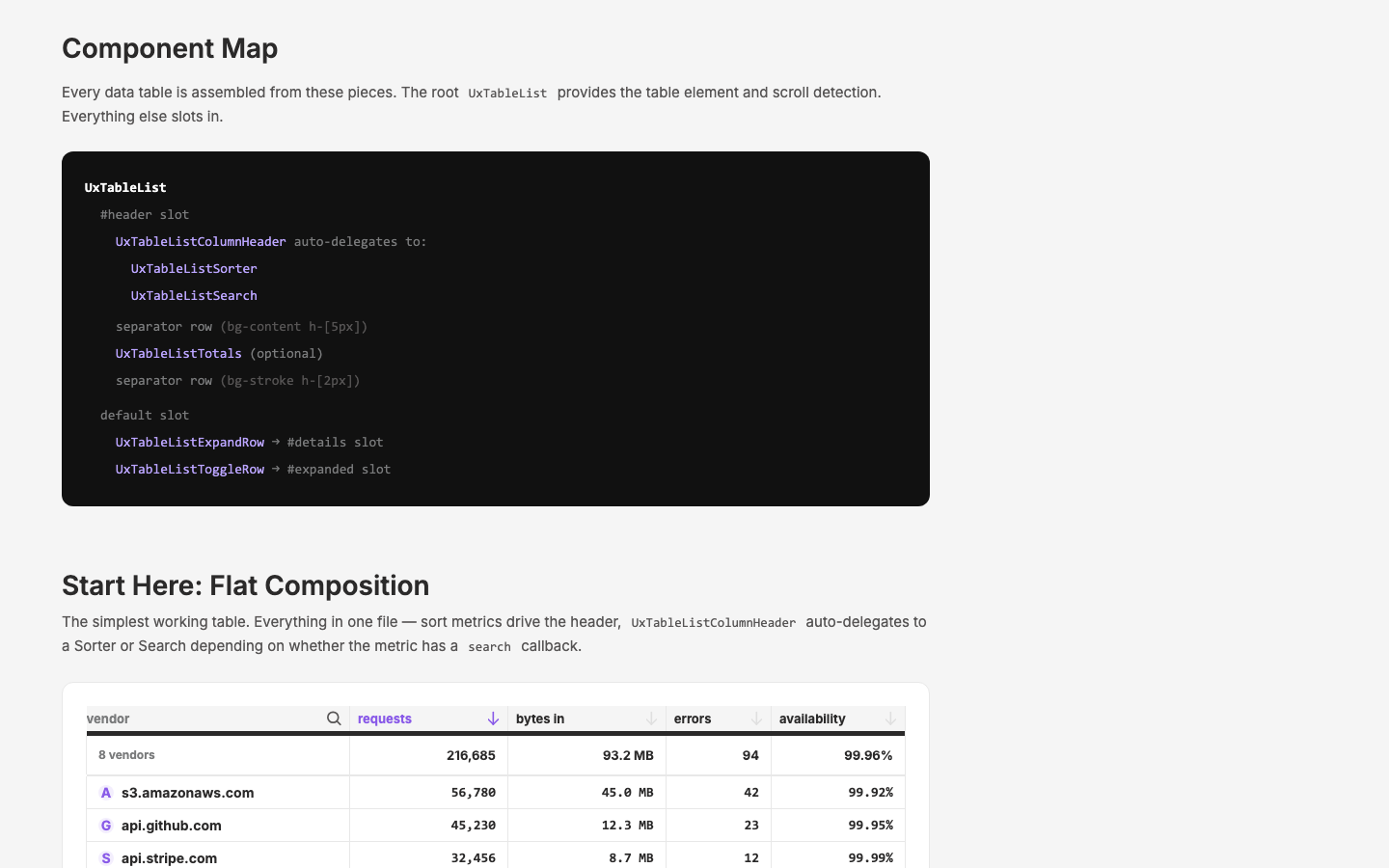
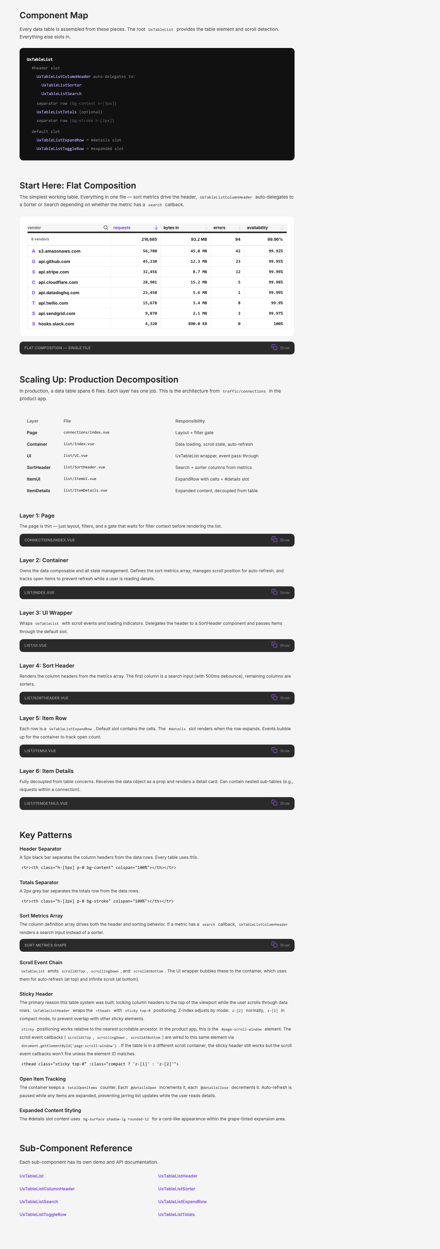
- Component Map — visual tree of all 8 sub-components and their nesting/slot relationships
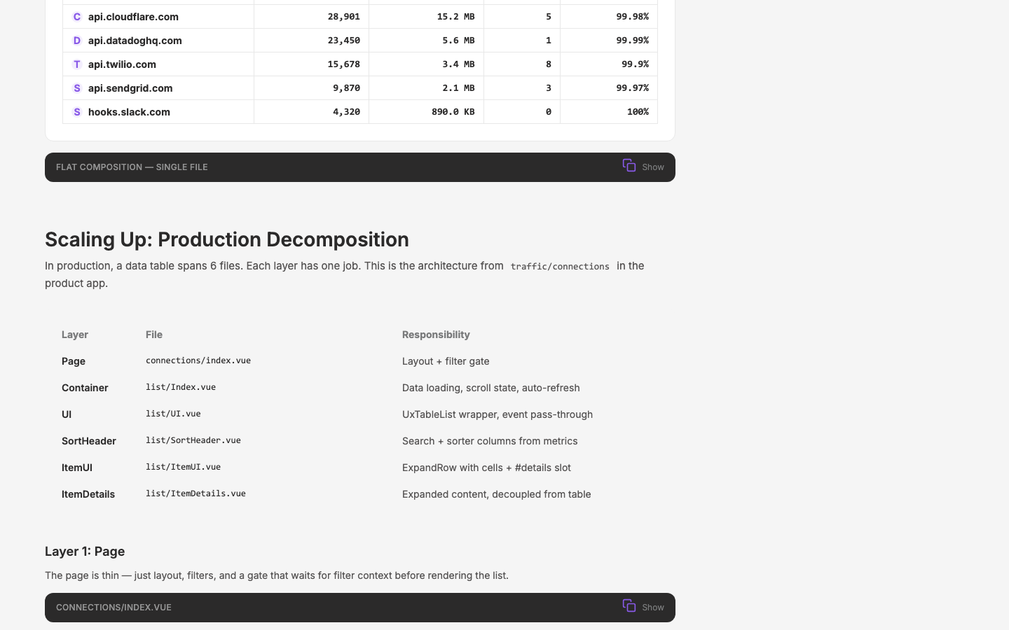
- Flat Composition — live working demo + copyable code showing single-file pattern with sort metrics, ColumnHeader auto-delegation, separator rows, ExpandRow details
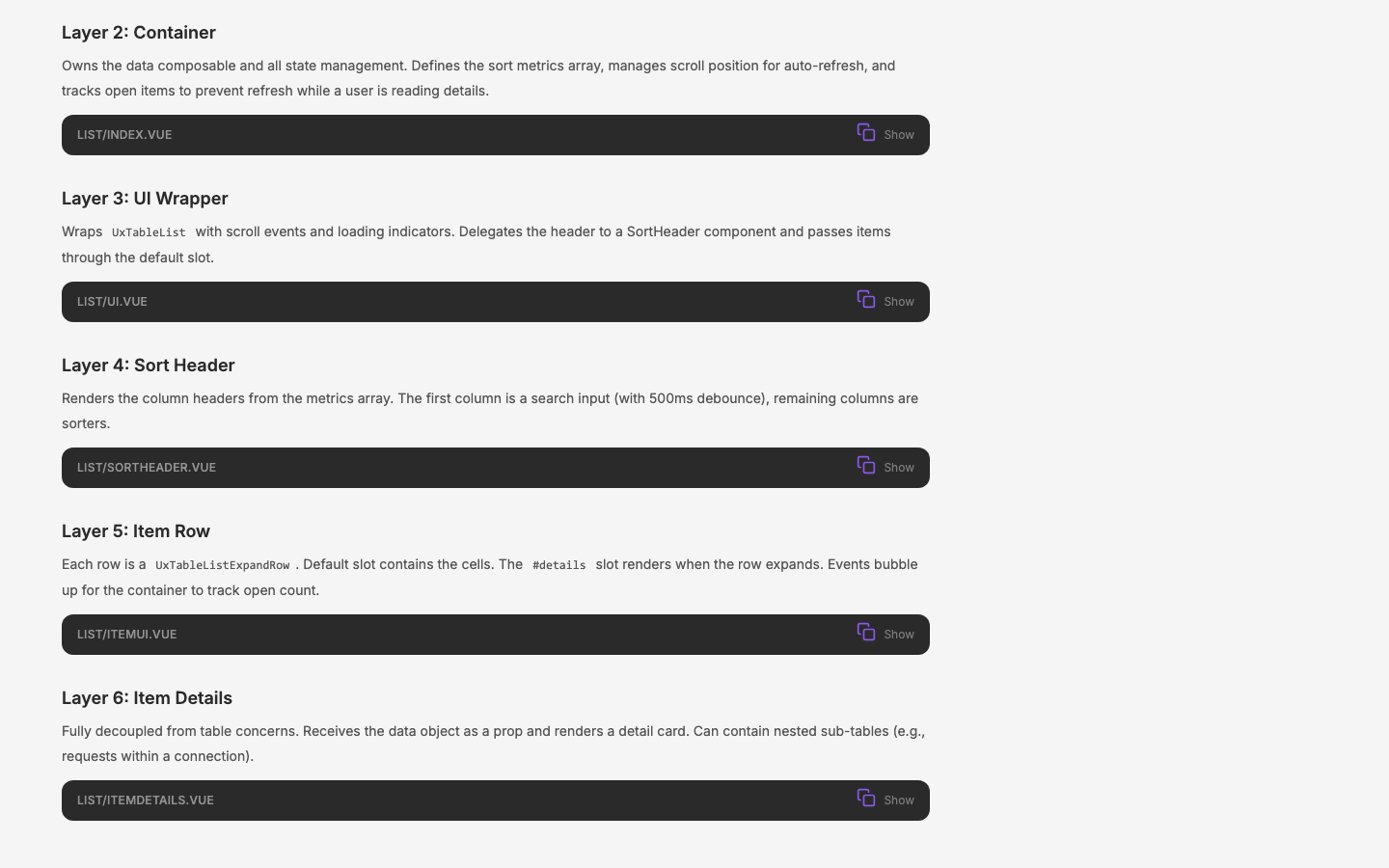
- Production Decomposition — 6-layer walkthrough from
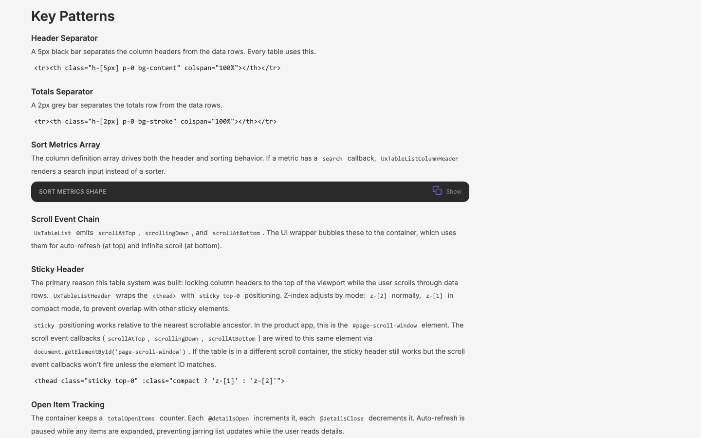
app.qpoint.io/traffic/connectionswith annotated code blocks: Page → Container → UI → SortHeader → ItemUI → ItemDetails - Key Patterns — header separator, totals separator, sort metrics shape, scroll event chain, sticky header (the primary motivation —
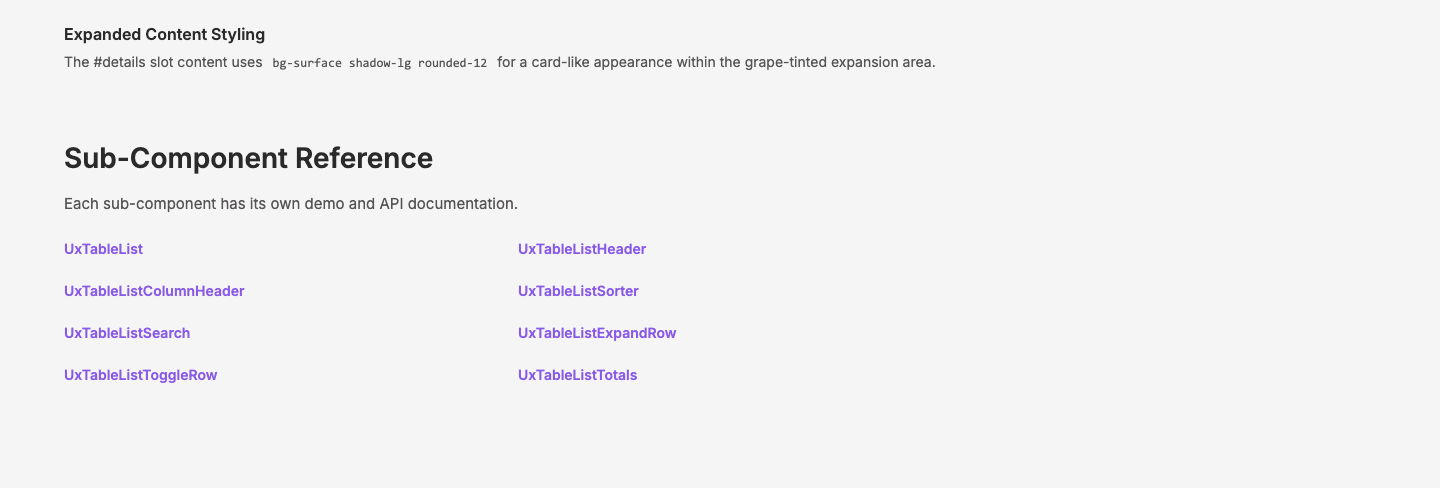
sticky top-0with#page-scroll-windowdependency), open item tracking, expanded content styling - Sub-component cross-references — links to all 8 individual component pages at
/components/table/*
Navigation wired: /patterns index, /patterns/app, /patterns/all all include the new Data Table entry. Total app patterns: 5 (was 4).
Open Issues
None.
Visual record
6 captures — heroes, page slices, and full-page renders. Click to view.
In the archive
Artifacts
- initial-prompt.md
- initial-prompt.md