archivedcreated February 2026· last activity 2026-09-11
Why
Sister projects (www.qpoint.io, app.qpoint.io) duplicated components, tokens, and CSS. Changes had to be made in multiple places. The styleguide project had the canonical versions but no mechanism to share them.
Objective
Transform the styleguide project into a Nuxt Layer that sister projects can extend to inherit shared components, design tokens, and CSS.
What Was Done
Canonicalized tailwind.config.js as single source of truth for design tokens (fixed border-radius bug, production line-heights, 28 font sizes)
Consolidated shared CSS into assets/css/shared.css
Configured Nuxt Layer with @@/ aliases, auto-import dirs, cssPath: false
Created 4 icon stubs in components/icon/ (X, Spinner, Check, Copy)
Extracted composables/useClipboard.ts
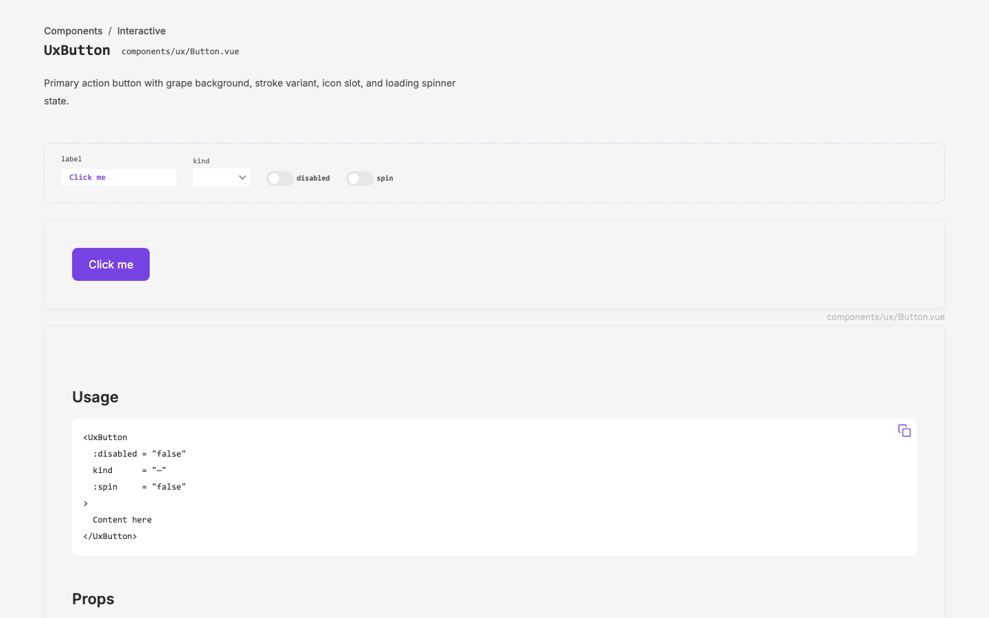
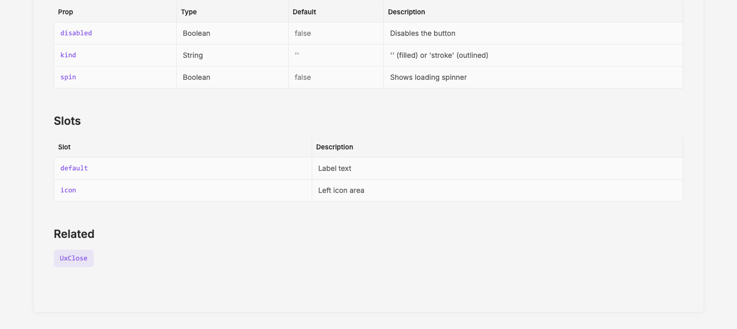
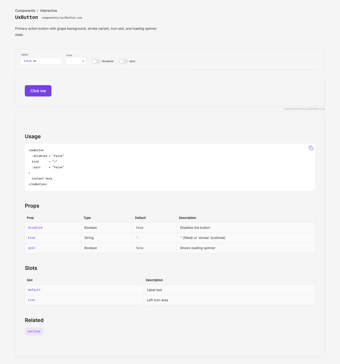
Built component showcase page at /components
Wrote brand/component_philosophy.md and brand/design_tokens.md
Outcome
Styleguide is a functional Nuxt Layer. Sister projects extend with one config line. Components auto-import with existing names — zero template changes needed in consumers.
Visual record
3 captures — heroes, page slices, and full-page renders. Click to view.