archivedcreated 2026-09-11· last activity 2026-09-11
Why
The design site documents components and patterns individually, but has no place showing how they combine into complete app pages. Engineers need a clean reference — layout, data shape, component composition — without API noise or setup logic.
Objective
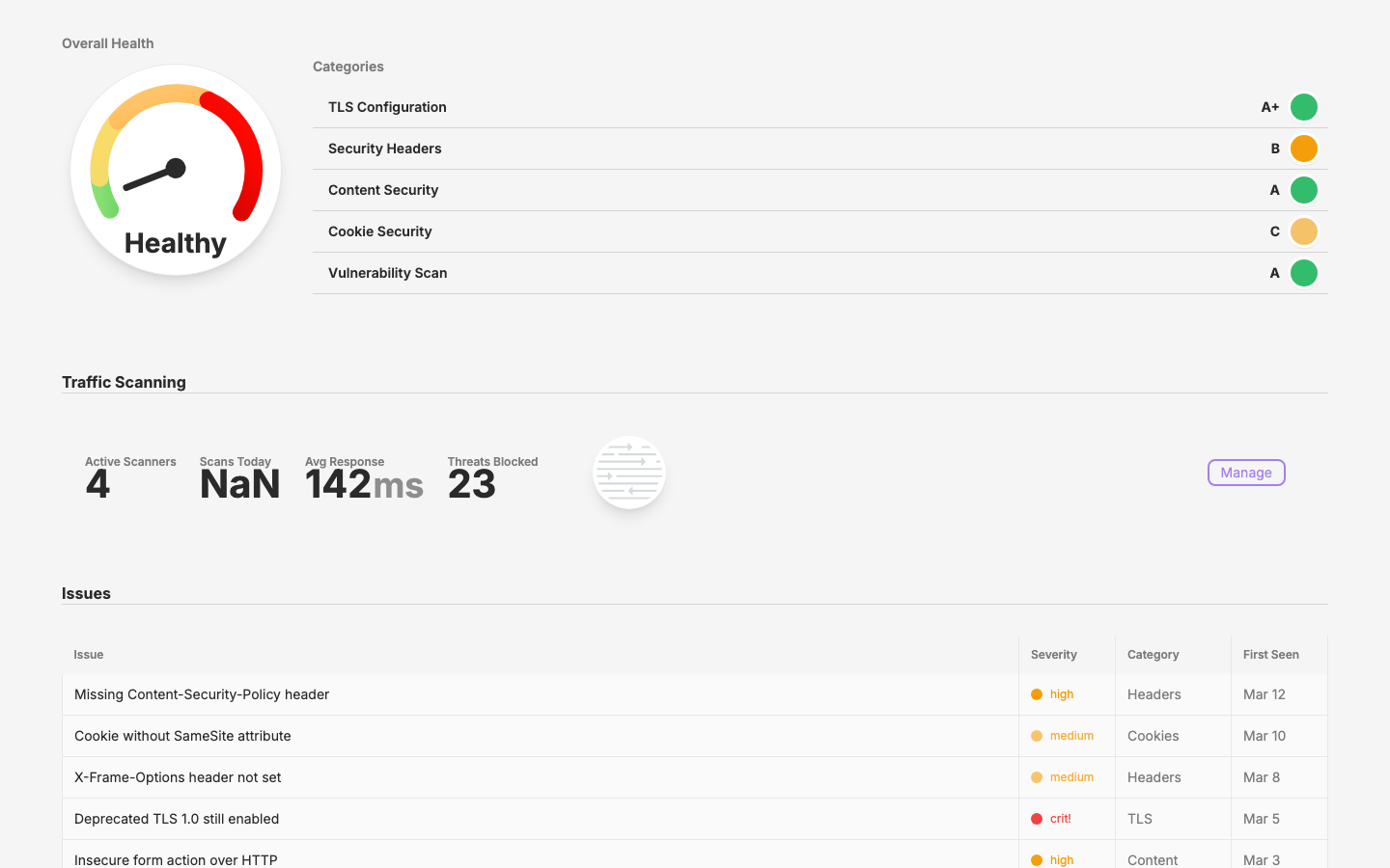
Add a "Pages" entity to the design site, starting with a recreation of security/overview from app.qpoint.io. Extract the necessary health and severity components into the shared layer.
Scope
Extract 5 presentational components to the layer (health/ + security/Severity)
Create page registry and index page
Build static mock of security overview using layer components
Add nav link
Key Changes
Layer: New components/health/ directory (Dial, DialSummary, SummaryItem, Scanning) + SecuritySeverity
API simplification (2026-03-19): Removed percent prop from HealthDial, HealthDialSummary, and HealthSummaryItem. Status now drives both color and needle position internally (cool:95, warn:60, warm:35, hot:10). HealthDialSummary auto-derives statusMessage from status (Good/Warning/Concerning/Critical) when not provided. Updated all consumers across design, app.qpoint.io (including production Overall.vue and local DialSummary override), registry, catalog, and skill docs.
Outcome
/pages lists page mocks. /pages/security-overview renders a static, data-complete recreation of the security overview page using only layer components and mock data.
Visual record
1 captures — heroes, page slices, and full-page renders. Click to view.