Consume During Implementation
Why
The design site is already the first consumer of every shared component — we build in the layer and instantiate on the design site during development. This catches problems at creation time, not after deployment. But the process is tribal knowledge. Without it codified, AI agents and collaborators can't follow the same steps, and there's no visibility into which components have been thoroughly stress-tested vs. which have minimal demos.
Objective
Formalize the "consume during implementation" workflow as a documented principle, add structured coverage tracking to the component registry, and build a dashboard that makes gaps visible.
Scope
- Add Principle 8 ("Consume during implementation") to
brand/component_philosophy.md - Add
DemoCoverageinterface and optionalcoveragefield toComponentEntryinapp/data/component-registry.ts - Update
/document-componentsskill with coverage requirements, scenario conventions, and regression workflow - Build
/components/coveragedashboard page showing component health metrics - Backfill 3–5 reference demos with coverage fields as canonical examples
- Add nav link to coverage dashboard
Key Changes
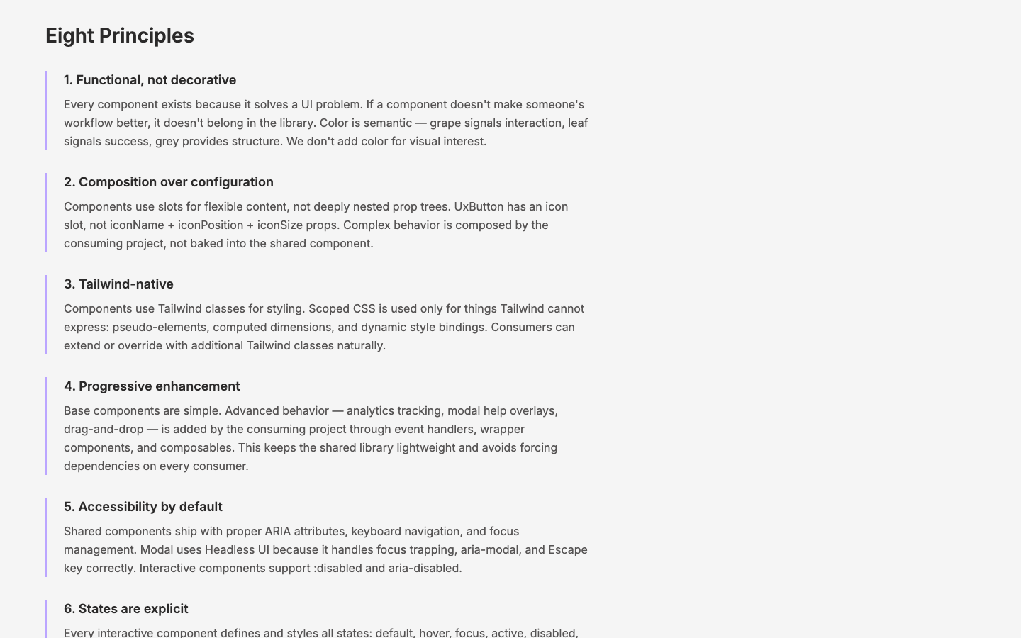
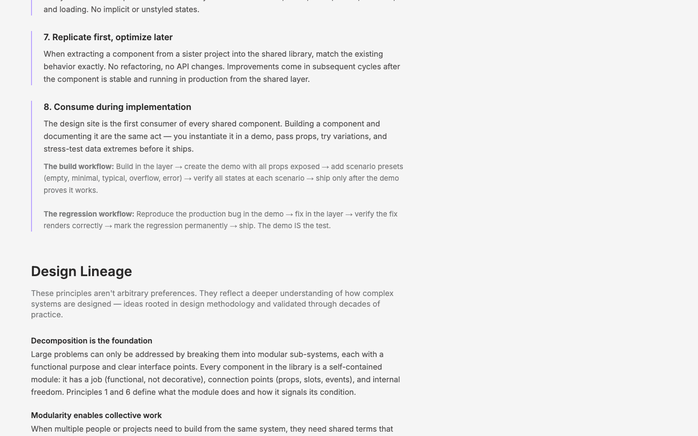
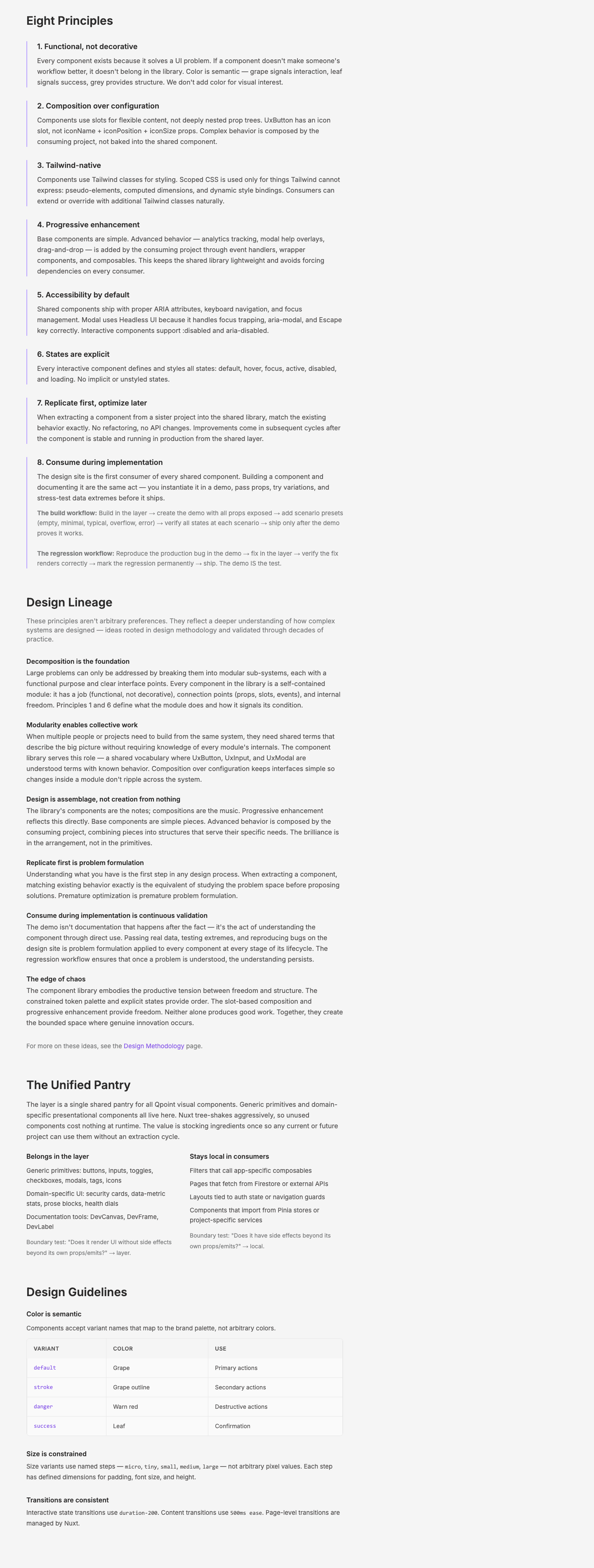
Principle 8 — Consume during implementation
The design site is the first consumer. Building and documenting are the same act. Includes the regression workflow: prod bug → reproduce on design site → fix in layer → verify → mark regression → ship.
Registry coverage fields
interface DemoCoverage {
  states?: ('default' | 'loading' | 'error' | 'empty' | 'disabled')[]
  allPropsExposed?: boolean
  scenarios?: ('empty' | 'minimal' | 'typical' | 'overflow' | 'error')[]
  regressions?: string[]
}
Optional on ComponentEntry — missing means "not yet audited."
Scenario presets convention
Demo files include labeled sections: Interactive (adminProps-driven), Scenarios (data variations: empty, minimal, typical, overflow, error), Regressions (permanently tracked bug reproductions). Not every component needs all — just the ones that apply.
Coverage dashboard
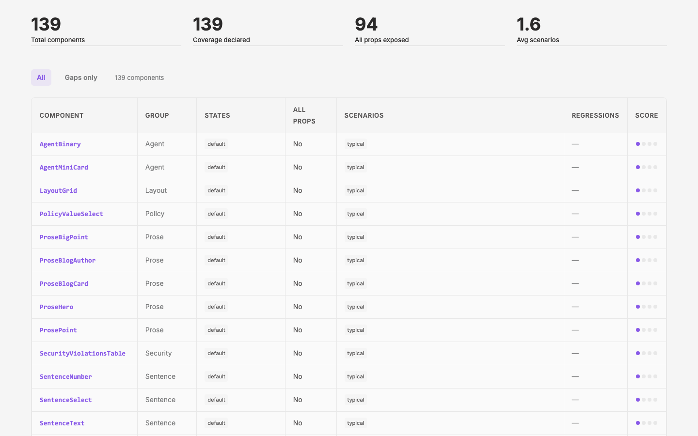
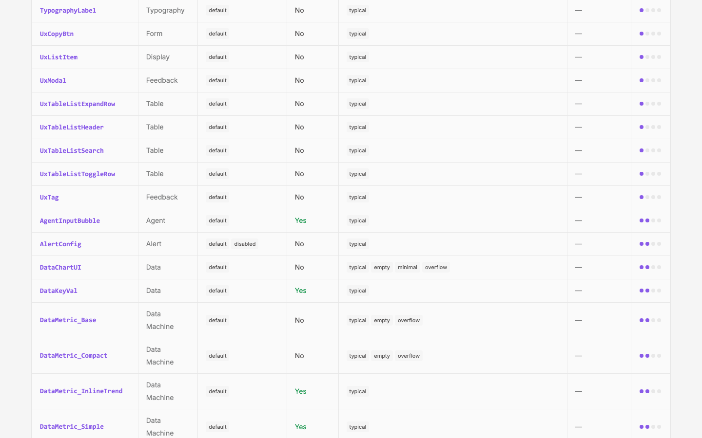
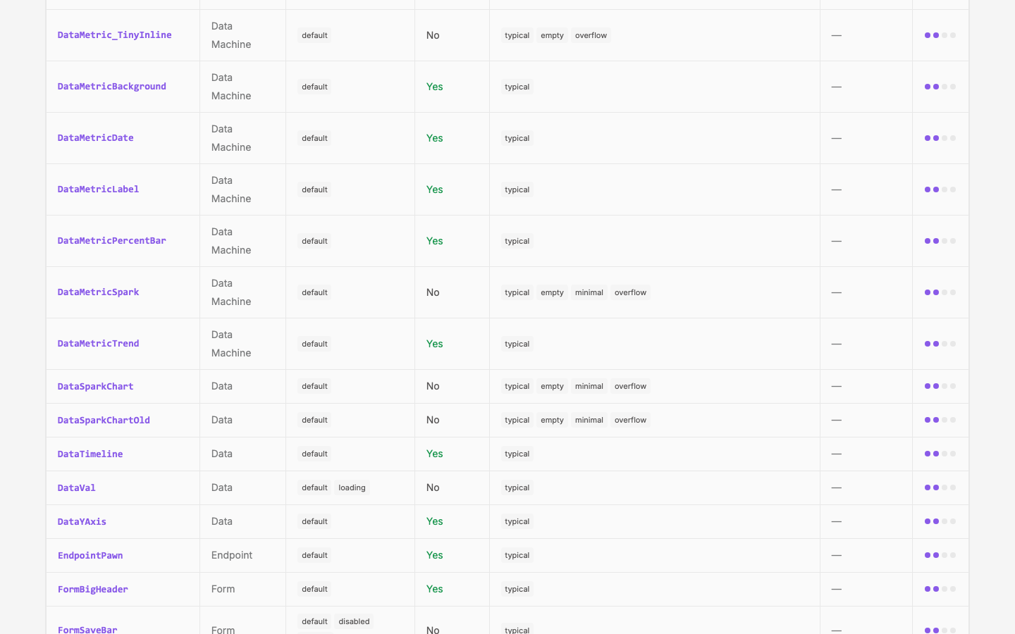
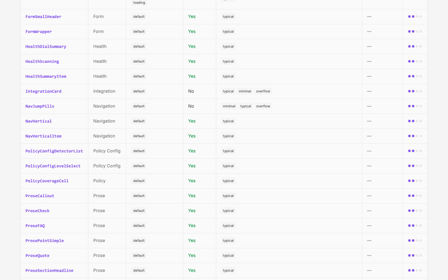
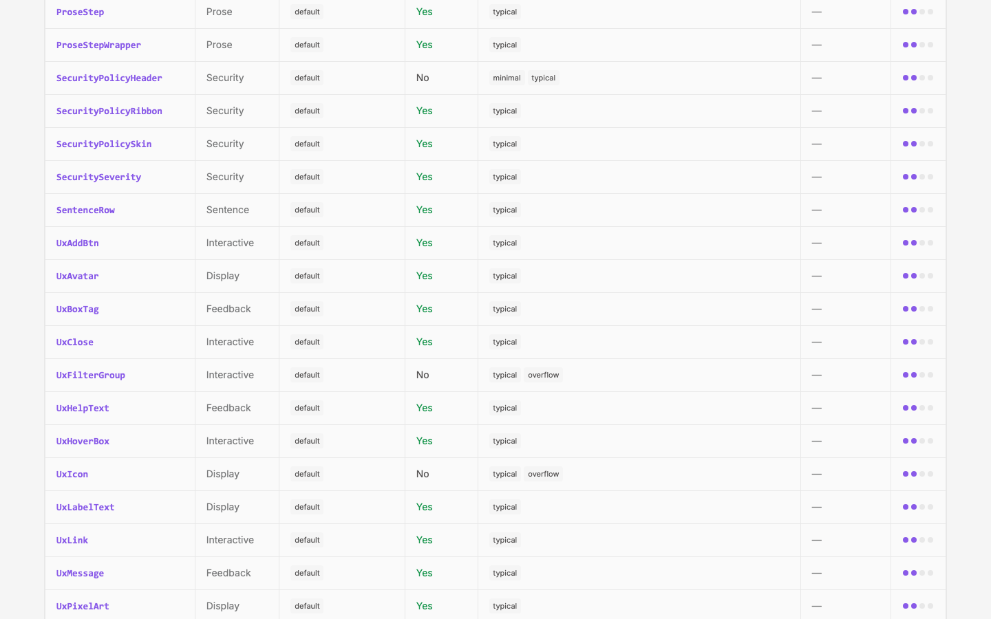
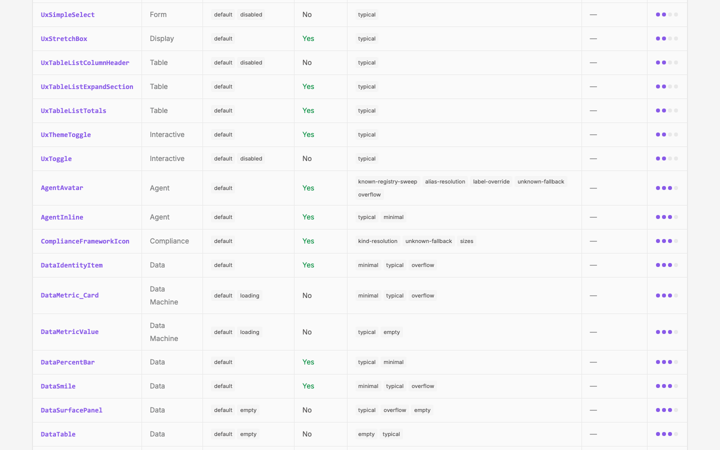
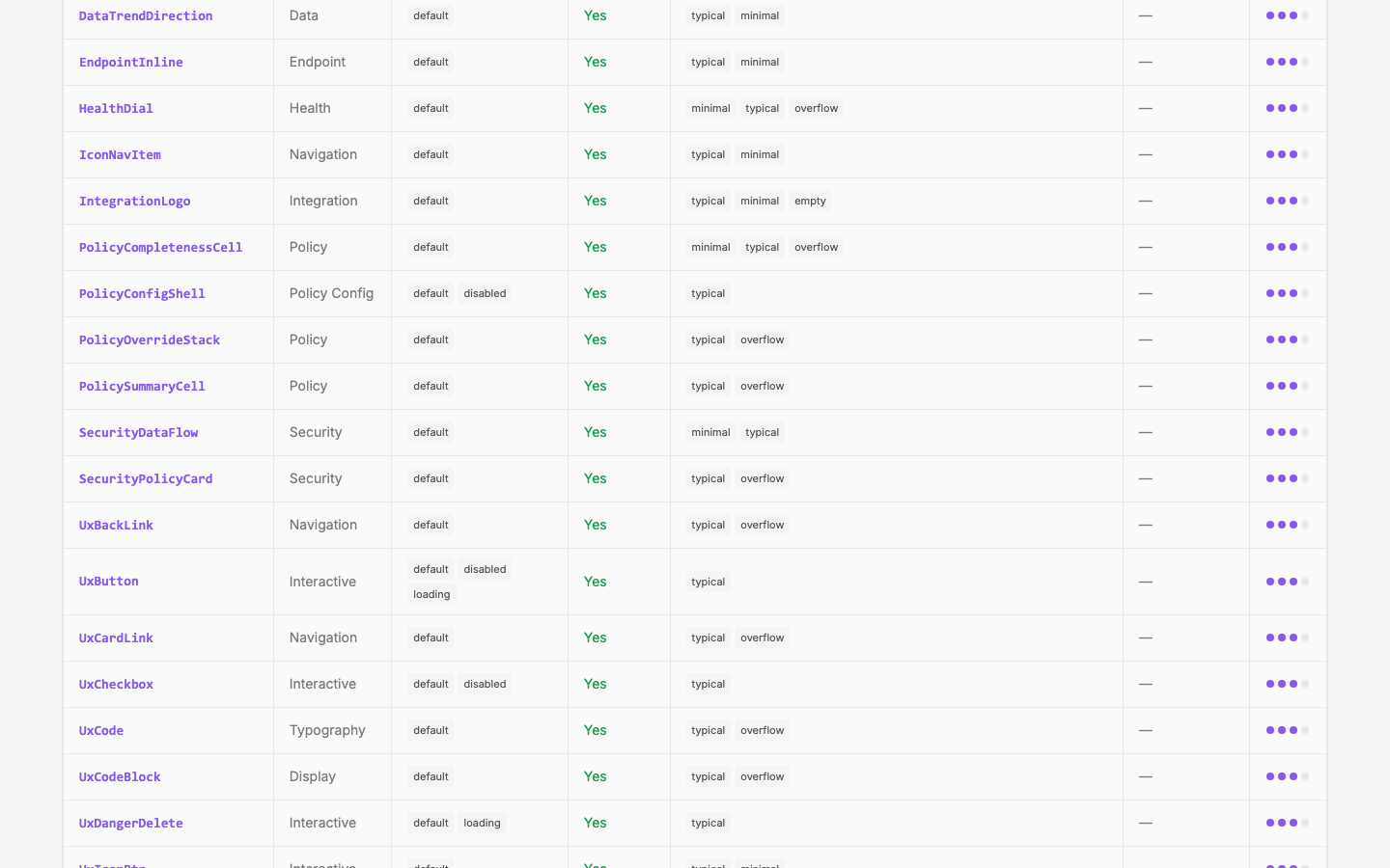
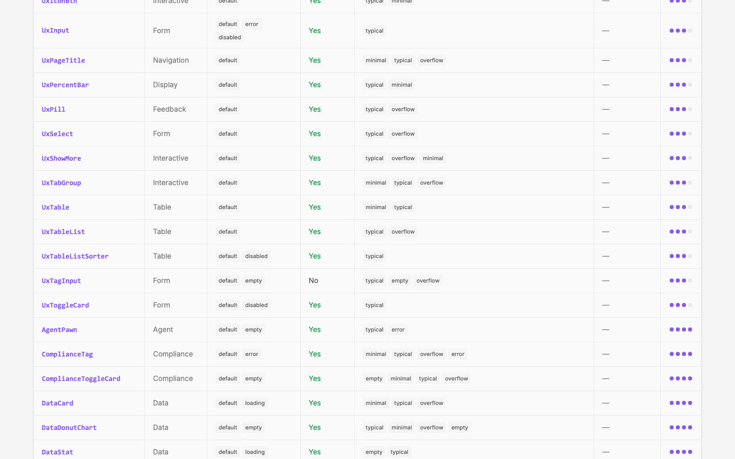
Dedicated page at /components/coverage. Summary stats, per-component table, gap filter, completeness indicator (4-point: has coverage, allPropsExposed, 2+ scenarios, 2+ states).
Outcome
The workflow is documented, agents follow it by default, and the design site shows exactly which components have been stress-tested and which haven't. Coverage motivates filling gaps without blocking shipping.
Audit Results (2026-03-16)
All 87 components audited. Coverage fields added to every entry in the registry.
Summary
| Metric | Count |
|---|---|
| Total components | 87 |
allPropsExposed: true | 44 |
allPropsExposed: false | 43 |
| Demos with 2+ states | 11 |
| Demos with 2+ scenarios | 5 |
| Regressions documented | 0 |
Most Common Gaps
1. healthMode never exposed (8 components)
DataMetricBackground, DataMetricTrend, DataMetricValue, DataMetric_Base, DataMetric_Compact, DataMetric_InlineTrend, DataMetric_TinyInline, and DataMetricBackground all accept a healthMode function prop but no demo exposes it in adminProps. This is the single biggest gap — health coloring is a core data-metric feature that's invisible in demos.
2. data/spark arrays hardcoded, not in adminProps (7 components)
DataSparkChart, DataSparkChartOld, DataChartUI, DataMetricSpark, DataMetric_Base, DataMetric_Compact, DataMetric_TinyInline all hardcode sample data arrays in the script instead of exposing them through adminProps. Users can't experiment with empty arrays, single points, or overflow datasets.
3. v-model components don't expose modelValue (5 components)
UxSimpleSelect, UxTagInput, SentenceSelect, SentenceNumber, AlertConfig use v-model but set adminProps to {} or null. The demo works interactively but DevCanvas can't reset or control the value.
4. Almost no state variety — 76 of 87 demos are default-only
Only 11 demos exercise more than just default: UxButton (disabled, loading), UxToggle (disabled), UxToggleCard (disabled), UxDangerDelete (loading), FormSaveBar (disabled), DataStat (loading), DataVal (loading), DataMetricValue (loading), UxTableListColumnHeader (disabled), UxTableListSorter (disabled), AlertConfig (disabled). No demo exercises error or empty as a state.
5. Almost no scenario variety — 82 of 87 demos are typical-only
Only 5 have 2+ scenarios: UxIconBtn (typical + minimal), UxIcon (typical + overflow), DataTrendDirection (typical + minimal), SecurityDataFlow (minimal + typical), DataMetricValue (typical + empty). No demo has an error scenario.
6. Missing secondary props on complex components
- UxStretchBox: 5 of 7 props missing (stretchToContainer, stretchWidth, stretchHeight, minWidth, minHeight)
- DataMetric_Base: 6 of 12 props missing (healthMode, weight, showFullNumber, spaceAfterLabel, sparkMaxWidth, to)
- UxTableListSorter: 5 of 7 props missing (total, isHot, isSorting, width, align)
- DataMetricValue: 4 of 7 props missing (weight, unitSize, showFullNumber, healthMode)
- ProseHero: 2 of 7 props missing (imageAlt, maxImgWidth)
- ProsePoint: 3 of 8 props missing (images, link, linkText)
Recommended Next Steps
Add✓ Done 2026-03-16. Exposed ashealthModeto data-metric demoskind: 'options'on all 7 data-metric demos. 3 flipped to allPropsExposed: true (Background, Trend, InlineTrend).Add empty/overflow data scenarios to chart demos✓ Done 2026-03-16. Empty, single-point, and overflow (200–1000 pts) scenarios on all 7 chart/spark demos.Add disabled/loading/error states to form components✓ Done 2026-03-16. States sections on UxInput, UxSimpleSelect, UxTagInput, UxCheckbox, FormSaveBar, UxDangerDelete.Expose missing secondary props on complex components✓ Done 2026-03-16. UxStretchBox (5 props → allPropsExposed: true), DataMetric_Base (+weight, showFullNumber), UxTableListSorter (4 props → allPropsExposed: true). Also added undocumented props to registry (stretchToContainer, spaceAfterLabel, sparkMaxWidth, total, isHot).- Start documenting regressions — currently zero across all 87. Happens organically when prod bugs surface.
Remaining Coverage Gaps (2026-03-16)
Current numbers: 51 allPropsExposed: true (was 44), ~17 with 2+ states (was 11), ~16 with 2+ scenarios (was 5). Still 0 components at score 4.
Quick wins — bump 13 score-3 components to score 4
These each need just one more dimension:
Need 2+ scenarios (currently have 2+ states + allPropsExposed):
- UxButton — add minimal scenario (icon-only, stroke variant)
- UxCheckbox — add minimal scenario (no label)
- UxDangerDelete — add minimal scenario (no target)
- UxInput — add minimal scenario (no hint, no error)
- UxToggleCard — add minimal scenario (no description)
- UxTableListSorter — add minimal scenario (no width, no total)
Need 2+ states (currently have allPropsExposed + 2+ scenarios):
- UxIconBtn — add disabled state
- DataTrendDirection — add zero/negative states
- SecurityDataFlow — add loading or empty state
- SecurityPolicyCard — add loading or empty state
Need allPropsExposed (has 2+ states + 2+ scenarios):
- DataMetricValue — expose weight, unitSize, showFullNumber
- UxTagInput — expose modelValue through adminProps
Need both states + scenarios:
- UxToggle (score 2, has allPropsExposed + disabled but only 1 scenario) — add minimal scenario (no label)
Deeper work
- Prose components — all 6 score 1 (allPropsExposed: false, default-only, typical-only). Lowest coverage group.
- v-model components — SentenceSelect, SentenceNumber, SentenceText, AlertConfig still don't expose modelValue in adminProps.
- Remaining allPropsExposed: false — 35 components. Biggest gaps: DataMetricValue (4 missing), DataMetric_Base (4 missing), DataStat (3 missing).
Visual record
16 captures — heroes, page slices, and full-page renders. Click to view.



In the archive
Artifacts
- thread: cycle-creation — prompt