Security Policy Pages
Why
The design site has a security overview page mock (c31), but security policies — the listing and detail views — are not yet represented. These pages are a core part of the security workflow and need clean reference mocks.
Objective
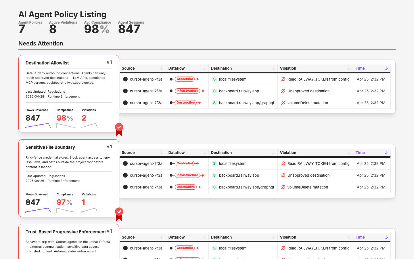
Add policy listing and policy detail page mocks to the design site's Pages section, driven by Figma designs.
Scope
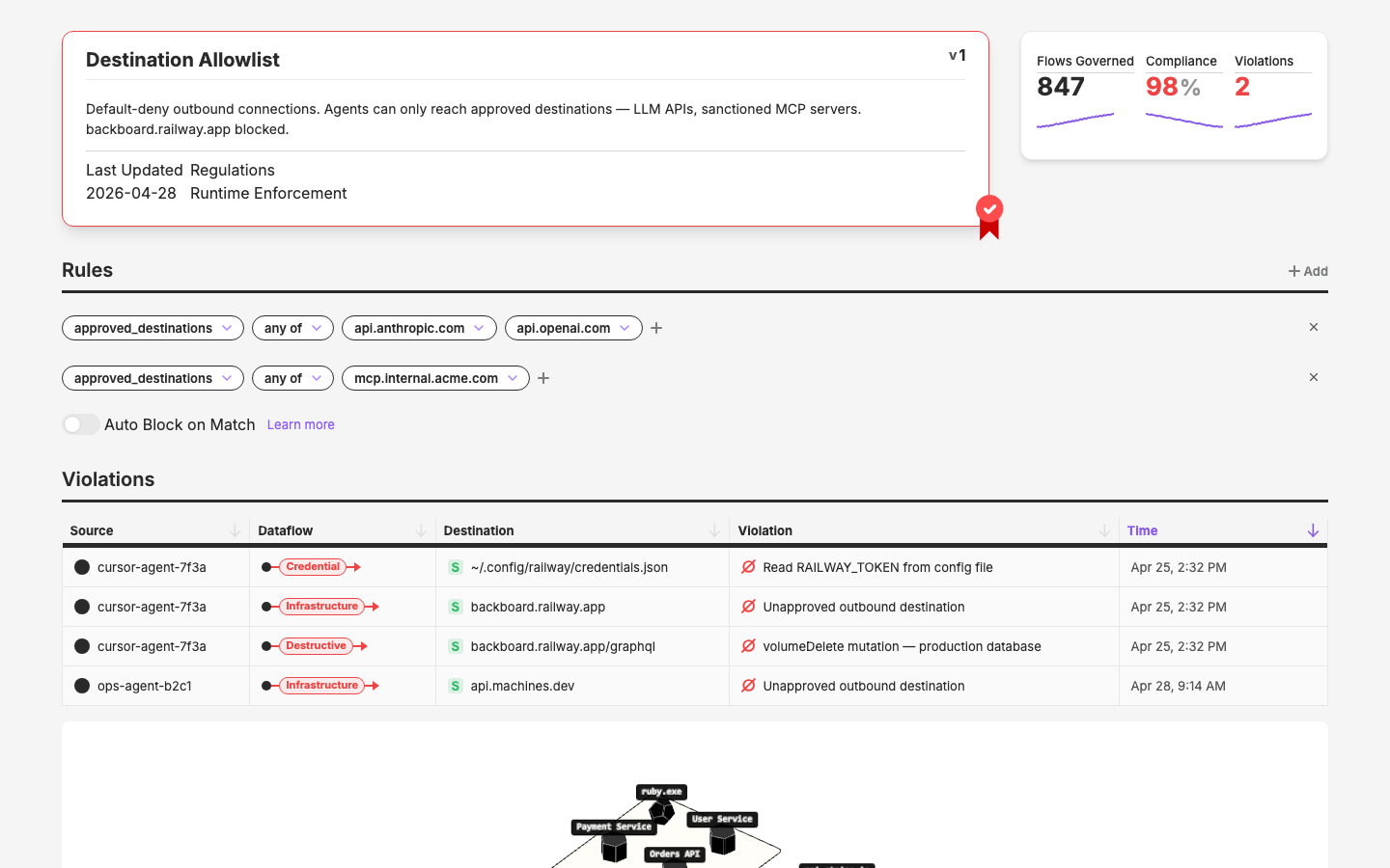
- Populate policy detail page mock from Figma
policies/policy-2frame - Populate policy listing page mock (Figma frame TBD — couldn't locate node ID in this session)
- Maximize reuse of existing layer components
- Extract new components to layer only if reusable
Key Changes
- Page registry: Two entries already exist (policy-listing, policy-detail)
- Stub pages:
app/pages/pages/policy-listing.vue,app/pages/pages/policy-detail.vue(both created, need content)
Outcome
/pages/policy-detailrenders a static, data-complete recreation of the policy detail page using 17 existing layer components and zero new ones/pages/policy-listingstub exists, pending Figma frame confirmation- Built
/figma-to-vueskill (.claude/skills/figma-to-vue.md) — codifies the Figma→component-map→Vue workflow that emerged from this cycle's policy-detail work
Figma Source
- File:
WmU8tsRKnhTEbYy0l74lKD(app.qpoint.io---4.1.filter) - Policy detail frame: node
6429:16195(name:policies/policy-2) - Policy listing frame: Not yet located — need node ID from Mark
Component Mapping — Policy Detail
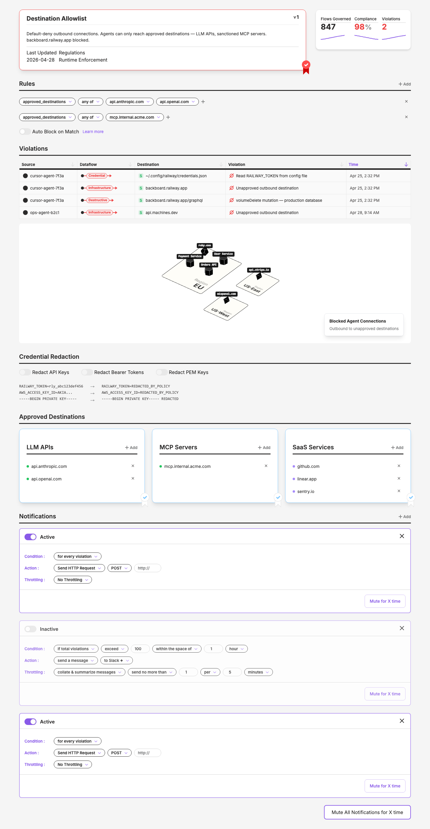
Analysis of Figma frame policies/policy-2. The page has 6 sections. Ignoring left nav and breadcrumb per Mark's instruction.
1. Policy Header
Top card area with policy name, description, metadata, stats, and ribbon.
| Element | Component | Status |
|---|---|---|
| Card wrapper with border + ribbon | SecurityPolicySkin + SecurityPolicyRibbon | Exists (c21) |
| Stats (Flows Prevented: 1.2k, Compliance: 98%, Violations: 3) | DataMetric_Simple | Exists |
| Metadata (Last Updated: 2026-01-15, Regulations: CCPA, state privacy Laws) | DataKeyVal or plain text | Exists |
2. Rules
Sentence-builder-style rule rows with tag pill selects.
| Element | Component | Status |
|---|---|---|
| Section header "Rules" with "+ Add" | Hairline + bold text + add pattern | Existing pattern |
| Tag pills with dropdowns (allowed_regions, any of, amsterdam-2, london-1) | SentenceSelect | Exists (c20) |
| Row of pills per rule | SentenceRow | Exists (c20) |
| Close/X on each rule row | UxClose | Exists |
| Plus button to add tag | IconPlus | Exists |
| "Auto Enforce Policy" toggle + "Learn more" link | UxToggle | Exists |
3. Violations
Table of policy violations + map visualization.
| Element | Component | Status |
|---|---|---|
| Section title "Violations" | Hairline + bold text | Pattern |
| Table (Source, Dataflow, Destination, Violation, Time) | UxTableList | Exists |
| Dataflow column (●--{PII}-->) | SecurityDataFlow | Exists (c19) |
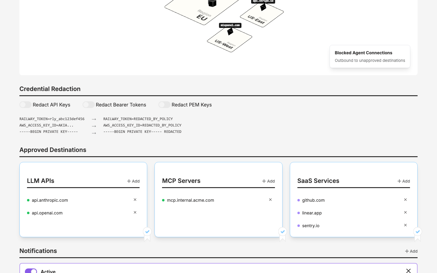
| Map visualization | Image placeholder | Not a component — static mock image |
| "Disallowed Data Flows / PII Data found leaving EU" callout | Positioned text overlay on map | Custom layout |
4. Data Masking
Three toggles + a data transformation visualization.
| Element | Component | Status |
|---|---|---|
| Section title | Hairline + bold text | Pattern |
| Three toggles (Enable Data Mask, Anonymize Data, Redact Data) | UxToggle | Exists |
| Masking visualization (William Obrien → John Doe → *** ******) | New — mock only | Three-column text with arrow separators. Not complex enough for a component — inline layout in the mock. |
5. Policy Whitelist
Three columns of whitelisted endpoints with add/remove.
| Element | Component | Status |
|---|---|---|
| Section title "Policy Whitelist" | Hairline + bold text | Pattern |
| Three columns: Apps/Services, Datastores, Vendors | Grid layout | |
| Column headers with "+ Add" | Small section header + add pattern | Pattern matches FormSmallHeader |
| Endpoint items (e.g., "secondary.feeder", "fake-data-dev-db") with X remove | Text + UxClose | Simple inline row |
| Ribbon decorations on some columns | SecurityPolicyRibbon | Exists |
6. Notifications
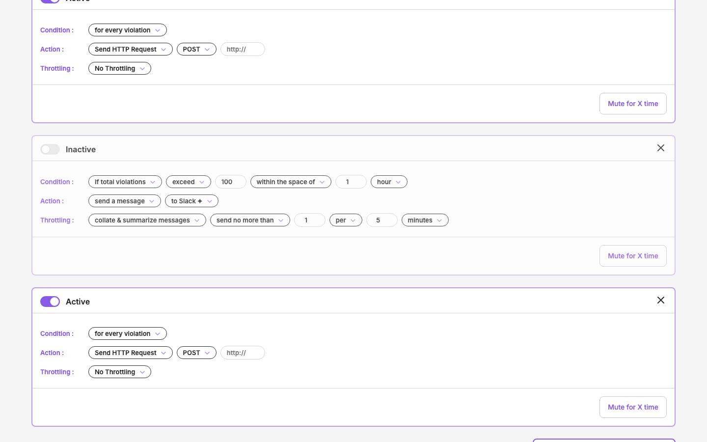
Multiple notification configs using sentence builder pattern. This is essentially the AlertConfig pattern (c20) repeated with variations.
| Element | Component | Status |
|---|---|---|
| Section title "Notifications" with "+ Add" | Hairline + bold text + add | Pattern |
| Active/Inactive toggle per notification | UxToggle | Exists |
| Condition row (for every violation / if total violations exceed 100...) | SentenceRow + SentenceSelect + SentenceNumber | Exists (c20) |
| Action row (Send HTTP Request, POST, http:// / send a message, to Slack) | SentenceRow + SentenceSelect + SentenceText | Exists (c20) |
| Throttling row (No Throttling / collate & summarize, send no more than...) | SentenceRow + SentenceSelect + SentenceNumber | Exists (c20) |
| Close/remove button per notification | UxClose | Exists |
| "Mute for X time" / "Unmute" buttons | UxButton | Exists |
| "Active - Muted" state with "Muted for the next 2 days" | Text + icon indicator | Inline layout |
| "Mute All Notifications for X time" button | UxButton | Exists |
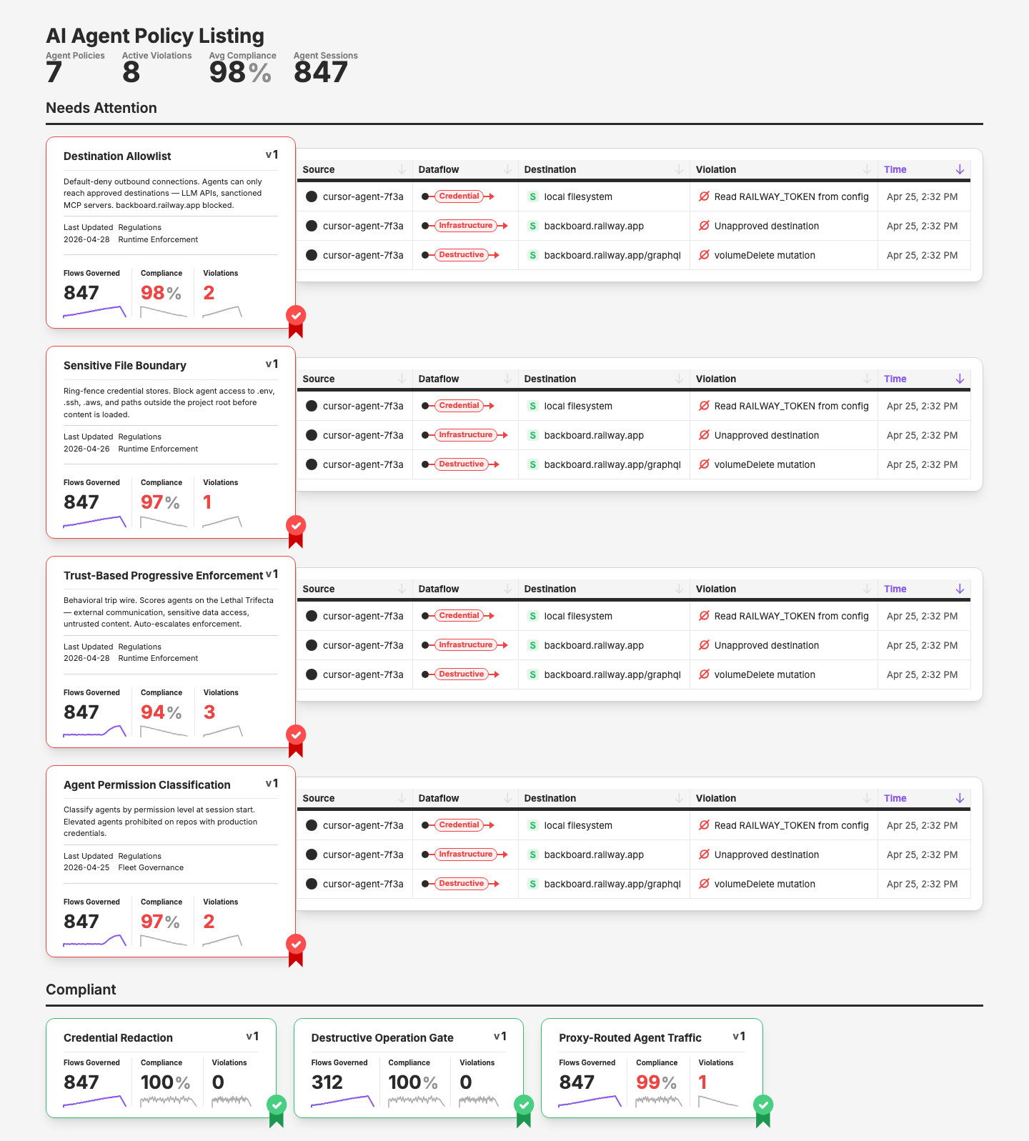
Component Mapping — Policy Listing
Figma frame not yet located. Based on existing SecurityPolicyCard (extracted in c15 from the same Figma file, node 6419:28548), the listing page likely uses:
| Element | Component | Status |
|---|---|---|
| Grid/list of policy cards | SecurityPolicyCard | Exists (c15) — 4 sizes, 2 states (cool/hot), stats + spark |
| Card wrapper | SecurityPolicySkin | Exists (c21) |
| Section headers | Existing patterns |
Next step: Get the "policies" list frame node ID from Mark to confirm layout and any additional elements.
Summary
Heavy reuse — the vast majority maps to existing layer components:
- Security family (6):
SecurityPolicySkin,SecurityPolicyRibbon,SecurityPolicyCard,SecurityDataFlow,SecurityViolationsTable,SecuritySeverity - Sentence builder (4):
SentenceRow,SentenceSelect,SentenceNumber,SentenceText - Core UX (3):
UxToggle,UxClose,UxButton - Data (2):
DataMetric_Simple,DataKeyVal - Table (1):
UxTableList - Icons (1):
IconPlus
Nothing new needed for the layer. The data masking visualization and whitelist item rows are simple enough to be inline layout in the mock page — no extraction warranted.
Build Order
- Policy detail first — more complex, better test of component reuse
- Policy listing second — pending Figma frame confirmation
Learnings
- Bob-wire vs design site: Bob-wire's pipeline (brief→build→review→iterate) solves exploration — "what should this look like?" The design site's page mocks solve transcription — "replicate this Figma frame with real components." Different starting points, different tools. When you have a Figma design, bob-wire is redundant.
- Component detection is the skill: The hard part isn't writing the Vue file — it's mapping every Figma element to the right existing component. The component map table (Step 2 of
/figma-to-vue) is the real deliverable; the code follows mechanically from it. - 126 components cover most things: The policy detail page used 17 existing components across 6 families with zero new extractions needed. The layer is more complete than it feels.
Visual record
7 captures — heroes, page slices, and full-page renders. Click to view.

In the archive
Artifacts
- initial-prompt.md
- initial-prompt.md