Sharing Our Work Thus Far
Communicate the new app.qpoint.io architecture and q-nuxt-layer to colleagues
Why
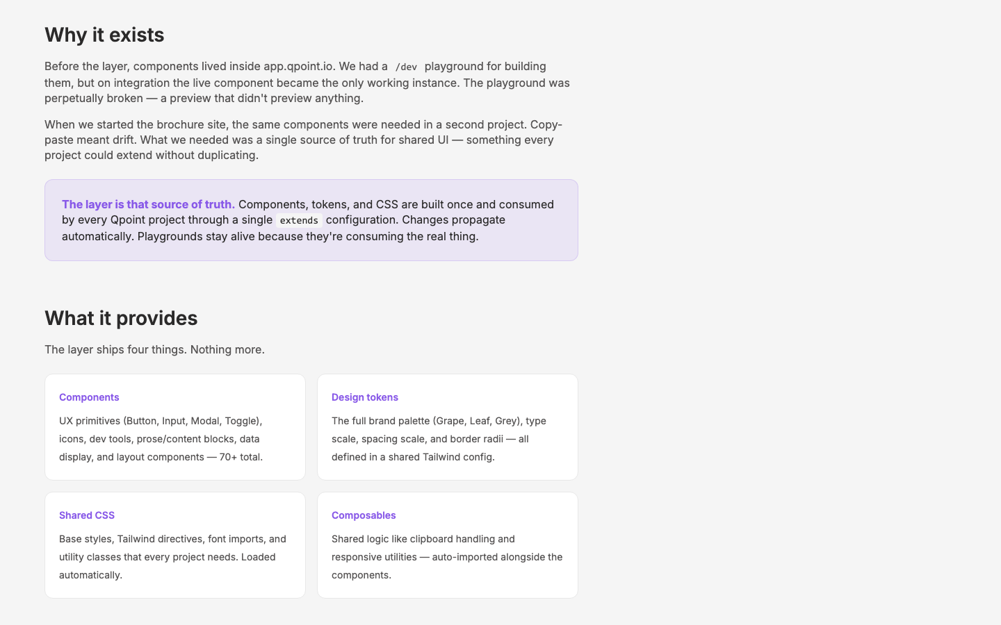
Colleagues need to understand the structural changes we've made to app.qpoint.io and the shared component layer. The old pattern — develop a component in the /dev playground, then integrate it into the app where the live instance became the only working copy — was brittle and usually broken. We've replaced it with something fundamentally better, and the team needs to see the logic and benefits.
Objective
Create clear internal communication (async walkthrough, documentation, or presentation) explaining the q-nuxt-layer architecture and why it matters.
Scope
Key points to communicate:
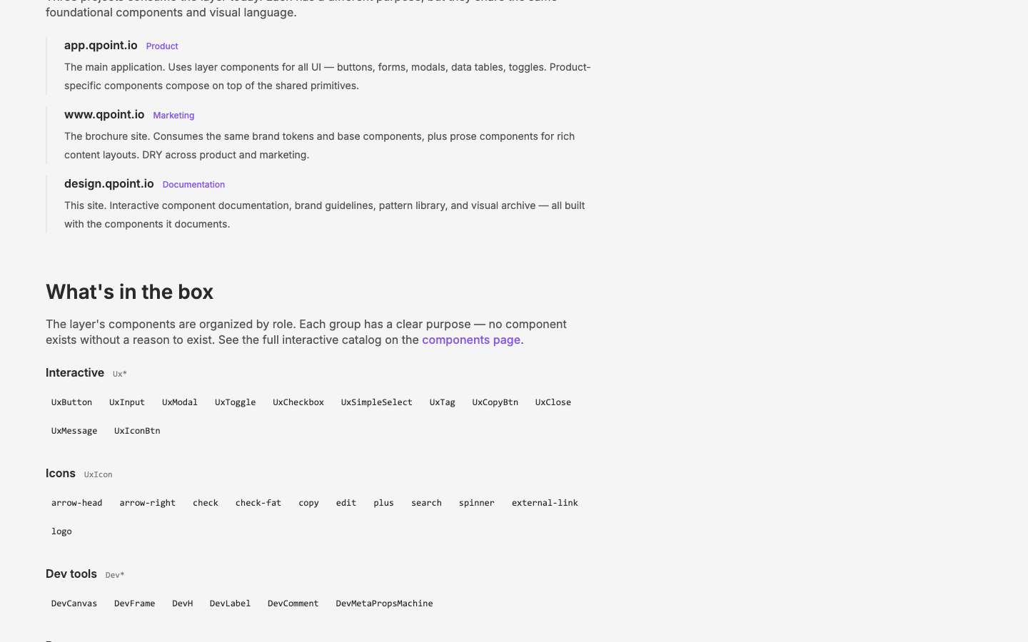
- Composition pattern: Components are built once in the layer, then used as compositional building blocks across app.qpoint.io, www.qpoint.io, and the design site
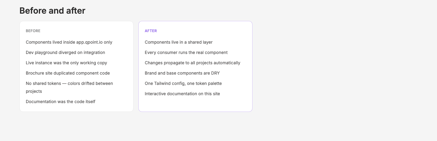
- Why the old pattern failed: The dev playground diverged from production — on integration, the live component became the only working instance, so the playground was perpetually broken
- DRY across projects: The brochure site consumes the same brand and base components as the app — no duplication
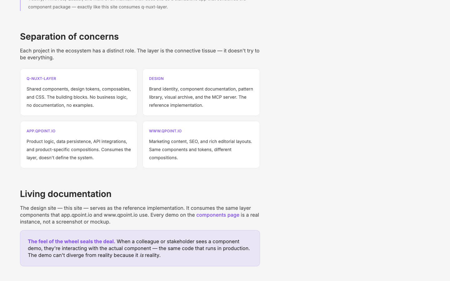
- Living demos: The brochure site instantiates real components for mini demos — "the feel of the wheel seals the deal"
- Clean documentation: design.qpoint.io provides interactive component docs, pattern examples, and brand guidelines
- Separation of concerns: Layer (shared components/tokens), design site (documentation/brand), app (product), www (marketing) — each has a clear role
Key Changes
- New page:
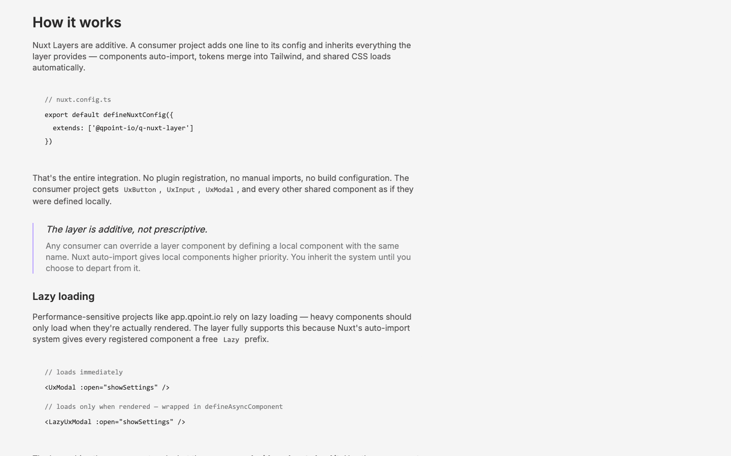
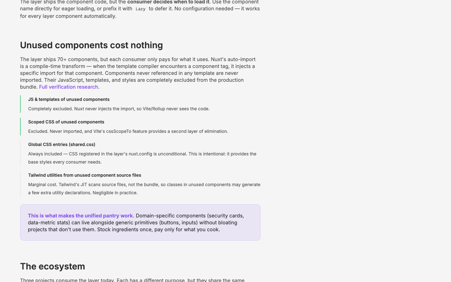
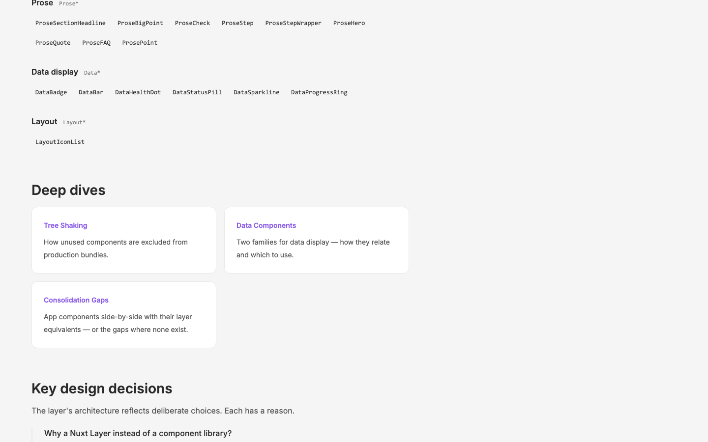
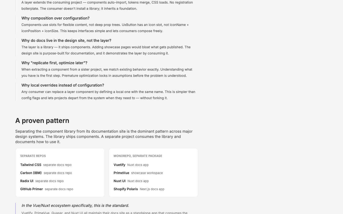
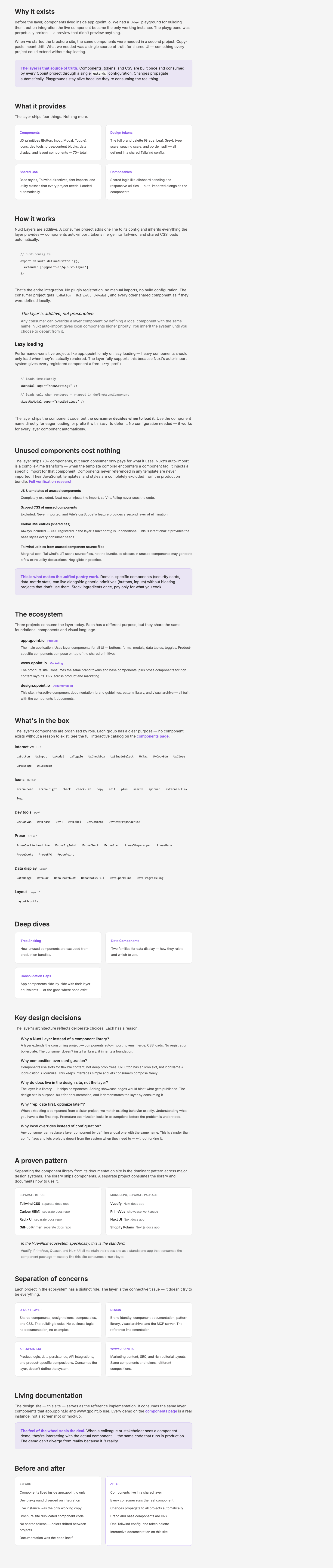
/layer— 8-section documentation page covering why the layer exists, what it provides, how it works, the ecosystem, component inventory, key design decisions, separation of concerns, and before/after comparison - Lazy loading subsection — documents that the layer fully supports Nuxt's
Lazyprefix for on-demand component loading, important for app.qpoint.io's performance requirements - Icon documentation updated — phased out references to old
Icon*render-function components across the site in favor of<UxIcon id="..." />as the standard pattern. Updated layer page, components page, and component registry. - UxTableList empty-state fix — removed hardcoded
<img>referencing a consumer-specific SVG (assets/images/.../sine-long.svg) from the layer'sUxTableListcomponent, replaced with a<slot name="empty">defaulting to "No Records". This was blocking the/componentspage and violated the principle that layer components can't depend on consumer assets. - Nav link added — "Layer" added to AppNav between Method and Components
Outcome
/layer page communicates the architecture, its benefits over the old pattern, and links to the interactive component catalog. Icon documentation is current. The UxTableList empty-state bug (from c3's "kept as local" workaround) is resolved — consumers can now provide custom empty states via the #empty slot.
Visual record
9 captures — heroes, page slices, and full-page renders. Click to view.
Artifacts
- thread: c16-initial — prompt