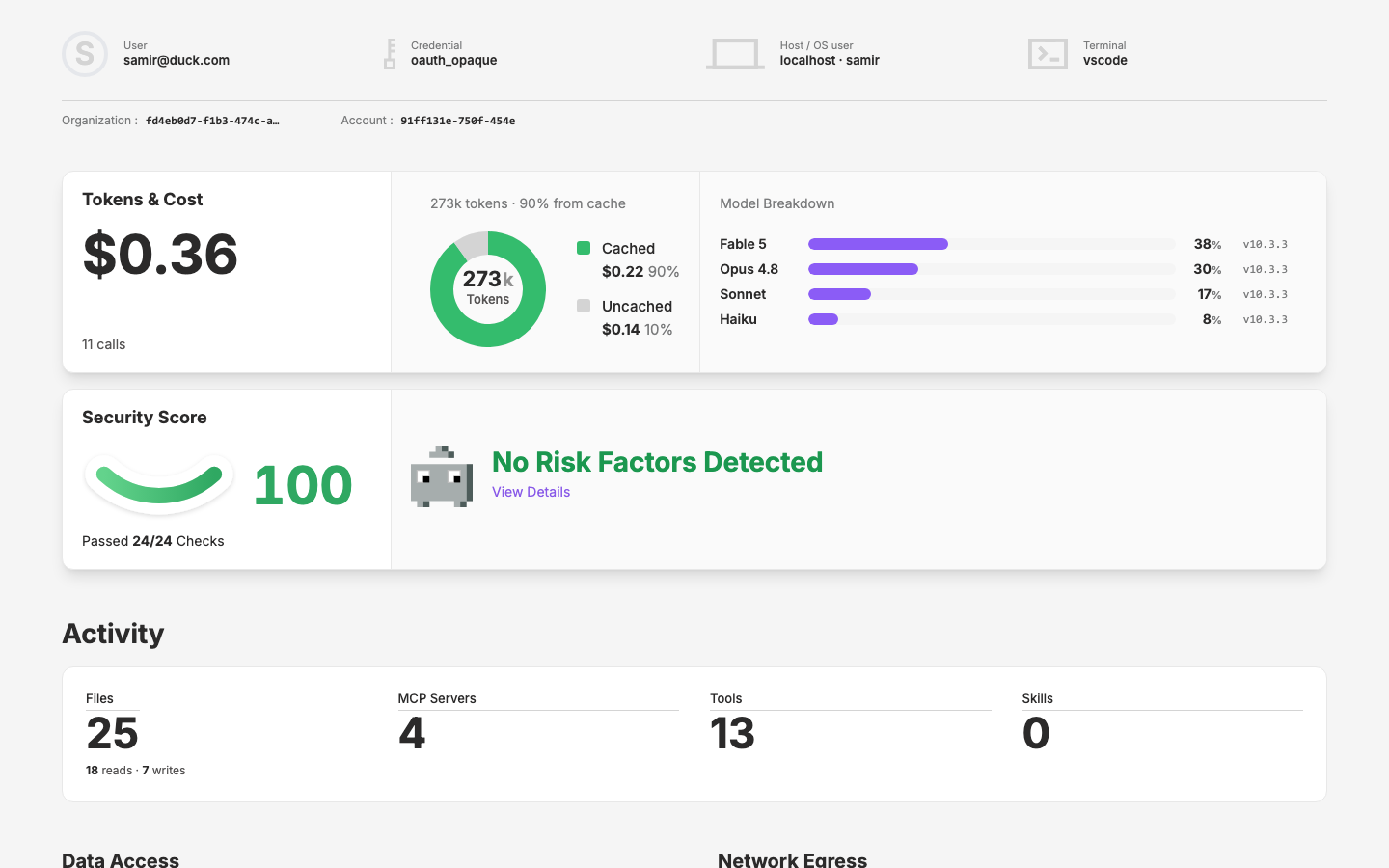
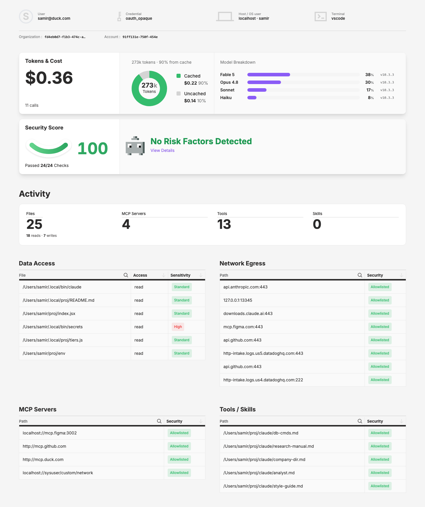
Agent Details Page
Build new component library for the rich agent details page design
Why
The agent details page (app.qpoint.io/inventory/agents/:id) has been designed with rich, composable data visualizations. The design site is building the new components needed to support this page: DataCard for flexible metric display, HealthDial for status visualization, and DataSmile for symmetric score gauges. These components are foundational for all upcoming inventory and security pages.
Objective
Complete and document the display components (DataCard, HealthDial, HealthDialSummary, DataDonutChart, and DataSmile) with full prop APIs, demo pages, and coverage specs. Ensure the agent-detail page works as a reference implementation. Optionally move these to the layer if they're reused across security pages.
Scope
Completed:
DataCard— Flexible metric card with optional title, description, data value, unit, and details slot. Supports large number abbreviation, custom value slot, and loading state.HealthDial— Status indicator dial with four states (cool, warn, warm, hot). Used in security scores and system health contexts.HealthDialSummary— Summary variant pairing health dials with labels and thresholds.DataDonutChart— Donut/pie chart (hand-rolled SVG) with a center slot and a swatch legend, driven by an array of{title, percent, html?, color?}items. For part-to-whole breakdowns like cached vs. uncached token spend. Lives in the layer (components/data/DonutChart.vue).DataSmile— Articulating SVG "smile" gauge for 0–100 scores (security score, health grade). Driven by value with color ranges (default red/orange/green); smooth transitions and optional numeric readout override via default slot. Lives in the layer (components/data/Smile.vue).
Pages affected:
app/pages/pages/agent-detail.vue— Primary demo/reference page for the component suite
Design site references:
app/pages/components/_demos/DataCard.vue— Interactive demo with scenarios and slotsapp/pages/components/_demos/HealthDial.vue— Interactive demo with status variantsapp/pages/components/_demos/HealthDialSummary.vue— Summary variant demoapp/pages/components/_demos/DataDonutChart.vue— Interactive demo with scenarios and slotsapp/pages/components/_demos/DataSmile.vue— Interactive demo with scenarios and slotsapp/data/component-registry.ts— Component metadata and grouping
Figma source:
- Agent details design frames in the app.qpoint.io project
Key Changes
- ✓ Created
DataCard.vuedemo with full prop coverage (title, data, description, size, weight, showFullNumber, slots) - ✓ Created
HealthDial.vuedemo with four status states - ✓ Created
HealthDialSummary.vuedemo - ✓ Implemented
agent-detail.vuereference page using both components - ✓ Registered components in
page-registry.ts(Agent Detail entry, inventory group) - ✓ Created
DataDonutChartin the layer (components/data/DonutChart.vue) — hand-rolled SVG donut driven by an array of{title, percent, html?, color?}items, with a swatch legend and a center that defaults toDataMetricValue(auto-abbreviated, e.g. 273000 → "273k") plus an optional label; auto token palette (green → grey → grape…) with optional per-item override. Props:items,size,thickness,gap,legendBelow(legend below in a horizontal row vs. beside),centerValue/centerUnit/centerLabel/centerSize;#centerslot overrides the default. Demo +data-group registry entry on the design site.- Refinements: switched segments from dashed full-circles to discrete
<path>arcs to kill the dash-seam spike at 12 o'clock; fixed invisible legend swatches (w-3.5/h-3.5aren't in the generated CSS → inline 14px size); tightened the center value/label spacing (-mt-1); tuned defaults tosize:135, thickness:24, gap:0, centerSize:23.
- Refinements: switched segments from dashed full-circles to discrete
- ✓ Created
DataSmilein the layer (components/data/Smile.vue) — Articulating SVG smile gauge for 0–100 scores with value-driven control point, color range bands, and smooth transitions; full prop API (value, size, showValue, ranges); demo with interactive adminProps, scenarios (0/20/50/100 edge cases, custom ranges), and slot override; registry entry indatagroup on the design site.- Final geometry: true circular arc (segment of a circle) through two fixed endpoints, not a quadratic Bézier. Radius derived from the chord + signed sagitta;
value0/50/100 → frown/flat/smile. - Added
curveprop (max bend, default 78) plus demo slider to control curvature. - Three strokes share the arc: white background (thick halo), light track, and gradient fill clipped to
value% viapathLength. - Refinements this session: shadow no longer clips (SVG
<filter>set tofilterUnits="userSpaceOnUse"over the viewBox — % default region collapses on a near-flat path); gradient set togradientUnits="userSpaceOnUse"so the fill stays visible at low curve (objectBoundingBox gradient fails on a ~zero-height bbox); fixed apathLengthcasing typo (kebabpath-lengthwas ignored, breaking the progress fill); empty state at value 0 now renders no fill (a round cap turned a zero-length dash into stray dots); viewBox now snugly wraps the current curve so the smile is vertically centered with no wasted top space and the shadow never clips.
- Final geometry: true circular arc (segment of a circle) through two fixed endpoints, not a quadratic Bézier. Radius derived from the chord + signed sagitta;
- ✓ Integrated
DataSmileintoagent-detail.vueSecurity Score card, replacing theHealthDialstand-in (optional swap completed) - ✓ Integrated
DataDonutChartintoagent-detail.vuefor token cache breakdown - ✓ Agent details page full build-out —
design/app/pages/pages/agent-detail.vuenow complete with: identity row (IdentityItem components), org/account summary, "Tokens & Cost" DataCard (with donut + model breakdown in#detailspanel), "Security Score" DataCard (with DataSmile gauge), consolidated "Activity" surface panel (four DataMetric_Base metrics: Files, MCP Servers, Tools, Skills), and "Permissions & access" 2×2 grid of PermissionTable components (Data Access, Network Egress, MCP Servers, Tools/Skills). - ✓ DataCard layer enhancements (additive, no breaking changes):
- Added
#descriptionnamed slot — overrides thedescriptionprop when present; falls back to prop when absent. - Added optional
minWidth(Number) prop — applies min-width (px) to the card's left content section for consistent alignment across multiple cards.
- Added
- ✓ New site component:
PermissionTable.vue— Reusable labeled-list table built on the full UxTableList suite (UxTableListColumnHeader → Sorter/Search) with UxPill status badges and UxTableListExpandRow rows that open details in place (white bg-surface detail card). Props:title,columns({name, key, width?, search?, pill?}),rows. Includes lightweight click-to-sort and type-to-filter. Used 4× on the agent-detail page for permission grids. - ✓ New site component:
IdentityItem.vue— One cell of the identity row: a generic leading-visual slot +label/value. Refactored the agent-detail identity row from av-forloop into four hard-coded<IdentityItem>instances (User avatar circle, Credential, Host/OS user, Terminal); the leading slot takes either an avatar circle or a bare icon. - ✓ New layer icons + identity-row wiring — Added
key,laptop,terminalSVGs to the layer (assets/icons/) and rendered them in the identity row via<UxIcon>(key usesfilled; laptop/terminal are stroke icons). - ✓ New semantic token
content-subtler(grey-300) — Added to the layer token pipeline (tokens/semantic.mjs→ regeneratedassets/css/tokens.css, mapped intailwind.config.jsastext-content-subtler). Applied to the identity-row icons and avatar circle. Light/dark both#D4D4D4. - ✓ New layer component family: Pixel Pawns —
PawnAgent(first of the c47 set) —q-nuxt-layer/components/pawn/Agent.vue→<PawnAgent>. Props:state(default'angel'),provider(optional logo overlay, e.g.anthropic),size(px). Loads multicolor SVG art fromassets/pawns/<entity>/<state>.svg(+assets/pawns/providers/) via an eager?urlglob and renders<img>— deliberately not routed throughUxIcon, which would forcecurrentColorand destroy the colors. Provider logo is an absolutely-positioned overlay. Placeholder SVGs in repo pending Illustrator exports. Design site: newpawnregistry group ("Pawns") +PawnAgententry +_demos/PawnAgent.vue(state/provider/size controls, missing-art fallback scenario). Integrated into the agent-detail Security Score card.
Outcome
In progress.
The display components (DataCard, HealthDial, HealthDialSummary, DataDonutChart, DataSmile) are implemented in the layer with interactive demos and registry entries, and the agent-detail.vue reference page composes them as a working mock.
This session: Built out the full agent-detail page mock with all supporting surfaces (identity, tokens/cost, security score, activity, permissions). Added two new site components (PermissionTable on the UxTableList suite; IdentityItem for the identity row) and two additive DataCard enhancements (#description slot, minWidth prop). Wired DataDonutChart, DataSmile, and DataMetric_Base into the page. Added three layer icons (key/laptop/terminal) and a new content-subtler (grey-300) semantic token. Kicked off the Pixel Pawns component family with PawnAgent — the first reusable entity-pawn component in the layer — with placeholder art, a demo, and a new pawn registry group.
Still open: replace the PawnAgent placeholder SVGs with the real Illustrator exports (and tune provider-overlay placement); build the remaining c47 entity pawns + agent states; per-table detail content for PermissionTable; possible promotion of PermissionTable/IdentityItem to the layer if reused; deciding whether the DataCard shadow should be optional; layer release to propagate the new token/icons/pawn to production consumers.
Visual record
2 captures — heroes, page slices, and full-page renders. Click to view.