agent-mini-card
AgentMiniCard — compact agent summary card composing the AgentPawn, with mock page
Why
c57 gave the agent pawn its state system; the reference design (shared 2026-07-26) shows the first real composition around it — a compact inventory card with the pawn's status at a glance, workspace/provider identity, request/file stats in pixel-frame icons, tools & skills, and navigation links. This is the pattern agent inventory surfaces will build on.
Objective
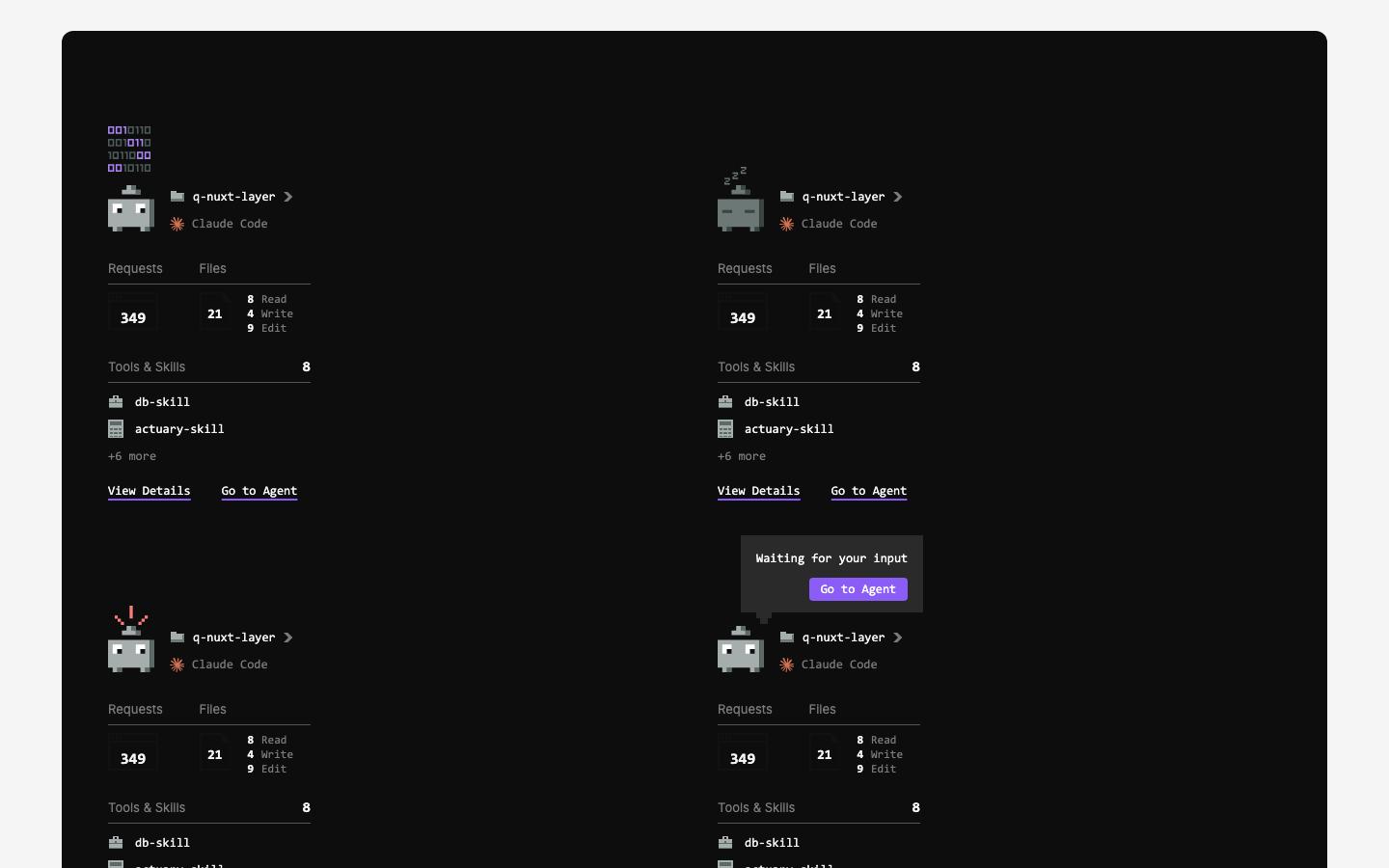
AgentMiniCard and AgentInputBubble in the layer's agent group, executing the reference design, plus a /pages mock (agent-mini-cards) showing the four designed states (working, idle, errored, needs-input) on a dark canvas. Missing pixel icons are hand-authored placeholders that Illustrator exports replace by filename.
Scope
q-nuxt-layer/assets/svgs/pixel-icons/— folder, browser-frame, page, briefcase, calculator (placeholder art)q-nuxt-layer/components/agent/InputBubble.vue,MiniCard.vueapp/pages/pages/agent-mini-cards.vue+app/data/page-registry.tsapp/pages/components/_demos/AgentMiniCard.vue,AgentInputBubble.vue+app/data/component-registry.ts
Key Changes
q-nuxt-layer/assets/svgs/pixel-icons/— 5 hand-authored placeholder pixel SVGs (folder, browser-frame, page, briefcase, calculator) in the pawn palette; Illustrator exports replace them by filenameAgentInputBubble(components/agent/InputBubble.vue) — dark callout with mono text, violet action button (emitsaction), stepped pixel tail; fixed dark styling to match the dark-first pixel artAgentMiniCard(components/agent/MiniCard.vue) — composes AgentPawn (+ built-in AgentInputBubble on needs-input, re-emitted asgo-to-agent), pixel folder row + inline registry-resolved provider row (deliberately not AgentAvatar, whose bold chip styling is for table cells), Requests/Files counts overlaid on pixel-frame icons, Tools & Skills list, View Details / Go to Agent links; semantic theme tokens so it renders via adark-classed canvas- Mock page
/pages/agent-mini-cards— 4 cards (working, idle, errored, needs-input) on a near-black canvas + page-registry entry (inventory group) - Demos + registry entries for both components under the
agentgroup - Explicit-width fix: converted all arbitrary-value Tailwind sizing/positioning in the agent components to inline styles — the consumer's Tailwind scan doesn't reliably cover layer files, so those classes silently got no CSS (icons rendered full-width). Gotcha recorded in memory and MEMORY.md
- Rescaled to match the design after side-by-side review: card 300→210px, pawn 72→48, browser frame 84→52px, page 42→28px, tighter type/spacing, bubble padding/tail scaled down
Outcome
Card and bubble shipped in the layer's agent group, matching the reference design at design scale, with the /pages/agent-mini-cards mock and component demos live. Two review rounds against the design (explicit widths, then overall scale) landed the fixes above.
Carries forward: the 5 pixel icons are my placeholders — Mark's Illustrator exports swap in by filename. Layer release (0.6.0) pending.
Learnings: no arbitrary-value Tailwind classes in layer component templates (see Key Changes); side-by-side build-vs-design comparison caught scale drift that looked fine in isolation.
Visual record
1 captures — heroes, page slices, and full-page renders. Click to view.
In the archive
Artifacts
- initial-prompt.md
- initial-prompt.md