Alert Config Component
Alert rule configuration component for policy violation alerts
Why
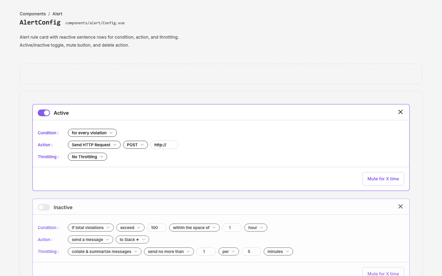
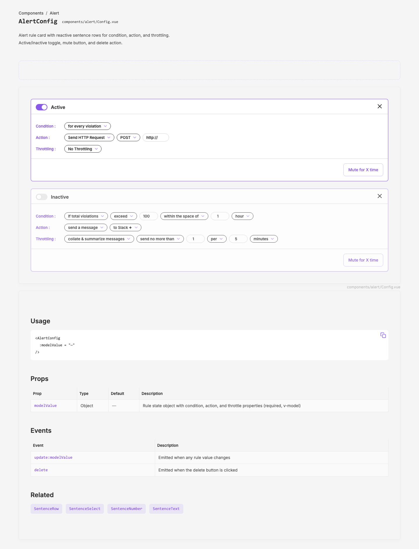
Users need to define alert rules that fire when policy violations meet specific criteria. The component enables configurable conditions (every violation, or threshold-based), multiple action types (HTTP webhook, Slack message), and throttling controls — all composed as readable inline sentences.
Objective
Create an alert rule configuration card component, reusing the inline-pill dropdown pattern from the filter system. Extract from design site pattern into a shared layer component.
Scope
- Alert config card with active/inactive toggle
- Condition builder (simple: every violation; threshold: count + time window)
- Action config (HTTP request with method + URL; Slack message)
- Throttling config (none; rate-limited with collation)
- Mute button
- Add/delete rules
- Document in design site patterns page and component listing
Key Changes
Phase 1 — Pattern prototype:
- Built
NotificationRuleCard.vueas a local pattern indesign/app/components/patterns/with inline render-function sub-components (SentenceRow, PillSelect, PillNumber, PillText) - Created pattern page at
/patterns/notificationand added to patterns index
Phase 2 — Layer extraction:
- Extracted to
q-nuxt-layer/components/alert/as 5 proper SFC components:Config.vue→AlertConfig— main card with reactive sentence rowsSentenceRow.vue→AlertSentenceRow— labeled row containerPillSelect.vue→AlertPillSelect— pill-shaped native selectPillNumber.vue→AlertPillNumber— pill-shaped number inputPillText.vue→AlertPillText— pill-shaped text input
- Converted inline render functions to proper Vue SFCs
- Fixed template
astype casts — moved to script-side handler functions
Phase 3 — Rename:
- Renamed namespace from
notification/→alert/(these are alert rule definitions, not notifications themselves) - Renamed
RuleConfig→Config(auto-imports asAlertConfig— cleaner) - Updated all consumers: pattern pages, demo files, component registry
Design site documentation:
- 5 demo files in
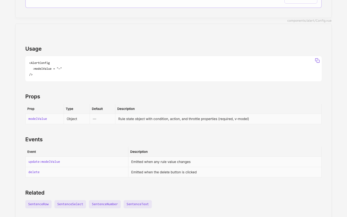
_demos/(AlertConfig, AlertSentenceRow, AlertPillSelect, AlertPillNumber, AlertPillText) - New "Alert" group in component registry with full props/emits/slots documentation
- Pattern page at
/patterns/notificationupdated to use layer components
Phase 4 — Sentence abstraction:
- Recognized pill inputs + sentence row as a generic "sentence builder" pattern, not alert-specific
- Moved 4 components from
alert/to newsentence/directory in q-nuxt-layer:alert/SentenceRow.vue→sentence/Row.vue(SentenceRow)alert/PillSelect.vue→sentence/Select.vue(SentenceSelect)alert/PillNumber.vue→sentence/Number.vue(SentenceNumber)alert/PillText.vue→sentence/Text.vue(SentenceText)
alert/Config.vuestays, now usesSentence*components- Design site: new "Sentence" group in registry, 4 new demos, old Alert pill demos removed
- AlertConfig remains in its own "Alert" group with 1 component
Phase 5 — Polish:
- AlertConfig: switched to UxToggle
#labelslot for clickable Active/Inactive label (was nested<label>) - SentenceSelect: wrapped
<select>in relative div with UxIcon triangle overlay (commented out pending native arrow removal) - Added scoped CSS for cross-browser
appearance: none(native arrow persists on macOS — deferred) - Removed unused
useConditionalSequencecomposable from layer - Updated UxToggle demo to show both
labelprop and#labelslot usage
Outcome
Sentence builder abstracted to reusable sentence/ namespace (4 components). Alert namespace reduced to AlertConfig (1 component). Pattern documented at /patterns/notification. Component docs at /components/sentence/* and /components/alert/*. UxToggle #label slot documented.
Open Issues
- Native select arrow persists despite
appearance: noneon macOS — need alternative approach - What triggers the "add new rule" flow? Button above the card list?
- Does "Mute for X time" open a modal/popover for duration selection?
- Are condition/action/throttling types extensible (more options later)?
Visual record
4 captures — heroes, page slices, and full-page renders. Click to view.