Policy Enforcement Page
Design-site mock of the v2 Policy & Enforcement page from Figma — tabbed policy-control table built on UxTableList
Why
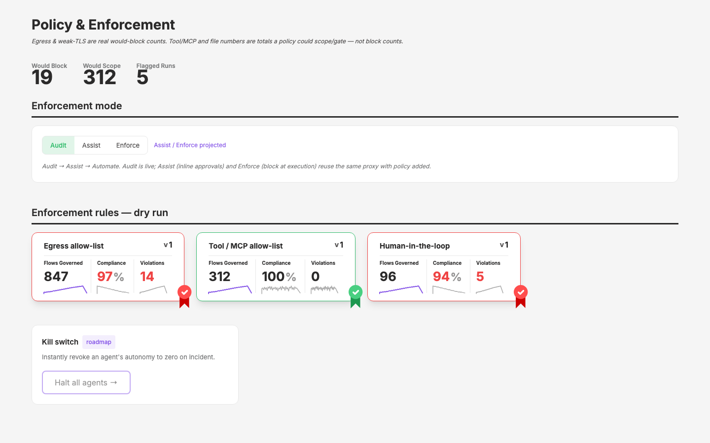
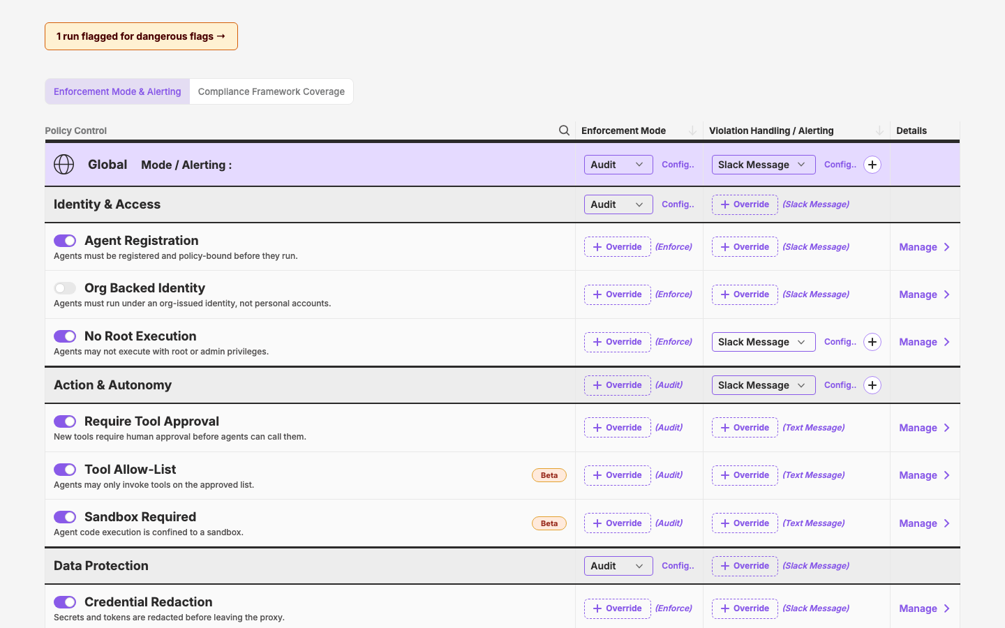
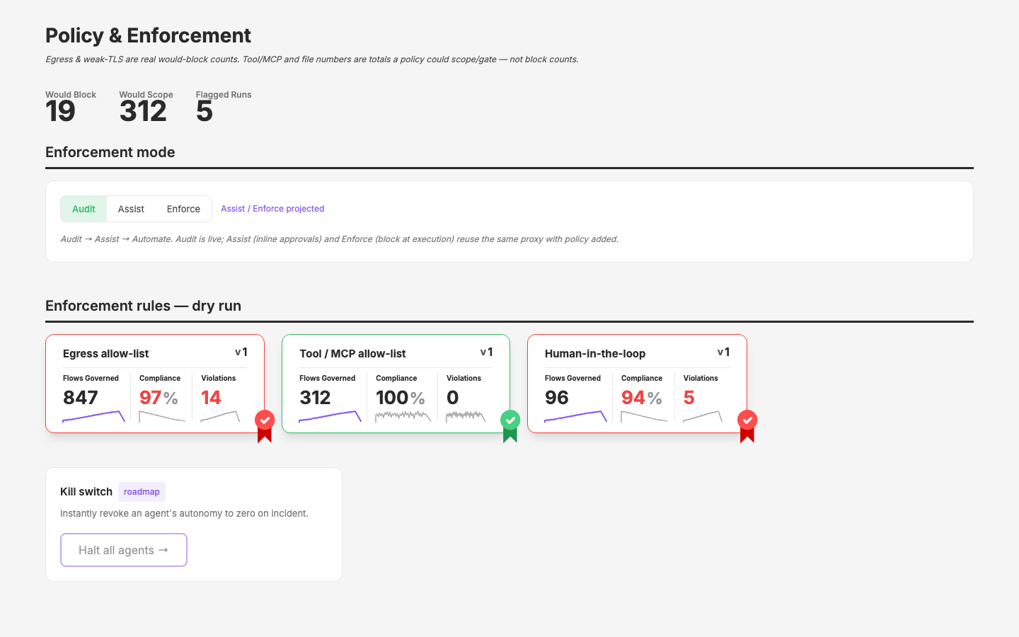
The Figma file has a v2 design for the app's Policy & Enforcement page (v2/policy-and-enforcement, two modes: Enforcement Mode & Alerting, Compliance Framework Coverage). The existing design-site mock (/pages/policy-enforcement, from the pre-v2 layout) uses SecurityPolicyCards; the new design replaces that with a three-column policy-control table with an inheritance cascade (Global → section → policy, overridable at each level). Transcribing it onto the design site pressure-tests UxTableList with fully custom cell components — a first for a design-site page — and surfaces whatever new primitives the v2 direction needs (dashed override button, inherited-value cells, tab strip).
Objective
A new page mock at /pages/policy-enforcement-v2 faithfully reproducing both Figma modes as tabs, using UxTableList for the tables with custom components in row cells. Existing policy-enforcement.vue and compliance.vue mocks stay untouched. Done = both tabs render the Figma layouts with static inline data, page registered in page-registry.ts, and new-component candidates identified for possible layer extraction.
Scope
In
app/pages/pages/policy-enforcement-v2.vue— new page, both tabs- Local cell components (proposed
app/components/policy/): PolicyControlCell, InheritedModeCell, AlertingCell app/data/page-registry.ts— register the new page (security group)- Figma extraction:
get_design_contexton both frames; framework-coverage frame node-id still to capture (see research.md)
Out
- Replacing/retiring the existing
policy-enforcement.vueorcompliance.vuemocks - Layer extraction of new components (identify candidates only)
- Real interactivity beyond tab switching and cosmetic toggles — this is a static mock
Plan
- Extract design context —
get_design_contexton both frames for exact spacing, colors, text. - Build the enforcement-mode tab — page skeleton (h1, source line, intro, flagged banner), tab strip (
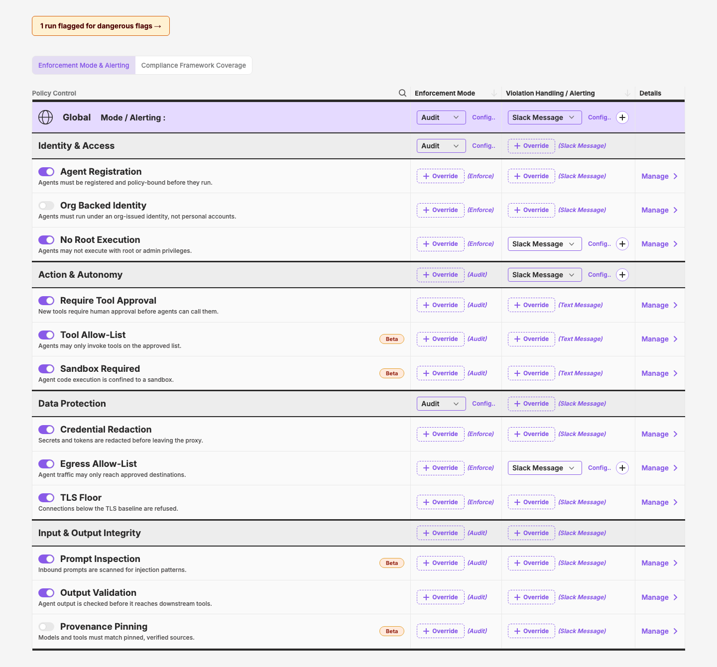
UxFilterGroupor custom),UxTableListwith 3-column header, then row components: Global row, section rows, policy rows with toggle/description/Details-link/Beta pill, inherited-mode + dashed+ Overridecells, alerting cells withUxSelectoverrides. - Build the framework-coverage tab — framework filter tags (+ Add Framework), one 5-column
UxTableList(Control + 4 framework columns) with completeness row, section rows, and Required/! Required/—coverage cells with ✔ Active. See research.md for anatomy. - Register + polish —
page-registry.tsentry, check against screenshots, note extraction candidates.
Key Changes
- Built
app/pages/pages/policy-enforcement-v2.vue— both tabs, static data inlined, first design-site page to composeUxTableListdirectly (custom tab strip;UxFilterGroupdidn't match the joined-segment Figma look) - Added 5 local cell components in
app/components/policy/:PolicySummaryCell(toggle + name + Details link + Beta pill),PolicyValueSelect(grape select + Configure.. + ⊕/spacer),PolicyOverrideStack(inherited label + dashed Override),PolicyCoverageCell(Required/! Required/dash + ✔ Active),PolicyCompletenessCell(mini bar + 84% · 14/18 · Controls) - Registered
policy-enforcement-v2inapp/data/page-registry.ts(security group) - Live search filter wired through
UxTableListColumnHeader'smetric.searchon the Policy Control column - Layer finding:
UxTableListputs its row slot directly inside<table>with no<tbody>— SSR hydration mismatch (browser inserts implicittbody), which corrupted patching and brokev-iftab switching. Worked around by wrapping page rows in an explicit<tbody>; a proper fix belongs in the layer (wrap the default slot in<tbody>), likely alongsideSecurityViolationsTableet al. - Verified via puppeteer DOM assertions: tab 1 = 13 Override buttons / 5 selects / 2 Beta pills / 1 toggle off; tab 2 = 14 Required / 4
! Required/ 4 completeness cells / 4 framework tags; zero console warnings or errors - Extended the mock from the Figma's 2 sections to 4 c17-family categories: added Data Protection (Credential Redaction, Egress Allow-List, TLS Floor) and Input & Output Integrity (Prompt Inspection, Output Validation, Provenance Pinning — Beta), per the taxonomy prior-art mapping in research.md. Replaced the Figma's repeated placeholder description with real per-policy one-liners. Re-verified: 12 policies, 27 Override buttons / 7 selects / 4 Beta pills on tab 1; 28 Required / 8
! Requiredon tab 2; console clean - Extracted all 5 components to the layer as the new
policygroup (q-nuxt-layer/components/policy/{SummaryCell,ValueSelect,OverrideStack,CoverageCell,CompletenessCell}.vue, auto-import names unchanged); deleted the local copies. Fixed theUxTableListtbody bug in the layer (default slot now wrapped in<tbody>) and removed the page's workaround. Design dev server now runs withNUXT_LOCAL_LAYER=1. Regression-checked/pages/policy-detailand the UxTableList demo — clean. - Documented all 5 on the design site: new
policygroup (order 3.25, after Security) incomponent-registry.tswith full props/coverage entries + 5 interactive demos in_demos/(adminProps + scenarios). Verified all detail pages and the coverage dashboard render. Added the group to the layer's CLAUDE.md catalog. Goes out with the pending 0.6.0 release. - Enforcement tab: moved "Details + Configuration" into its own 4th Details column (Alerting narrowed 432→300px).
PolicySummaryCellgained adetailsLinkprop (default true) to suppress the in-cell link; coverage tab unchanged. Demo + registry updated. - Layer:
UxTableListSorterwidthnow defaults to'1%'(shrink-to-content);PolicySummaryCelldescription wraps with the cell (whitespace-normal, dropped fixed max-width). Mock drops all manual column widths — sorter columns hug content, Policy Control absorbs the rest. Checked ViolationsTable (explicit widths, unaffected) and the Sorter demo. - Extracted the tab strip as
UxTabGroup(ux/TabGroup.vue): options + v-model, always-one-selected,#rightaction slot. Page swapped over; documented (interactive group + demo + layer CLAUDE.md). Mark redesignedPolicySummaryCell(toggle-label name, right-aligned Beta, no in-cell link) and renamed the Details link to "Manage" — cleaned up the orphaneddetailsLinkprop across component/page/registry/demo.
Outcome
/pages/policy-enforcement-v2 shipped with both Figma modes as tabs — the first design-site page composing UxTableList directly with fully custom cells. Five policy cell components extracted to the layer as the new policy group (SummaryCell, ValueSelect, OverrideStack, CoverageCell, CompletenessCell) plus the tab strip as UxTabGroup, all documented with demos. Also fixed a real layer bug the cycle uncovered: UxTableList rendered its row slot without <tbody>, causing an SSR hydration mismatch that broke v-if tab switching. Mock extended to four c17-family categories with real per-policy copy; verified via puppeteer DOM assertions.
Figma
- File:
AGxdHnJ1cf847C7WRuybch(app.qpoint.io — 1.1 — Agent Transition) v2/policy-and-enforcement -- enforcement-mode: node12556:29387(screenshot in cycle dir)v2/policy-and-enforcement -- framework coverage: node12447:23368, page6135:20195(screenshot in cycle dir)
Visual record
4 captures — heroes, page slices, and full-page renders. Click to view.
In the archive
Artifacts
- initial-prompt.md
- build-spec.md
- initial-prompt.md
- research.md