inventory
Design qdash inventory page to surface agent status and footprint at a glance
Why
Currently designing a new inventory page for qdash (replacing localhost:7878/inventory) following the design site's page-mock workflow. The page needs to give users an immediate sense of what agents are running and their footprint. Exploring both general inventory views and agent-focused perspectives, informed by available data (MCP servers, repos, tools). Design is the process of eliminating noise so the signal cuts through.
Objective
Phase 0: Clarify page purpose, explore available data, and produce a clear design brief with optional wireframe. Understand what's most important to surface and how to make sense of it at a glance.
Phase 2: Execute one or more page mockups on the design site based on Phase 0 insights.
Scope
Design site page mocks only (not implementation in qdash). Explore agents running and their footprint. Consider MCP servers, repos, and tools in context. Compare general inventory view vs agent-focused views. May use bob-wire for exploratory wireframes.
Key Changes
- Phase 0 complete (2026-08-02):
design-brief.md— page purpose (fleet-lens substrate: what exists, is it alive, what's its footprint, what's unmonitored), three-tier data reality from a full qdash data-model audit (live / captured-but-hidden / permanently-NULL), at-a-glance hierarchy (presence → coverage → footprint → risk-as-exception), and three design directions (V1 Roster, V2 Ledger, V3 Footprint) with a recommendation to mock V1 + V2 and fold V3 in as a lens. Mock data to speak the Meridian staged world. - Phase 2 complete (2026-08-02): two page mocks built per
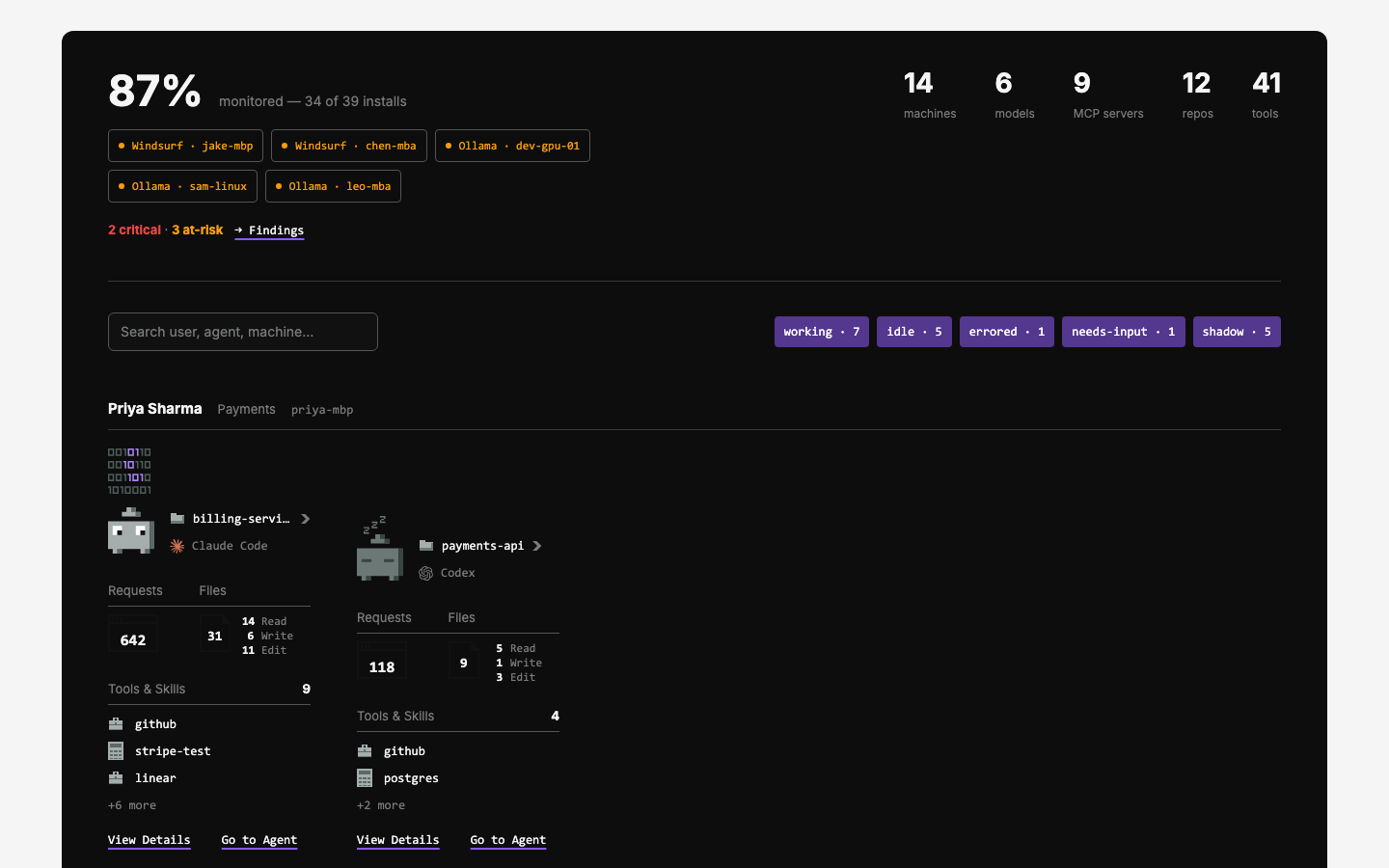
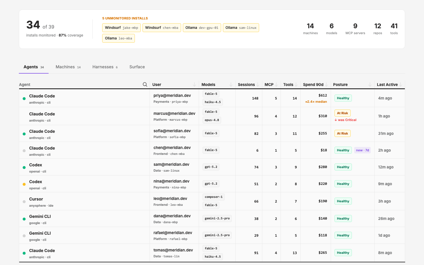
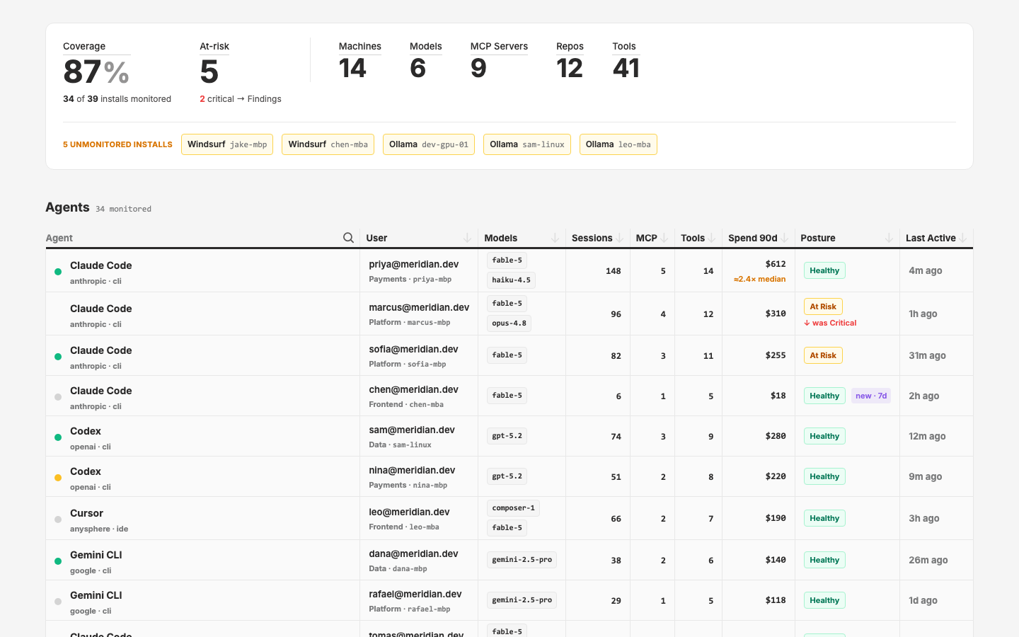
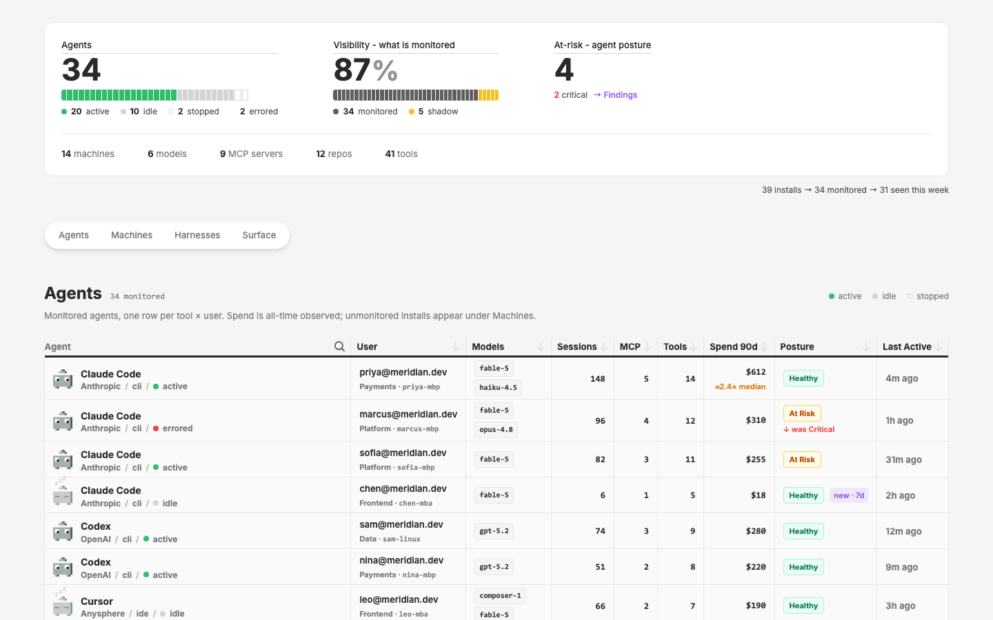
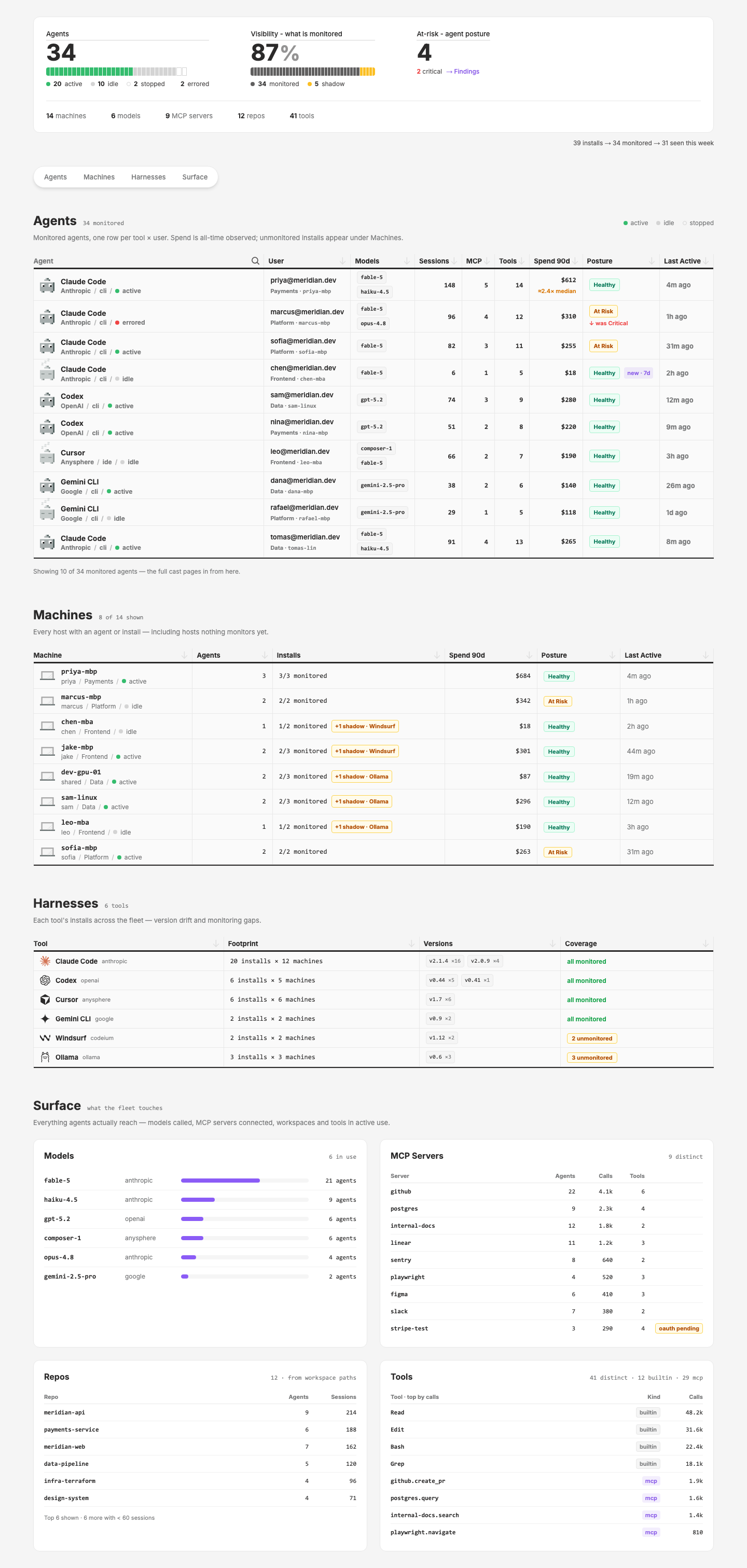
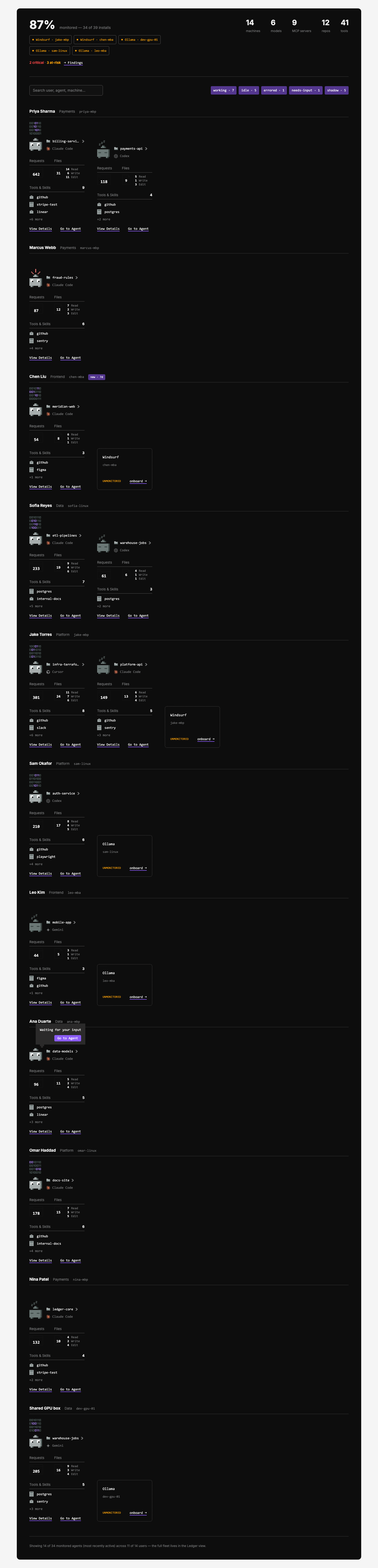
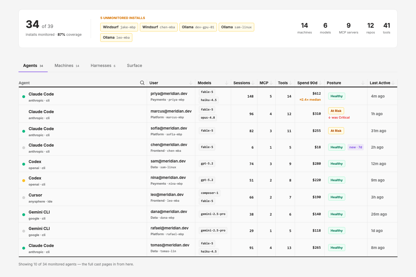
plan.md, registered inpage-registry.ts(groupinventory), dev-server smoke-checked (200s, no Vue warnings):/pages/inventory-roster— V1 presence-first: dark canvas, AgentMiniCard grid grouped by user, coverage header (87% · 34/39) with clickable shadow chips, footprint strip, shadow installs as dashed ghost cards inline in their machine's group, search + state filters ("chen" acceptance test passes)./pages/inventory-ledger— V2 dense ledger: coverage/footprint band, four lenses (Agents / Machines / Harnesses / Surface). Agents lens = UxTableList with sorters, posture regression marker ("↓ was Critical" on marcus), "new · 7d" on chen, and the designed expand-row (fingerprint, quota bar with overage pill, cwd-derived repo chips, MCP servers with oauth-pending, recent runs, denied-calls line). Surface lens folds in the V3 general-inventory idea (Models / MCP Servers / Repos / Tools panels). Numbers cross-foot with the roster and the Meridian world.
- Candidate layer extractions logged (out of c59 scope): footprint strip, coverage stat, shadow/ghost card (AgentMiniCard has no ghost state), posture badge with regression marker, the designed agent expand-row (replaces qdash's INTERIM AgentExpandDetail).
- Iteration 2 (2026-08-02, from
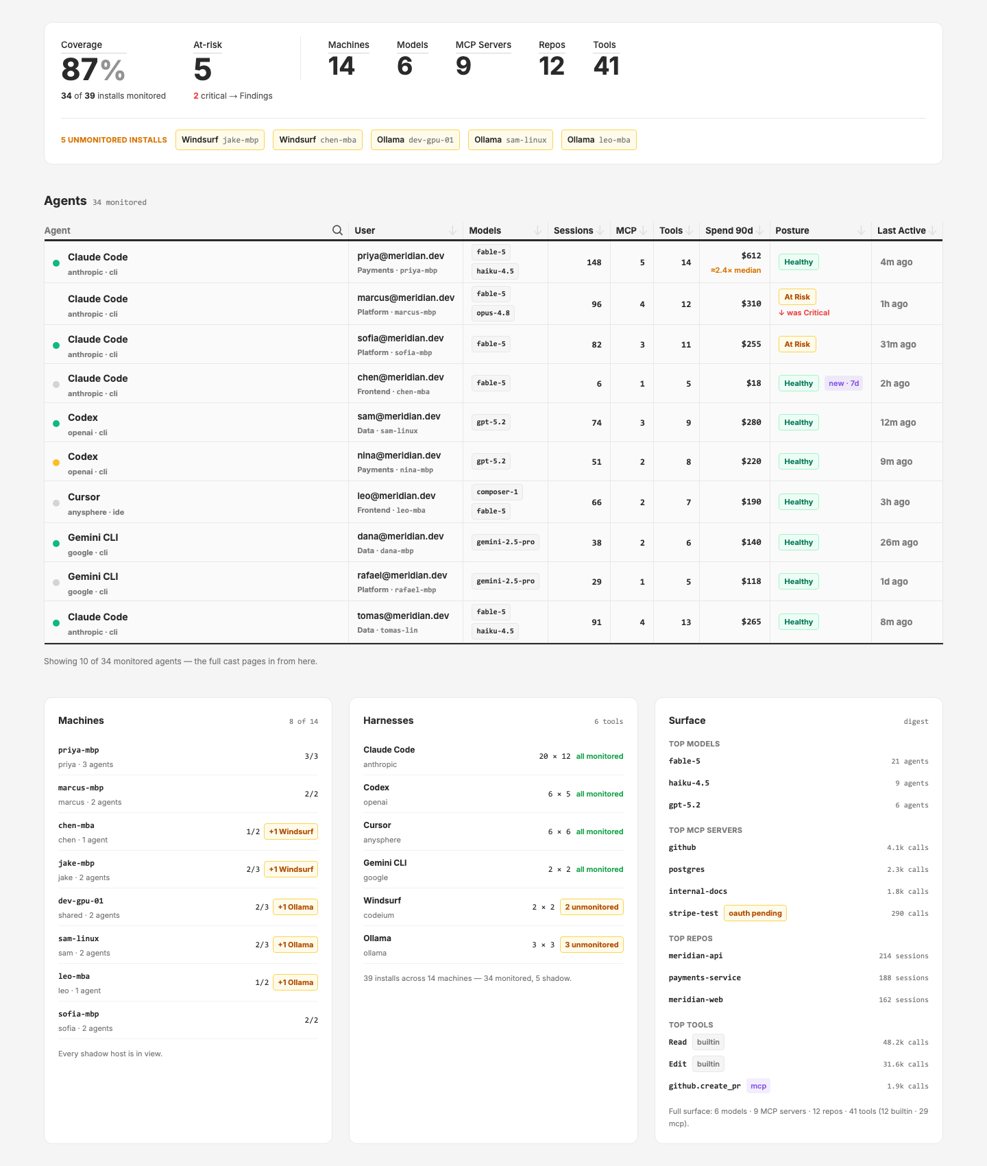
revisions.md— ledger chosen as the direction): two new pages so v1 stays archived, registered and smoke-checked (200s, clean log):/pages/inventory-ledger-v2(Stacked) — overview as a proportional 39-segment coverage bar (34 neutral / 5 amber shadow segments with hover identity), footprint counts + risk line beneath; all four lenses open as stacked sections with a sticky anchor-pill jump nav./pages/inventory-ledger-v3(Composite) — overview as a DataMetric_Base tile row (Coverage 87, At-risk 5, five footprint tiles) with shadow chips in a strip below; no tabs — agents table primary, Machines / Harnesses / Surface as a three-rail band underneath.
- Iteration 3 (2026-08-02):
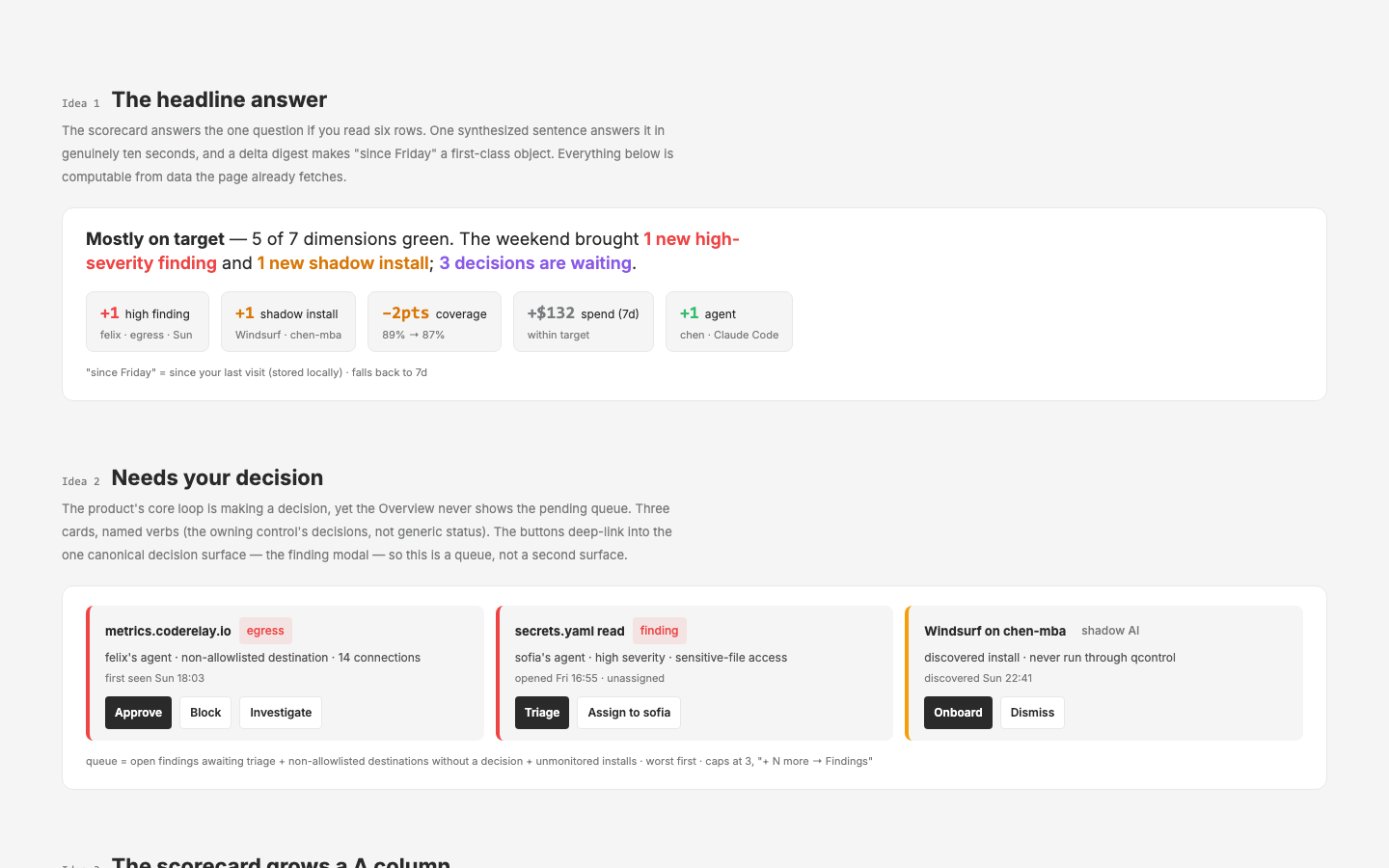
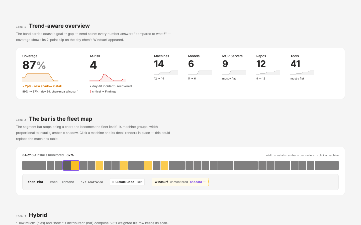
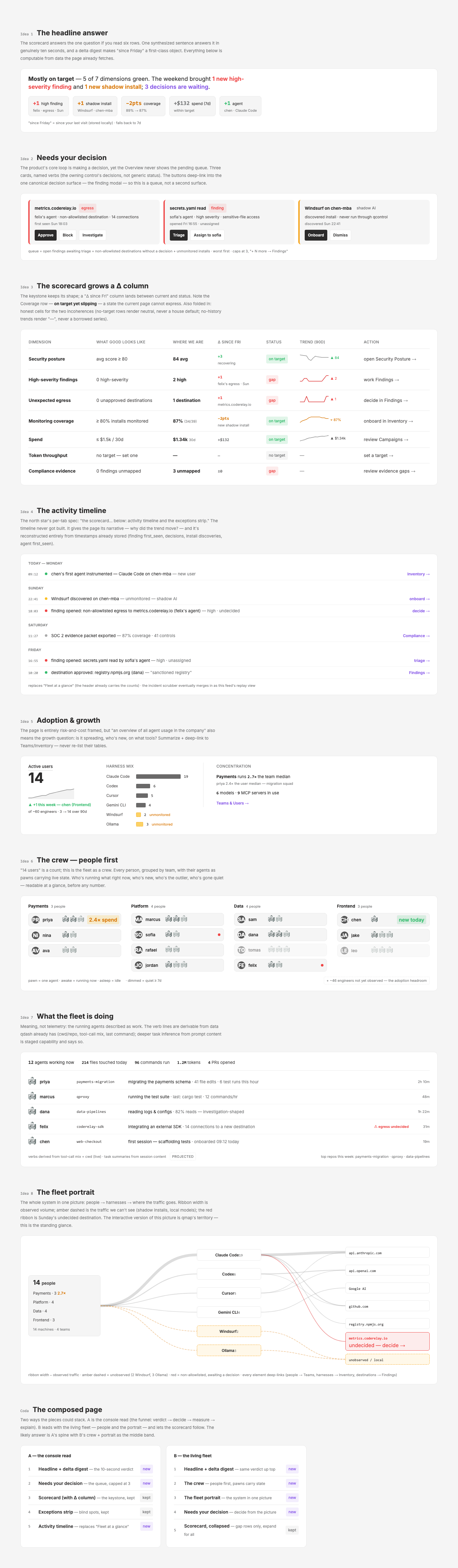
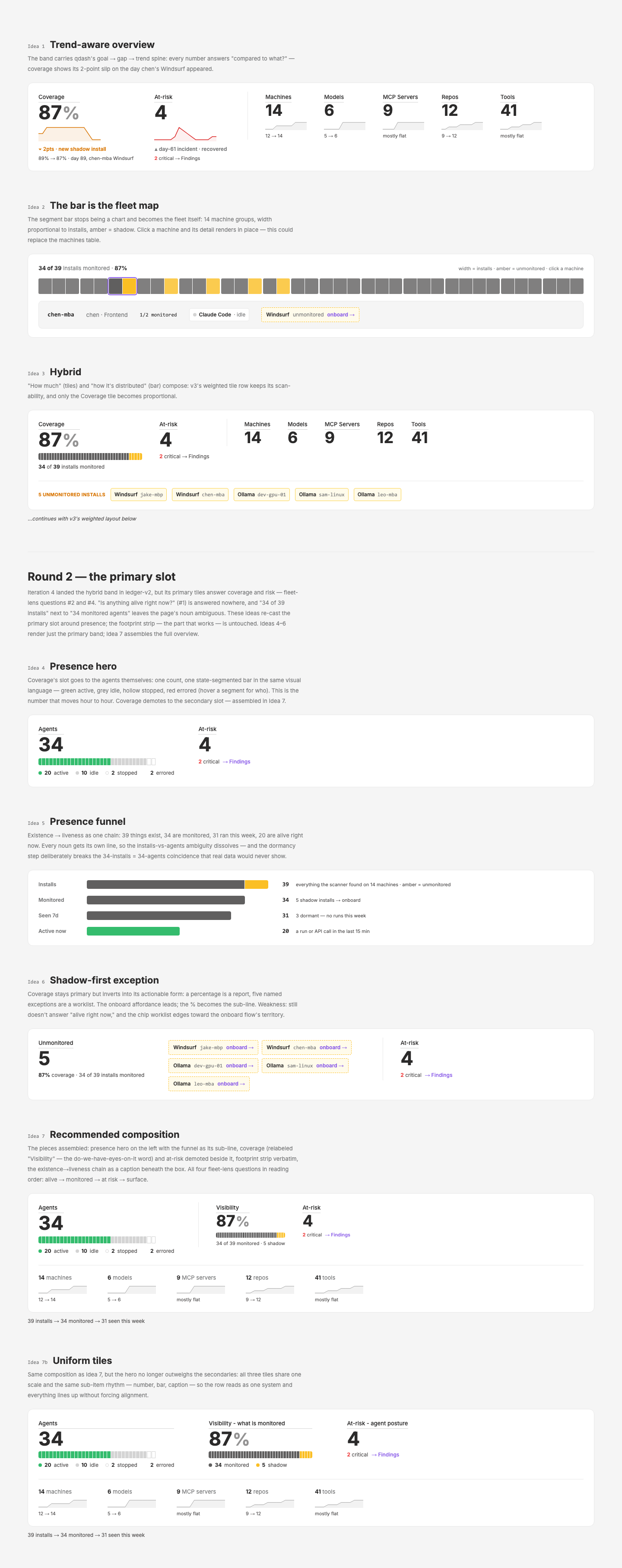
/pages/inventory-overview-ideas— three overview concepts rendered working on one page for visual comparison: (1) trend-aware tiles with DataMetricSpark sparklines telling the Meridian story (coverage 89→87 dip on chen's Windsurf, day-61 at-risk spike/recovery); (2) the coverage bar regrouped as a clickable 14-machine fleet map with a detail line (chen-mba preselected — could replace the machines table); (3) hybrid — v3's tile row with the proportional 39-segment bar inside the coverage tile. - Iteration 4 (2026-08-02, Mark's picks folded back into v2): ledger-v2 overview revised — hybrid's mini coverage tile (compact 39-segment bar) + At-risk tile replace the full-width bar, right side left empty; footprint items keep their small text and gain the grey 90-day sparks + trend captions beneath (idea 1, without the big-tile treatment). Jump nav moved beneath the overview. Sparks are hand-rolled inline SVG (min-max normalized, stroke-only line) — DataMetricSpark needs a baseline/min-max mode + line-only stroke to absorb this (layer candidate).
- Buildability audit (2026-08-02):
buildability.md— ledger-v2 audited element-by-element against qcontrol. ~85% buildable today; a 5-item backend punch list converts the captured-but-unserved rest; only agent pawn-states and trend sparks are genuinely staged (both on qdash's own roadmap: liveness states, IA-doc §8 trend reconstruction). - AgentInline extracted to the layer (2026-08-02): new
q-nuxt-layer/components/agent/Inline.vue— pixel pawn + bold name + "Vendor / kind / ● status" sub-line for table rows; status ∈ active/idle/stopped/errored (honest qdash vocabulary — idle renders the sleeping body, stopped dims + hollow dot). Required adding adecorationsprop to AgentPawn (suppresses floating zzz/binary/alert that would overflow rows). Ledger-v2's lead cell now uses it (page states converted working/needs-input → active) with a status legend in the section header. Documented:_demos/AgentInline.vue+ registry entry (AgentPawn entry updated fordecorations). NeedsNUXT_LOCAL_LAYER=1dev restart to render (new layer component + new demo glob). - Theme-compatible pixel art (2026-08-02, approved plan): new
UxPixelArtlayer component inlines pawn + pixel-icon SVGs and rewrites their palette hexes to--px-*CSS variables at load time (Illustrator exports untouched — futureb-exports drop in unchanged). Handles both art shapes: style-block classes (pawns) and fill attributes (icons), plus the fill-less pupil rects.--px-*roles added totokens/semantic.mjs(pixelArt export, hex form) and emitted bytokens/build.mjsinto tokens.css; light values = art hexes verbatim (zero visual change), dark values = conservative first pass for Mark to tune. AgentPawn body/decor and AgentMiniCard icons now render through it (provider overlay stays<img>— brand marks don't theme). Documented:_demos/UxPixelArt.vue+ registry entry, theme-contexts scenario in the AgentPawn demo. Follow-up logged: AgentInputBubble is still hard-coded dark. - Iteration 5 (2026-08-03, the primary slot): analysis of the v2 overview against the fleet-lens questions — the band answers coverage (#2) and risk (#4) but never presence (#1, "alive right now"), and "34 of 39 installs" beside "34 monitored" agents leaves the page's noun ambiguous. Four concepts appended to
/pages/inventory-overview-ideasas a Round 2 (smoke-checked, 200): (4) presence hero — 34-agent count + state-segmented bar in the coverage bar's visual language (AgentInline vocabulary; 20 active · 10 idle · 2 stopped · 2 errored, per-segment hover for who); (5) presence funnel — 39 installs → 34 monitored → 31 seen 7d → 20 active now, a dormancy step that breaks the unrealistic 34-installs = 34-agents coincidence; (6) shadow-first exception — the five named unmonitored chips with onboard → promoted to the hero, the % demoted to sub-line; (7) recommended composition — hero + funnel sub-line, coverage relabeled "Install coverage" + at-risk demoted into v2's deliberately-empty right side, v2 footprint strip verbatim. Backing roster of 34 cross-foots per-machine monitored counts and harness totals (CC 20 · Codex 6 · Cursor 6 · Gemini 2). Caveat carried frombuildability.md: presence states are category C (running/stopped + derivable errored/idle today) — the hero makes that bet prominent by design. - Iteration 6 (2026-08-03, Mark's review of Round 2): Idea 7 refined into Idea 7b "Uniform tiles" (7 preserved as-built): the 44/36 hero-vs-secondary size split read as misalignment, so all three tiles share
:size=44and one sub-item rhythm (number → h-4 bar row → text-12 caption; At-risk's caption sits on the bar line). Verbiage: coverage tile relabeled "Visibility - what is monitored" (the do-we-have-eyes-on-it word; plain hyphen), its caption switched to the Agents-legend totals style (swatch dot + bold count: ● 34 monitored · ● 5 shadow); funnel chain moved to a caption beneath the box; secondaries left-aligned (a floor-alignment experiment was tried and reverted). At-risk renumbered fleet-wide 5 → 4 (2 critical + 2 at-risk) on the active pages (ledger-v2 + all overview-ideas tiles + the Idea-1 spark) — the double-5 next to "5 shadow" manufactured a redundancy read; the two are different axes (posture of the monitored vs installs unseen), and 7b's At-risk label now says so: "At-risk - agent posture". Shadow stays amber, not red: red = confirmed bad (critical/errored), amber = unknown/attention — consistent with every c59 shadow surface. Archived pages (roster, ledger v1/v3) keep the old 5 as historical snapshots. Also fixed while reviewing:SparkChartOld.vue's un-scopedpolygon, polyline { v-bind(...) }style block leaked document-wide and turned every hand-rolled spark solid black (fill collapsed to the SVG default outside the component); scoped it plusTrend.vue/TrendDirection.vue— gotcha added to memory. - Iteration 6 addendum (2026-08-03): layer additions from the round —
DataMetric_Basegained a default slot (content renders inside the inline-block root so the label hairline spans it; documented in the demo + registry), andDataMetricValuegotline-height: 1.05on both value and unit (display-numeral leading: the inherited 1.5 reserved ~22px of dead air under 44px values, and the unit's taller line box misaligned tiles with units). 7b also lost its vertical separators and widened togap-x-20. The finished 7b band was then applied to/pages/inventory-ledger-v2as its overview (34-agent roster + presence helpers copied over, funnel caption beneath the box, provenance comment updated) — the ledger mock now leads with presence. Both layer changes ride the pending release. - Iteration 7 (2026-08-06, the designed expand-row):
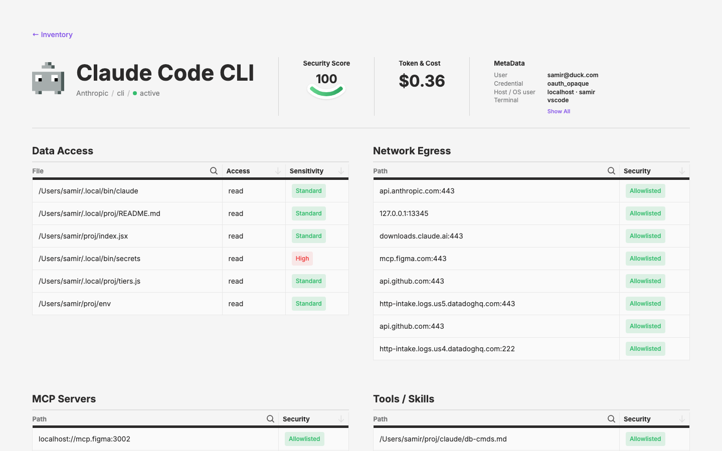
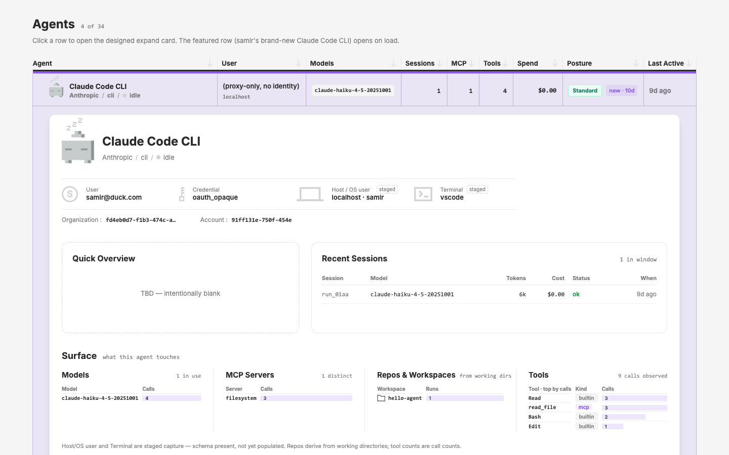
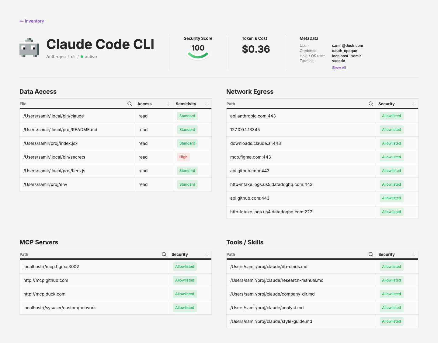
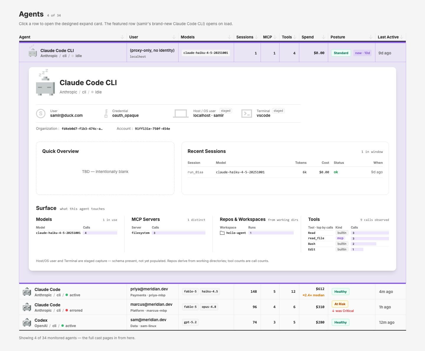
/pages/inventory-agent-expand— the designed agent expand-row from Mark's designer comp, the deliverabledesign-brief.mdqueued when it marked qdash's expand panel INTERIM. A 4-row mini ledger (row cells verbatim from ledger-v2) whose expand card composes: AgentPawn + name header with the AgentInline sub-line scaled up, the agent-detail identity strip (User / Credential / Host / TerminalDataIdentityItems + Organization / Account IDs) with dashedstagedpills on the two Tier-3 fields, a deliberately blank Quick Overview (comp annotates "Leave blank, TBD"), a Recent Sessions mini-table, and four agent-scoped Surface panels copied from qcontrol's live /inventory —app/components/inventory/SurfacePanel.vueis a byte-diffable replica of qdash'scomponents/inventory/SurfacePanel.vue(onlypctinlined), kept 1:1 for the eventual layer extraction. Featured row (samir's sparse brand-new install, per the comp) auto-opens on load; priya's row carries 12 tool rows so the Tools panel demosUxShowMoreoverflow. Cross-foot rule: row Sessions/MCP/Tools counts equal the card's workspace-runs total and panel row counts. Layer gaps logged:UxTableListExpandRow'sisOpenprop is dead (shadowed by a local ref — no declarative default-open; the mock simulates a click), and the layer has nogithubicon (qdash-only), so workspace rows all usefolder. Flagged for Mark: posture vocabulary divergence — the comp says "Standard" (qdash's danger_level word) where the c59 ledgers say "Healthy"; the page shows both. Addendum: SurfacePanel gained acompactmode (Mark's ask: no border, no padding, tighter leading, smaller fonts — one type notch down across title/caption/headers/rows;#rownow passescompactso consumer cells can adapt their padding/pills). Applied as an identical additive diff to both copies (design replica + qdash's original, defaultfalseso qdash pages are untouched) to preserve diffability; the expand card's four Surface panels now render compact, and the Quick Overview / Recent Sessions row was made non-responsive (always[2fr_3fr]) after review. - Iteration 7 addendum (2026-08-06, sectioned expand row): Mark's stacked-cards comp executed per
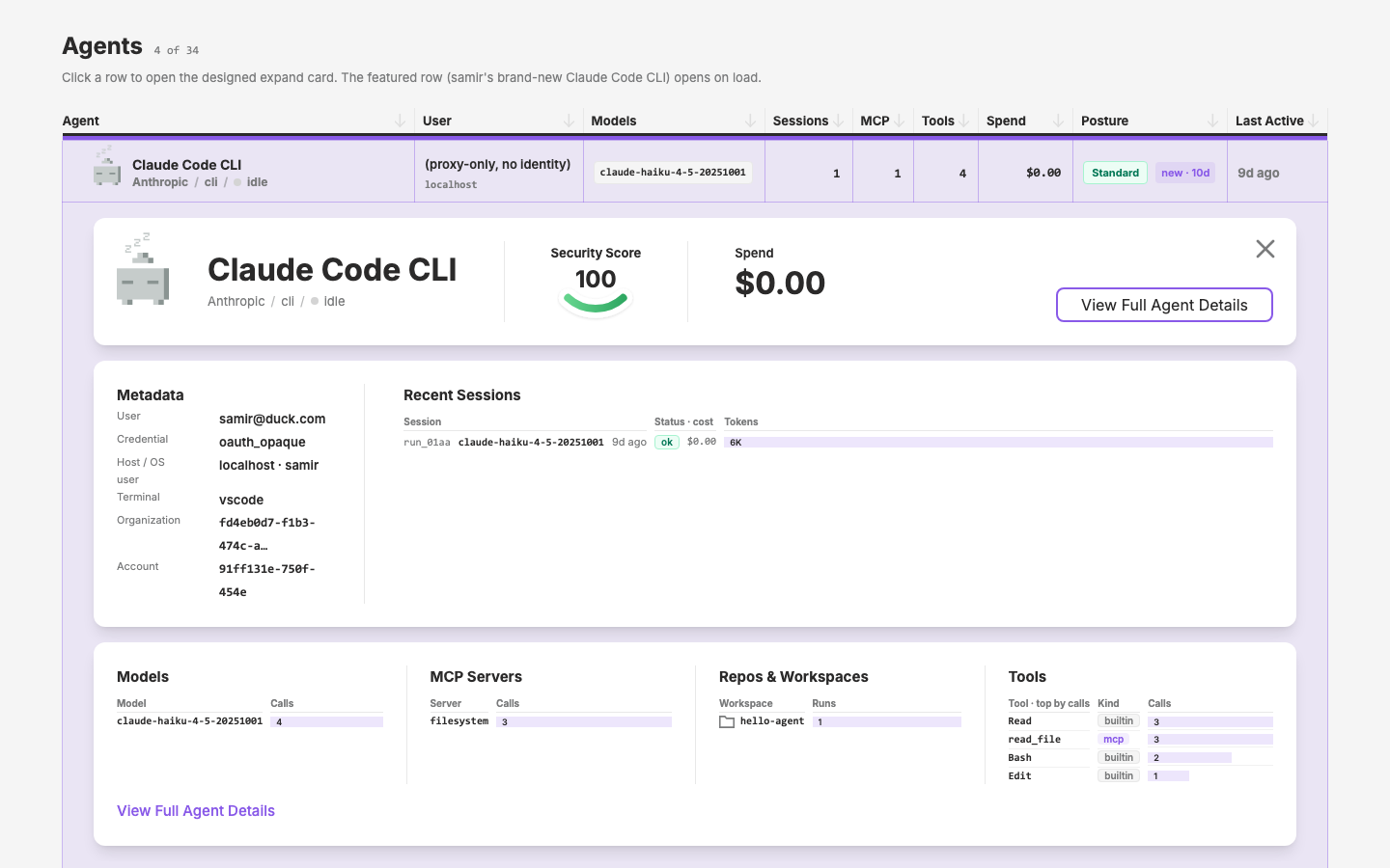
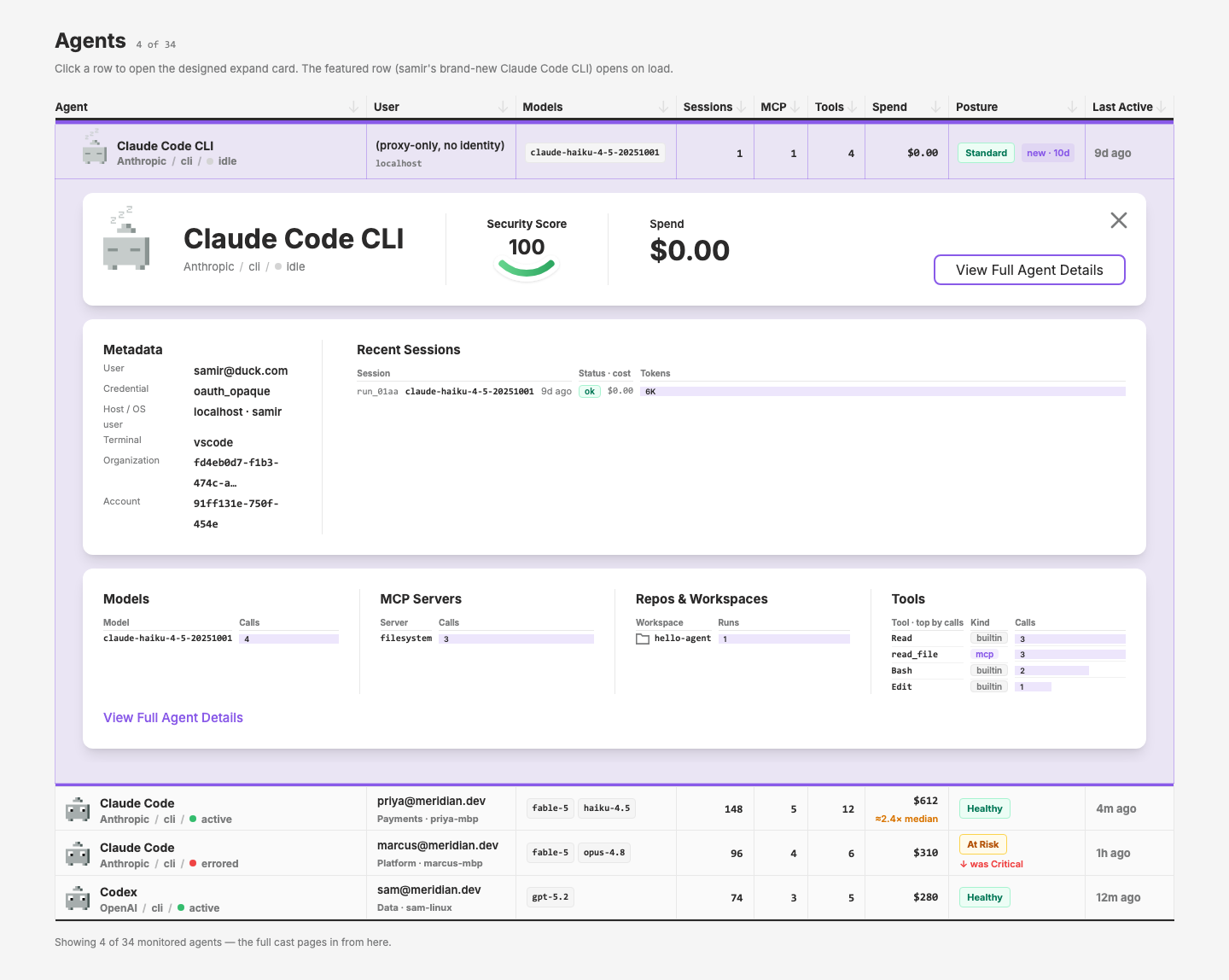
expand-row-sections-plan.md— new layer componentUxTableListExpandSection(ux/table-list/ExpandSection.vue): a borderless white section card (rounded-12 bg-surface p-6 shadow-lg, no props, default slot) for stacking inside anUxTableListExpandRow#detailswell; the consumer owns stack spacing (space-y-4) so the well tint shows through the gaps. Close stays the ExpandRow's sticky X (no per-section X). New evaluation page/pages/inventory-agent-expand-v2— the agent-expand mock rebuilt as three sections (header+identity · Quick Overview/Recent Sessions · Surface), the original single-card page kept untouched for side-by-side comparison; both registered inpage-registry.ts. Documented:_demos/UxTableListExpandSection.vue+ registry entry (table group). Headless-verified 11/11 (3 borderless 24px-pad cards, 16px tinted gaps, X collapses, compact-panel invariants,Show all 12toggle, clean console). Flagged for Mark: the ExpandRow X abuts section 1's right edge in thepx-8gutter (dx 0) rather than sitting inside the card padding as the comp draws — same geometry as the single-card page; moving it means touching ExpandRow'sright-14, which qdash consumes. Joins the pending layer release (with NavJumpPills, AgentInline, UxShowMore, UxPixelArt, the SurfacePanel-era compact props). - Iteration 8 (2026-08-07, v2 refined + shipped to qcontrol): the v2 mock iterated with Mark to its final form — Recent Sessions restyled as a SurfacePanel (compact ranked rows: run id + model + when, status pill + cost, token bar), captions dropped across all panels, row caps at 7, and the header simplified per the comp: pawn + name · Security Score (
DataSmile, per-agent score) · Spend · strokeUxButton"View Full Agent Details"; the old identity strip became a Metadata column beside sessions. Two gotchas logged to memory along the way:divide-*containers hijack direct children's border colors (the grey stroke-button bug), and the close affordance moved out of ExpandRow. Close X redesign (layer API): the sticky viewport-anchored X is gone;UxTableListExpandSectionnow renders a card-anchored X only when an@closelistener is attached, and ExpandRow wraps its#detailsslot in one ExpandSection by default (same chrome as DataTable's old hand-rolled wrapper, now with the X) — abareprop opts out for sectioned stacks, the details slot scope providesclose, andopen()/close()are exposed for template refs (the mock's programmatic-click hack retired).DataTabledropped its wrapper and gainedbareDetails+ close forwarding. Extraction:DataSurfacePanel(data/SurfacePanel.vue, from the byte-diffable replica; grid template moved to inline style per the layer's no-arbitrary-classes rule) — both local copies deleted, all design + qdash usage sites swapped, demo + registry entry added. qcontrol port (Stage B): newqdash ui/app/components/inventory/AgentCard.vue— the three-section card wired to real data (roster row renders the header instantly; lazy/api/agentfetch feeds metadata, quota bar + governance denied-count (kept from the old expand per Mark), rich sessions with running/ok/error pills, and the four Surface panels with drill-down + listing links, oauth-pending joined by server name). ReplacesAgentExpand.vueon/inventoryandAgentExpandDetailon machine detail (Teams keeps the interim card until its redesign). Opportunistic fixes:PawnAgent→AgentPawnon agent detail (component never resolved — pawn was invisible in prod),EXPAND_CAP15 → 50 TODO, deadSurfaceMore.vuedeleted. All 133 qdash vitest tests pass; Vite transforms clean. Ships as layer v0.9.6 (with Mark's UxButtonsize+ grape-600 default and the AgentPawn zzz tweak) + a qdash dist rebuild.
Visual record
18 captures — heroes, page slices, and full-page renders. Click to view.
In the archive
Artifacts
- initial-prompt.md
- buildability.md
- design-brief.md
- initial-prompt.md
- plan.md
- revisions.md