Policy Skin Extraction
Why
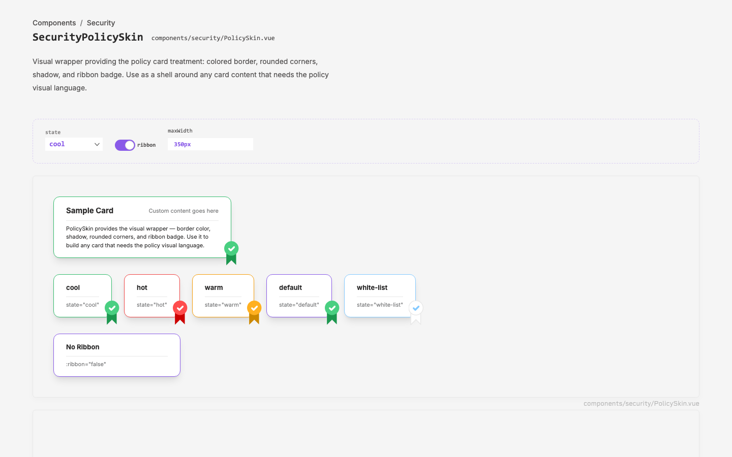
The security policy page needs cards for whitelisted apps, datastores, and vendors that share PolicyCard's visual treatment (colored border, shadow, rounded corners, ribbon badge) but with completely different content inside. The visual wrapper was baked into PolicyCard alongside domain-specific stats and sparklines, preventing reuse.
Objective
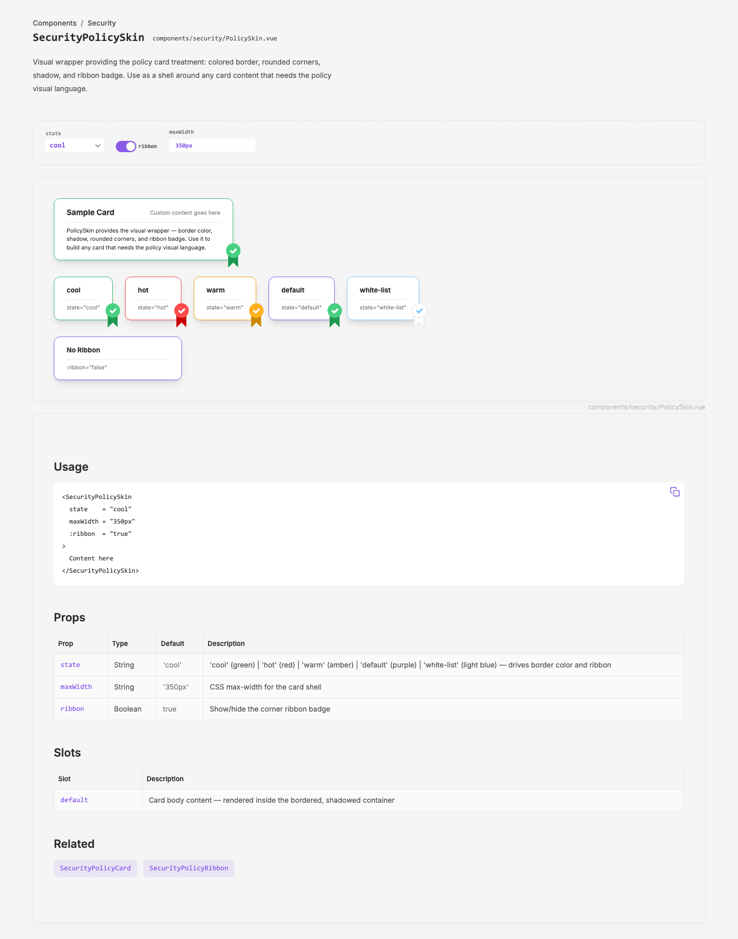
Extract PolicyCard's visual wrapper into a standalone SecurityPolicySkin component so any card content can adopt the policy visual language.
Scope
- New
SecurityPolicySkincomponent in the layer (components/security/PolicySkin.vue) - Refactor
SecurityPolicyCardto use PolicySkin internally (zero visual change) - Extend
SecurityPolicyRibbonto support the newwhite-liststate - Design site registry entry and demo page
Key Changes
New: SecurityPolicySkin
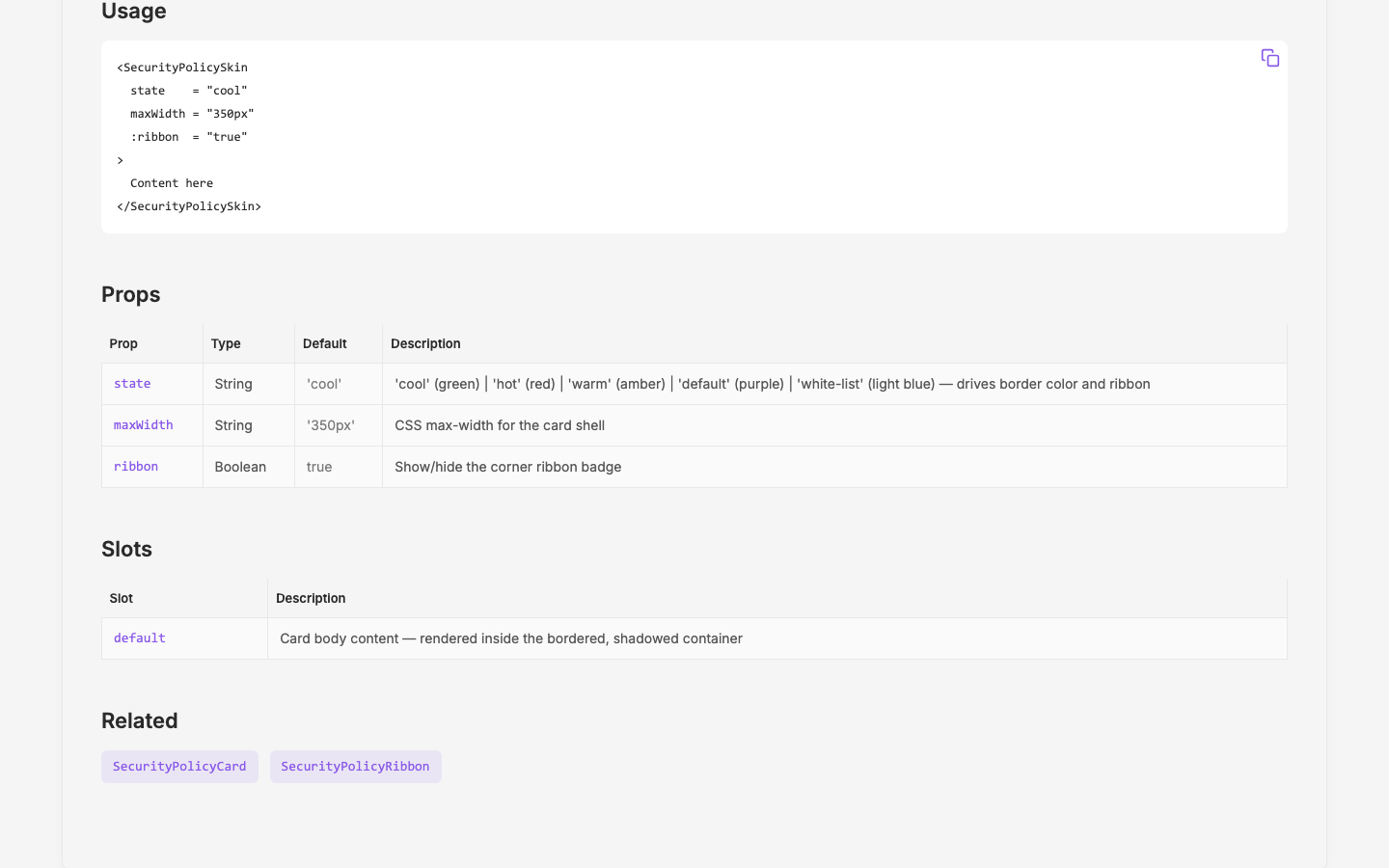
Wrapper component with three props:
state—'cool'(green) |'hot'(red) |'warm'(amber) |'default'(purple) |'white-list'(light blue#84CAFF)maxWidth— CSS max-width (default350px)ribbon— show/hide ribbon badge (defaulttrue)
Default slot for arbitrary card content.
Updated: SecurityPolicyRibbon
Extended palette to support white-list state:
- White badge with
#DFDFDFgrey stroke #84CAFFblue checkmark- White tail with grey stroke
- Stroke applied to both badge circle and ribbon tail SVG paths
Refactored: SecurityPolicyCard
Replaced the manual card wrapper (<div class="relative py-4 px-6 bg-white border ...">) and inline <SecurityPolicyRibbon> with <SecurityPolicySkin :state="state">. Removed borderColor computed. All external behavior unchanged.
Outcome
SecurityPolicySkinavailable as a standalone wrapper for any card needing the policy visual treatment- 5 states cover all current use cases: compliance (cool/hot/warm), brand (default), and allow-list (white-list)
- PolicyCard is now a composition of PolicySkin + domain content, not a monolith
Visual record
4 captures — heroes, page slices, and full-page renders. Click to view.