Control Components
Schema-driven configurator for runtime property control
New in this cycle: Schema-driven DevConfigurator — the control panel renders itself from a typed config
Why
qmap experiments had ad-hoc control UIs built inline in each ExperimentsApp.vue, and the q-nuxt-layer had two related but disconnected patterns: PropsMachine (flat auto-render, Nuxt-dependent) and DevControls (manual, categorized). We wanted one schema-driven configurator with categories — pass a typed data structure, get a full control panel — reusable across qmap, qflow, and design.
Objective
Build a configurator component (Configurator → ConfigCategory → ConfigProperty) that auto-renders a control panel from a categorized schema (toggle, select, color, text, range), plus a qmap config module so tuned values can be exported and frozen into wrapper components.
Key Changes
- 2026-04-16 — Landed in the
c18-c22batch commit (work recorded as starting 2026-03-24):- New
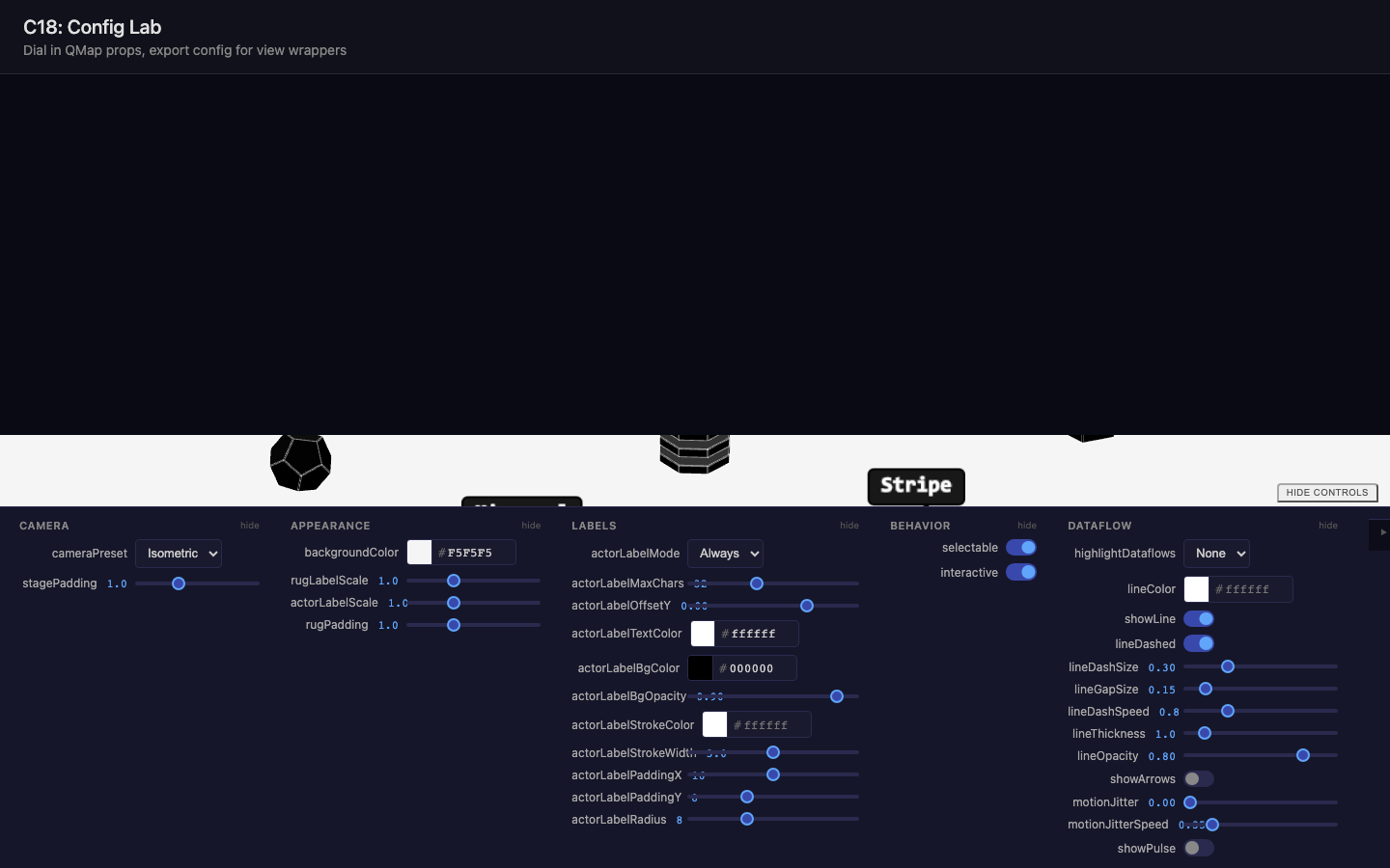
DevConfiguratorcomponent in q-nuxt-layer — takes a categorized schema, auto-renders DevControlSection + DevControl* components; top-level keys are categories, nested keys are typed properties - New
DevControlToggleandDevControlTextcomponents filling gaps in the existing control set;DevControlExportfor live preview + copy of exported config (via optionalexportFnprop) - New qmap
src/config/module:createQMapConfig(schema),resolveConfig(flatten to QMap props),exportConfigString(diff-only export — only props that differ from defaults) - "Config Lab" experiment at
dev/experiments/c18.control-components/consuming the layer component via a Vite alias (@q-nuxt-layer)
- New
Outcome
Working. Established the wrapper-component workflow: configure visually → export flat props → freeze into a wrapper. The Config Lab experiment became the tuning tool for later wrappers (c19's QMapDataflow rebuild, c21/c22 session maps), and DevConfigurator became the shared control system in q-nuxt-layer (components/dev/Configurator.vue + Control* family), used across sister projects.
Visual record
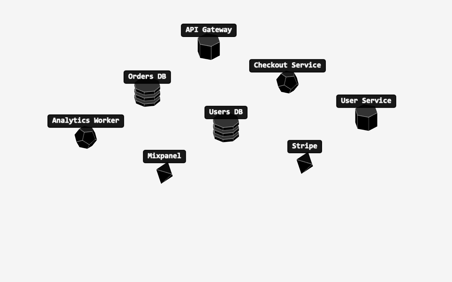
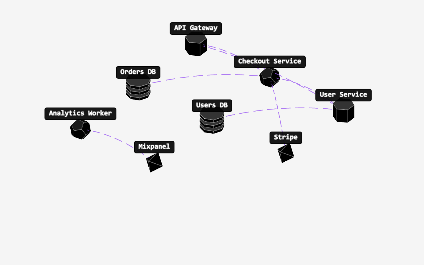
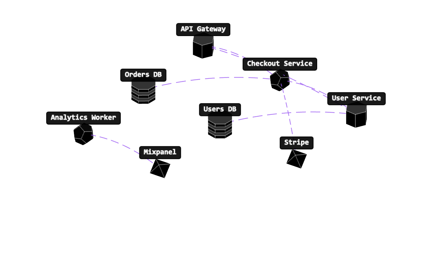
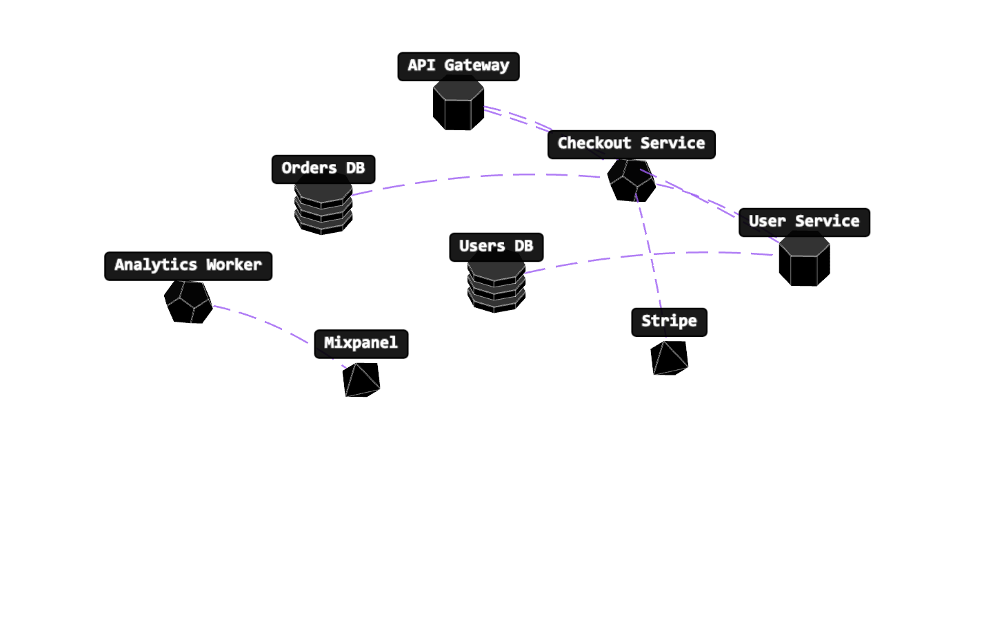
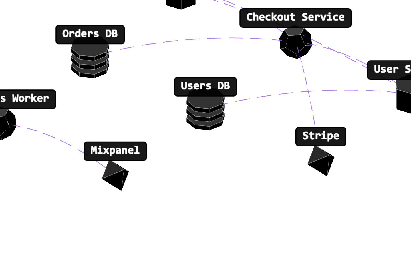
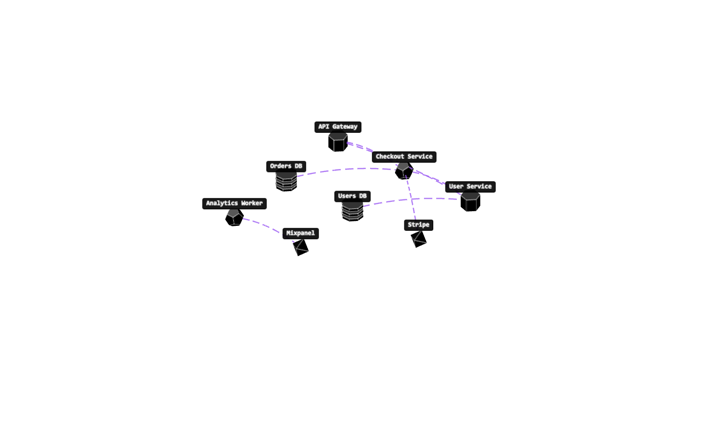
9 captures — heroes, page slices, and full-page renders. Click to view.