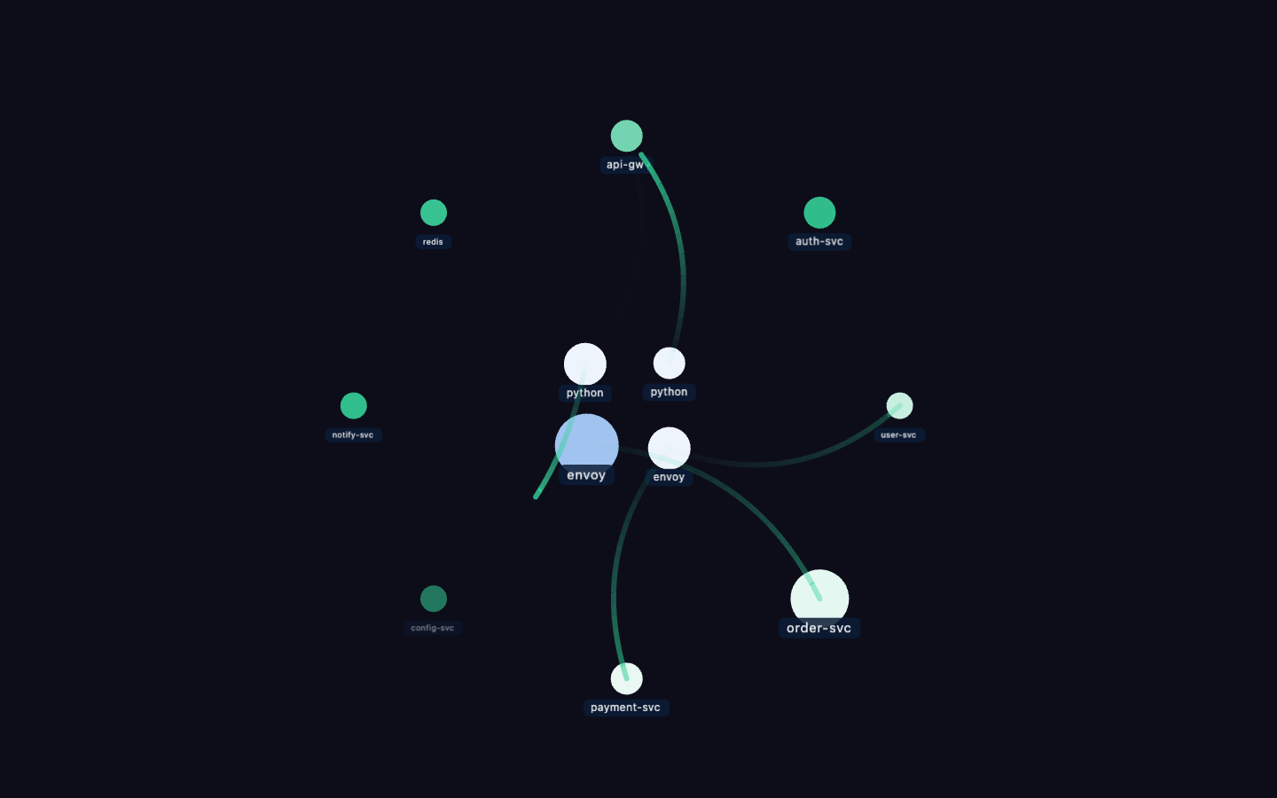
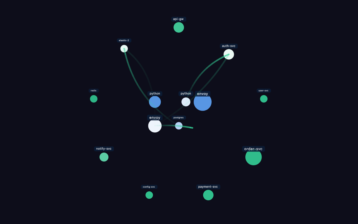
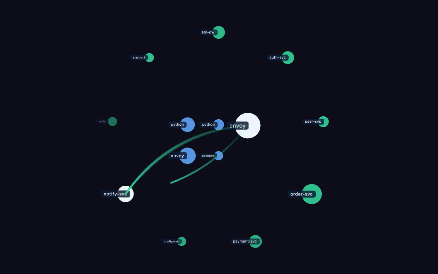
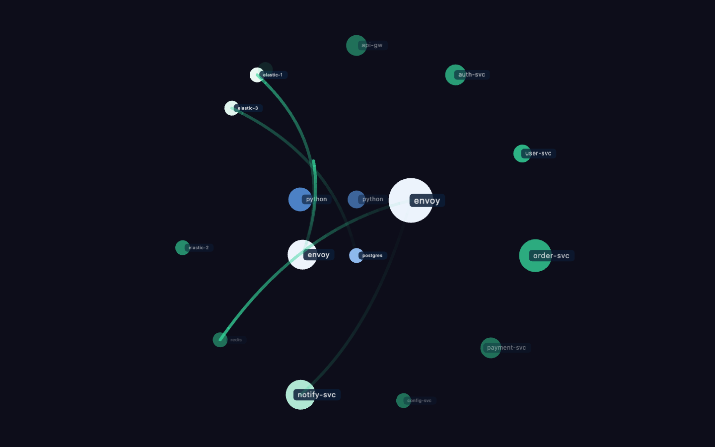
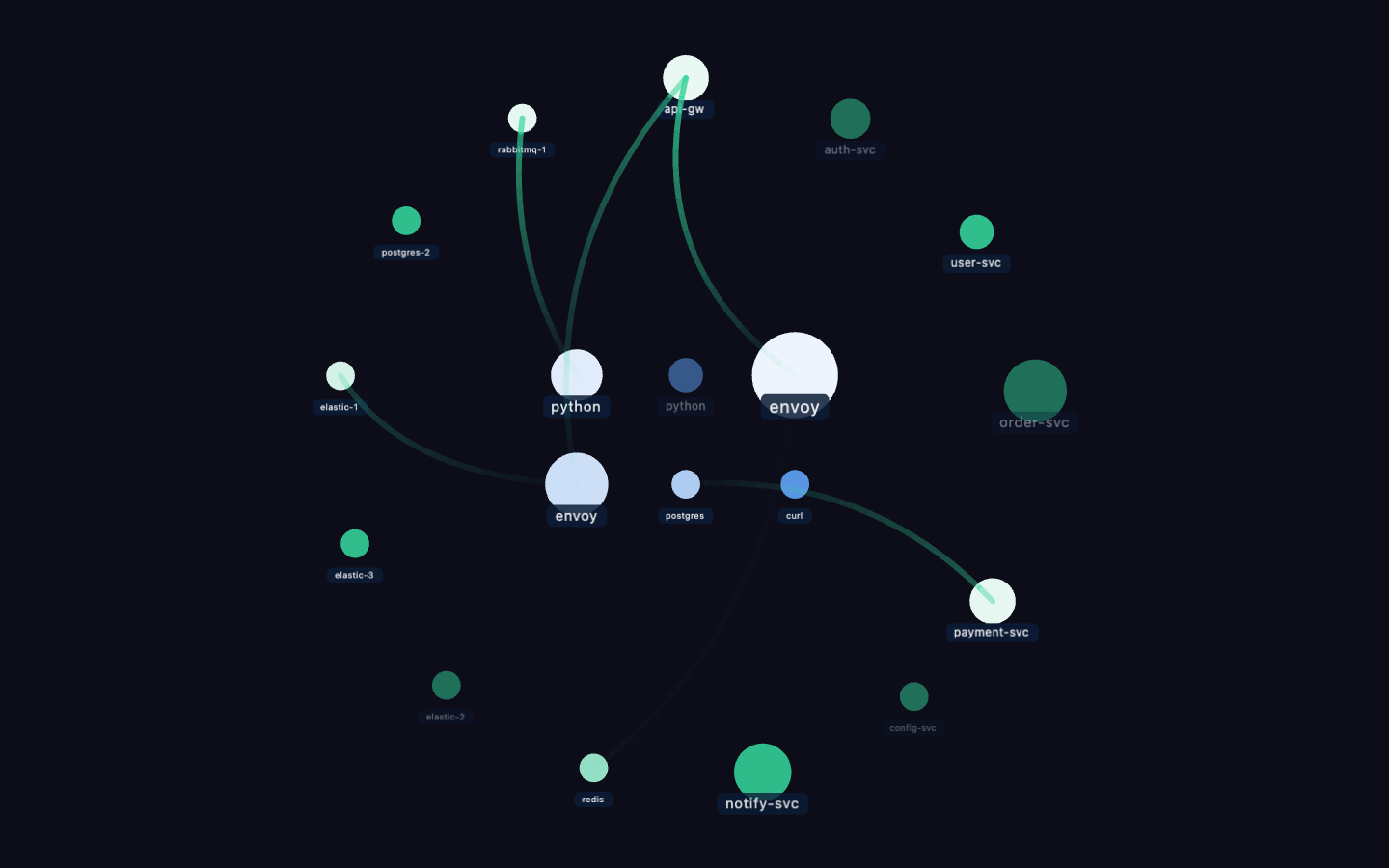
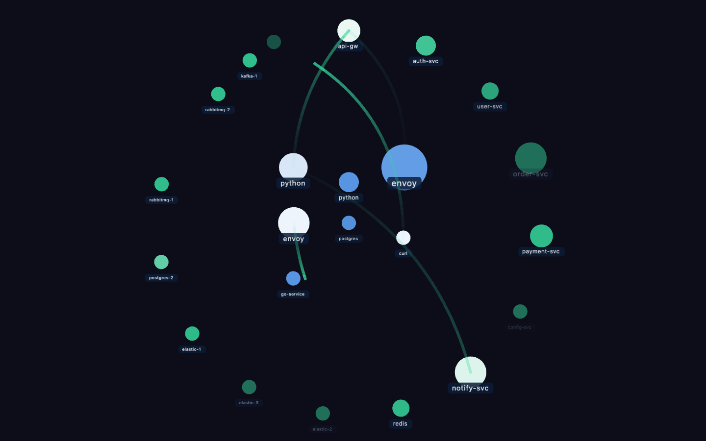
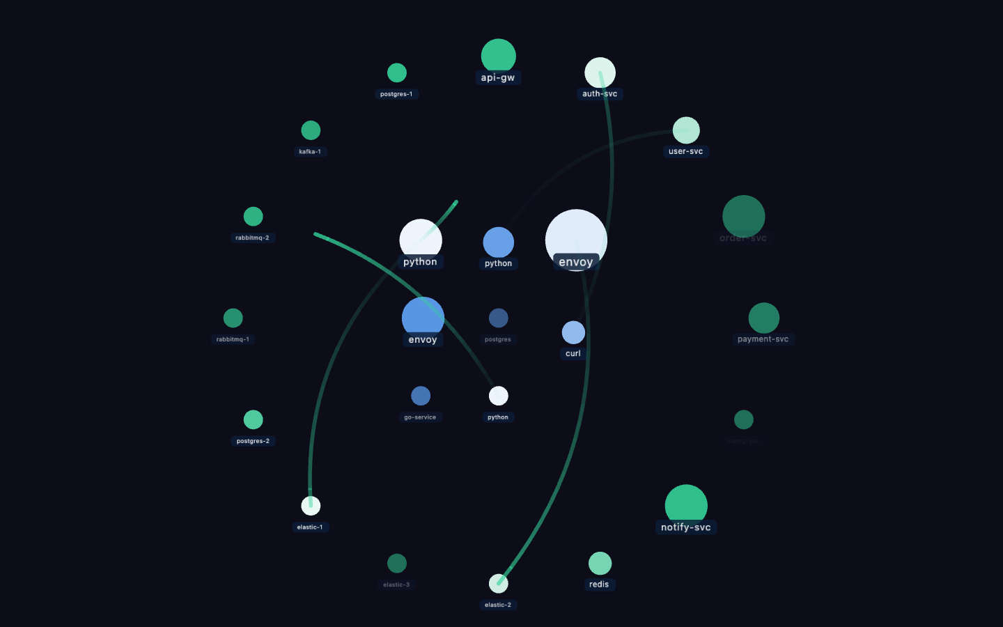
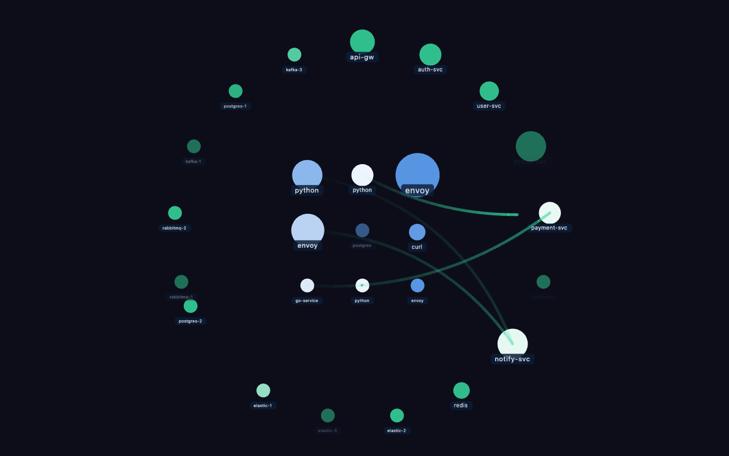
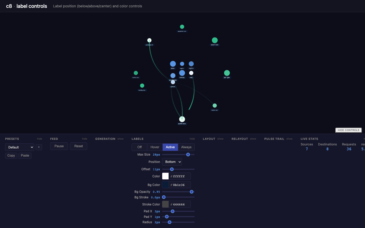
label controls
New in this cycle: Label system — position, color, and background controls (first DevControls build)
What changed
1. Label position & offset
Direction selector (top/bottom/left/right) + offset slider (0–40px). At offset 0, label sits at exact center of the node. Dragging the slider moves it outward in the selected direction.
2. Label color
Hex color text input (default ffffff) replaces the hardcoded 0x9aa8c0 gray-blue.
3. Label background
Rounded rect behind each label with full control over:
- Bg color (default
0b1c36) - Bg opacity (default
0.95) - Stroke width and stroke color
- Pad X / Pad Y — separate horizontal/vertical padding (defaults 3px / 1px)
- Corner radius (default
2px)
Labels are now a PIXI.Container wrapper (_bg Graphics + _text Text) rather than a bare PIXI.Text. Background redraws on any parameter change.
4. positionLabel() helper
Extracted duplicated label positioning logic (4 call sites) into a single positionLabel(wrapper, radius) function.
5. Reusable dev-controls components
Extracted repeated toolbar patterns into standalone Vue components:
| Component | Replaces | Count |
|---|---|---|
ControlSlider.vue | <label class="slider-row"> + range input + value display | 29 instances |
ControlColor.vue | <label> + hex text input | 5 instances |
ControlSelect.vue | <label> + <select> dropdown | 5 instances |
ControlSection.vue | <div class="control-group"> + <h3> header | 8 sections |
DevControls.vue | <footer class="experiment-toolbar"> | 1 wrapper |
- ControlSlider —
v-model, label, min/max/step, optional suffix - ControlColor —
v-model, label, placeholder - ControlSelect —
v-model, label, options (strings or{value, label}objects) - ControlSection — collapsible section with title + show/hide toggle,
collapsedprop for initial state - DevControls — wrapper panel with a toggle button to show/hide the entire toolbar
All styles are scoped inside each component. App.vue toolbar markup reduced significantly.
6. Preset support
All new label controls included in the preset save/load/copy/paste system.
Defaults
- Max size: 28px, offset: 11px, position: bottom, color: ffffff
- Bg: 0b1c36, opacity: 0.95, pad X: 3px, pad Y: 1px, radius: 2px, stroke: 0
Visual record
9 captures — heroes, page slices, and full-page renders. Click to view.