Nav Submenu
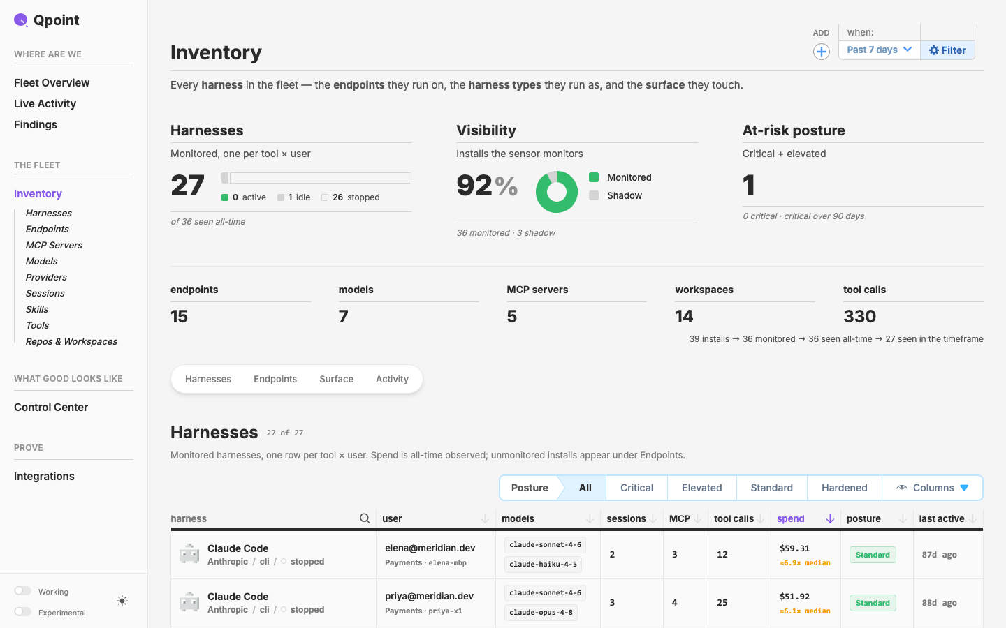
A layer nav item that owns child items and discloses them by URL. First use: THE FLEET › Inventory in the qcontrol sidebar shows its 9 listing pages whenever `/inventory` is in the URL.
New in this cycle: NavVerticalSubmenu: a sidebar row that owns child rows and opens them by URL. In qdash, THE FLEET moves up to second and Inventory lists its 9 listing pages (italic, med 13, 1px gap on a stroke-strong rail) on every /inventory page
Why
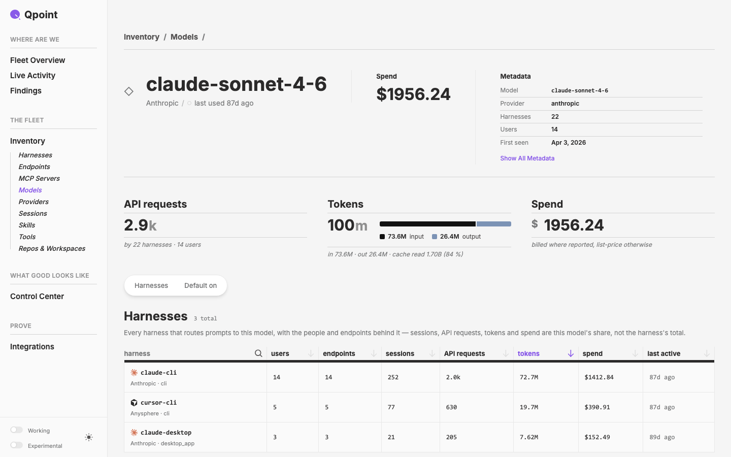
Inventory has grown into a hub with 9 listing pages under it: Harnesses, Endpoints, MCP Servers, Models, Providers, Sessions, Skills, Tools, Repos & Workspaces. The qcontrol sidebar lists pages flat, so today those listings are only reachable from the sidebar through the WORKING dev toggle. The sidebar should say where you are without anyone clicking to expand anything. When you're anywhere under /inventory, the Inventory item should open to show its children.
Objective
- Layer:
NavVerticalSubmenu(new) + a non-breakingNavVerticalItemchange. Children inside a submenu take the sub treatment: Inter italic (med 13 since 2026-09-26, first specced as bold), tighter rows, a hairline rail at the parent's left edge. - Design site: demo + registry entry with full prop coverage and empty / minimal / typical / overflow scenarios.
- qdash: the Inventory item in
AppSidebar.vuebecomes a submenu.
Done means:
- The qdash sidebar matches reference.png on every
/inventory*page and stays collapsed elsewhere. - The demo proves every form of the component.

Scope
q-nuxt-layer/components/nav/VerticalSubmenu.vue(new),nav/VerticalItem.vue(inject + sub styling), layerCLAUDE.mdNav tabledesign/app/pages/components/_demos/NavVerticalSubmenu.vue,design/app/data/component-registry.tsqcontrol/crates/qdash/ui/app/components/AppSidebar.vue(children derived fromWORKING_LISTINGS)
Plan: plan.md · Prompt: initial-prompt.md
Decisions (Mark, 2026-09-26)
- URL matching lives in the component.
matchtakes path prefixes and defaults toto, andv-model:openoverrides it. This followsIconNavItem'sbasePathprecedent. Row active stays caller-controlled. - The parent row stays default ink on child pages. It is grape only on
/inventoryitself. - Children prefix-match, so Models stays lit on its detail pages. Top-level items keep exact match.
- WORKING stays as is. The 9 listings show in both places for now.
Defaults, unless Mark objects:
- The name is
NavVerticalSubmenu. - No chevron.
- A URL-matched list can't be click-collapsed.
- It opens instantly, with no animation.
Key Changes
- Kick-off (2026-09-26): plan drafted, four decisions settled, cycle activated.
- Layer + demo (2026-09-26):
NavVerticalSubmenu(q-nuxt-layer/components/nav/VerticalSubmenu.vue): the parent row is aNavVerticalItem(:sub="false") or a toggle<button>, followed by arole="group"list. Disclosure is segment-aware prefixmatch(defaults toto), withv-model:openas the override.- Rail: a
::beforepseudo, so thetop-2 bottom-2inset doesn't push the children down. It usesstroke-strong, which matches the reference pixel for pixel (rgb 212, the same stroke as the section title rule). NavVerticalItemgainssub(defaultundefined, which inherits viainject('navSubmenu')): bold italic,py-0.5. The measured result is 15px/700 italic, 26px rows against the parent's 30px. The reference pitch is ~27.5px.- Demo
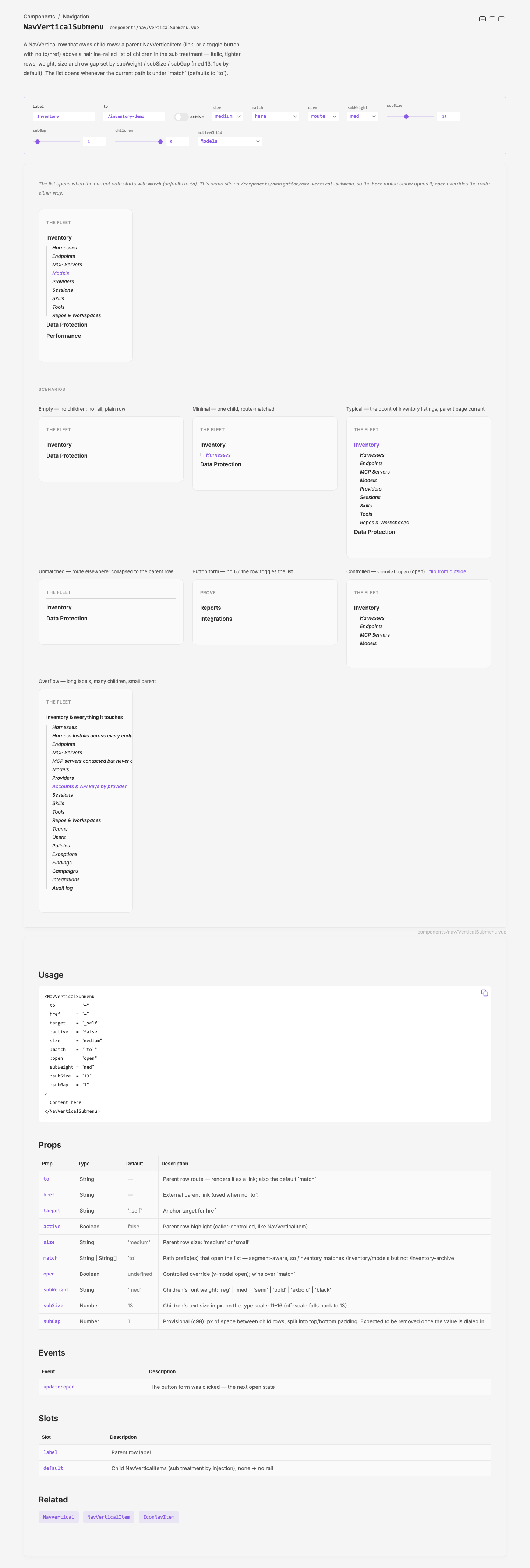
_demos/NavVerticalSubmenu.vue: interactive sidebar + empty / minimal / typical / unmatched / button / controlled / overflow scenarios. Registry entry added; theNavVerticalItementry and demo gainsub. LayerCLAUDE.md: Nav table rows + an unreleased migration note. - Gotcha: the button's first class name
._togglecollided withUxToggle's unscoped._toggle::after(a 2px white dot). It was renamed._submenu-toggle, and the rail class._submenu-rail.
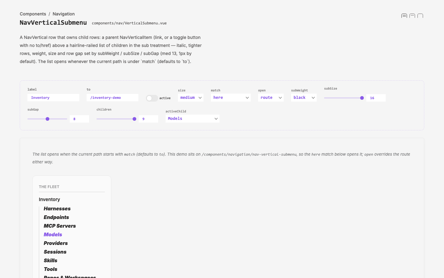
- Sub weight + size props (2026-09-26, Mark):
NavVerticalSubmenugainssubWeight(reg | med | semi | bold | exbold | black, defaultbold) andsubSize(px on the type scale 11–16, default 15).- How it reaches the children: the submenu now provides
{ weight, size }instead oftrue.NavVerticalItemmaps them through literal class tables, so Tailwind sees every class; an off-scale value falls back to bold 15. - Demo: a weight dropdown + a 11–16 size slider. All six weights and six sizes verified in the browser. The parent row stays semi 15.
- Consistency: named weight steps + scale-bound sizes keep it inside "size is constrained", with no arbitrary px.
- How it reaches the children: the submenu now provides
- Provisional
subGap(2026-09-26, Mark): px of space between child rows (default 4, the oldpy-0.5), split into top/bottom padding by inline style so the click area stays contiguous. Demo slider 0–16.- Measured pitch = line-height + gap − 2 (the link's
-mb-[2px]): 0 → 22px, 4 → 26px, 8 → 30px, 16 → 38px at 15px text. The reference's ~27.5px pitch sits at a gap of about 5–6. - To be removed once dialed: bake the chosen value into
NavVerticalItem'sSUBconstant and drop the prop, the provide field and the demo slider.
- Measured pitch = line-height + gap − 2 (the link's
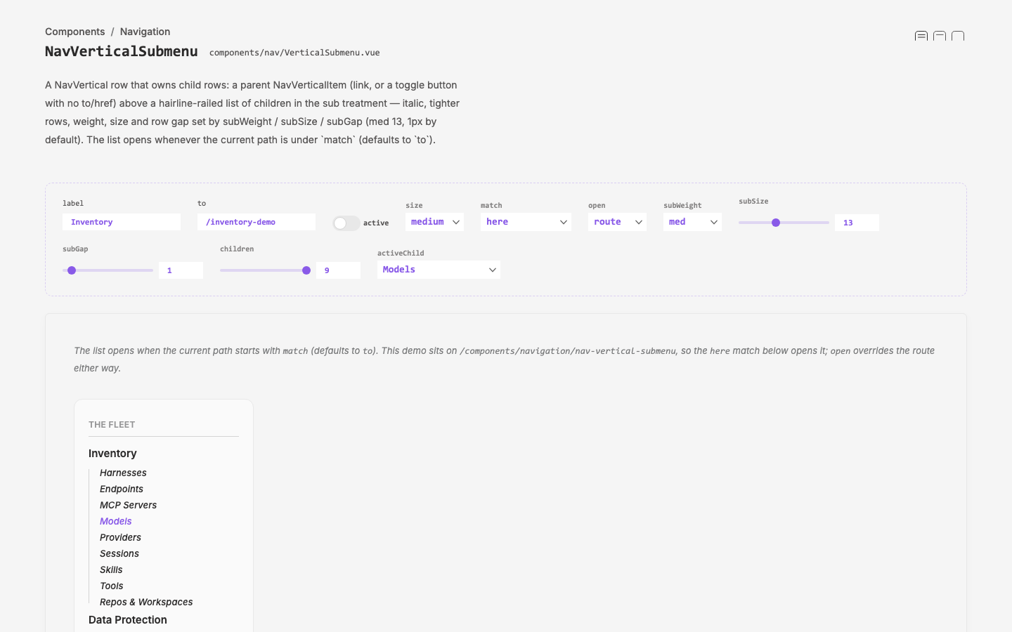
- Sub defaults dialed (2026-09-26, Mark, from the demo controls):
subWeightmed,subSize13,subGap1 are now the defaults (were bold / 15 / 4).- Measured: children render 500 13px italic with 0.5px top/bottom padding, 23px rows. The parent row is unchanged at semi 15.
- Scope:
NavVerticalItem'sSUBconstant holds the same values, sosubforced outside a submenu matches, and the scoped.sub py-0.5rule is gone.subGapstays provisional until the next look; if 1 holds, bake it intoSUBand drop the prop.
- qdash wiring (2026-09-26): in
qcontrol/crates/qdash/ui/app/components/AppSidebar.vue, a nav item listed in aSUBMENUSmap renders as aNavVerticalSubmenu. Today that is only/inventory, whose children areWORKING_LISTINGSfiltered to/inventory/*, so they're derived rather than typed a second time. Everything else renders as aNavVerticalItem, as before.- Active rules: new
isSubActiveis a segment-aware prefix match for children. The top-levelisActivestays exact. WORKING is untouched. - Verified on the live :3030 server (NUXT_LOCAL_LAYER):
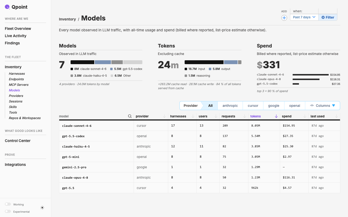
/and/users: collapsed./inventory: open, parent grape, no child lit./inventory/models/detail?id=…: open, parent ink, Models lit./inventory/workspaces: Repos & Workspaces lit.- Children render 500 13px italic, 23px rows, rail rgb 212.
working-nav.test.tspasses (6/6).
- Active rules: new
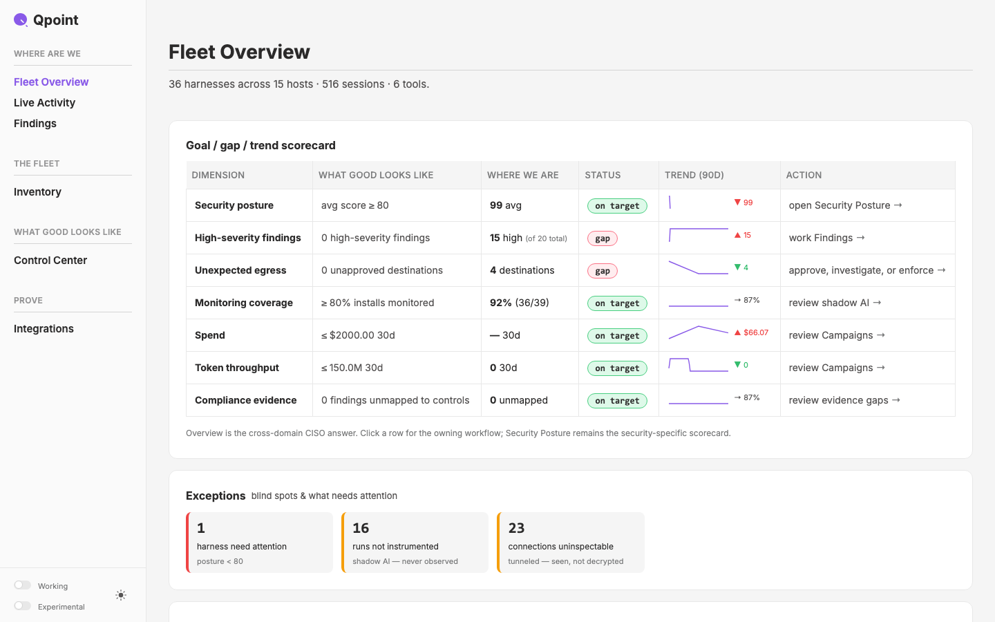
- THE FLEET moved up (2026-09-26, Mark): qdash
NAVnow reads WHERE ARE WE → THE FLEET → WHAT GOOD LOOKS LIKE → ACT → PROVE. The groups still follow the Rust dashboard's 5-section IA, but the order now diverges from it;AppSidebar.vuenotes this. Verified on :3030. - Inventory page title (2026-09-26, Mark):
/inventoryPageHeader "Harness Inventory" → "Inventory", matching the nav label. That was its only use of the old title in qdash.
Outcome
Completed 2026-09-26. The qcontrol sidebar now shows where you are. On every /inventory page, Inventory opens to its nine listings: Harnesses, Endpoints, MCP Servers, Models, Providers, Sessions, Skills, Tools, Repos & Workspaces. The current listing is lit, including on its detail pages. Elsewhere the submenu collapses to one row. THE FLEET moved up to second in the rail, and the Inventory page is titled "Inventory".
- Layer (unreleased; rides the next bump with the queued 0.9.22 work):
NavVerticalSubmenu: parent row + disclosed children; route-awarematch(defaults toto, segment-aware) +v-model:open; a button form when there's noto.NavVerticalItemgainssub, inherited by injection. Existing call sites are unchanged.
- Design site: demo with DevCanvas controls and seven scenarios; registry entry; archive entry
content/archive/2026-q3/2026-09-26-c98-nav-submenu.md; six captures inpublic/cycles/design/c98-*. - Learnings:
- Tune in the demo. Exposing weight / size / gap as props turned "a bit less space" into a two-minute session on the demo's controls. The dialed values (med 13, 1px) became the defaults. Worth repeating for any styling question the reference doesn't settle.
- Measure the reference. Sampling the reference PNG (PIL) settled the rail colour exactly: it is
stroke-strong, the section title rule, notstroke. Size and pitch came from the same sampling, not from eyeballing. - Layer class names can collide. An underscore-prefixed class in a layer component can hit another component's unscoped rule (
UxToggle's._toggle::after). Prefix with the component's own name.
- Carried forward:
- Remove the provisional
subGaponce 1px holds: bake it intoNavVerticalItem'sSUBand drop the prop and slider. - Release the layer; qdash's committed
dist/rebuilds on that bump. - qcontrol is uncommitted (on purpose). The qdash edits (
AppSidebar.vue,pages/inventory/index.vue) sit in files carrying the uncommitted c92 harness-rename work, onfeat/new-pages. The THE FLEET block that moved is the renamed one, andisSubActivesits against the rewrittenisActive. Another session also has files staged in that index. They commit together when that work does. - Other sections could take submenus through the same
SUBMENUSmap inAppSidebar.vue. - WORKING still duplicates the nine listings by choice. Revisit when WORKING is next touched.
- Remove the provisional
Visual record
7 captures — heroes, page slices, and full-page renders. Click to view.