Table Column Picker
A checkbox popover that shows/hides a table's columns — `UxColumnPicker` on a new `UxPopover` primitive — prototyped on the design site, then extracted to q-nuxt-layer and wired into a qdash listing
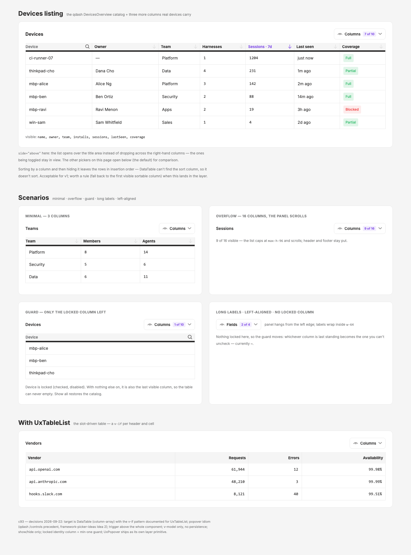
New in this cycle: UxColumnPicker on a new UxPopover primitive — a checkbox popover above the table that shows/hides DataTable columns, with a locked identity column and a min-one guard; prototyped as design-local components before layer extraction
Why
qdash listing tables are getting wide (Devices carries 7 columns, Sessions and the /inventory/* listings more) and nothing in the ecosystem lets a user hide the columns they don't need. DataTable already takes a columns array, so the missing piece is only the control. The anchored panel it needs has been hand-rolled in three places, which is the signal for a primitive.
Objective
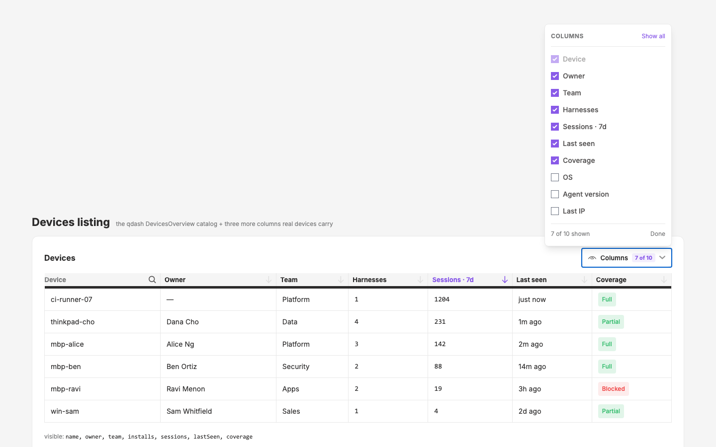
UxPopover— trigger + anchored panel primitive on Headless UI (toggle, Escape, click-outside, focus return owned by Headless; chrome and alignment owned here).UxColumnPicker—columns: { key, label, locked? }[]in, visible keys out via v-model in catalog order; locked columns checked + disabled; min-one guard; Show all / Done footer; trigger with aN of Mbadge when anything is hidden.- Both demonstrated on the design site with minimal / overflow / guard / long-label / left-aligned scenarios and the
UxTableListv-if pattern, then extracted to the layer, documented, released, and placed on one qdash listing.
Decisions (2026-09-22): target DataTable, popover idiom, trigger above the whole component, v-model only (no persistence), show/hide only (no reorder), locked identity column + min-one, UxPopover as its own primitive.
Scope
- Design:
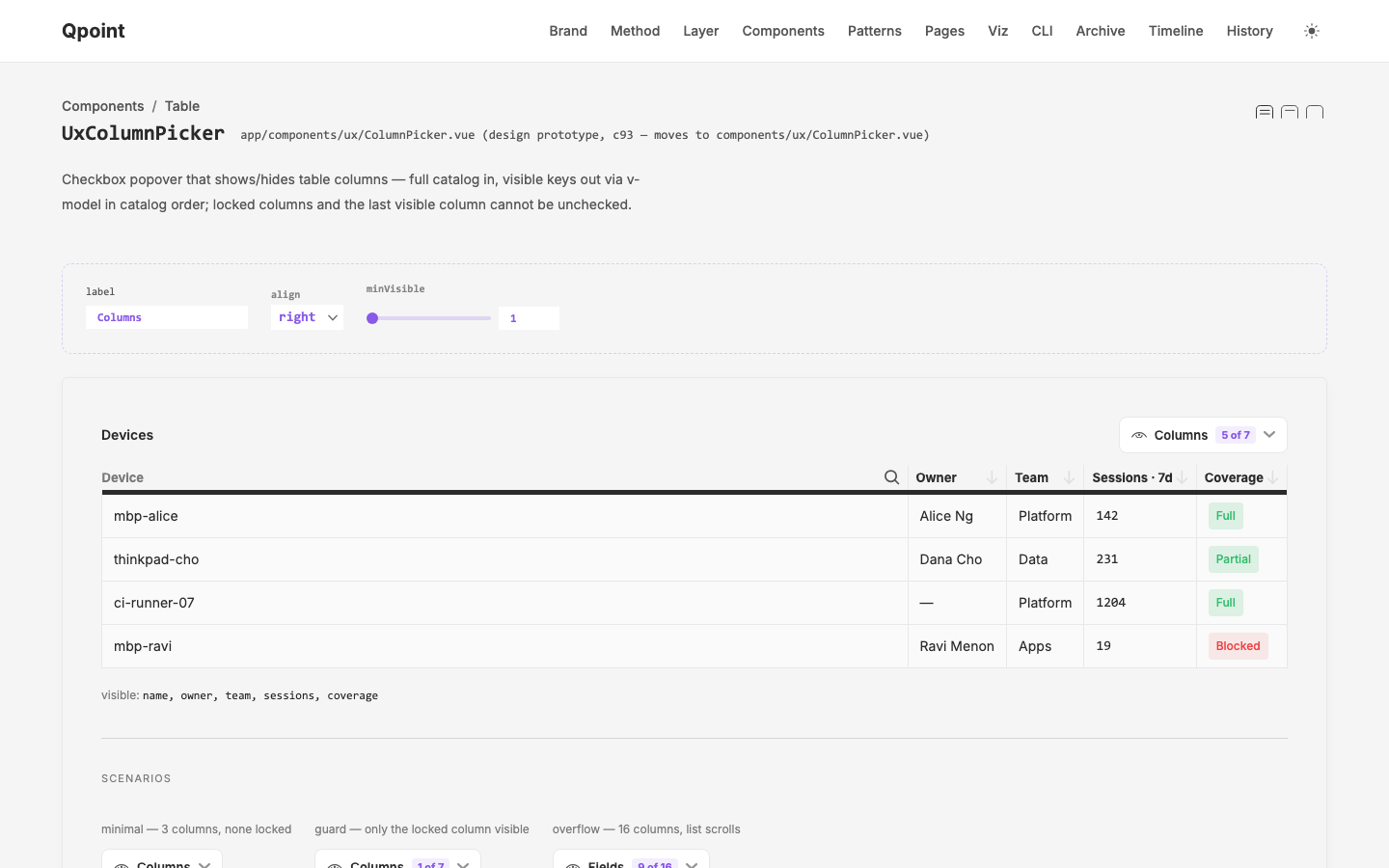
cycles/c93.table-column-picker/(initial-prompt.md,plan.md, this record); prototypesapp/components/ux/{Popover,ColumnPicker}.vue(auto-import asUxPopover/UxColumnPickerso extraction is a file move); demoapp/pages/pages/column-picker.vue+page-registry.tsentry; later_demos/UxPopover.vue,_demos/UxColumnPicker.vue,component-registry.ts. - q-nuxt-layer (extraction):
components/ux/Popover.vue,components/ux/ColumnPicker.vue; possibleDataTablesort fallback when the sorted column is hidden. - qcontrol (first consumer,
feat/new-pages):crates/qdash/ui/app/components/DevicesOverview.vue.
Key Changes
- plan (2026-09-22): survey of existing pieces + seven open questions →
plan.md; all seven answered the same day. - prototype (2026-09-22):
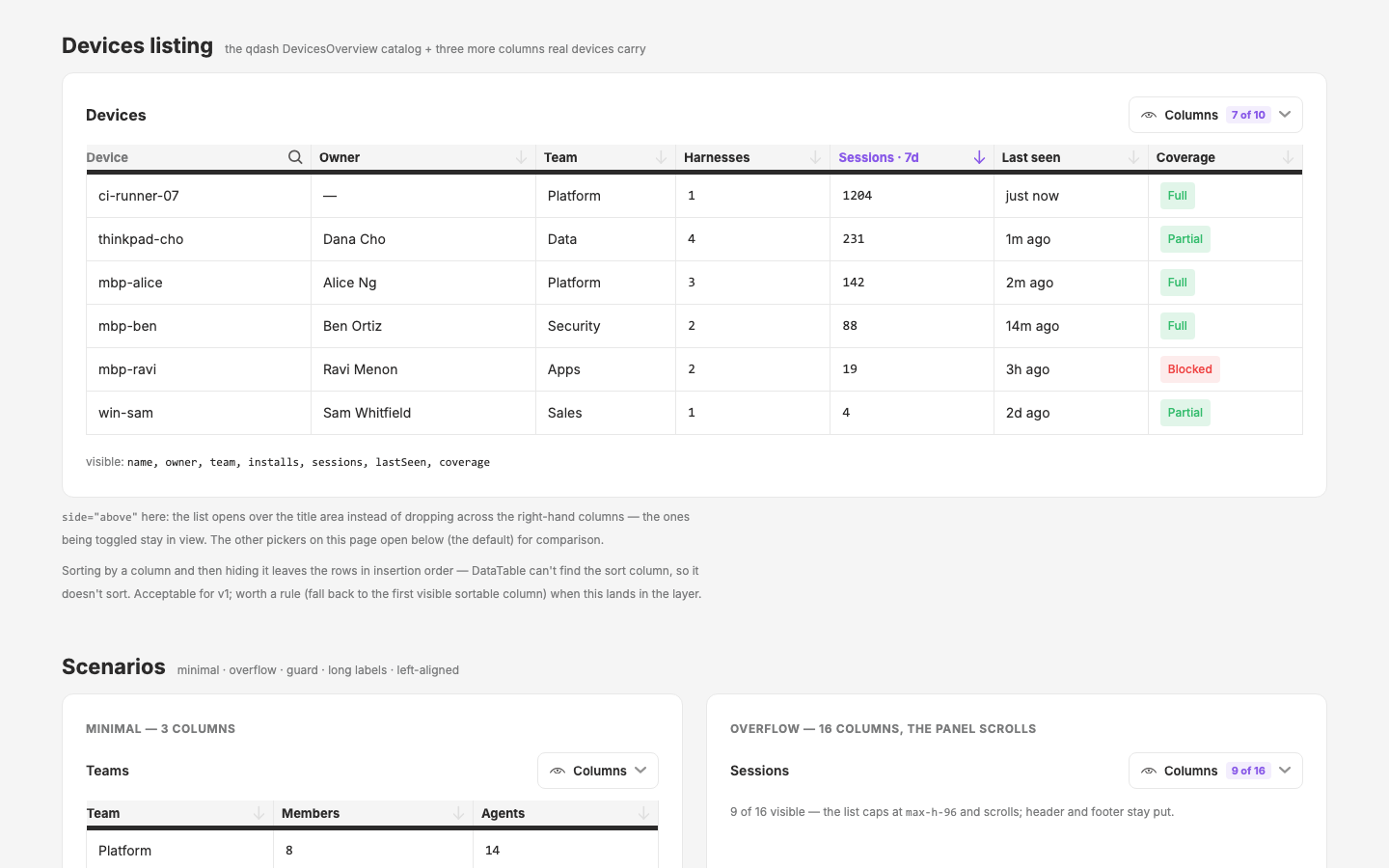
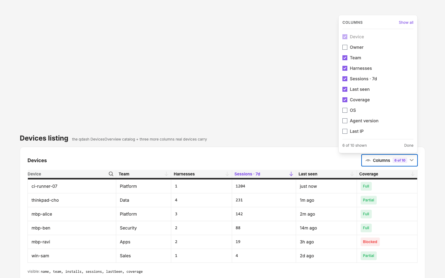
UxPopover+UxColumnPickerbuilt as design-local components underapp/components/ux/;/pages/column-pickerdemo with the Devices catalog live table, five scenarios, and the UxTableList pattern. Verified on the live :3000 server viascripts/shot-programs/c93-column-picker.json(closed → open → Owner toggled off: badge 7→6 of 10, column drops); capturespublic/cycles/design/c93-column-picker{,-full,-open,-toggled}.png. Polish from the shots: locked/last-standing rows dim; list cap raised tomax-h-96so a 10-column catalog doesn't scroll. Not committed — Mark reviews first (push = deploy). - component docs (2026-09-22): both prototypes registered in
component-registry.ts(UxPopoverunder Interactive,UxColumnPickerunder Table) with_demos/UxPopover.vue+_demos/UxColumnPicker.vue(adminProps cover every prop; minimal / typical / overflow scenarios, guard state) — so they appear on/componentsnow, not only after extraction.sourceis display-only, so it reads the design-local path with a note. - side prop (2026-09-22): Mark's note that the panel covered the very columns being toggled →
UxPopovergainsside: 'below' | 'above'(passed throughUxColumnPicker); the live demo and the DevCanvas default open upward over the title area so the table stays fully visible. Trade-off: 'above' needs headroom — a picker at the very top of a page would push the list off-screen, so it suits tables that sit under a title band (every qdash listing does) and the default stays 'below'. - known gap: sorting by a column and then hiding it leaves DataTable unsorted (sort column not found). Candidate rule at extraction: fall back to the first visible sortable column.
Outcome
(open)
Visual record
5 captures — heroes, page slices, and full-page renders. Click to view.