Design
Brand evolution and artifacts. What changed, what was built, why it matters.
Qpixel Library Restructure
c40April 2026Restructured qpixel from a Nuxt app to a Vue + Vite library. Live editor embedded on the design site.
Qpixel converted from Nuxt 4 app to pure Vue 3 + Vite library. 50KB ESM bundle, vue as sole peer dep.
/visualization/qpixel — live embedded editor with fullscreen mode, prop table, and export catalog.
Qpixel card on /projects now links to /visualization/qpixel. Visualization index updated.
Added @qpoint-io/qpixel alias and optimizeDeps exclude for local dev.
Narrative
Qpixel was scaffolded as a full Nuxt app during c35, but it used Nuxt only for file routing and auto-imports on a single page. Aligning it with the qmap/qflow packaging model — pure Vue + Vite library mode — made it embeddable on the design site and importable by any Vue project.
The restructure converted ~35 Tailwind utility classes to scoped CSS, replaced Nuxt auto-imports with explicit Vue imports, and added a QpixelEditor wrapper component with configuration props. The design site now has a live interactive editor at /visualization/qpixel, completing the visualization trifecta alongside qmap and qflow.
CLI Harness & Qpixel
c35April 2026Terminal UI design for the QControl CLI spawned a standalone pixel art editor.
MOTD banner, pre-agent banner, and status bar designs for the QControl CLI. cat-compatible ANSI .txt output.
pixel-to-ascii.py (PNG→block art), stitch.py (icon compositor), preview.sh (terminal preview).
Spawned standalone ASCII block art editor at ../qpixel/ — web editor with Unicode block characters + ANSI color export.
Narrative
Designing terminal banners required a toolchain that didn't exist. The pixel-to-ascii.py script converted PNG source art to Unicode block characters, but iterating meant round-tripping through image editors. Building a direct web editor was faster than the round-trip — and useful enough to become its own project.
The half-height Cisco+Qpoint co-brand lockup using ▄/▀/█ block characters with ANSI color proved the approach. Qpixel was extracted as a standalone repo with the web editor plus CLI tools.
Data Component Rationalization
c28March 2026Two overlapping component families reconciled. DataMachine renamed to DataMetric across the ecosystem.
All 22 data components classified: 6 replaced by data-metric equivalents, 4 unique-purpose (kept), 12 composable metric building blocks.
DataMachine → DataMetric across all three repos. ~79 files in app, 12 layer components, 12 design demos. Zero old references remain.
/layer/data-components — classification, architecture, and decision guide for choosing between data/ and data-metric/ families.
Layer nav dropdown expanded with links to Tree Shaking and Data Components sub-pages.
Narrative
The data/ and data-metric/ families grew independently. data/ components are standalone display widgets built for various needs. data-metric/ components are composable building blocks for single-value display with optional decorations (sparkline, trend, percent bar). Without a clear map, contributors couldn't tell which family to reach for.
Rename scope was larger than expected — layer source, design demos, design registry, app production pages, app lib docs, app dev pages, app registry, app skills, and app agents all needed updating. Separating the audit/classify/rename phase from actual migration of deprecated components kept the cycle manageable. The deprecated data/ components still work; migration happens incrementally.
Document Dev Controls
c26March 2026The tooling documents itself. All 11 dev components get interactive demos.
New dev-controls group with 6 entries: DevControls, DevControlSlider, DevControlColor, DevControlSelect, DevControlSection, DevMetaPropsMachine.
11 new demo files covering all dev components. Both dev and dev-controls groups hidden from public index.
Narrative
Dev components are the foundation for every other component demo. DevCanvas, DevFrame, DevComment, DevControls — these are what contributors use to build and test new demos. Documenting them makes the demo-building workflow discoverable.
Hiding dev and dev-controls from the public components index keeps the consumer-facing view clean while making the tooling fully browsable for contributors who navigate directly.
Consume During Implementation
c25March 2026The design site becomes the first consumer of every component. Coverage tracking makes gaps visible.
Principle 8: "Consume during implementation." Build workflow and regression workflow formalized in component_philosophy.md.
DemoCoverage interface — states, allPropsExposed, scenarios, regressions. Added to all 87 component entries.
/components/coverage page showing summary stats, per-component table, score dots, and gap filter.
Gap-filled: healthMode on 7 data-metric demos, empty/overflow scenarios on 7 chart demos, disabled/loading/error states on 6 form demos.
/components/philosophy surfacing all 8 principles, design lineage, unified pantry concept, and design guidelines.
Narrative
The audit revealed systematic gaps, not one-offs. healthMode was never exposed across 8 data-metric demos. v-model components didn't expose modelValue. 76 of 87 demos only exercised the default state with a single data scenario. Making this visible was enough to motivate filling it — no gates or thresholds needed.
The adminProps kind: system (range, options) scaled well. Adding healthMode as a dropdown across all data-metric demos required no custom UI per demo. The structured prop types that c17 introduced paid off immediately.
Unified Component Pantry
c23March 2026The layer becomes the single pantry for all visual components. Tree-shaking makes "keep it pure" irrelevant.
"Component scope" section rewritten as the "unified pantry" model. Boundary test: visual/presentational → layer, business logic wired to app state → stays local.
6 local DevCanvas fork files deleted (Canvas, Comment, Frame, H, Label, PropsMachine). 857+ usages now resolve from layer.
Scanned 101 app lib demo files. 46 components (45%) already exist in the layer — identified as design site documentation backlog.
Narrative
The instinct to keep the layer "pure" — only generic primitives, no domain components — doesn't survive scrutiny. Nuxt tree-shakes aggressively, so unused components cost nothing at runtime. A single pantry is strictly better than splitting across repos.
Deleting app's local DevCanvas forks was the proof point. Same props, same v-model pattern — the only difference was visual styling. Layer versions have dark theme and polished CSS. Local overrides remain the escape hatch: Nuxt prioritizes local components, so any consumer can override by placing a local copy.
Violations Table
c22March 2026Standalone violations table. PolicyCard slot replaced with a prop-based API.
Standalone sortable table (Source, Dataflow, Destination, Violation, Time) using UxTableList + SecurityDataFlow.
Default slot replaced with violationSamples prop. When non-empty, renders ViolationsTable in adjacent panel.
Narrative
The default slot from c19 was only ever used for a violations table — it wasn't a generic composition point. Promoting the table to a standalone component and switching to a prop keeps the layout logic contained.
ViolationsTable serves dual purpose: PolicyCard uses it internally for the summary view, and the security policy detail page can use it directly for the full dataset. Prop over slot when the content type is always the same.
Policy Skin Extraction
c21March 2026PolicyCard's visual wrapper becomes a standalone component. White-list state added.
Standalone wrapper with state (cool/hot/warm/default/white-list), maxWidth, and ribbon props. Default slot for arbitrary card content.
Extended with white-list state: white badge, grey stroke, blue checkmark.
Refactored to use PolicySkin internally — removed manual wrapper div and borderColor computed.
Narrative
The security policy page needed cards for whitelisted apps, datastores, and vendors that share PolicyCard's visual treatment but with completely different content. The visual wrapper was baked into PolicyCard alongside domain-specific stats.
Extracting PolicySkin follows the same pattern as the sentence builder extraction: recognize when a component contains a reusable primitive, pull it out, compose back together. PolicyCard is now PolicySkin + domain content, not a monolith.
Alert Config & Sentence Builder
c20March 2026Alert rule configuration card. Sentence builder primitives extracted as a generic pattern.
Card component with UxToggle, conditional sentence rows for condition (every/threshold), action (HTTP/Slack), and throttling.
4 generic sentence builder components extracted to sentence/ namespace: SentenceRow, SentenceSelect, SentenceNumber, SentenceText.
#label slot documented in demo — was previously only showing the label prop.
Narrative
The alert config started as a local pattern prototype with inline render-function sub-components. Extraction to the layer revealed the pill inputs and sentence rows weren't alert-specific — they're a generic "sentence builder" pattern reusable in filters, rules, and config UIs.
Key discovery: UxToggle is already a <label> element. Wrapping it in another <label> creates invalid HTML. The #label slot is the correct API for dynamic label content.
Security Composition Primitives
c19March 2026SecurityPolicyCard gains a default slot. SecurityDataFlow visualizes data-type tag routing.
Default slot added — when present, renders card + slot content side-by-side. Backward-compatible: no slot = same render as before.
New layer component rendering source → data-type tags → destination flow visual with configurable types and color palette.
PolicyCard demo shows violations table composed in the slot, matching the security dashboard wireframe from c11.
Narrative
The security dashboard vision from c11 showed policies with adjacent violations tables. The PolicyCard was props-only — no way to compose detail content alongside it. Adding a default slot follows the layer's composition-over-configuration principle: the card handles its own rendering, the consumer decides what goes next to it.
SecurityDataFlow captures a core Qpoint concept — the visual pattern of data flowing from source through typed tags to destination. Having it as a shared component means every security-related view can render data flows consistently.
Design Site Visual Identity
c17March 2026The design site starts looking like the brand it documents.
Three-state toggle on component detail pages: Full (header + docs), Work (canvas + admin), Focus (canvas only, admin below). Custom icons designed in Illustrator.
Multi-line format with one prop per line, aligned = signs, type-aware : binding prefixes.
usePreference composable — SSR-safe localStorage sync with qd: prefix. Applied to view mode and index layout.
Fixed animation bug — _height-override class was never removed, causing snap instead of smooth transition on subsequent triggers.
brand/architecture_precedent.md — survey of 15+ design systems documenting precedent for the separated library + documentation site pattern.
Narrative
After 16 cycles of building the design system, the design site itself was still utilitarian. This cycle started applying the brand's own visual identity — Swiss-modern aesthetic, deliberate typographic hierarchy, generous whitespace — to the tool that documents it.
The three-state view mode (Full/Work/Focus) reflects how the site is actually used: sometimes you need the docs, sometimes you just need the canvas. Persistent preferences via usePreference mean the site remembers how you work.
UxTableList Documentation
c18March 2026Comprehensive documentation of the compound table component with a compositional guide.
All 8 UxTableList demo files rewritten with production-realistic examples using a shared test dataset.
/patterns/data-table — 5-section compositional guide: component map, flat composition, production decomposition, key patterns, sub-component cross-references.
Data Table pattern added to /patterns/app with live interactive demo. Total app patterns: 5.
New CodeBlock.vue component for multi-block guide pages — titled, collapsible, copyable.
Narrative
The Sortable Data Table was deferred from c6 because the sort metric API felt too app-specific. The breakthrough was showing both levels: a flat composition (simple) and a full production decomposition (complex, drawn from traffic/connections). The pattern is accessible at both levels.
Sticky header was the original motivation for UxTableList. The scroll event callbacks depend on #page-scroll-window — sticky positioning works in any scroll container, but the event chain requires the matching element ID. This kind of implicit contract is exactly what compositional guides exist to surface.
Figma Pipeline + Layer Docs
c15 + c16March 2026Figma MCP → Vue SFC workflow validated. Layer architecture documented.
Repeatable pipeline: get_design_context → adapt to Vue SFC → layer component. First output: SecurityPolicyCard with 4 sizes, 2 states.
/layer page — 8 sections explaining why the layer exists, what it provides, how it works, the ecosystem, and key design decisions.
Unified gallery using <UxIcon>. Deleted 26 old Icon* demo files. Click-to-copy snippets.
Hardcoded empty-state image replaced with <slot name="empty">. Layer components no longer depend on consumer-specific assets.
Narrative
The Figma MCP output is useful but noisy — data-node-id attributes, expiring image URLs, inline style overrides all need cleanup. But layout structure, size variants, and color values transfer cleanly. The pipeline is repeatable.
The /layer page closes the communication gap. Engineers and collaborators can now see what the layer provides, how it works, and why it's built this way — without reading CLAUDE.md files or source code.
Cross-Project Collaboration
c12March 2026Four core projects learn to discover and delegate to each other.
Sister Projects sections added to design, market-analyst, bob-wire, and q-nuxt-layer. Each declares what it offers and what it knows about.
Narrative
The Qpoint ecosystem has 8+ projects, each with deep domain specialization. Cross-project collaboration required manually knowing which project had what data. Now each project's CLAUDE.md declares its neighbors — when to use them, key data paths, and available agents or skills.
Documentation as API, not MCP. For internal AI agent work, file reads via additionalDirectories are simpler and sufficient. Peer-to-peer, not hub-and-spoke — every project declares its own capabilities.
Prose Component Library
c9 + c10February–March 2026content/ renamed to prose/. 7 marketing components extracted. 12 total.
Renamed content/ → prose/ to fix @nuxt/content namespace collision. Components: ProseBigPoint, ProseCheck, ProseSectionHeadline, ProseStep, ProseStepWrapper.
7 new components extracted from www: Hero, Quote, Point, PointSimple, FAQ, BlogAuthor, BlogCard.
3 new patterns: Hero Section, Alternating Sections, FAQ Grid. Total: 10 patterns.
IconQuote — render-function component for the quote mark SVG.
Narrative
@nuxt/content strips the content/ directory prefix from component auto-imports. Renaming to prose/ eliminated the collision cleanly — no filename workarounds needed. The directory-based prefix now works as Nuxt intends.
www.qpoint.io ended with zero local copies of any of the 12 prose components. One duplicate was found during extraction — point/Big.vue was an exact copy of the already-extracted ContentBigPoint. This kind of invisible duplication silently accumulates. Extraction surfaces it.
Design Methodology
c7February 2026The intellectual lineage behind the design system made explicit.
brand/design_methodology.md — maps thesis ideas (wicked problems, assemblage, decomposition, modes of innovation) to Qpoint practice.
/method page on the design site. Six sections with grape callouts, innovation modes, structure/freedom tension.
brand://qpoint/method resource exposing methodology to agents.
New writing principle: "Form the problem, then solve it." Added across all 5 brand touchpoints.
Expanded from 10 to 11 sections. New section 07: Design Methodology.
Narrative
Composition over configuration, cycle-based development, pattern discovery, replicate-first — these principles were already operational before the thesis connection was made explicit. The methodology was already embedded in the practice. It needed language.
The key insight: writing "in the voice of" rather than "about" the thesis produced artifacts that read as natural extensions of the brand. Academic citations would have created distance. The ideas are absorbed, not referenced.
The agent-era connection emerged as the strongest untapped angle. "Collective sketching" and "shared consciousness" describe exactly what MCP servers and CLAUDE.md files do for AI agents. Kept internal for now.
Component Extraction + Patterns
c4 + c5 + c6February 2026Reusable components extracted from www.qpoint.io. Compositional patterns documented.
New component group. Grid.vue — responsive grid with configurable columns.
New component group. 5 components: SectionHeadline, BigPoint, Step, StepWrapper, Check.
New /patterns page with 7 patterns — 3 marketing (Feature Grid, Process Steps, Section Template) + 4 app (Form Layout, Managed List, Modal Picker, Metric Dashboard).
/scan-patterns skill for systematic pattern discovery across sister projects.
Narrative
Individual component demos show what each piece does. Patterns show how they compose together — that's where the real value lives. Feature Grid is SectionHeadline + LayoutGrid + BigPoint. Process Steps is StepWrapper + Step. The combinations recur 20+ times across www pages.
The /scan-patterns skill formalized what had been a manual process: read pages from a sister project, identify layer component compositions, group by similarity, report frequency. It found 5 app patterns in app.qpoint.io — 4 clean enough to document immediately, 1 (Sortable Data Table) too coupled to its app context.
Ecosystem Integration
c3February 2026Three projects, one component library. app.qpoint.io joins the layer.
51 local component copies removed — 25 UX, 7 table-list, 4 form, 15 icons. All now consumed from the layer.
20 new component demos added to the design site. Total documented: 32 of 43 layer components.
Bugs discovered during integration: fixed relative imports, added missing Tailwind token (tableBorder).
Narrative
Connecting app.qpoint.io to the layer was the real test. The styleguide and www were already consuming it, but the product app had the most components and the most edge cases.
Every integration pain revealed a layer bug — relative imports that broke in consumers, Tailwind tokens defined only in the app's config. The consumer setup pattern crystallized: tarball dependency, extends config, cssPath false, remove local @tailwind directives. All three consumers now follow the same recipe.
Nuxt Layer — Shared Component Library
c1 + c2February 2026The design system becomes a distributable package consumed by every Qpoint project.
q-nuxt-layer — standalone Nuxt Layer with shared components, design tokens, and CSS. Published as @qpoint-io/q-nuxt-layer.
14 shared components extracted: 10 UX (Button, Input, Modal, Toggle, Tag, CopyBtn, Close, Checkbox, Message, Icon) + 4 icon stubs.
Becomes an honest consumer of its own design system — extends the layer like any other project.
tailwind.config.js canonicalized as single source of truth. Fixed border-radius bug, added production line-heights for 28 sizes.
Narrative
The design site was serving three roles simultaneously: distributable design system, brand knowledge base, and showcase website. An isSite flag in the config — conditional logic detecting whether the project was running as a site or being consumed as a layer — signaled these roles wanted to be separate.
The split created two projects with clear identities. The layer is unconditional (~25 lines of config). The design site is a standard Nuxt app that extends it. When the design site feels integration pain, other consumers will too.
Component philosophy was codified: composition over configuration, Tailwind-native, slots over deep prop trees. These principles would guide every extraction that followed.
MCP Brand Server
MCP v1.0.0February 18, 2026The exploration becomes a running service.
Version, mission, vision, core values.
Full color system — grape, leaf, grey scales + semantic.
Fonts and 9-level type scale.
Voice, tone by context, writing principles, prohibited patterns.
Full essential guide markdown (read from disk, always current).
Look up any brand color by name and scale step — returns hex value.
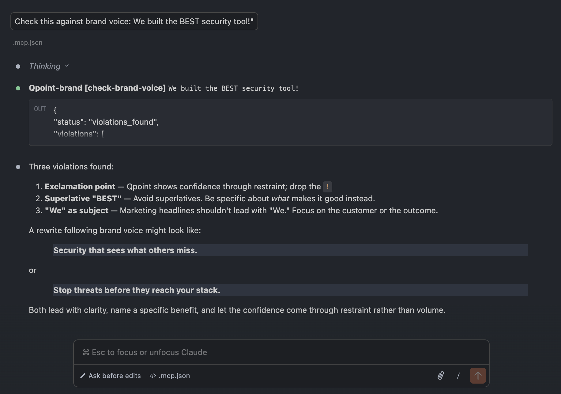
Check text against brand voice rules — flags violations with explanations.
Narrative
A working MCP server that makes Qpoint's brand identity programmatically available to Claude Code and any MCP-compatible AI client. Standalone Node.js process using stdio transport, separate from the Nuxt app. Imports brand data directly from server/data/brand.ts — zero duplication, single source of truth preserved.
The check-brand-voice tool is the first concrete example of brand enforcement rather than brand documentation. In its first test, it correctly caught three violations in a single sentence — an exclamation point, a superlative, and "We" as a marketing headline subject — and suggested compliant rewrites.
The style guide website remains the human-readable reference. The MCP server is the machine-readable one. Same source data, two interfaces.
Brand as a Service
MCP explorationFebruary 2026Exploring the brand as a service, not just a document.
Narrative
A new working document exploring the concept of a brand-aware MCP server — a service that would make Qpoint's brand knowledge programmatically available to any AI assistant used by the team.
Three capability layers: resources (brand content on demand), tools (brand-specific AI actions), prompts (pre-built templates). Four concrete use cases demonstrate range — from voice review to asset delivery to audience-specific messaging coaching.
This document marks a meaningful inflection point in how Qpoint thinks about its brand system. The style guide has always been a document — something people read (or don't). The MCP server concept reframes the brand as a service — something AI tools consume automatically.
This connects directly to the v1.5 elevation of the MCP server as a first-class product capability. The brand is now thinking about MCP not just as a product feature for customers, but as internal infrastructure for how the team itself operates.
AI Governance Pivot
v1.4 → v1.5February 2026AI governance pivot and Section 2 begins.
Two questions replace one. Framing shifts to AI-era governance: "How do I maintain data governance in the age of AI?"
Working note added about vibe-coded apps as a specific use case.
Empowerment language replaced with automation: "Dangerous patterns are detected and prevented automatically."
MCP server added as explicit capability. Converted from prose to bullet list.
Three-color palette: Grape (#895AE8), Leaf (#58E392), Grey. Scales, semantic placeholders, usage rules.
Inter as display, Geist Mono for code. Nine-level type scale defined.
Symbol, Wordmark, Lockup. Four color variants. Clear space and minimum sizes codified.
Narrative
Two major things happen in v1.5. First, the AI governance pivot: "vibe-coded apps" enters the language as a specific threat vector. The MCP server is elevated to a first-class capability. The vision shifts from empowerment to automation — suggesting Qpoint acts on your behalf, not just informs you.
Second, Section 2 begins. The brand's tangible identity starts taking shape. Grape as primary color is deliberately non-blue, aligning with competitive differentiation. Color is framed as functional, not decorative. Semantic colors are marked as placeholders — honest about what's decided and what isn't.
Problem-First Framing
v1.3 → v1.4February 2026Lead with the customer's question, not the product's capabilities.
Reframed from product description to customer problem. Opening question: "Where is my data going — and can I stop it?"
Added urgency: "and the power to act on it the moment something is wrong."
Added "deep, kernel-level" to describe visibility. Three-dimensional coverage moved here.
"Not a wall of dashboards" rewritten to explicitly define both visibility and control as distinct concepts.
Threats subsection gains a concrete example about unvetted third parties.
Narrative
The most meaningful structural shift in v1.4 is the move from product-first to problem-first framing. Instead of opening with what Qpoint does, it leads with the question that security and platform teams can't answer.
Technical specificity increases: "deep, kernel-level" enters the language. The stable core — values, persona, voice, writing principles — remains untouched.
Brand Baseline
v1.3February 2026First complete, polished Essential Guide.
Narrative
The foundation is clean and finished. Dual emphasis on visibility and control is established as a first principle. Three-dimensional coverage (egress, internal, endpoints) is introduced inline in the opening paragraph.
The voice is confident and peer-level. The persona — the senior engineer who's already solved the problem — is set. Values, writing principles, and the decision framework are locked in and will remain unchanged through subsequent versions.