Dark mode for the product
Design the dark color theme for Qpoint's product UI, in the browser, with the design site's theme editor
- Designer
- sarah
- Deliverables
- a dark theme (17 color values) exported from the theme editor · optionally a second, softer "subtle" variant · before/after screenshots of the reference pages · a short note on the choices
In plain words
Every screen in Qpoint's product is painted from a short list of named colors: the page background, a slightly recessed background, the text, quieter text, the thin lines between things, the brand purple, and four signal colors for good, bad, warning and information. Light mode has a settled set of those seventeen values. Dark mode has a first-pass set that an engineer wrote by picking darker greys, and nobody has designed it yet. Your job is to design it: choose the seventeen dark values so the product feels like the same brand at night, not like a photo negative of the day. You do it live, in this website, with a small color panel that repaints the page as you drag sliders.
The job in three lines
Choose the dark value for each of the seventeen semantic color roles so that the product's pages read clearly, keep their hierarchy, pass contrast minimums, and still feel like Qpoint (Swiss-modern, restrained, grape as the accent). Judge the result on real pages, not swatches: the product mocks under /pages on this site are built from the same roles the product uses. Hand back the exported values, screenshots, and a few sentences on why.
The line to design against, from the brief Mark wrote for the brochure site's dark mode: "Dark mode should feel native, not inverted. A naive inversion (swap white for black, done) produces a design that feels like a negative."
What exists today
- The current dark values. The product already flips to dark; the values are a conservative first pass: greys from the brand's grey scale, grape one step lighter, signals one step lighter. They work. They were not designed. They are the column you'll be replacing.
- A "subtle" variant from July (c52). Someone tried a softer dark: a slightly blue-black base, muted grape, signals toned down 15–20%. It lives as a saved theme called
dark-subtle-baseline. It's an opinion to react to, not a starting point you owe anything to. - A brochure-site dark-mode brief (c46). Written for Illustrator work on the marketing site, not the product, but its principles and contrast minimums apply here and are repeated below.
- An unstarted note titled "simpler light/dark mode colors" (c76). A one-line wish, never worked. Your work answers it.
- Pixel-art colors. The little agent figures and pixel icons have their own dark values, marked "tune visually". Out of scope for this brief; note anything that looks wrong and we'll do them next.
The tool
The theme editor is on every page of this site. Bottom-right corner, a small circle button. Click it.
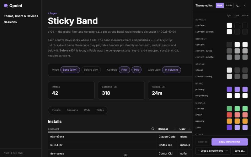
- Rows are the seventeen roles, grouped Surface · Content · Stroke · Brand · Signals.
- Three swatches per row: light, dark, subtle. Click a swatch for a picker with a hex field and hue / saturation / brightness sliders. The page repaints as you drag.
- See dark. The moon/sun toggle in the editor's header (also in the site's top nav) switches the whole site between light and dark. Work with the site in dark.
- Dark vs Subtle. The pair of buttons in the header chooses which column the dark site renders from. Keep it on Dark unless you decide to make a subtle variant too; then use Subtle to compare.
- Reset. The small arrow on a changed row resets that role; Reset all clears everything.
- Your edits survive. They're stored in your browser, so you can reload, move between pages, come back tomorrow. They are only in your browser: a different browser or a cleared cache loses them, so export when you reach a state you like.
- Export: Copy semantic.mjs. This copies all seventeen roles as text. Paste it into the Google Doc (see Deliverables). This is the hand-off; nothing else is needed from the tool.
- Save as… and the Load menu do not work on this site. They need a server this site doesn't have when published. Ignore them. Copy semantic.mjs is the save.
The roles
What each one paints, with today's light and dark values. The dark column is the one to design.
| Role | What it paints | Light today | Dark today |
|---|---|---|---|
surface | The page and cards. Most of every screen. | #FFFFFF | #111111 |
surface-sunken-subtle | A barely recessed area, between surface and sunken. | #FAFAFA | #161515 |
surface-sunken | A recessed area: the page behind cards, table stripes, inputs. | #F5F5F5 | #1A1919 |
surface-sunken-deeper | The deepest recess, rarely used. | #E8E8E8 | #2B2A2A |
surface-logo | The chip behind third-party logos. Stays white in dark so other brands' marks stay legible. Leave it. | #FFFFFF | #FFFFFF |
content | Body text and headings. | #2B2A2A | #F5F5F5 |
content-muted | Secondary text: descriptions, table cells. | #565454 | #AAAAAA |
content-subtle | Tertiary text: labels, timestamps, captions. | #7A7B7C | #7A7B7C |
content-subtler | Faintest text and placeholder marks. | #D4D4D4 | #D4D4D4 |
stroke | Hairlines: borders, dividers, table rules. The design language is flat and hairline-driven; in dark, borders do the job shadows do in light. | #E8E8E8 | #393939 |
stroke-strong | Heavier borders: inputs, emphasized dividers. | #D4D4D4 | #565454 |
primary | Grape. Links, buttons, the active thing. | #895AE8 | #AB86F6 |
on-primary | Text on a grape button. | #FFFFFF | #FFFFFF |
success | Leaf green. Good, passing, enforced. | #34BC6D | #58E392 |
error | Red. Failed, blocked, past due. | #EF4444 | #F87F7D |
warning | Amber. Pending, attention. | #F59E0B | #F59E0B |
info | A second grape for informational notes. Must stay distinct from primary. | #7742E2 | #BBA5FF |
The brand's full grey, grape and leaf scales are on /brand/colors. You can go off-scale; the light theme didn't, and that restraint is part of why it reads as one system.
Where to judge it
Swatches lie. Judge on these pages, in dark, after every meaningful change:
/pages/phase1/toolsand/pages/agent-detail: product pages as the product renders them. Tables, tiles, pills, detail headers./pages/sticky-band: a long table with a pinned header, for how surfaces stack./components: every component in every state. The place to catch a role that works on one page and fails on another./patterns: compositions./briefs: this section, as a control.
Principles and minimums
From the brand and the c46 brief, unchanged:
- Color is functional, not decorative. Don't add color because the dark canvas looks empty.
- Keep the hierarchy. Light mode has clear levels: heading, body, muted, subtle. Dark must keep the same relationships. Relative contrast between levels matters more than any single pairing.
- Native, not inverted. Build from the brand palette. Dark surfaces, lighter text, accents that work against dark.
- Brand guidance: dark surfaces are Grey-800/900 territory; grape-tinted surfaces (Grape-850/900) only for branded moments, sparingly; the reversed logo is white or Grape-300.
- Contrast minimums (WCAG AA): body text 4.5:1, large text 3:1, UI elements and icons 3:1. Check with the WebAIM contrast checker. Known traps: light grey on dark grey that looks fine and fails; Grape-500 on Grey-900 passes for large text, fails for body.
- Leaf stays distinct from grape. They mean different things.
- Competitors lean on dark dashboards and threat imagery. Qpoint's dark mode should still feel calm and precise, not like a security product at night.
Deliverables
- The export. Copy semantic.mjs, pasted into a Google Doc titled
Dark mode — theme export — <date>, in the Drive folder Mark names. One paste per version you want to keep; date each. - Screenshots. Each reference page above in light and in your dark, full page. Same Drive folder.
- A note. A few sentences: what you were going for, what you changed from today's values and why, anything that didn't work. If you made a subtle variant, say when you'd use each.
- Optional: pixel-art notes. Anything in the agent figures or pixel icons that looks wrong on your dark.
Mark moves your values into the design system; the product's dark mode follows from there.
Jargon
| Term | What it means here | If you had to picture it |
|---|---|---|
| Token | One named color (or size) the whole system refers to by name, so changing it once changes it everywhere. | A paint can with a label |
| Semantic role | A token named for what it does (content, stroke) rather than what it is (grey-700). The seventeen rows in the editor. | The label on the can says "trim", not "beige" |
| Surface / content / stroke | The three families: backgrounds, text, lines. | Wall, writing, pencil lines |
| Sunken | A background one step recessed from the main one. | A tray set into the counter |
| Primary | The brand color in use: grape. | The one colored thing on a grey page |
| Signal | A color that means something: success, error, warning, info. | Traffic lights |
| Grape, Leaf, Grey | The brand's three color scales, each a run of steps from 50 (lightest) to 900 (darkest). | Three paint strips |
| Hex | A color written as #RRGGBB. What the editor stores and exports. | A paint code |
| HSB | Hue, saturation, brightness: the three sliders in the picker. Hue is which color, saturation how vivid, brightness how light. | A color wheel, a vividness dial, a dimmer |
| Contrast ratio | How different two colors are in lightness, as a number like 4.5:1. The accessibility standard (WCAG) sets minimums. | Reading a sign in fog |
| WCAG AA | The accessibility standard most products aim at. | The pass mark |
| Light / dark mode | The two whole-site color schemes. The site switches with the moon/sun toggle. | Day and night |
| Subtle | A third column in the editor, meant for a softer dark variant. Optional. | Dusk |
| Design system, the layer | The shared box of components and tokens every Qpoint app is built from. Your values go there. | The parts bin |
| qdash, the product | The Qpoint app your dark mode will ship in. The /pages mocks are its pages rebuilt here. | The real thing, with the lights off |
| Theme editor | The panel on this site. | The paint-mixing counter |
semantic.mjs | The file in the design system that holds the seventeen roles. The export is its contents. | The recipe card |
Record
- Shipped: